
There’s a paragraph in the handbook that says “The difficulty is persuading yourself that it is ok to leave ‘mistakes’ in your sketchbook. You don’t need to think of your sketchbook as a precious space for perfect drawings and finished ideas – it can be rough, unfinished and raw. In fact, as far as your tutor is concerned, ‘mistakes’ aren’t mistakes at all!” – Page 51 of Illustration 1: (Illustration Sketchbooks Handbook).
From reading my response to the last exercise’s questions you will know that this is my biggest fault when it comes to using sketchbooks. I find it so hard to leave mistakes but with the help of this unit I’m going to try as hard as possible to break out of my comfort zone and leave all my mistakes! From reading the answers to the question “Do you allow yourself to make mistakes in your sketchbook?” I understand that most people don’t mind mistakes and that they can actually be a ‘gift’ of sorts.
Drawing activity:
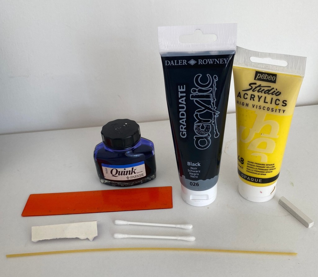
For this exercise I was asked to create 4 different A4 drawings showing what is to the left, right, front and back of me. I did them in 5 mins or under. I chose to draw on coloured paper, a different colour for each angle, this was when they are presented together there is a nice contrast.
For my tools I decided to use:
- Black acrylic paint & a ruler
- Blue Quink ink & a piece of spaghetti
- Yellow acrylic paint & a cotton swab
- White chalk stick
My drawing activity outcomes:
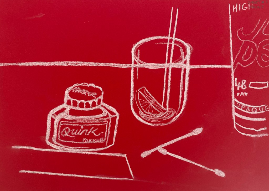
Sheet 1 – Front – red paper – white chalk:
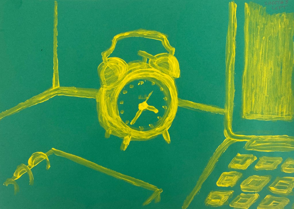
Sheet 2 – Left – Green paper – yellow acrylic paint & cotton swab:
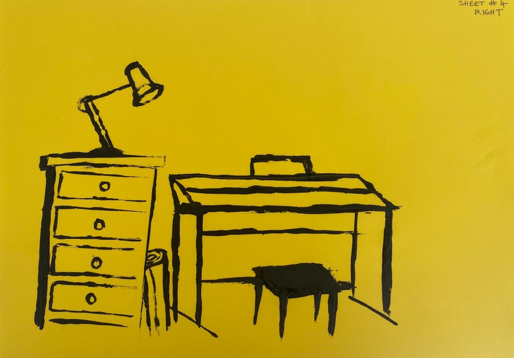
Sheet 3 – Right – Yellow paper – black acrylic paint & ruler:
Sheet 4: Back – Orange paper – blue ‘Quink’ ink & spaghetti

At the end of this exercise I am supposed to make a note about how I felt whilst completing this exercise. The suggested ‘feel’ words are:
- liberated
- scared
- anxious
- or any other emotion
Personally I felt a mixture of liberated and excited. I think this is because I had a certain amount of time to complete each drawing which is something I don’t do very often. I normally overthink my drawings and make them ‘perfect’ so it was nice to draw what I saw in under 5 mins. I will definitely be using this technique in future work.
My booklets made from the above drawings:

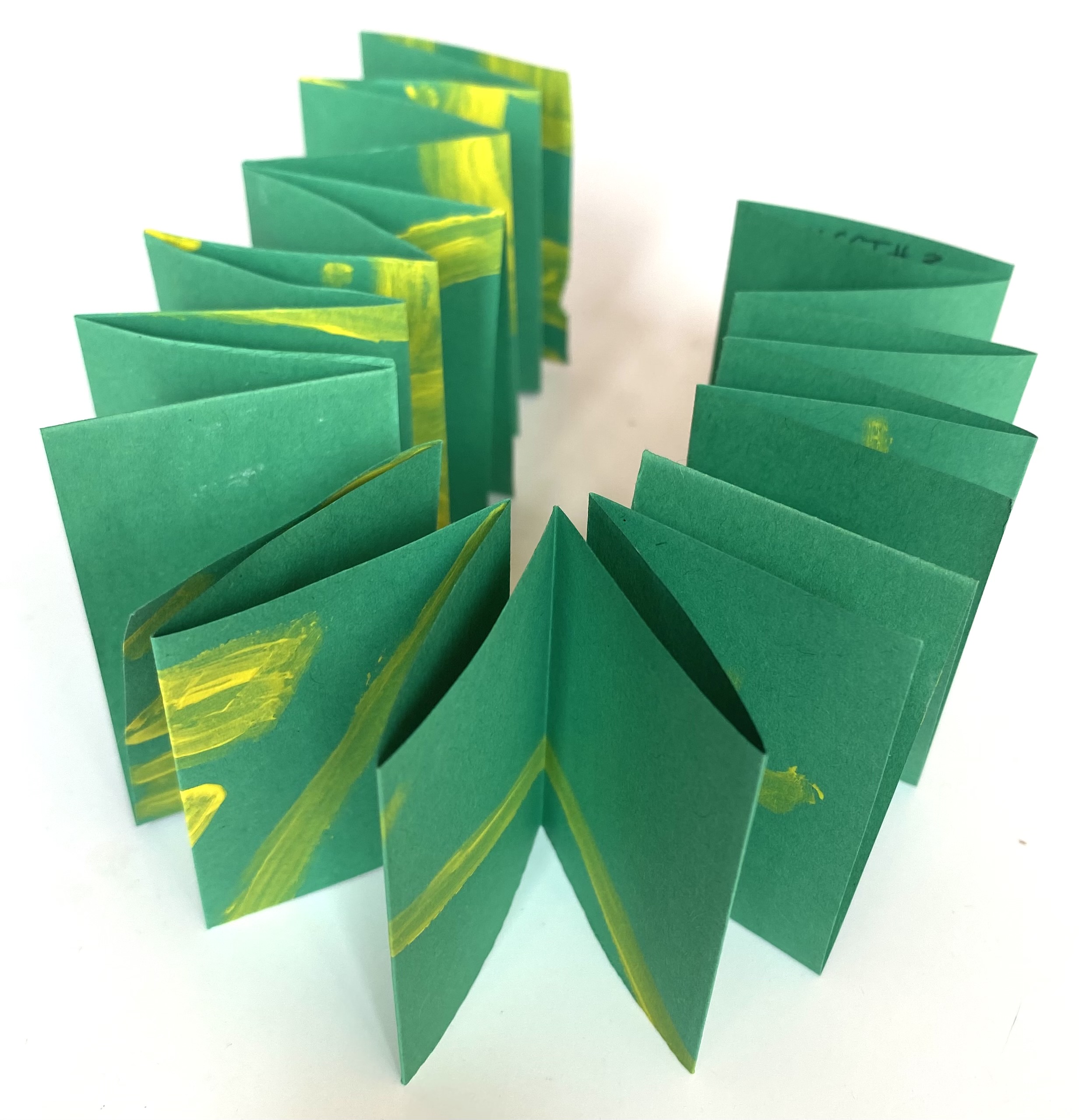


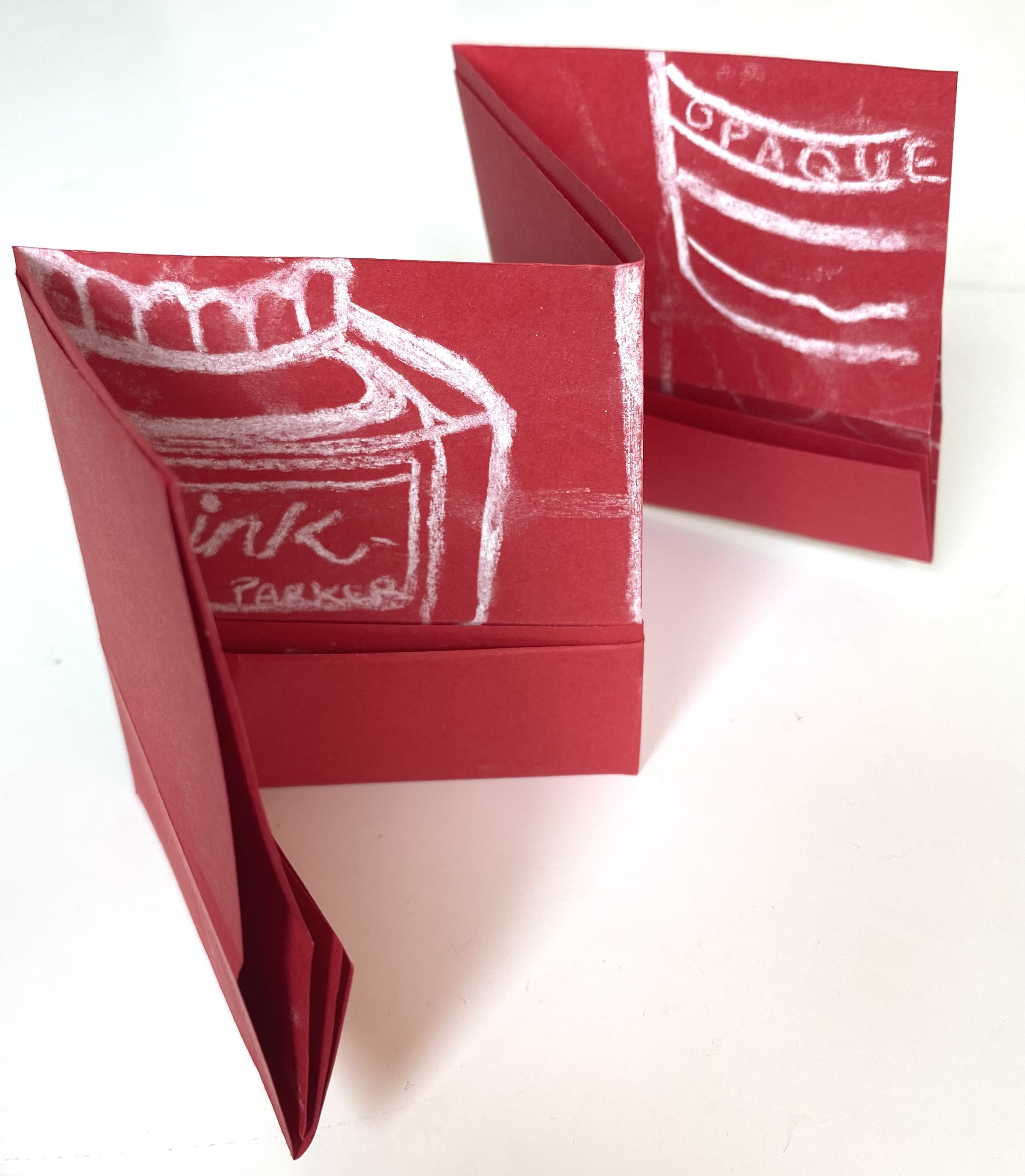
To be honest I really liked slicing these drawings up into booklets, I was able to look at each drawing differently. For some reason the red paper drawing reminds me of ‘Coke’ I think this was because of the way I drew the type from the side of the ink bottle, ‘Coke’ soft of has the same font and colours. The green paper booklet just reminded me of a slinky! The orange paper booklet was very neat and easy to make which I liked but my favourite format has to be the yellow paper booklet (I’m not sure if what I even did was correct but…) I tucked outwards one of the singe sheets of the booklet and this made a little cover, I didn’t do this intentionally and even the writing that I had wrote in the top corner of the drawing ended up in a really neat place at the right hand top of the booklet, this made me really happy. I also like the way you can almost see what is inside but it is misty due to it being covered by the front page. I decided not to add to any of the booklets as I thought they looked interested enough and didn’t want to ruin them.

There is so much truth in this. Such an amazing project. I can’t wait to get to where you are. 😁
LikeLike
Thanks! It really was a good project. And the quote really does sum it up. 🙂
LikeLiked by 1 person