Research Task 1:
For this research task I need to research Kafka’s short story The Metamorphosis (Die Verwandlung), The story is about a man called Gregor who wakes up one day to find himself transformed into a beetle. The story then explores how Gregor and his parents deal with this transformation. It is set in Gregor’s bedroom in his parent’s house, and the door of the room becomes an important visual metaphor for being trapped.
I will research how different illustrators have tackled the story. There is a limited range of illustrations, they focus only on the bedroom door, the beetle, and the bed.
My research findings:
Book covers:

How have illustrators tackled this story for book covers?
All of the book covers share the fonts and tones that you would expect from ‘old’ books, I think this has been done on purpose to give the ‘feel’ of an old creepy story.
The mediums used by these illustrators are all different, some have used charcoal, some have used pen and ink and others have used paint. Some look like illustrations used for science and others look like graphic fiction illustrations.
The covers that I chose out of the large choice on Google Images have primarily focused on the man after he has become the beetle or is halfway through the process, they do this by showing a beetle-human hybrid in a few of the images.
The illustrators have used the elements by showing the beetle or man-beetle hybrid on the cover, two of the covers have depicted the bed and bedroom door also. I think the illustrators have tried to focus on using the beetle for the cover as this would draw more people in than a man leaving a room in a confused/anxious state like the original cover depicts. I think showing a beetle with the title ‘The Metamorphosis’ would make people think this book is strange and interesting.
The illustrators’ choices framed my understanding of what the story is about by showing the beetle and sometimes the man-beetle hybrid, the beetle is shown on the front cover in strange contexts, not just a beetle on the front. I think this added with the title would make someone understand what the book is about, as long as you know what Metamorphosis means!
My favourite book cover:
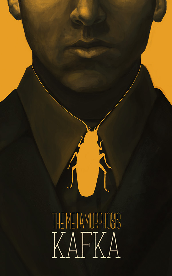
This is my favourite book cover out of all that I saw on Google Images. It’s so minimalistic, I find it really clever and interesting, he has made the beetle into the tie but also this symbolises the man with the beetle around his throat, almost giving a feeling of being strangled! The tone is muted and the painting of the man gives an old feeling to the illustration, at the same time the beetle is so vivid it gives a fresh new feel to the illustration, so having both overlap makes for a really interesting illustration. The typography used works fine and is enough to get an understanding of the title but I would be worried about just putting the Author’s surname, although, in this day and age, all you need to do is type the title and surname into Google and the Author would come up!
References:
- https://www.google.com/search?q=the+metamorphosis+franz+kafka&sca_esv=555867564&hl=en&tbm=isch&sxsrf=AB5stBg7fpmK6azOOU7c6DGJn-7EwjTJAg%3A1691750983292&source=hp&biw=1298&bih=706&ei=RxLWZLPDD6KjhbIPwLq1gAc&iflsig=AD69kcEAAAAAZNYgVwZu_4_ZYwNbRTD70a1KfRVOZaXl&oq=the+m&gs_lp=EgNpbWciBXRoZSBtKgIIATIEECMYJzIHECMYigUYJzIEECMYJzILEAAYgAQYsQMYgwEyCxAAGIAEGLEDGIMBMgsQLhiABBixAxiDATIFEAAYgAQyCxAAGIAEGLEDGIMBMgUQLhiABDIKEC4YigUYsQMYQ0iIHVAAWOgEcAB4AJABAJgB1QGgAcEFqgEFMi4yLjG4AQPIAQD4AQGKAgtnd3Mtd2l6LWltZ8ICBxAAGIoFGEPCAg0QABiKBRixAxiDARhDwgITEC4YigUYsQMYgwEYxwEY0QMYQ8ICERAuGIAEGLEDGIMBGMcBGNEDwgILEC4YigUYsQMYgwHCAgoQABiKBRixAxhDwgIREC4YgAQYsQMYgwEYxwEYrwHCAgsQABiKBRixAxiDAQ&sclient=img
- https://www.behance.net/gallery/10007489/The-Metamorphosis-Franz-Kafka
Linking image with text:
There is a physical connection between image and text, here are two examples of connections:
- Typography and image relating closely, typography continuing over the top of illustrations or vise-versa.
- The illustrative treatment of the typography itself, so changing the style of typography not the actual text.
Research Task 2:
For the research task I have been told to look at a range of book or magazine covers that use illustration and to answer the following questions through my analysis: How does the typography of the title, author, and other details interplay with the illustration? What’s the relationship between type and image?
I decided to look at books I already own rather than rely on Google Images again. I first grouped my books into different categories depending on what I wanted to explore with connections between image and text:
Clear typography, disconnected from the imagery:
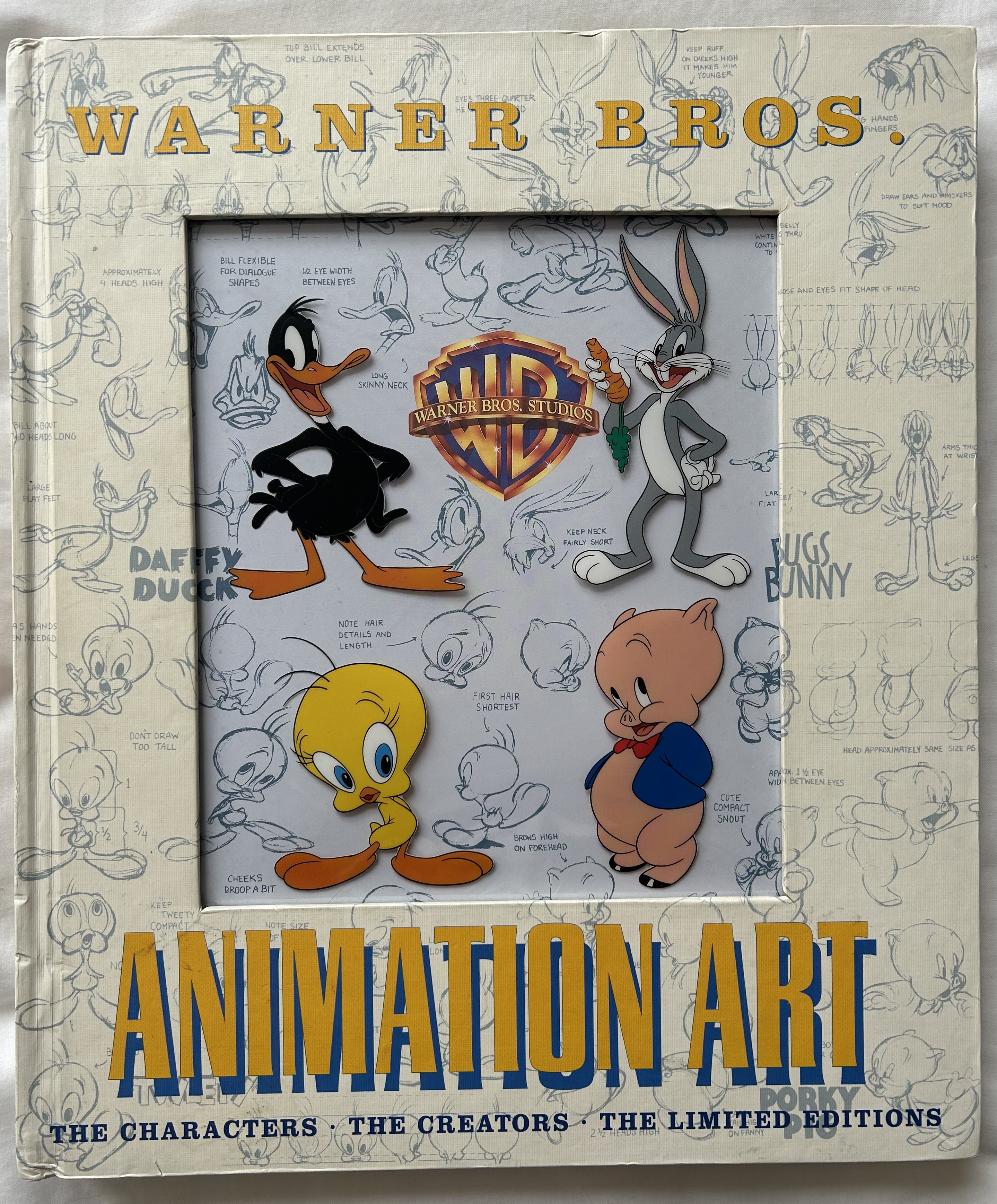
The books below show clear typography which doesn’t seem to be connected at all to the imagery on the cover. I think this is common in non-fiction books, for example, design books where there isn’t any story inside but instead non-fiction text and images to do with the subject matter. The typography is bold and easily readable, for example on the ‘Animation Art – Warner Bros’ book the writing has to be clear enough and bold in order to separate itself from the many small blue illustrations on the cover. These books are an example of typography not relating to the images.

Colour match typography and imagery:
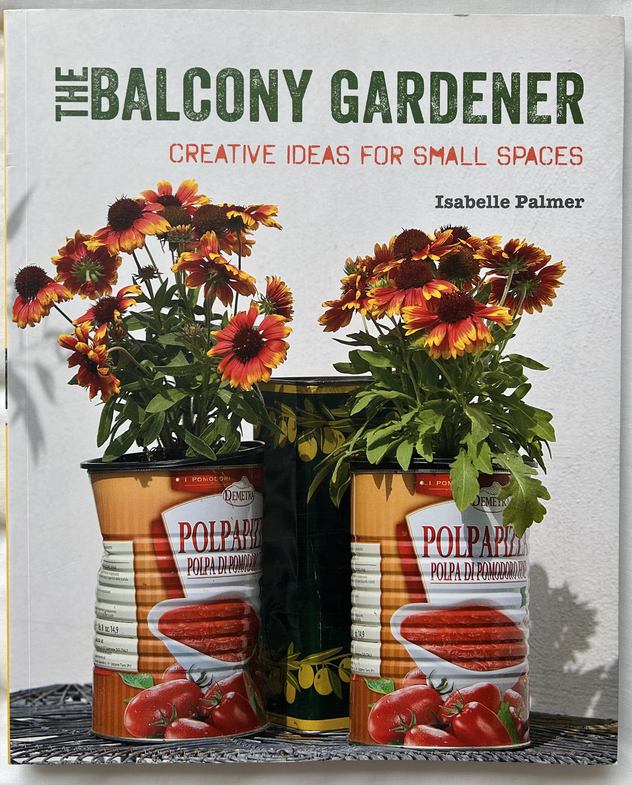
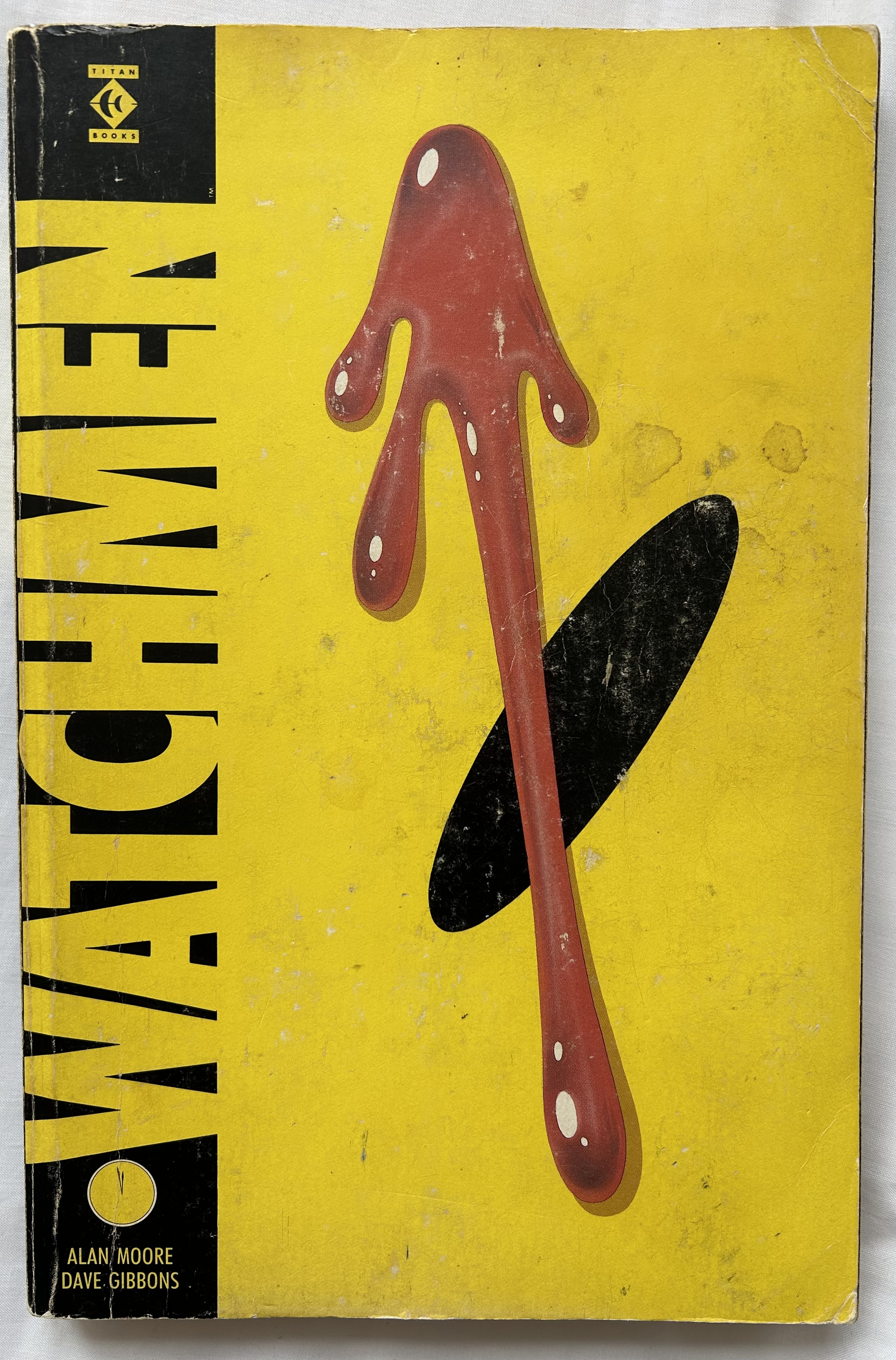
The books below show typography whose colour matches the image on the cover. The colours chosen for the typography have been selected from colours within the imagery. For instance, on the cover of the book ‘The Balcony Gardener’, the illustrator has used the same green for the title typography as the green on the underside of the leaves of the flowers and the text below which reads ‘Creative ideas for small spaces’ shares the same colour as the darker section of the petals on the flowers. This is also shown similarly in the ‘Watchmen’ graphic novel, the front cover shows a section of the smiley pin badge that is depicted in the story, and the illustrator has merged the title into the image by using the same colour yellow for both.
Intertwined and overlapped typography and imagery:
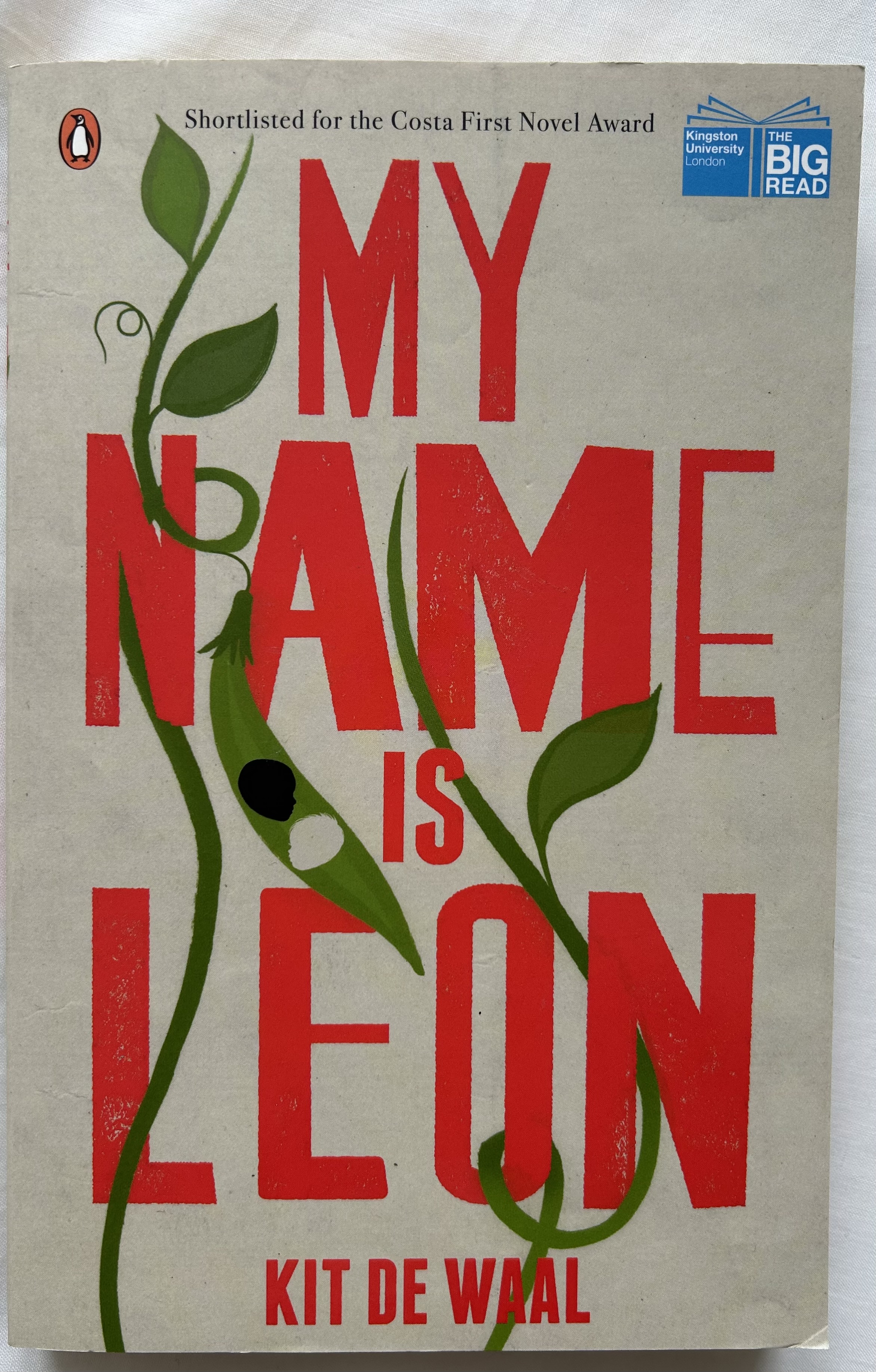
The books below show a few examples of when typography and image are intertwined, with either overlapping of image and text or when the image is running through the text. Out of the examples I have below, only one of the books depicted when text and image intertwine, this example is shown on ‘My Name is Leon’ where the pea plant is shown growing through the text, you can see this, especially on the ’N’ in Name and the ‘O’ in Leon. I think this design is clever as I could see it easily becoming messy and hard to read depending on how the illustrator created it. The three other books below show the text sitting over the imagery.

Typography that matches with TV and movies:
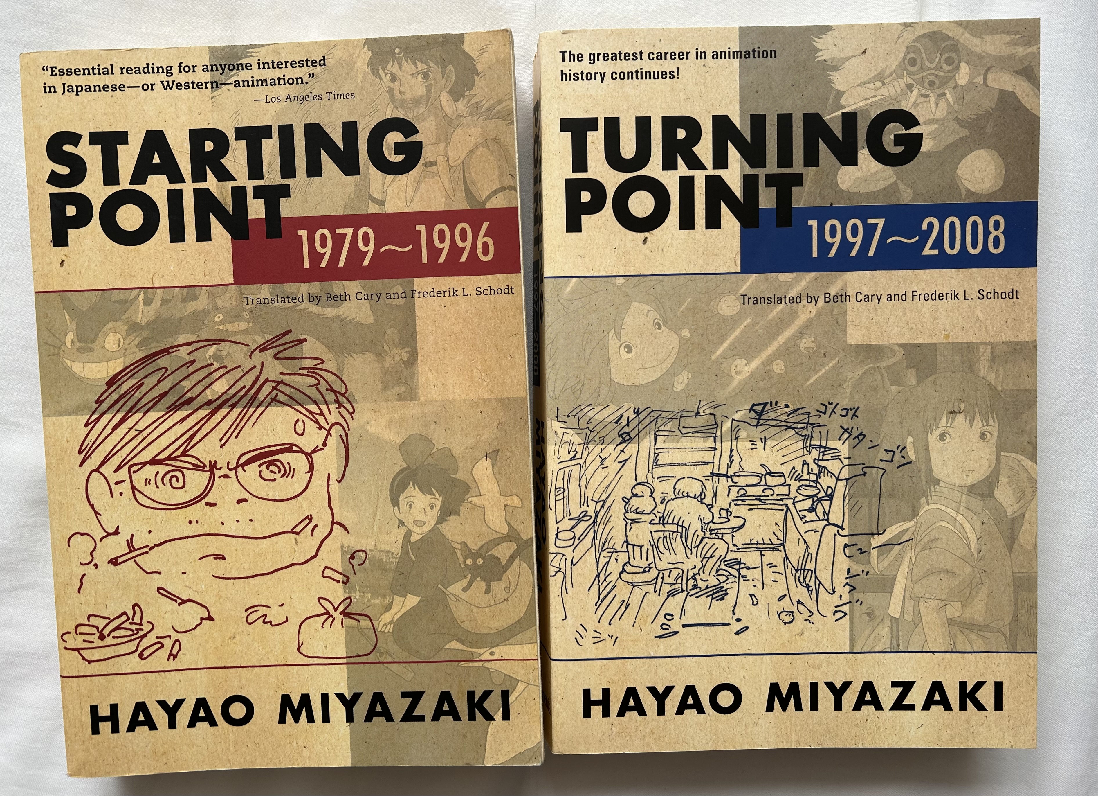
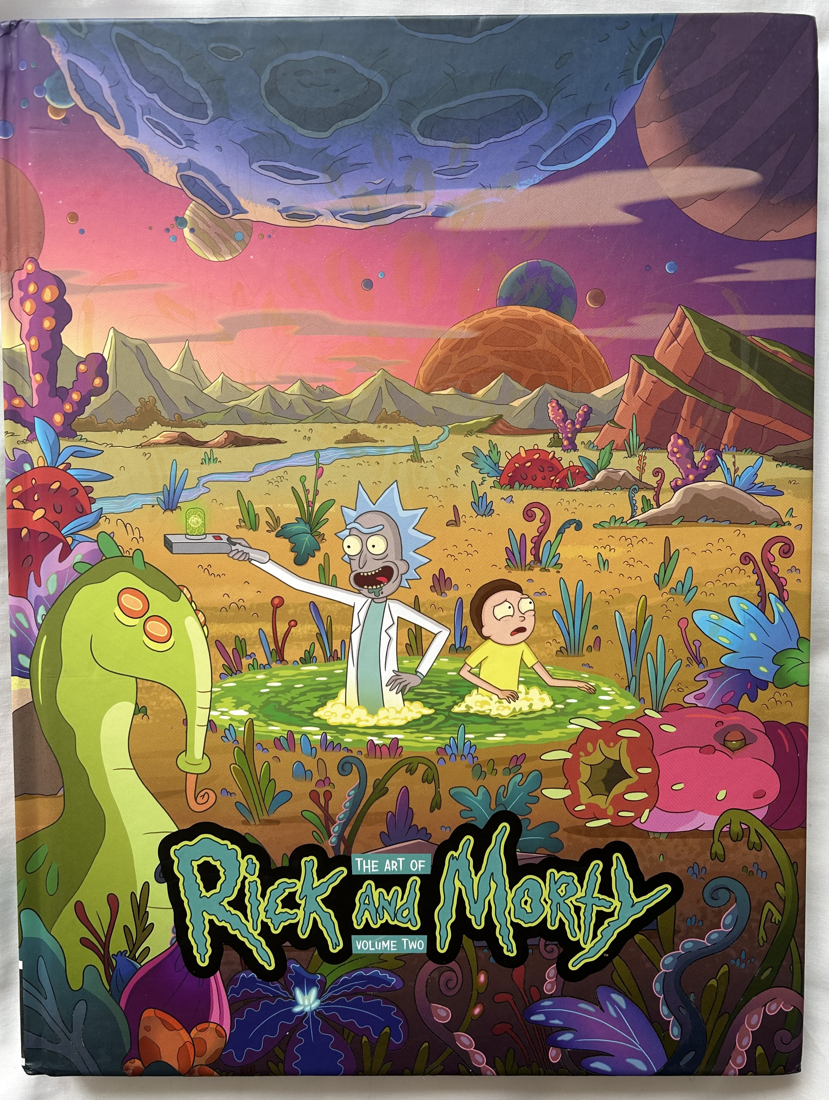
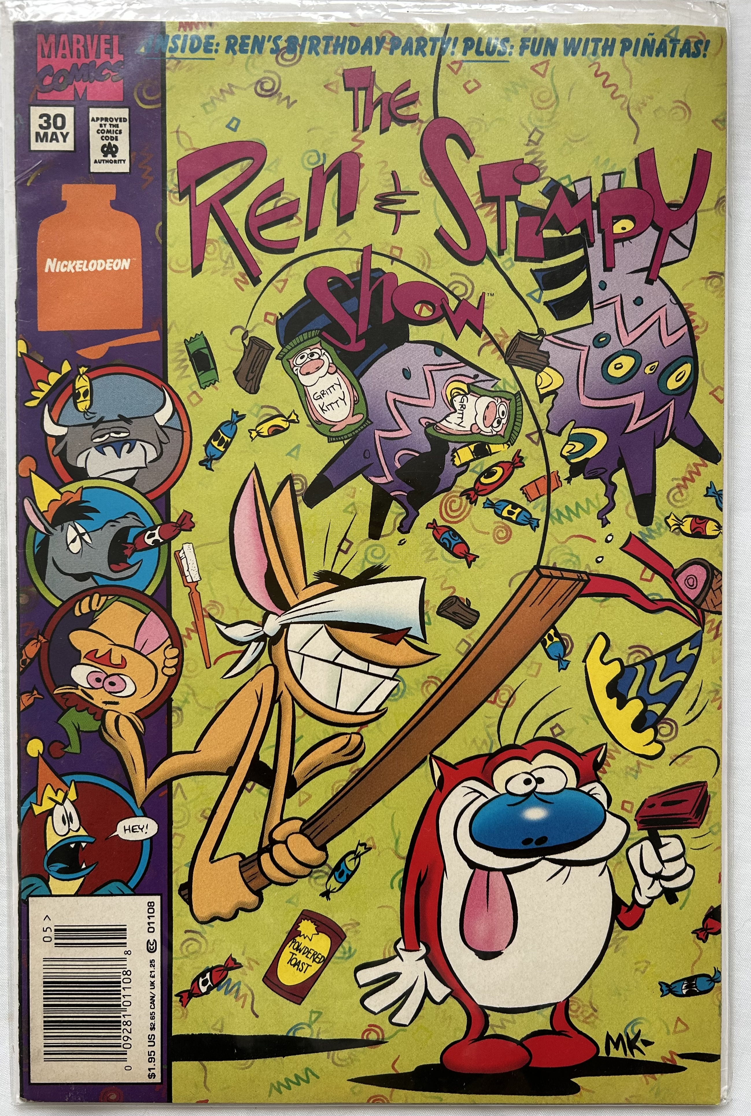
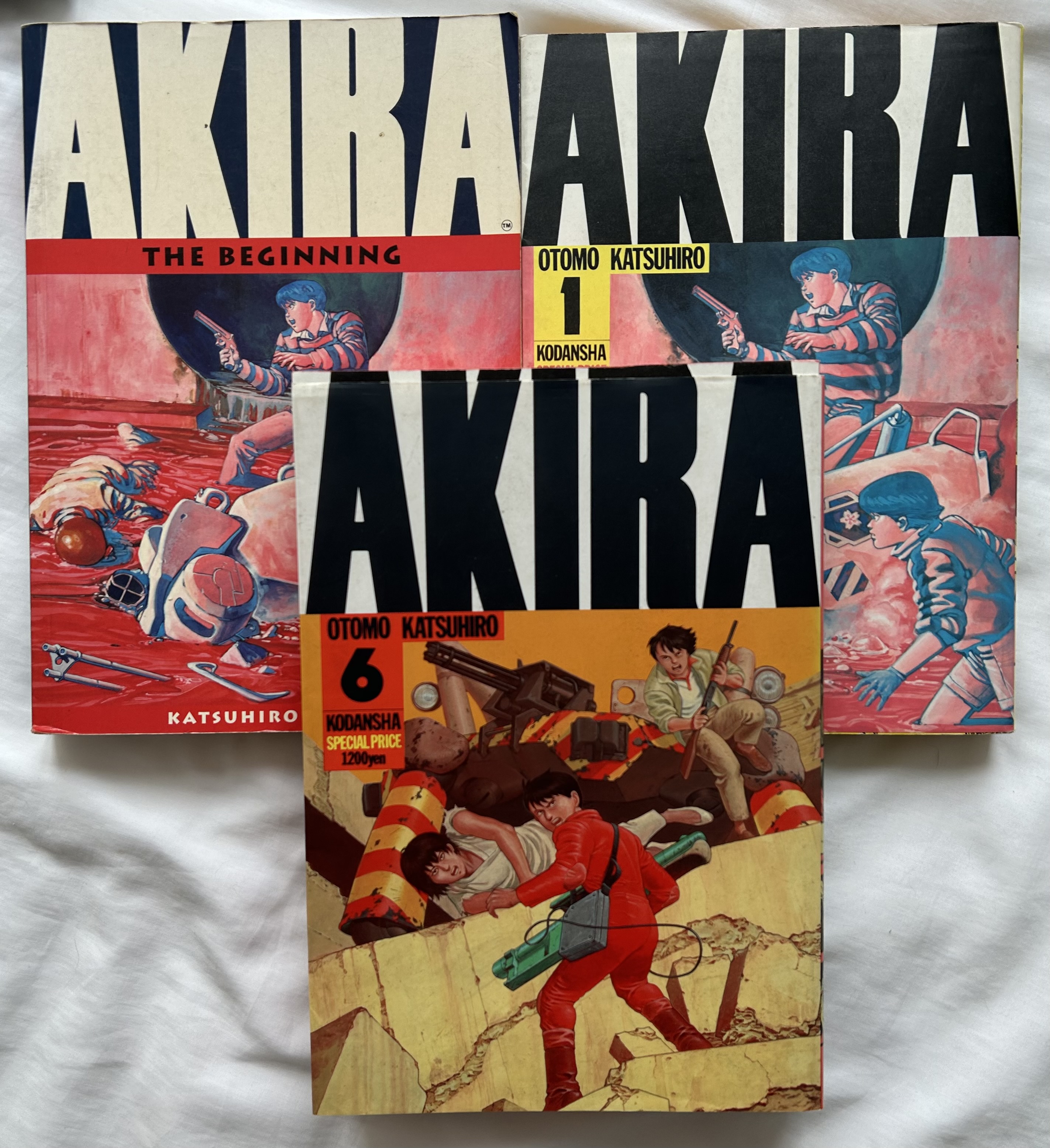
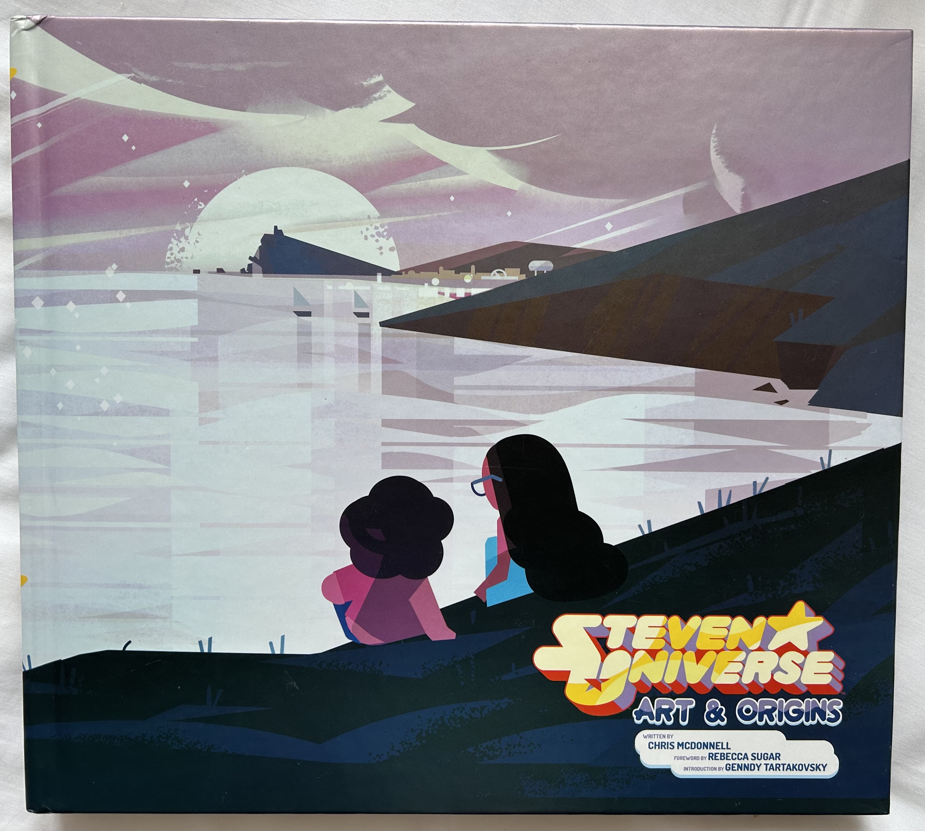
The books below show examples of when typography is identical to the title typography on the animated TV shows or movies. The ‘Rick and Morty’ and ‘Steven Universe’ books are both ‘The Art of’ books, the ‘Ren and Stimpy’ one is a comic book and the ’Akira’ books are graphic novels, yet all four are TV shows and Movies. On all four the typography overlaps and sits on top of the imagery. I think the typography still works well on these four though as for any fan of the TV show or Movie, you would almost ignore the text as you are more interested at looking at the imagery. Each typography works with the imagery as it has it’s on personality which relates well with the imagery.
Stylised typography to match imagery:
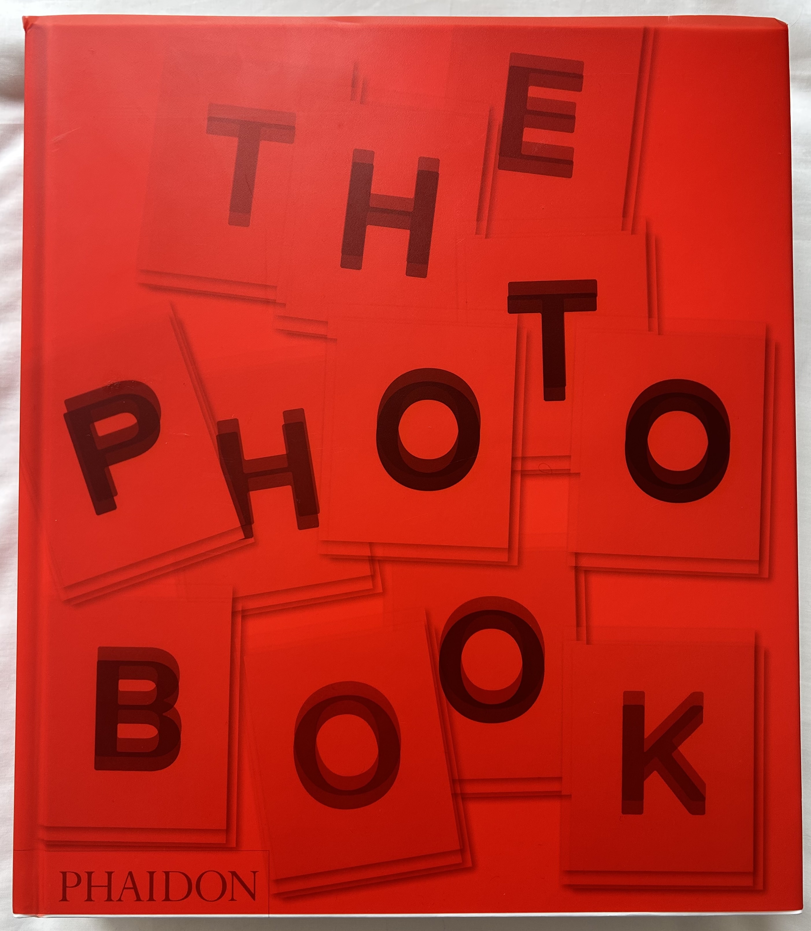
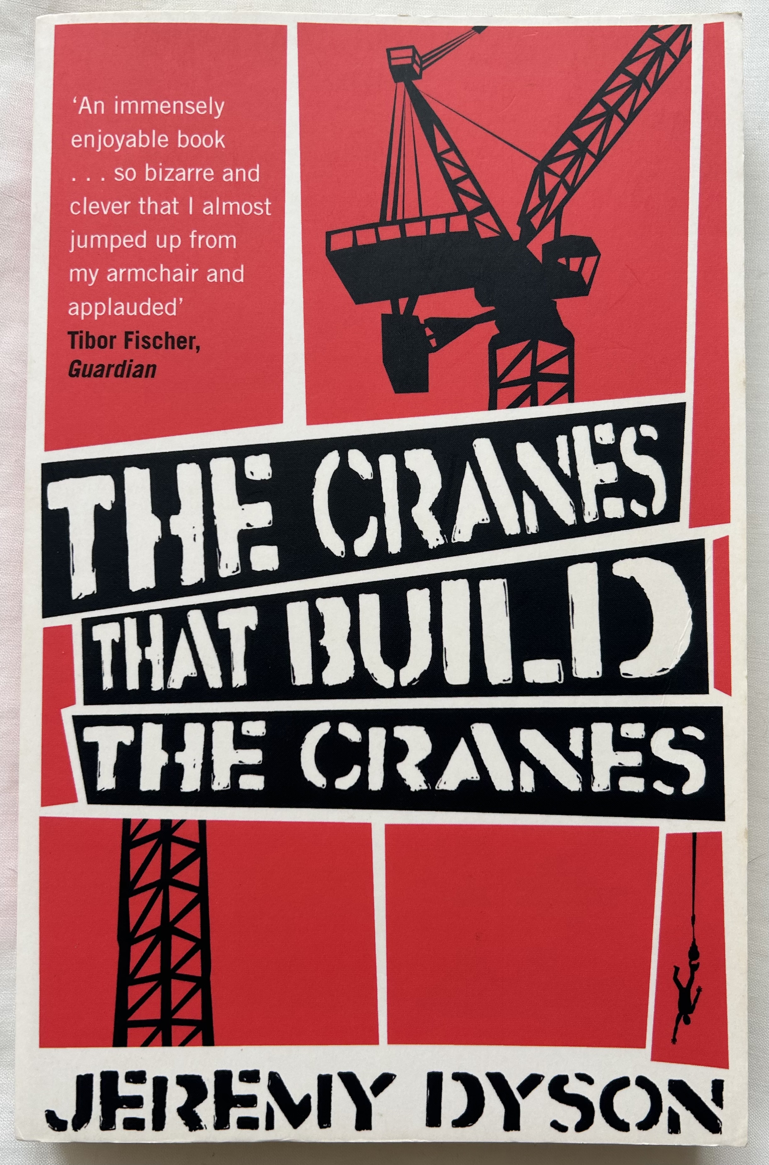
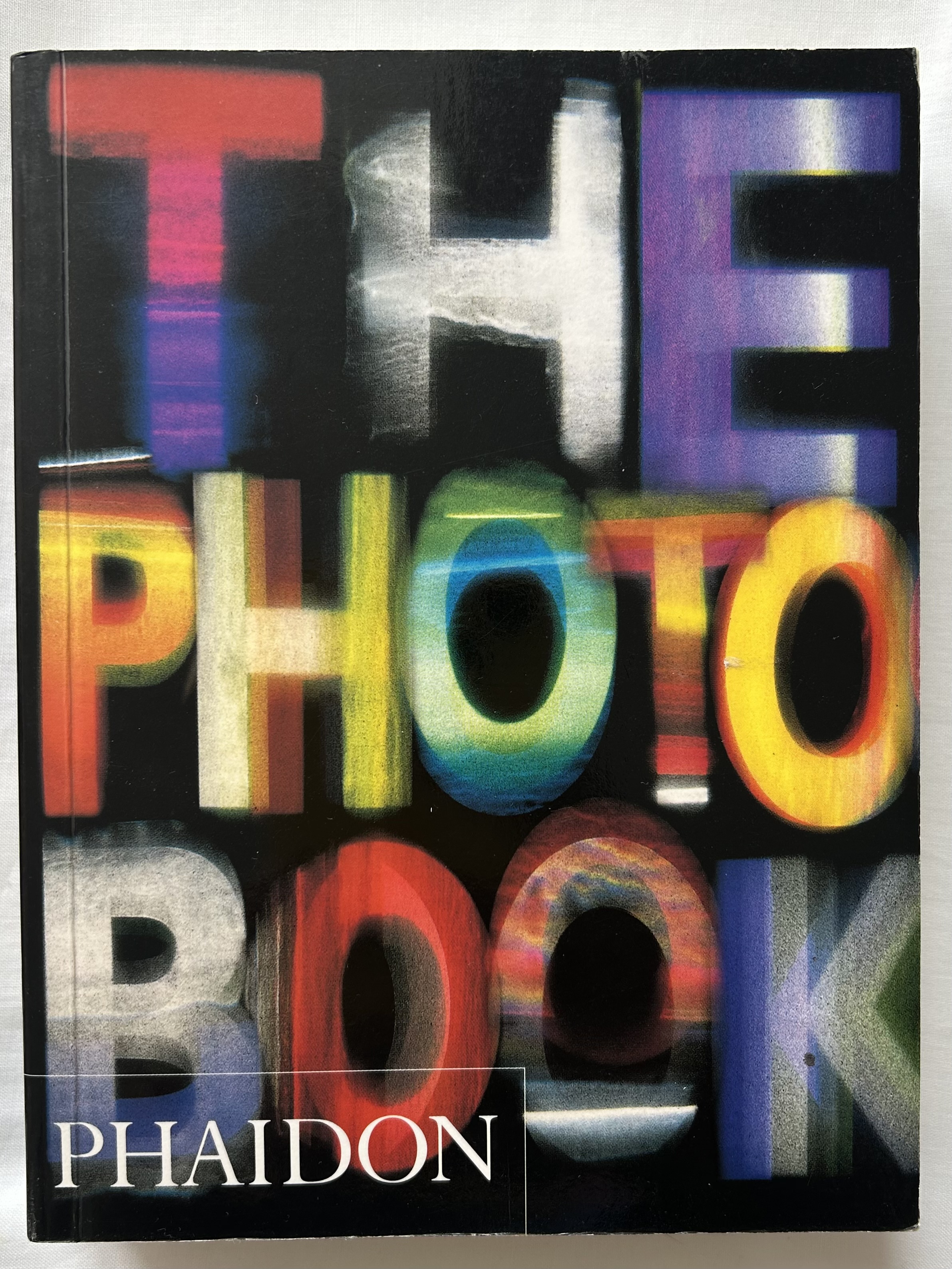
The books below show how typography style changes to interact with the imagery. The two ‘The Photo Book’s are a good example, the red book has been stylised to look like a red light in a dark room where traditional photos develop and each letter of the title looks like it’s made of separate photos that are semi-developed. The typography is bold and easy to read, which is the same on the other ‘The Photo Book’ even though it is very different in style, this time the typography has been created using separate photos for each letter of the title. They both work in their own unique way. On the book ‘The cranes that build the cranes’, there is another example of typography style changing to interact with the imagery, as the title text sits in black and white boxes that are slightly slanted, which gives the impression they are either depictions of metal that the crane is holding or a section of the crane. Either way the feel is one of industrial-ness, this is also shown in the typography itself with the letters looking like sometime you would see printed on the side of an old storage container from the 20s.
Research Task 3:
For this research task, I will look at how a first or best illustrator has defined a story visually and ask myself what is it about the illustrations that links so well with the text? Is it simply familiarity, that we’ve got used to seeing these characters in this way, or is there more going on in the relationship between image and text?
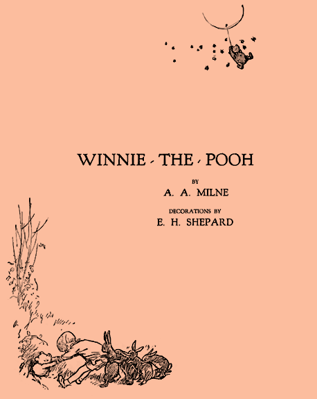
I decided to use the examples written in the workbook, Winnie The Pooh (1926) written by A A Milne and illustrated by E H Shepard, and The Gruffalo (1999) written by Julia Donaldson and illustrated by Axel Scheffler.
Winnie The Pooh:

Analysis:
Background:
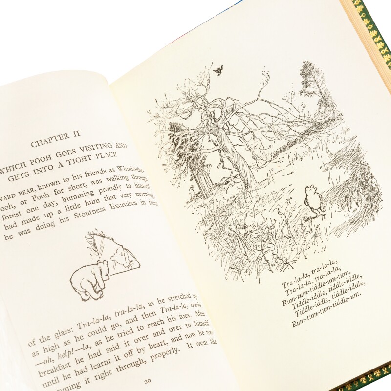
This story is set in the ‘Hundred Acre Wood’ a fictional location based on the location of the ‘Ashdown Forest’ which is located in East Sussex. The books are a collection of short stories surrounding the lives of a teddy bear named Winnie-the-Pooh, and his friends Christopher Robin, Piglet, Eeyore, Owl, Rabbit, Kanga, and Roo.

I was brought up with these books and the animated series also which came out in the late 1960s so Winnie-The-Pooh was a large part of my childhood. The illustration links so well with the text because of familiarity, I feel. I remember reading the books (or being read the books by my mother) first and then watching the animated series, and both the books and the animation have the same feel to them. I think E. H. Shepard first read the story and then created the characters from his imagination. I think A. A. Milne has added a great amount of detail and description into her writing about her characters which makes it a bit easier for E. H. Shepard to think up the character designs although he was also introduced to A. A. Milne’s son Christopher Robin Milne whom the character Christopher Robin was based. A. A. Milne named the character Winnie-the-Pooh after a teddy bear owned by Christopher, E. H. Shepard based his illustrations of Pooh on his own son’s teddy bear named Growler, instead of Christopher Robin’s bear. The rest of Christopher Milne’s toys – Piglet, Eeyore, Kanga, Roo, and Tigger – were incorporated into A. A. Milne’s stories. Two more characters, Owl and Rabbit, were imagined by A. A. Milne. The illustrated characters are instantly recognisable by most people, even today! I think this is to do with the books but mostly these days due to the animated series and movies also as reading is becoming something that children do less and less unfortunately. Personally for me though, I had great memories of reading the books so can say from my side that the way the characters were illustrated, it really gives a believable feel. The characters are illustrated so simply but also so well, Pooh is a round, happy, and simple bear, piglet is a small, nervous, and delicate piglet, Tigger is a hyperactive and friendly tiger, and Christopher Robin adds the sensible, human touch to the story. For me, I used to get immersed in the storyline and used to put myself in Christoper Robin’s place, as do many children I think, wishing you were in that world. I think it’s interesting that when you think about Winnie The Pooh, most people would think of the Disney version of the characters rather than the original illustrations in the books and I find this a bit sad.
The Gruffalo:
Background:
This story is a rhyming story about a mouse and a creature. The mouse goes for a walk in a dangerous forest but runs into some enemies. To scare off his enemies he invents a creature in his head called the Gruffalo, but what he doesn’t know is that the Gruffalo actually exists much to his surprise.
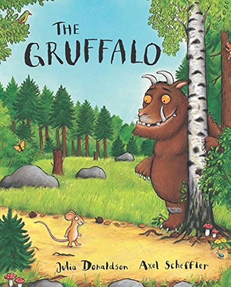
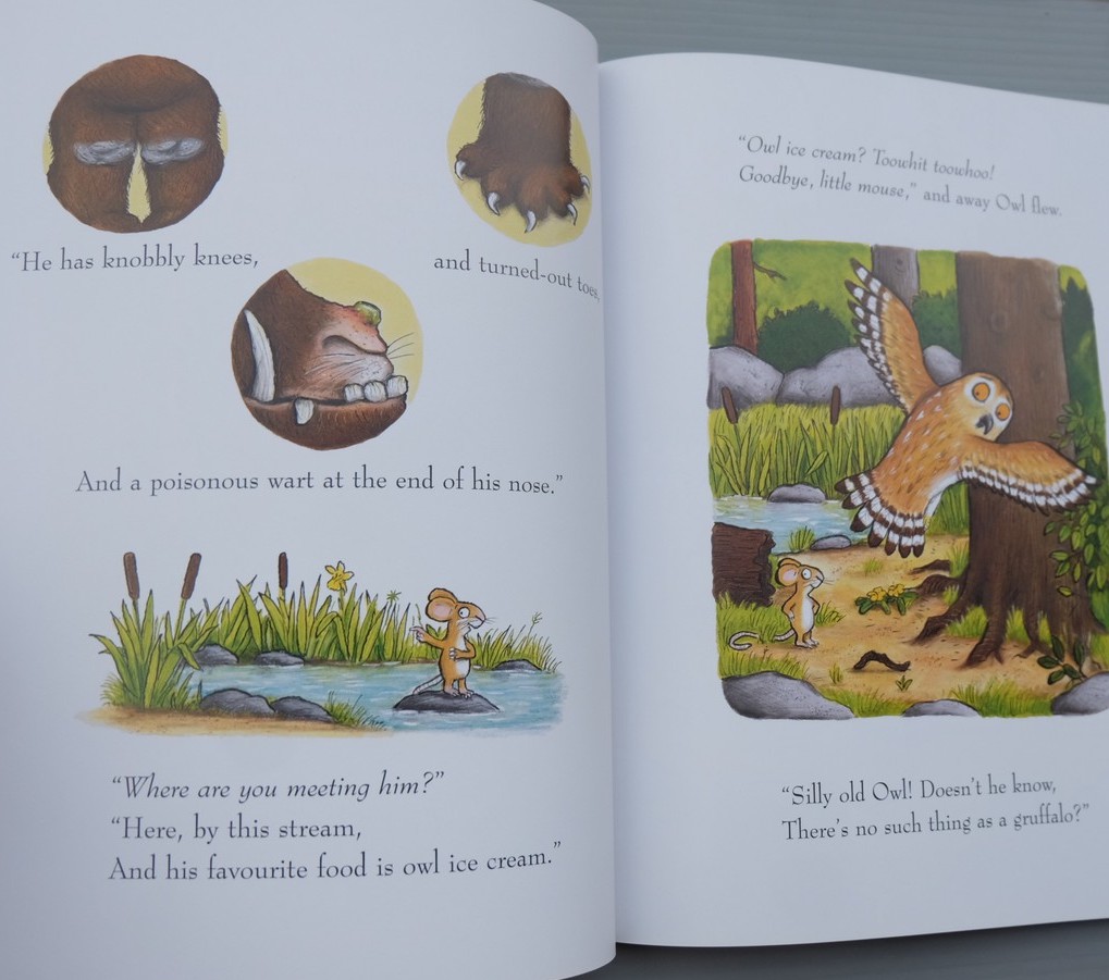
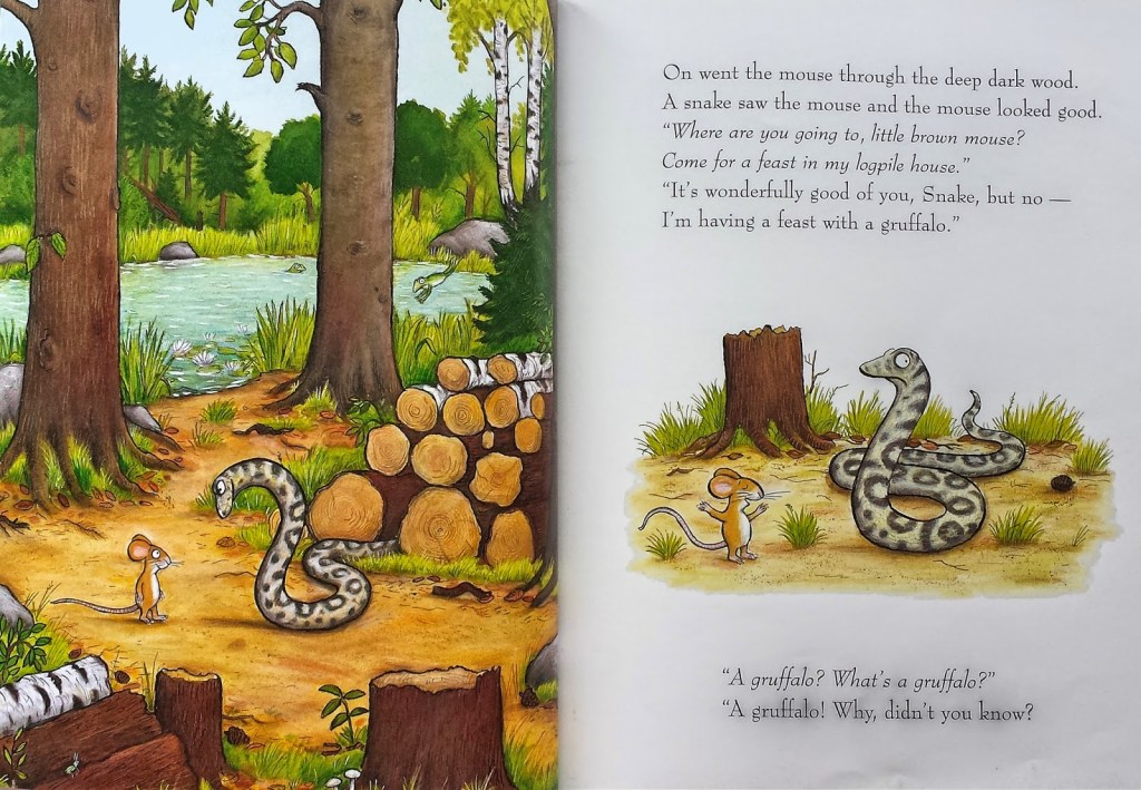
I was also brought up with my mother reading me this book as I was born in 1998 and this book came out in 1999. I think there are other representations of this story as a movie and also an audiobook but I haven’t seen or heard anything, I have only read the book. Like with A. A. Milne for Winnie The Pooh, Julia Donaldson’s descriptions of the Gruffalo is written within the text of the story itself, which makes it easier for Axel Scheffler to illustrate these characters. I think Axel has a good understanding of how to make his illustrations child-friendly without being too dark or grotesque, so the characters are still friendly to look at. As The Gruffalo is a story for the ages 3-5 years, the text and the imagery are both bold and easy to view. The text doesn’t overlap with the imagery, I think this is to make sure they are both easy for children to read and understand, maybe the font is also large so that when an adult is reading the story to a child, the child can follow along.
References:
Exercise 1: Once upon a time:
For this exercise, I have been asked to produce a series of black-and-white illustrations in response to a popular fairy story or folk tale. My illustrations will sit alongside the text to enhance the reading experience. I need to think about the best points in that narrative to place my illustrations. I need to make the most of the dramatic qualities of black and white and think about where I would physically place my images in relationship to the text on the page.
I started by looking at 24 famous folk tales/stories on Google and then narrowed it down to 3 possibilities:
- The Ugly Duckling
- The Princess and the Pea
- Goldilocks and the Three Bears

I chose to create illustrations for The Princess and the Pea
The Story – with chosen parts to illustrate highlighted:
The Princess and the Pea by Hans Christian Andersen
- Once upon a time there was a prince who wanted to marry a princess; but she would have to be a real princess. He travelled all over the world to find one, but nowhere could he get what he wanted. There were princesses enough, but it was difficult to find out whether they were real ones. There was always something about them that was not as it should be. So he came home again and was sad, for he would have liked very much to have a real princess.
- One evening a terrible storm came on; there was thunder and lightning, and the rain poured down in torrents. Suddenly a knocking was heard at the city gate, and the old king went to open it.
- It was a princess standing out there in front of the gate. But, good gracious! what a sight the rain and the wind had made her look. The water ran down from her hair and clothes; it ran down into the toes of her shoes and out again at the heels. And yet she said that she was a real princess.
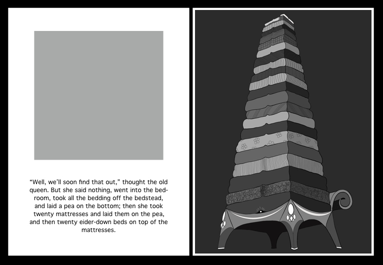
- “Well, we’ll soon find that out,” thought the old queen. But she said nothing, went into the bed-room, took all the bedding off the bedstead, and laid a pea on the bottom; then she took twenty mattresses and laid them on the pea, and then twenty eider-down beds on top of the mattresses.
- On this the princess had to lie all night. In the morning she was asked how she had slept. “Oh, very badly!” said she. “I have scarcely closed my eyes all night. Heaven only knows what was in the bed, but I was lying on something hard, so that I am black and blue all over my body. It’s horrible!”
- Now they knew that she was a real princess because she had felt the pea right through the twenty mattresses and the twenty eider-down beds. Nobody but a real princess could be as sensitive as that.
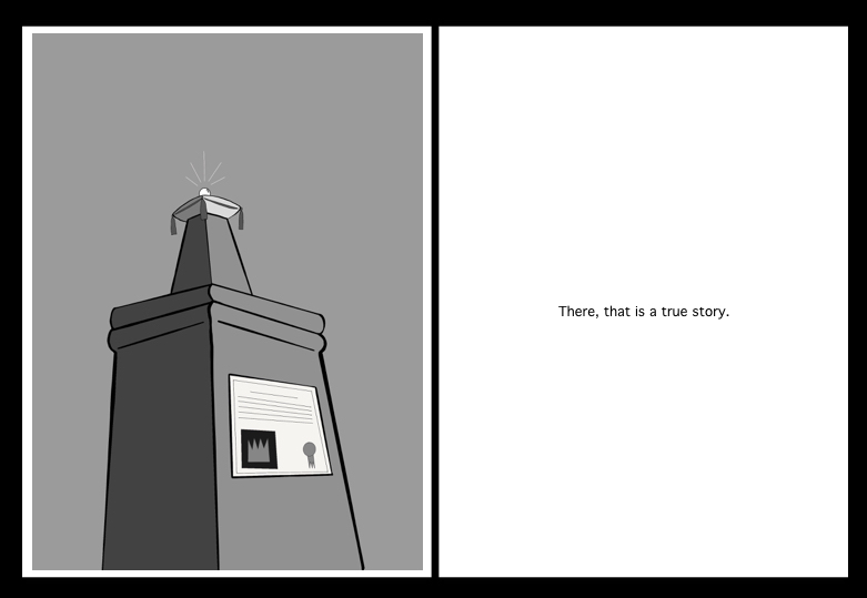
- So the prince took her for his wife, for now he knew that he had a real princess; and the pea was put in the museum, where it may still be seen, if no one has stolen it.
- There, that is a true story.
I have divided the story into sections (or pages) so I can base my illustrations on what’s on the pages.
Story pages layout and where the illustrations and text are placed:


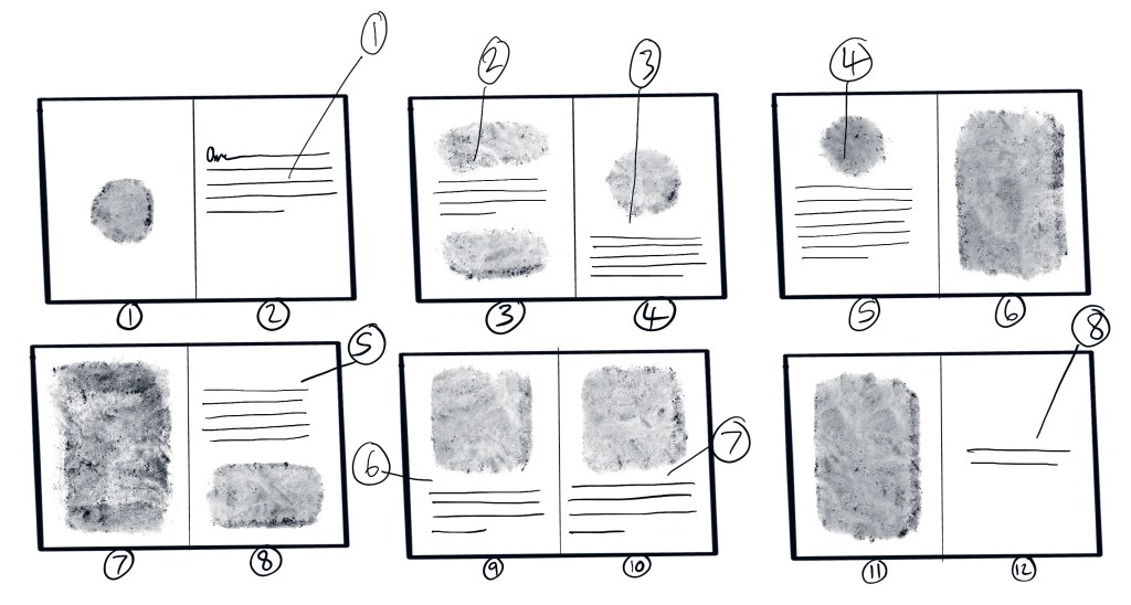
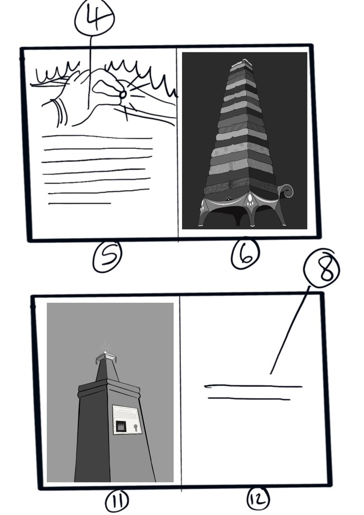
The pages are numbered 1-12, the text is lined and numbered 1-8 and correlates with the story that has been numbered and the smudge image marks are where the illustrations should sit around the text, as you can see there are 8 smaller illustrations and 3 full-bleed illustrations on pages 6, 7 and 11.
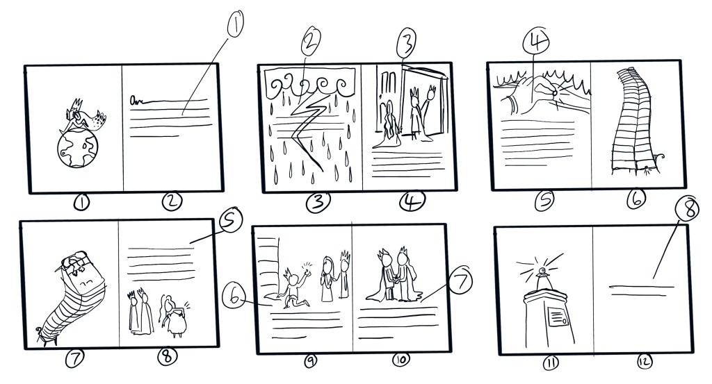
Above are my initial thumbnail sketches but I will be focusing on only 2 of them for this exercise so I have time to make some good illustrations.
my 2 Initial sketches chosen from above:


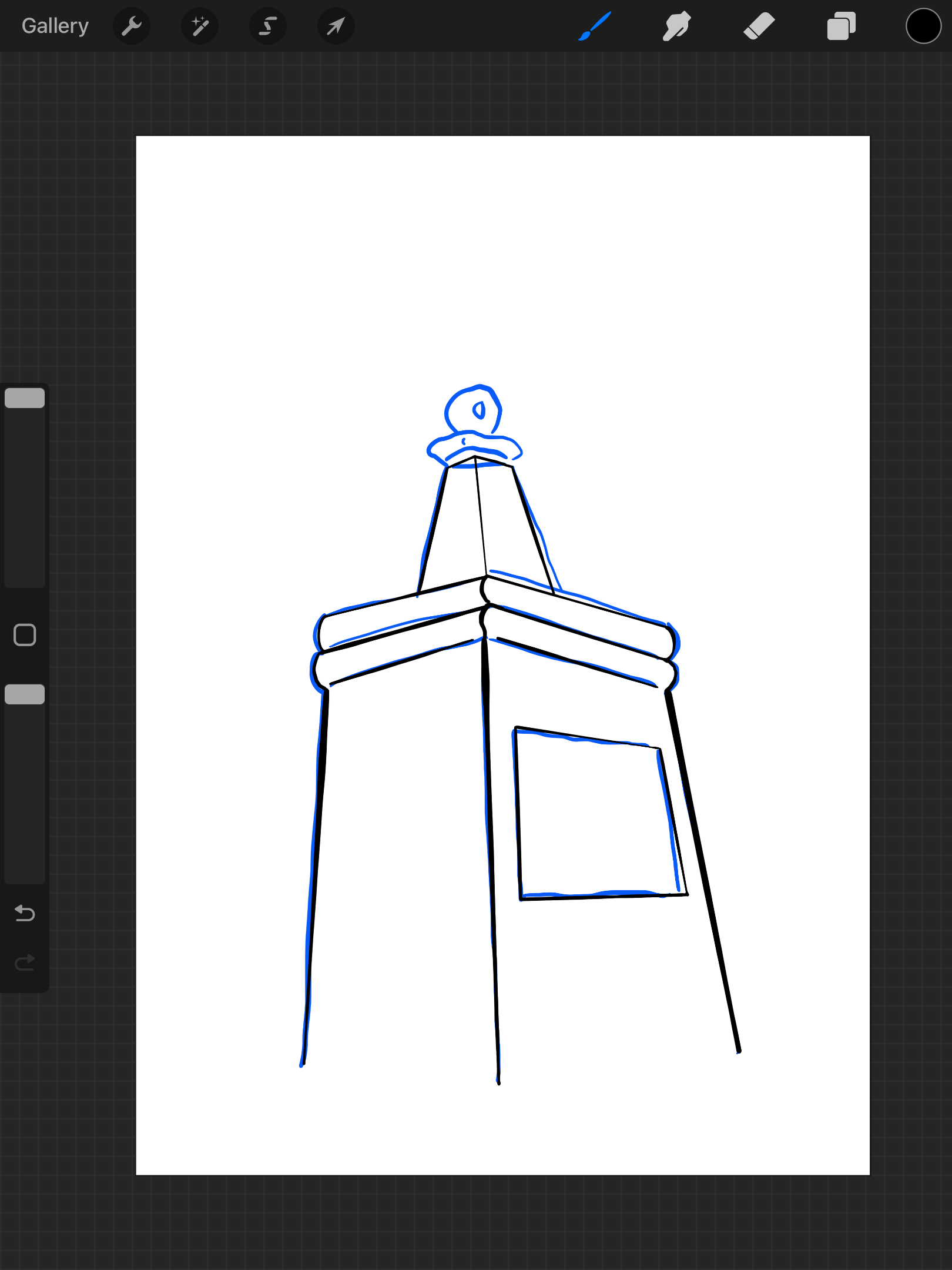
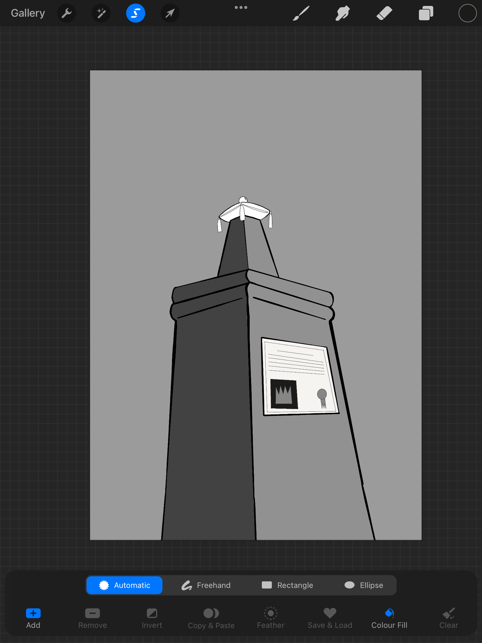
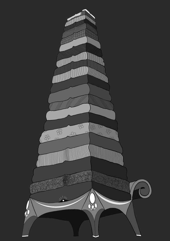
Design Process for Illustration 1:
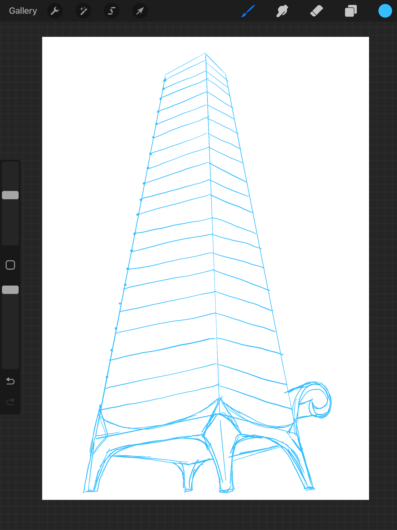
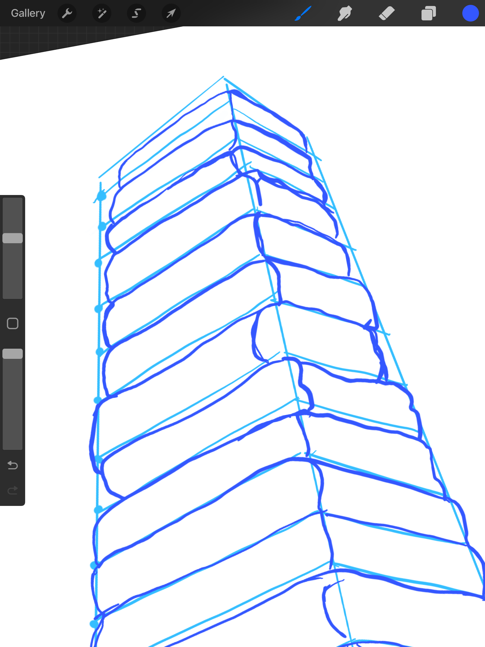
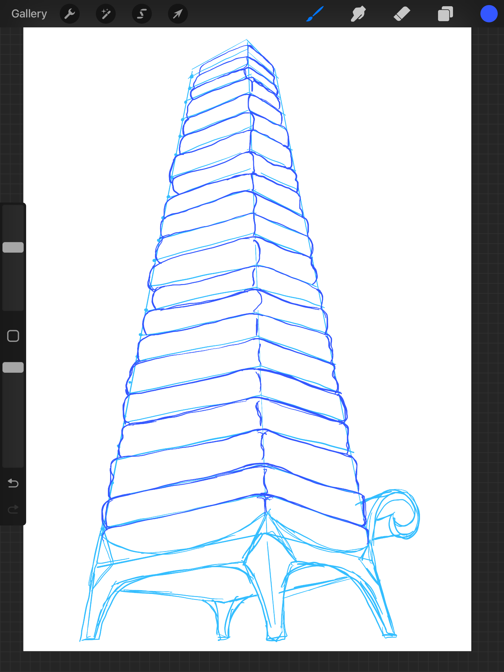
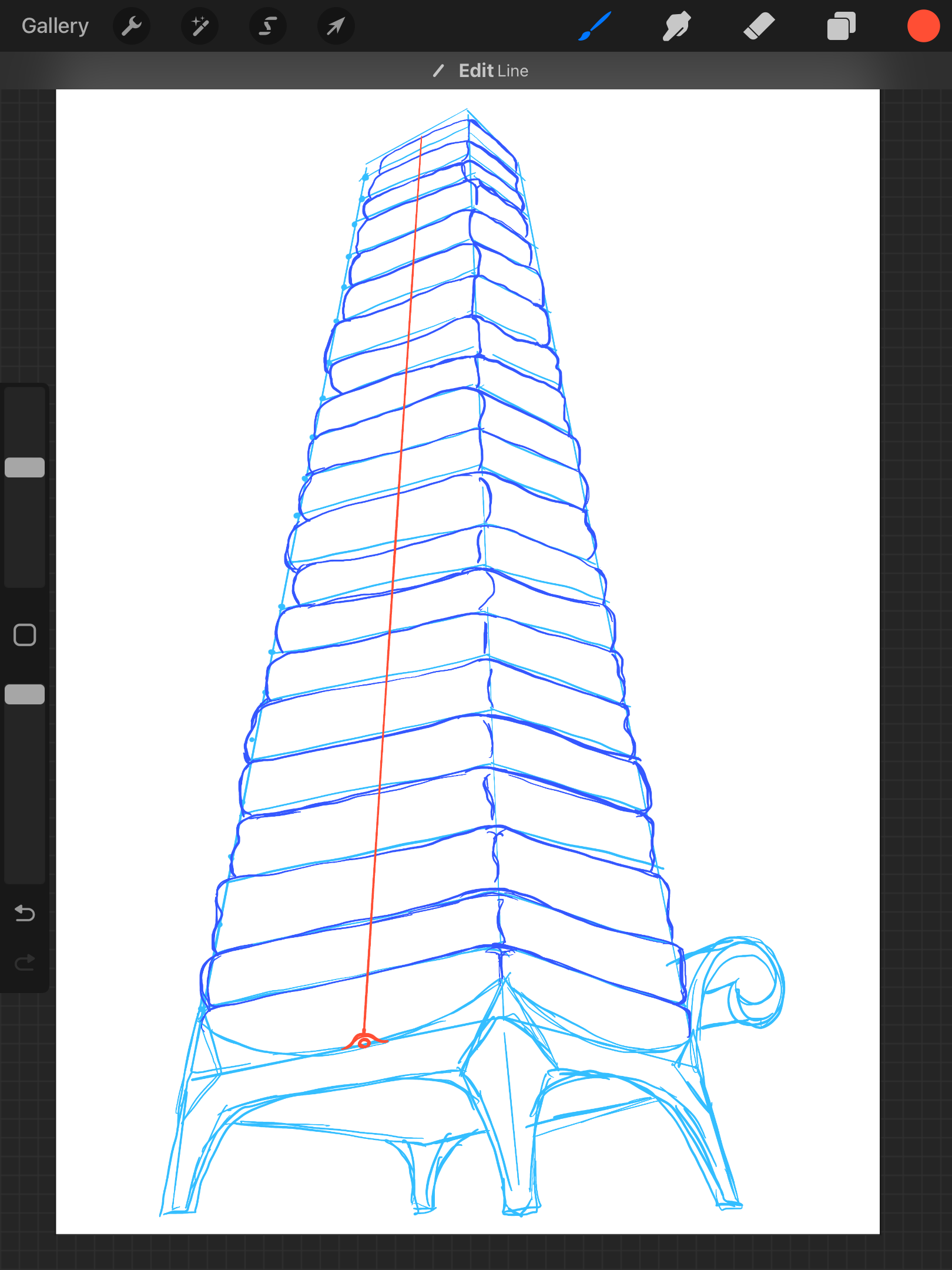
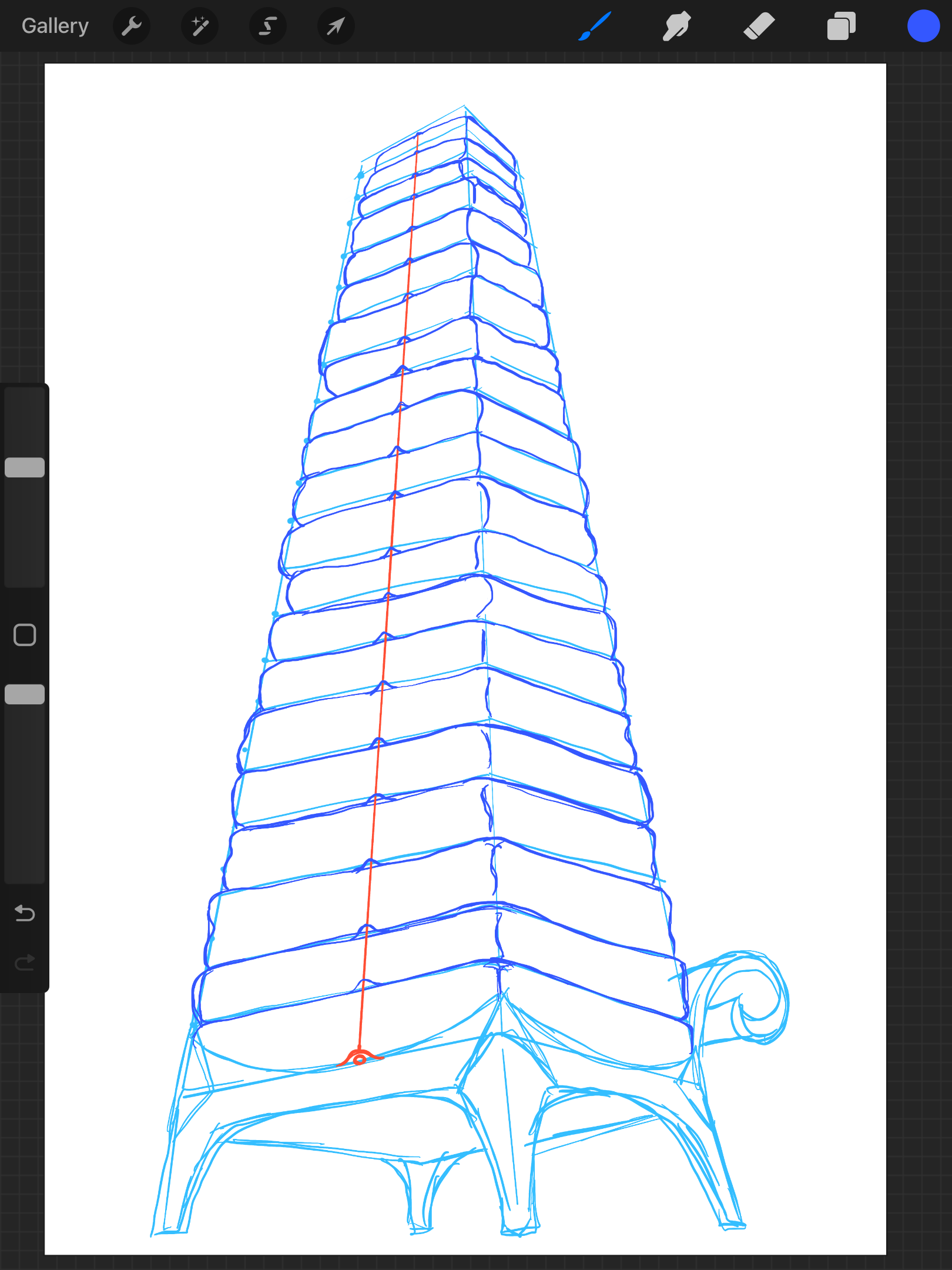
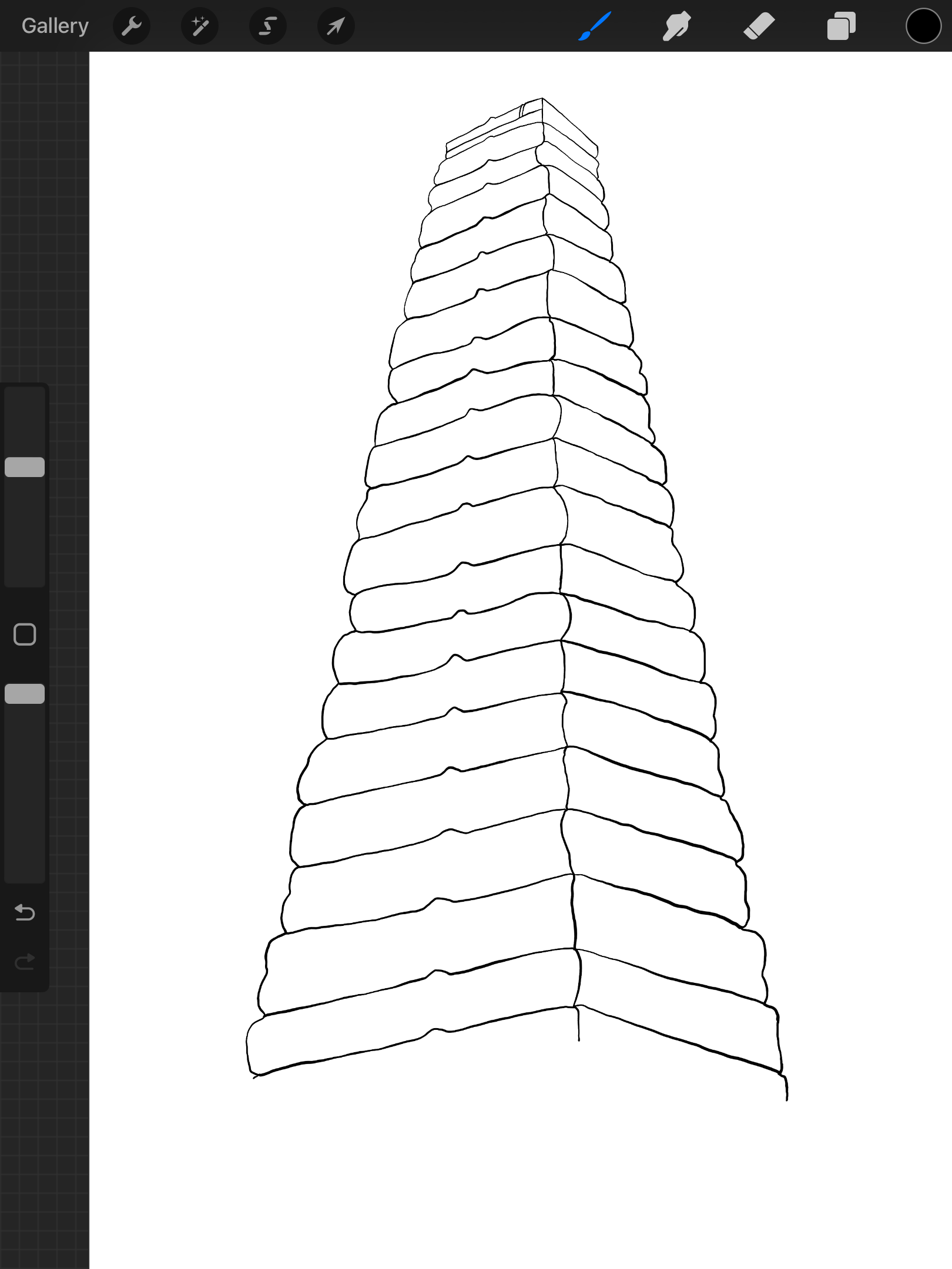
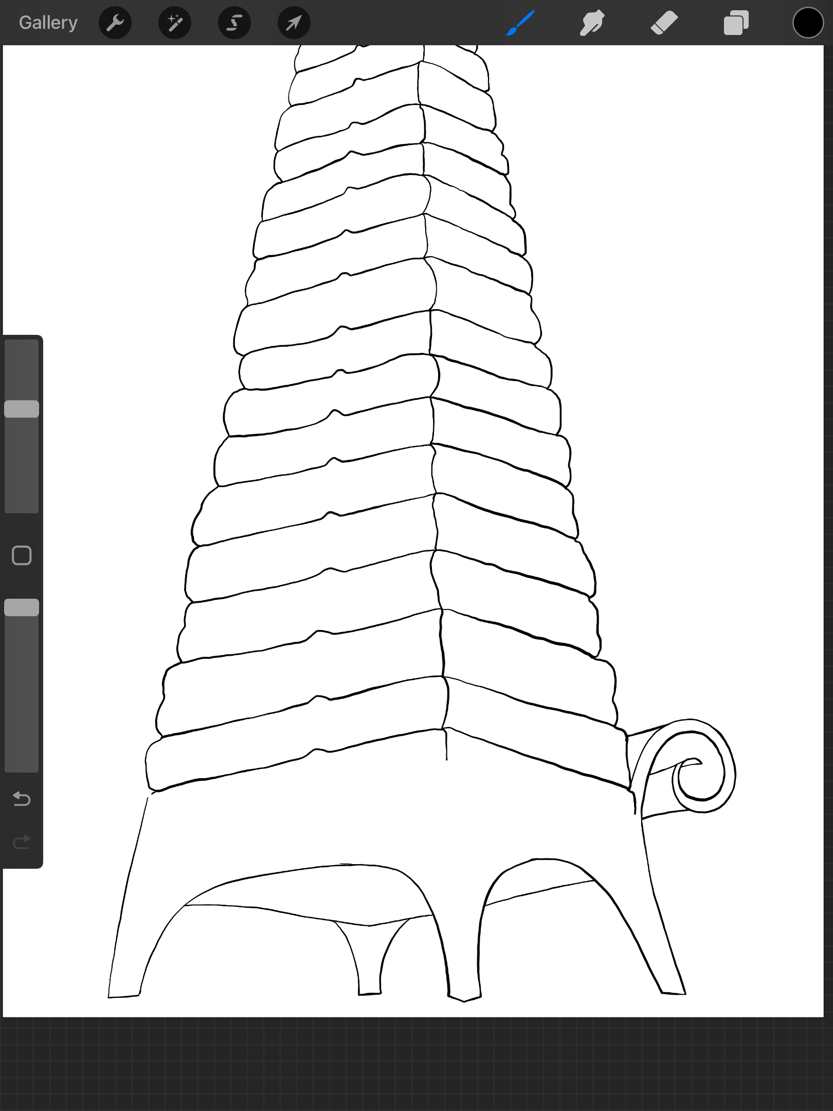
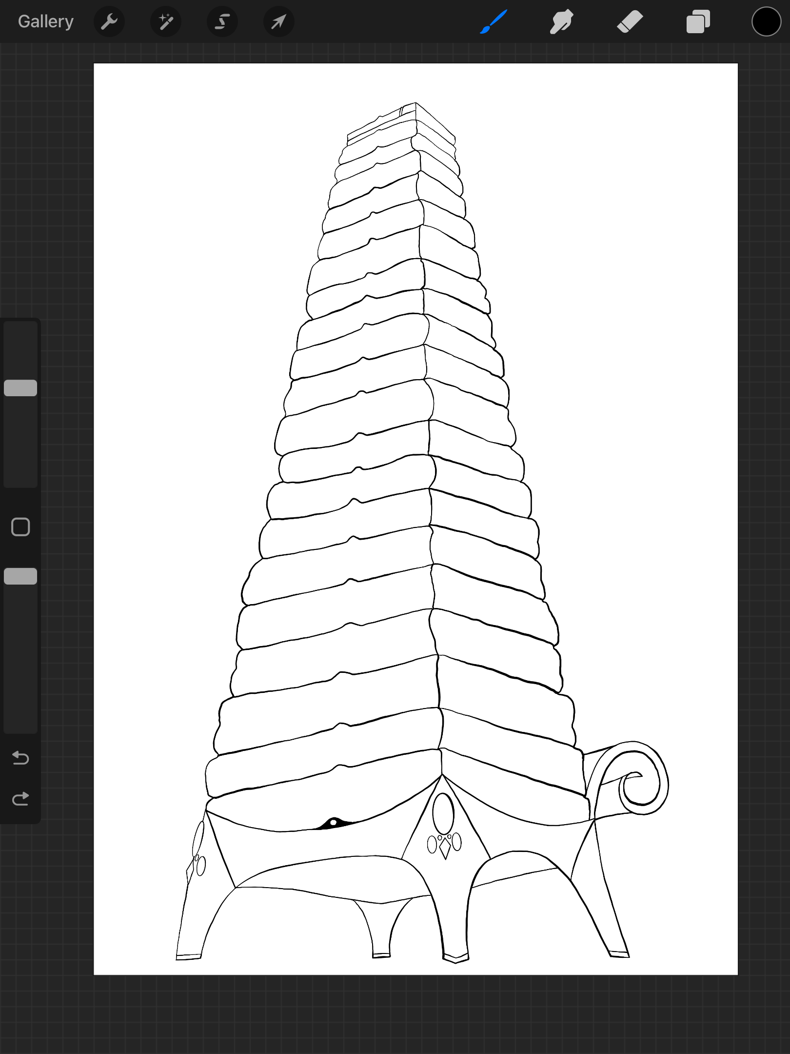

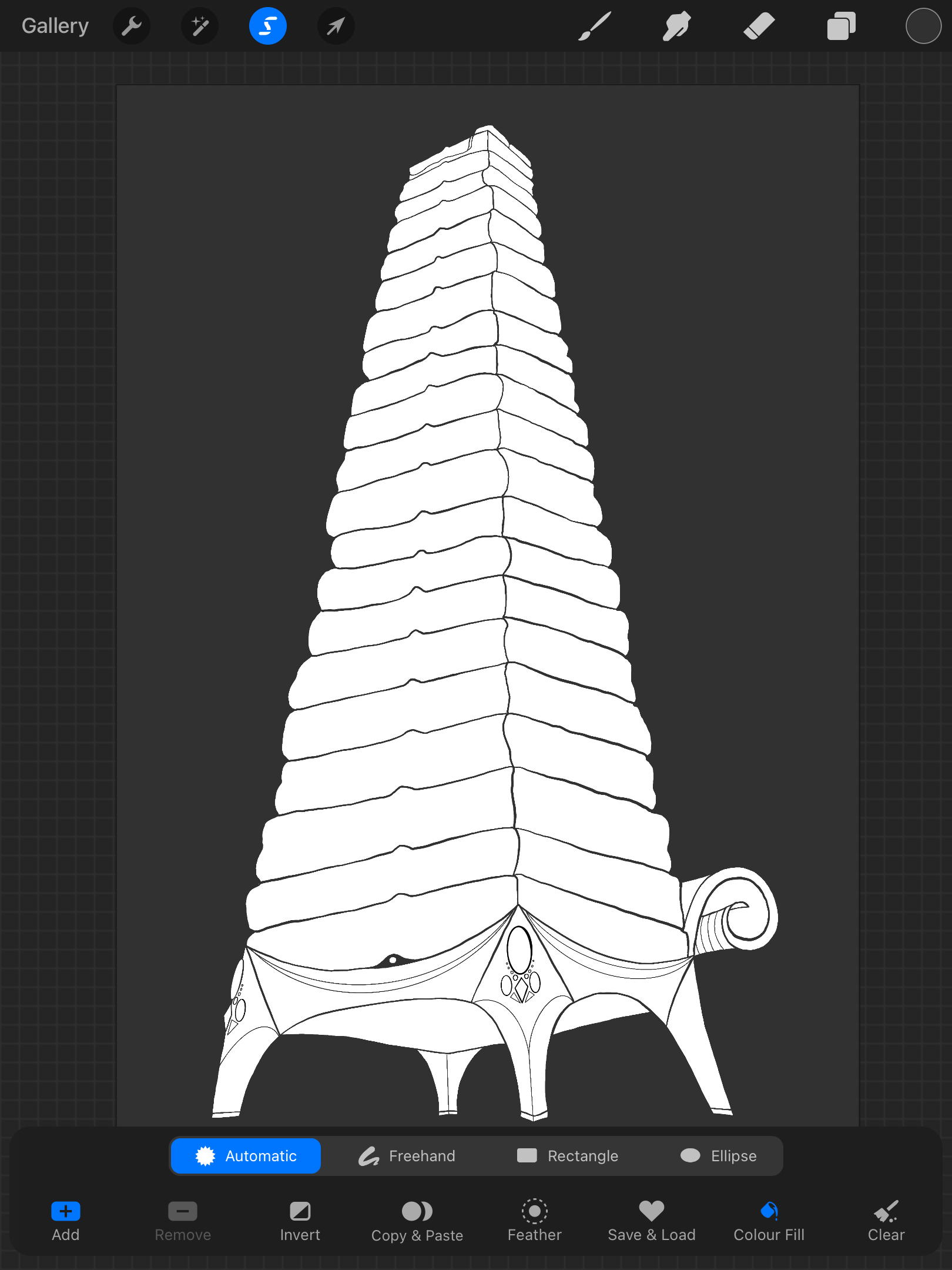
Design Process for Illustration 2:
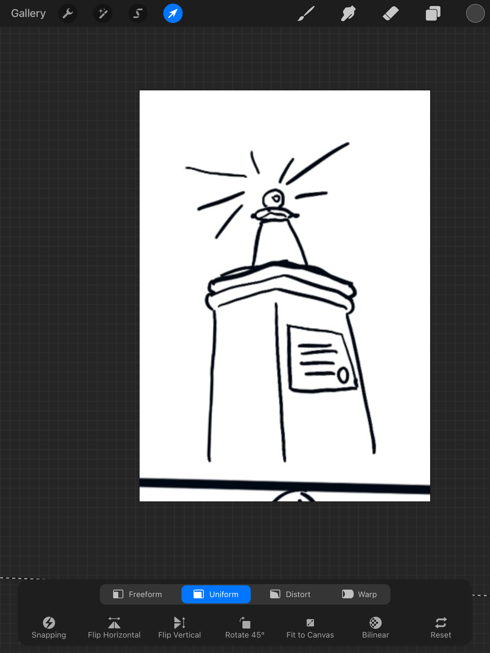
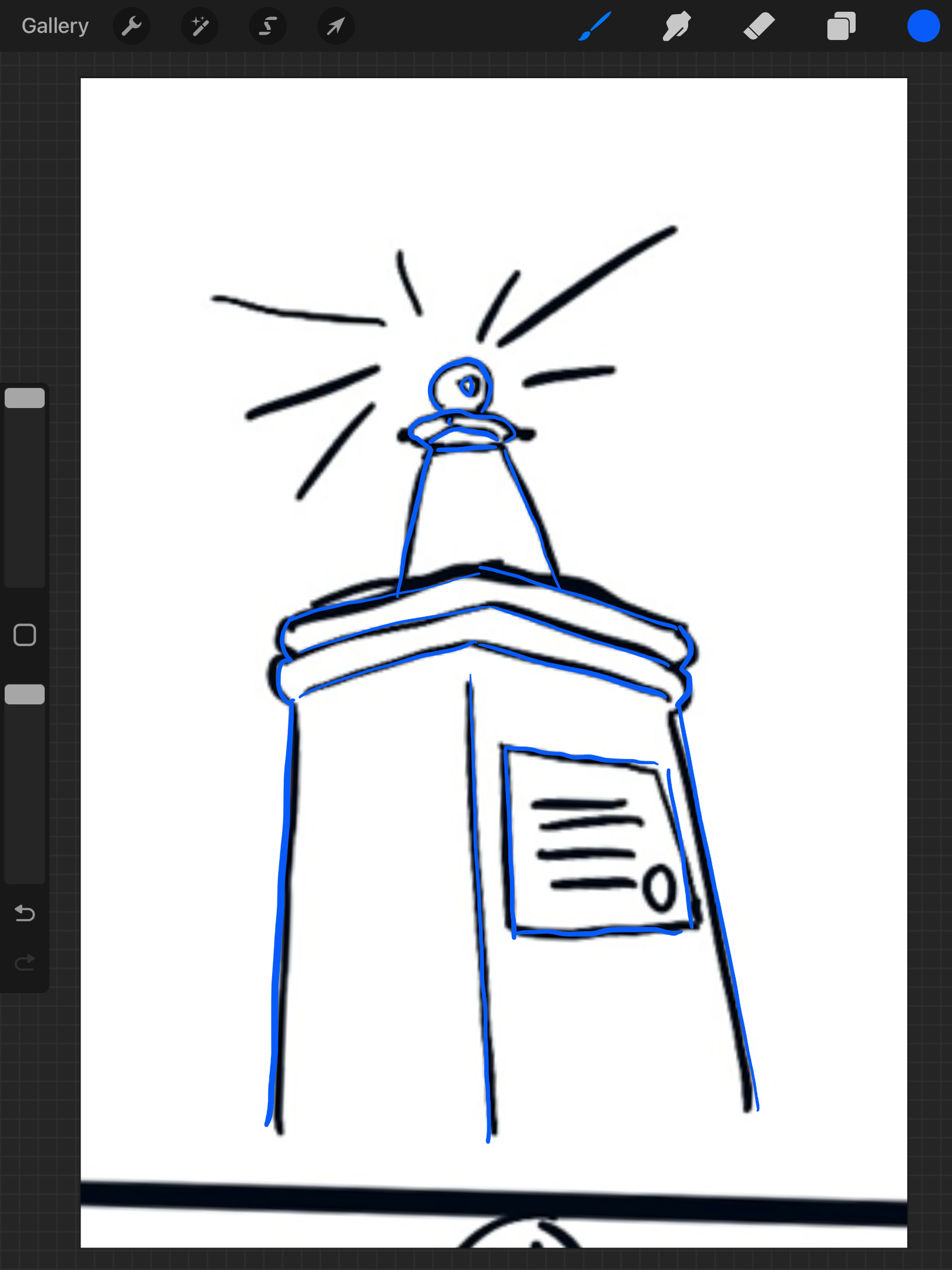
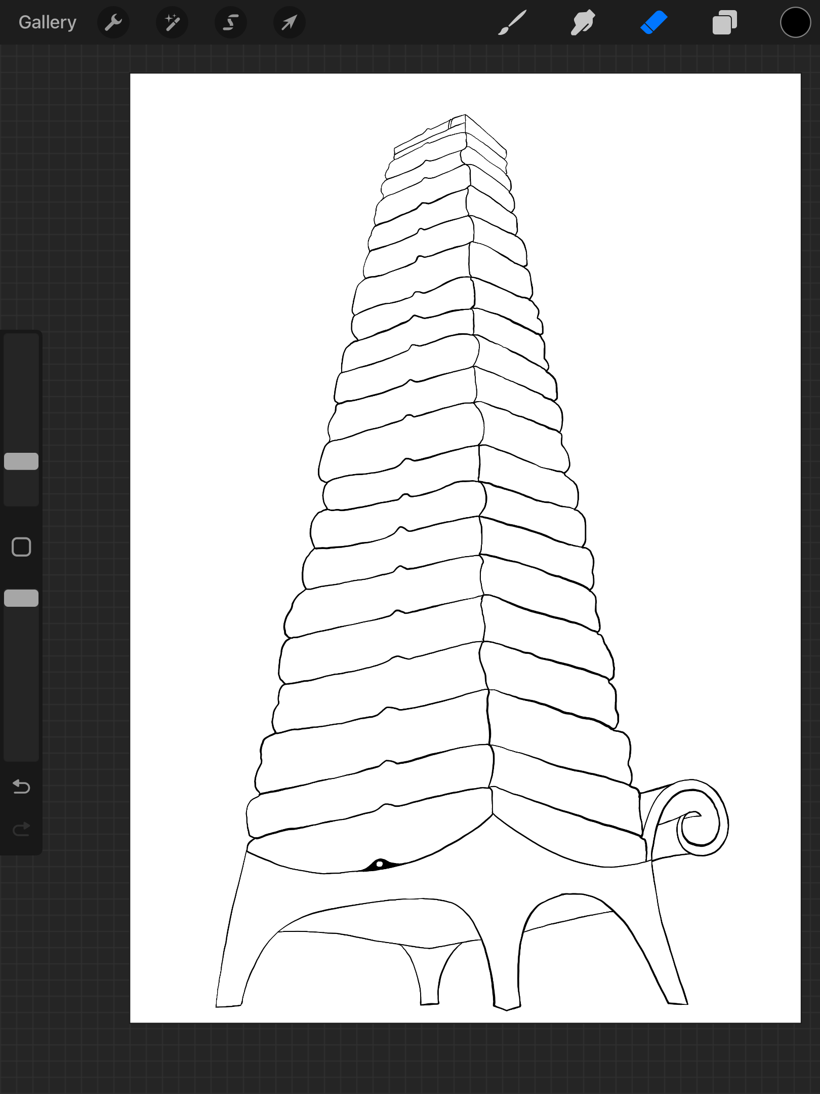
Final designs:
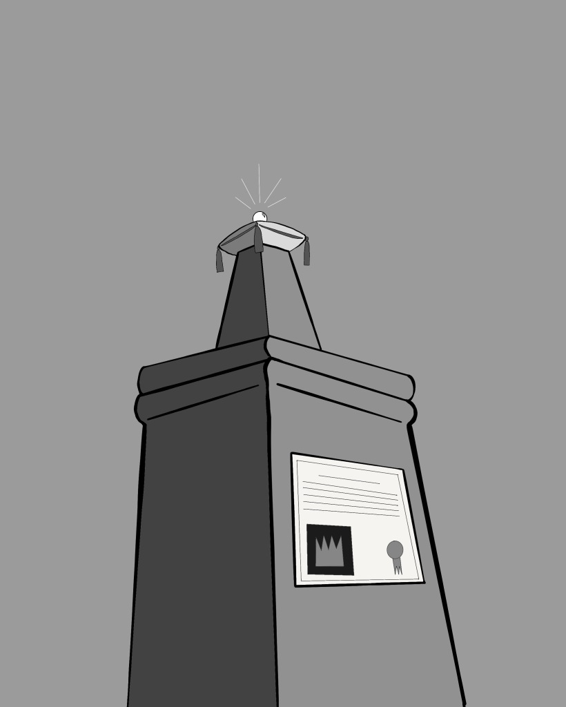
2 chosen double-page spreads with illustrations in situ:
I am happy with the way these both turned out and feel as though they tell the parts of the story through the imagery. I think I have shown my design process clearly. Both images work to the brief as they are in monochrome. I feel like the illustrations work well in relation to the pages in the mock-up above. My favorite out of both final designs is the first one as I think it looks better as it has more detail and is a much more interesting image.
Reference: http://hca.gilead.org.il/princess.html
