
THE BRIEF
THE BRIEF PROCESS:
1. Receiving the brief
2. Identifying key words & responding to words
3. Generating ideas and researching
4. Drawing ideas up
5. Choosing ideas
6. Working within the given format and creating ‘thumbnails’
7. Considering viewpoint, composition and content
8. Visuals
9. Final artwork
MY CHOSEN ILLUSTRATION: SLINKY MALINKI

This book used to be my favourite as a child, the illustrations used to stand out to me and because of this, I used to read it every night before bed with my mum. The words and illustrations were so well connected that you could eventually just ‘read’ the book by looking at the images only.
MY BRIEF FOR SLINKY MALINKI (front cover):
I would like for you to illustrate a Children’s book cover.
The main character in the book is a skinny black cat named ‘slinky malinki’.
I would like the skinny black cat to be positioned on a fence so the reader can understand that the cat is walking across the fence.
The cat should be shown to carry an item, maybe a glove (something that stands out that obviously doesn’t belong to the cat), this should hint what ‘slinky malinki’ could be up to, stealing! The glove should also be bold and colourful to stand out from the rather monotone background.
I would like the fence to be situated at the bottom of the illustration and be a head-on simplistic view.
In the background behind the cat on the fence, I would like for you to illustrate some shrubbery/tall plants (like reeds) to show the reader that the fence is situated in a garden of some sort. This should be just a hint of a garden as I do not want the shrubbery to take up all of the background so focus on drawing this on one side only of the illustration.
There should also be room for the title and author name on the cover. I would like for you to write this Title clearly as this book is for a young child so they need to be able to read it easily.
I would like for the typography to be related to the skinny cat, maybe it could be formed using the same media as on the cats tail (black and thin, showing hairs), and actually, be formed from tails.
There should be a moon or cloud in the background to make the black title stand out.
GENERATING IDEAS
SPIDER DIAGRAMS:
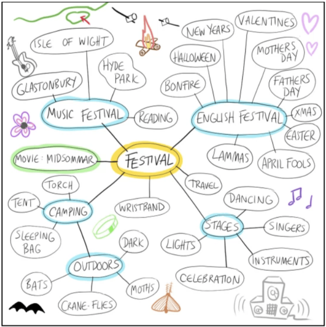
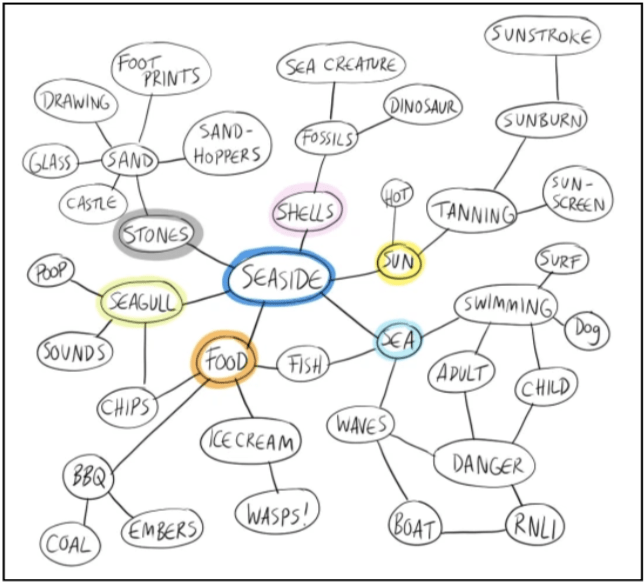
For my spider diagrams I wanted to include the little things that people rarely think about. The extreme and the extraordinary things that can happen when thinking about these 3 words.
Spider Diagram of the word ‘Festival’:
Spider Diagram of the word ‘Angry’:

Spider Diagram of the word ‘Seaside’:
4- the brief
Which word was the most difficult for you to work with?
I found the word ‘festival’ the hardest as personally I have never been to a festival so I couldn’t add anything personal to the diagram, I could only put stereotypical words down, for instance, the locations of different festivals. I did try as hard as possible to think of everything that I could see if I was at a festival, as most of it is just camping (but with music).
What strategies suited you the best in order to come up with new ideas?
It helped me to think of all the most important words first, then after I would think of those words themselves and expand through the important words, for instance, seaside = sun = hot + tanning = sunscreen + sunburn.
“Brainstorming:
To empty your head of the many possible ideas that you have lurking there and to review them for usefulness.
Spider diagrams:
Are one way to think around an idea, or brainstorm, and it is a strategy successfully employed within many commercial, non-artistic situations to consider multiple approaches.”
(definitions from page 23 in the Illustration Handbook: https://www.oca-student.com/sites/default/files/oca-content/course-pdfs/ill1041111.pdf)
WORDS TO PICTURES
The two different sides of a brain:
• Right side: Non-verbal and intuitive, where we thing through images and patterns (the art side) • Left side: Verbal and rational, where we think about and use words and numbers (the logic side)
TURNING WORDS INTO PICTURES:

Above are a few images of what came into my head straight away when I thought of the word ‘destruction’.
On the left you will find: Destruction of art, radioactivity, volcanos, tornados, tsunamis, weapons, forest fires, destruction of oneself (anorexia/obesity), nuclear explosion, nuclear bomb (nuke), food added with palm oil, alcohol, drugs (ecstasy & heroin etc) and self harm.
All images show destruction in many different forms and levels of destruction. Next, I wanted to expand on a few idea.
On the right: I wanted to show the height of a tsunami wave and how the wave is formed before it reaches the shore. I also drew a very simple typhoon design and also the Fujita scale for tornados showing the level of destruction and how big the tornado can get from F0-F4.
I also wanted to expand on the idea of mental destruction including suicide and self-harm. The images symbolise the distraught thoughts that people have when harming themselves by cutting, taking an overdose and hanging.
MAKING A MOODBOARD:
I chose the word ‘exotic’ for my moodboard.

I used a A1 brown cardboard sheet for my board as it was the biggest ‘sheet’ of card/paper that I had in my home. Above is a mixture of collected pages found in food and fashion magazines that I had at home and my own illustrations of exotic birds including the Capuchin Bird, Pink Ibis Bird, Crescent-caped lophorina Bird and also a peacock feather.
I also added some interesting ‘exotic’ textures which I found in magazines including coffee beans, coffee cherries, rhubarb, flowers and trees, I call these textures as I find that these items could be used to create interesting backgrounds.
My favourite parts of the moodboard:
These two images below are my favourite parts of the moodboard. I like my illustration of the Capuchin Bird because I think it is comical but also reasonably accurate (especially the colours) and to me this is the image of ‘exotic’ that I see. The second image is of a lady with flowers around her eyes, I chose to add it to the moodboard as it almost looks like she has become an ‘exotic’ creature! There are so many ‘exotic’ imagery in fashion magazine, especially right now as it’s coming up to summer, so people want to think about holidays on ‘exotic’ islands etc.

USING REFERENCE
USING REFERENCE: THE 1950’S
(Some of the most) Famous 50’s Idols:

Female Fashion:

Women dressed in a smart way in the 1950’s. They were expected to look groomed and clothing had to fit them well. Gloves and heels were a very popular style. So was the ‘swing skirt’ which had a very popular design called a ‘poodle skirt’.
In the 1950’s women would sometimes dress in a seductive manner. They would wear ‘pencil style’ in order to attain the ‘hourglass’ figure. Teenagers, young girls and women who went to work didn’t wear this sort of clothing as it was to “alluring”.
1950’s fashion almost always had an array of patterns involved. Geometric patterns were a big deal in the 50’s as well as floral and polka dots.
To summarise: Tiny waists, perfect makeup, heels, gloves & big skirts.
Male Fashion:
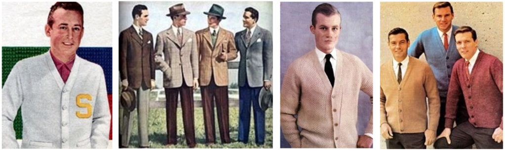
Men dressed in suits a lot of the time, they were known for looking ‘sharp’. Suits were a lot ‘fuller’ and more comfortable in comparison to suits worn by people now (tailored to fit). Men’s suits didn’t have many colour choices, you either wore: Dark Blue, Dark Brown, Black or Charcoal. The rule is that “the bigger your job, the more you earn and the more you earn, the more expensive your clothes are”.
Men also wore ‘cardigan sweaters’ which was a nice casual change from the suits they would normally wear.
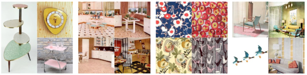
Architecture & Interiors:
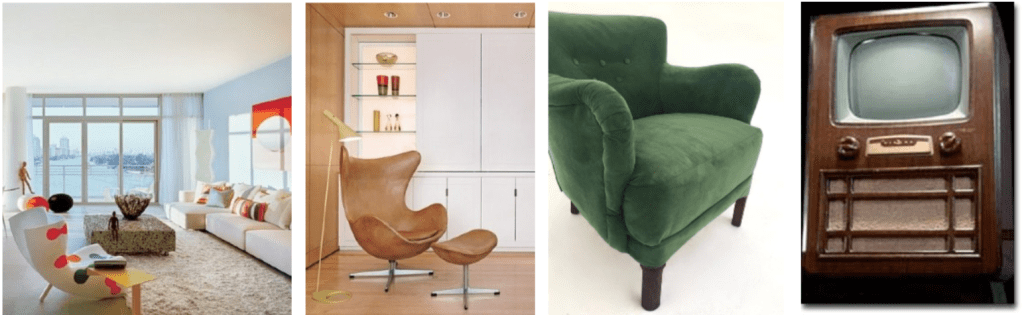
1950’s architecture and interior was mostly about modern, ‘less is more’ and sometimes futuristic styles. Upholstery became more interesting with the introductions of more patterns and colours in the home. Minimalism was a main factor in both architecture and interior design. In poorer houses, most people kept to their old furniture including armchairs and sofas as buying brand new furniture was very costly! Most houses had a Television (although these were costly too!)
Art: Painting, Drawing & Posters:

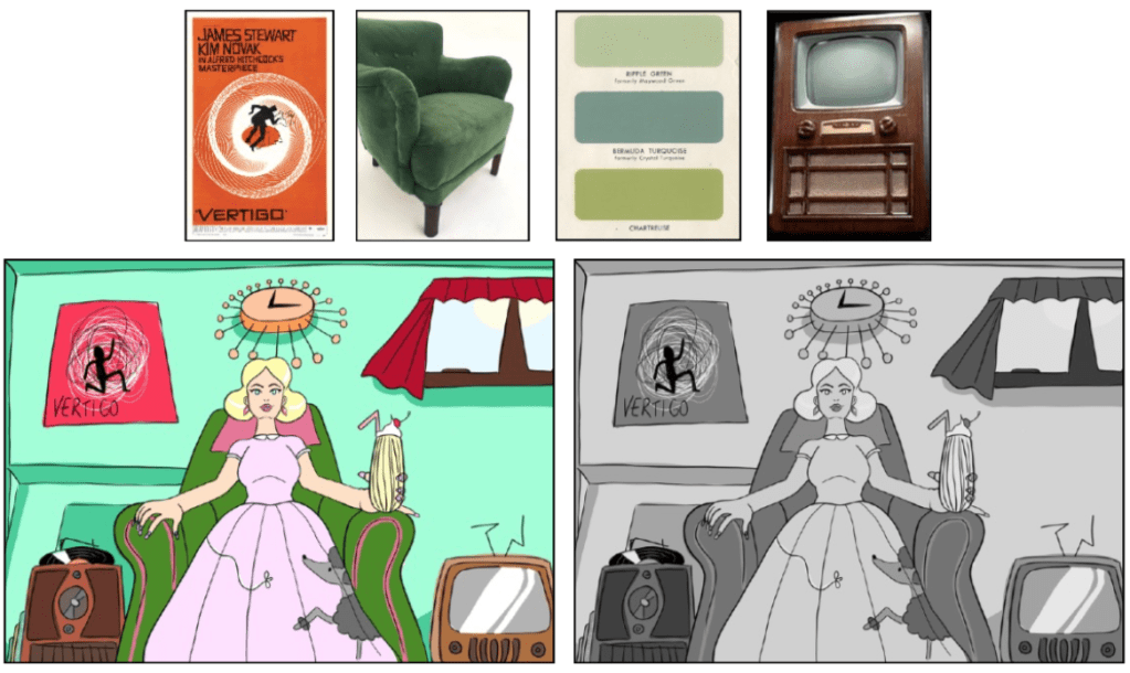
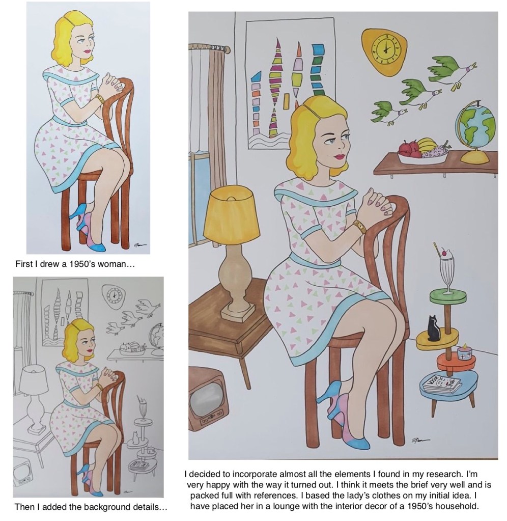
For my first initial idea idea I decided to use my Wacom Cintiq as a medium. For the illustration, I drew a stereotypical American 1950’s housewife sitting in a green armchair (which was the ‘in’ colour). She is wearing a ‘poodle skirt’ and is surrounded by 1950’s artefacts that would be in a stereotypical 50’s home, these include: record player with records, 1950’s B&W Television, stylistic 50’s clock, poster of a film (vertigo) which came out in the late 50’s. The colours that I have chosen are all very 50’s, jade/turquoise walls and dark red curtains are very fashionable?! I also decided to see what the illustration would look like if I changed the saturation (turned it to black and white), I did this because all tv’s in the 1950’s were in black and white.
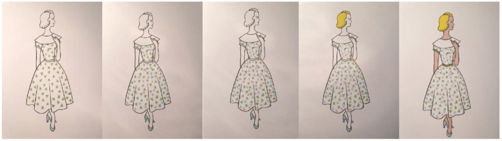
For my second initial idea, I wanted to focus more on the fashion illustration aspect of the 1950’s as I thought that if I drew in the same style that fashion artists did then that it would relate more to the brief. I drew a lady standing up for my initial idea so I could focus on the folds in the dress and practice them before applying them to the final design. I enjoyed this idea more than the previous as I feel like it could really go in a much better different direction than the first as the first is pretty much already complete. As I have focussed on the fashion aspect I have incorporated a stylish dress design that I had seen alot throughout my references. I like the fact that the lady is hand-drawn like they would have done back in the 1950’s as they didn’t have digital technology as advanced as we have it now (Wacom Cintiq). Below are the steps I have documented when drawing this idea.
Creating My Final Design:
I found a website called ‘Big Chill’ and I found even more images to use as references for my final design. https://bigchill.com/us/blog/7-reasons-why-1950s-homes-rocked/
MARK MAKING
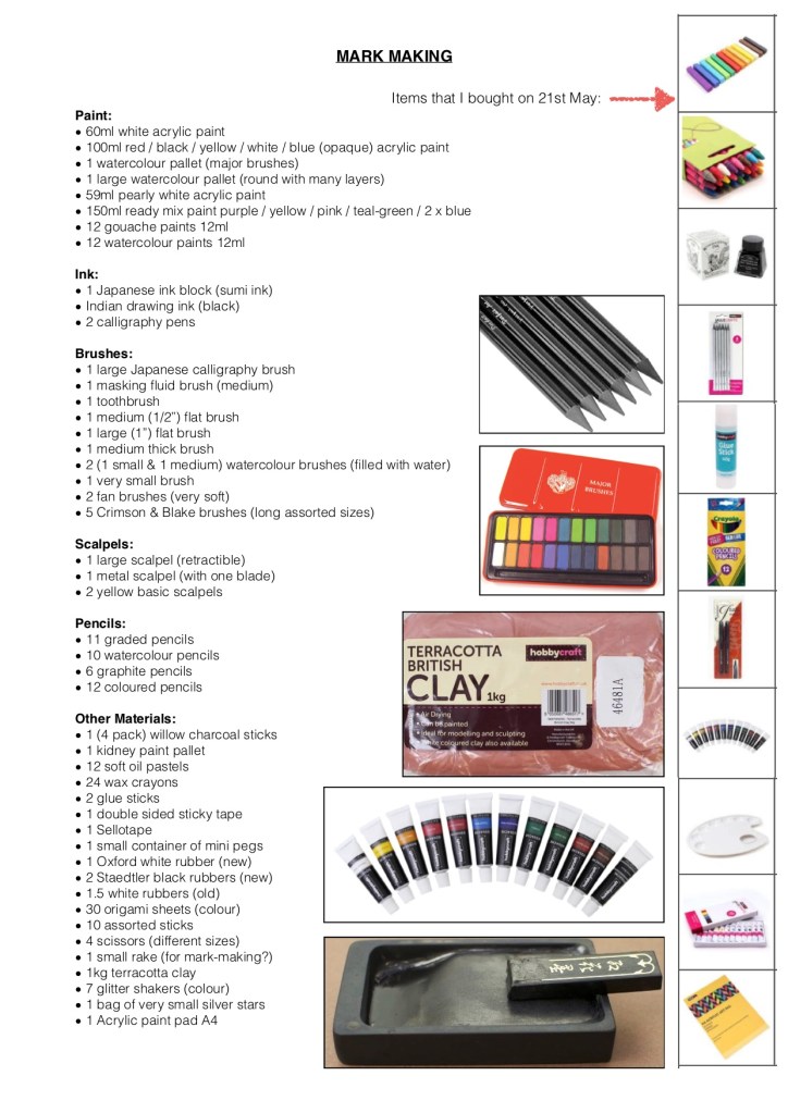
For this exercise I decided to research the British Artist Daniel Eatock. I found his work interesting and relatable to the idea of mark making. In one of his most recognisable works he used coloured felt tip pens and white paper as his medium.
He interestingly let around 250 marker pens bleed freely into an 200 gsm A1 piece of paper over a series of hours and days.


CREATIVE THINKING & PROBLEM SOLVING
Objective: Not influenced by personal feelings or opinions
Chosen Word: SHOE
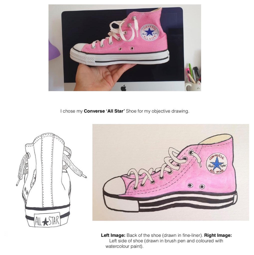
I enjoyed this exercise as I was able to be extremely neat and precise when drawing. I think my outcomes are good, I am happy with them as I added alot of details and made it very easy to understand what the item is.
If I was to change anything, it would be to remove the middle stripe on the bottom rim of the shoe in the right image as it doesn’t belong!
Subjective: Based on or influenced by personal feelings, tastes or opinions
Chosen Word: UMBRELLA


BLACK & WHITE
My Initial Ideas: Sea, Journey, Extraordinary & Building (from left to right):

Experimentation with black & white:

For my black and white project I decided to research 2 artists who’s work mostly feature black and white illustrations. They both have very different illustrative styles but both artists work seemed to interest me the most out of researching into about 15 different artists that I searched for on Google.
https://www.behance.net/gallery/87449885/Personal-Project-Black-White-Artworks-2019
The first artist is called Dániel Taylor from Budapest, Hungary. He is a freelance artist and from what his ‘Behance’ profile says most of Dániel’s art focuses on surrealism. He discovered Photoshop and digital drawing at the age of 14. Dániel’s work includes a lot of black and white illustrations as well as really colourful drawings. Personally I enjoy his black and white images the post as he has captured the atmosphere well using tone and contrast.
Since starting up as a freelance artist since 2014 he has already exhibited his art in Germany, France and the UK. He also has very established clients wanting to work with him including the likes of: Adobe, Playboy, Marvel and Mondo.
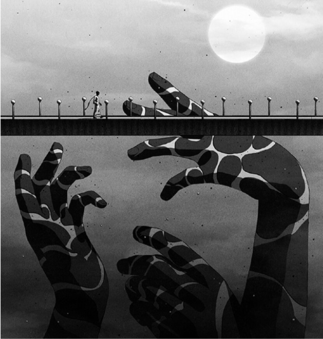
Dániel’s are is extremely expressive, this is why I chose to research him. The image to the left is one of a few black and white illustrations from Dániel’s personal collection. I find this image in particular intriguing as it looks like something from a dream or a nightmare. The art style reminds me quite a lot of Manga, I have a feeling that Dániel was influenced quite a bit from this type of animation. His use of black and white is very interesting, it immediately pulled my interest. Personally I don’t think this image even needs colour as it’s such a stunning illustration.

https://dribbble.com/dbezrukov
https://dribbble.com/shots/3981924-Reflection
The second artist that I decided to research is called Denis Bezrukov from Voronezh, a city in Russia. When researching this artist there wasn’t alot written about him in his biography or ‘about’ section on his ‘Dribbble’ webpage, I assume this is because he doesn’t know how to speak english. He is a designer working for a digital design company called ‘Evrone’. His work seems to focus on the advertising aspect, which I am guessing is his job at ‘Evrone’.
This didn’t seem like the type of artist I was looking but after looking into more of his art including a few animation loops I found this amazing piece. It’s called Reflection and it is actually animated on his page. His description of the animation writes ‘Abstract graphics for Functional programming сonference’, so I’m guessing that even this animation’s purpose is for advertising and the marketing industry too. I found this image very interesting as he has just used pure black and white in comparison to the first artist Dániel’s illustration where he has used grey also. This image leans more on the graphic design aspect. Yo can see exactly what it is, but it doesn’t need anything else added to it for you to see that it is a face. In the animation the white strip goes back and forth crossing the face and highlighting all the facial features.
CHOOSING CONTENT
I was asked to read an extract from ‘The Daffodil Affair’ by Michael Innes and answer specific questions.
The Extract:
“The room was void and unquickened; it was like a room in a shop window but larger and emptier; and the middle-aged man who sat at the desk had never thought to impress himself upon what he entered every day. Comfort there was none nor discomfort; only did the occupant deign to qualify the pure neutrality of his surroundings, it would surely be austerity that would emerge. The spring sunshine turned bleak and functional as it passed the plate glass of the tall-uncurtained windows.
The windows were large; the big desk lay islanded in a creeping parallelogram of light; across this and before the eyes of the man sitting motionless passed slantwise and slowly a massive shaft of shadow.
Perhaps twenty times it passed to and fro, as if outside some great joy wheel oscillating idly in a derelict amusement park. And the man rose, clasped hands behind him and walked to a window – high up in New Scotland Yard. He looked out and war-time London lay beneath… on his brow was a fixed contraction; this he had carried from desk to window, and now there was neither hardening nor relaxation as he looked out… during 15 years he had controlled the file of police papers which dealt with the abduction and subsequent history of feeble minded girls. Here lay his anger as he looked out over London… year by year the anger had burst deeper until it was now the innermost principle of the man”.
If this were to be made into a film what would the main character be like?
He would be a middle ages, proud and intelligent man who has a good job (police officer/abduction investigator) and dresses well. It’s WW2. He has a love of neutral tones and simplicity within his office.
What clothes would the character be wearing?
He would wear a suit (like any other man during wartime in Britain) and perhaps wear braces under his jacket. It would be well fitted and clean as he has the money to afford it considering his job at Scotland Yard.
What furniture is in the main area in which the action takes place?
A large desk and chair situated in the middle of a large room painted with neutral tones. The room also has tall, large windows without curtains. As the man likes simplicity and control the only uncontrollable item in his room would be the stack of paperwork (files about the abduction and subsequent history of feeble minded girls).
A website I found for this era:
https://www.history.com/topics/world-war-ii


Evaluation:
I was asked to choose a word that I feel captures the mood I would like to convey in my image: I chose ‘Gloomy’.
I wanted to add as my ‘gloomy’ colours and textures onto the mood board that I could think of.
I decided to focus mostly on texture but I wanted to add a new scenes including a burned down forest with grey sky in the background (the trees are reflected in the water) the idea of burnt down forests make me angry and sad. The second scene is of a lightning storm (which normally happens during a very rainy ‘gloomy’ day.
Next I focused on textures. I added charcoal and rubbed by fingertips in it to create a cloudy or foggy texture, then I tried to focus on crosshatching and a few other scratchy forms of texture (angrily mark- making).
Next is tea leaves from a teabag which I stuck on with glue. I decided to add this as it is something personal that I hate, when you are tired and ‘gloomy’ and trying to make a cup of tea and the bag splits and you want to scream! Above the tea leaves is a coffee stain which I thought creates quite a dull brown colour.
Next to that are a few colours that I thought looked quite ‘gloomy’. These first include 7 colours using my Windsor & Newton Promarkers, I chose the most boring colours from the pack. Next to that are 7 colours from an old crayon pack with dirt (charcoal etc) mixed into them so they created not so vivid colours than they should.
Last are a few boring watercolour marks that I made using a large round paintbrush.
Overall I feel like I have created a very boring, monotone ‘gloomy’ moodboard which works, if I was to change anything it would be to remove the pink and purple crayon colours as I feel like they make the page a bit too ‘happy’.

My Final Outcome:
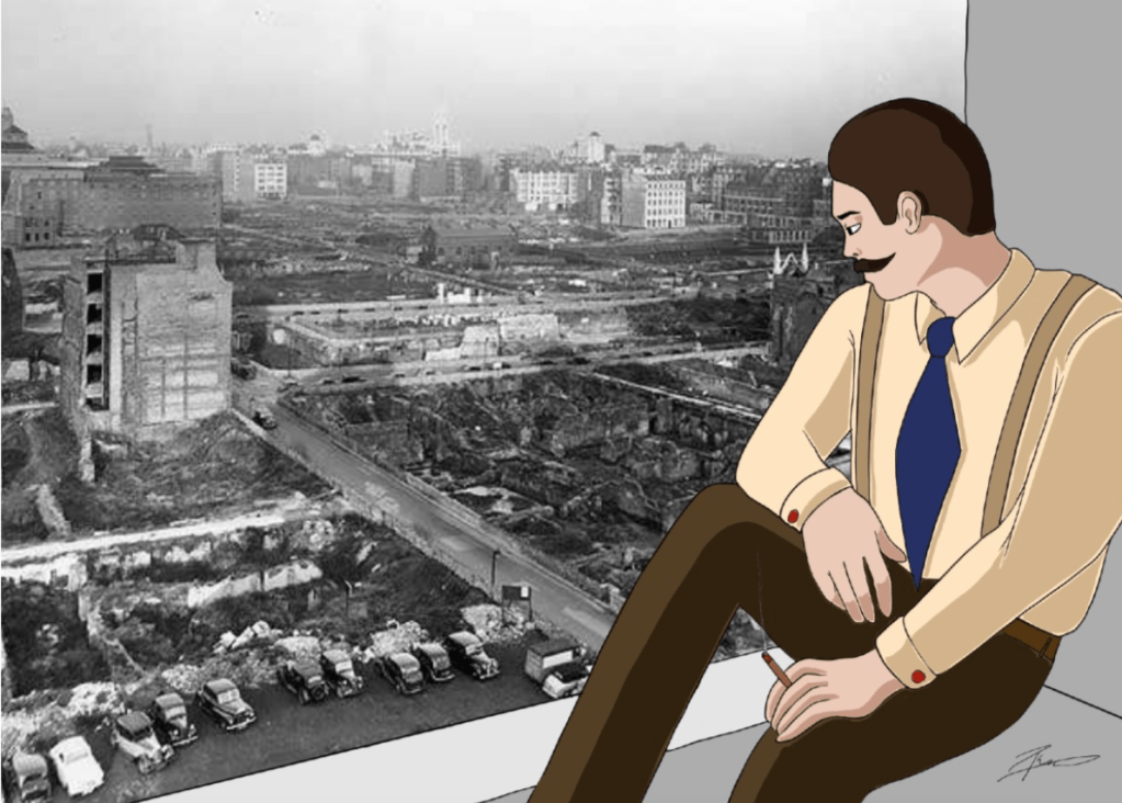
I am really happy with how my final illustration came out. Everything I said that I wanted to incorporate the real photo and I was really happy to find an image of London that would sit well in the perspective of where the man is sitting on the windowsill.
I did this illustration using my Wacom tablet. I used layers and in the end merged them all together forgetting to add the shadow (!) so I had to add the shadow afterwards and I was worried about going over the black outlines so I decided to avoid them. This actually worked in my favour as I like how there is a small line of the lighter colours before the black outlines. I feel this added to it in a good way.
MEANINGS IN IMAGERY
Examples of visual metaphors:
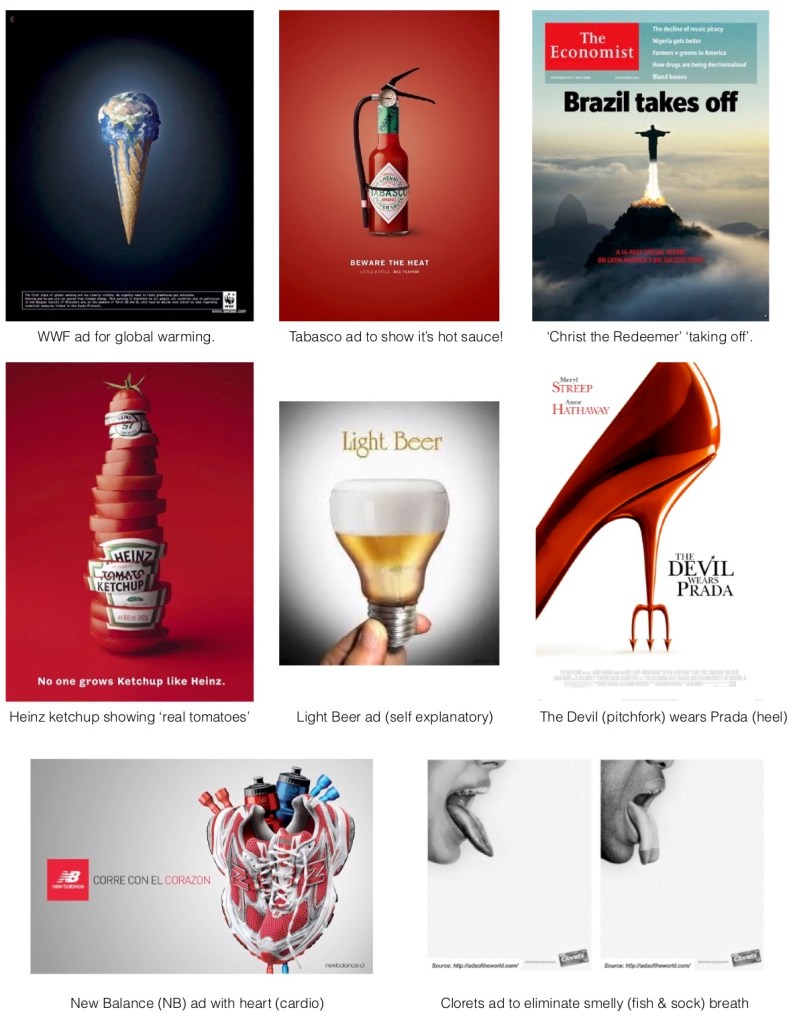

Literal: Free from exaggeration or embellishment.
Metaphorical: Expressing one thing in terms normally denoting another.
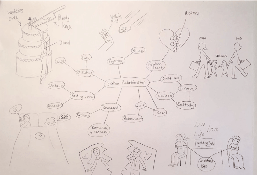
Visual Metaphor for phrase: Broken Relationship
Above is my spider diagram where I have thought of as many different things related to the phrase ‘broken relationship’. I have illustrated 7 ideas, each are very different and show different aspects of my chosen phrase. If I was to continue with any of these illustrations I would be likely to choose the lower right-hand side one the most as it sums the phase up very clearly. There would be the stereotypical “live, life, love or live, life, laugh” on the wall above the unhappy couple as well as a large wedding photo dangling as a constant reminder of their ‘big day’ which turned out to be a tragic mistake. The couple would be far away and not looking at each other. They would either be scowling or angry frowning at the floor with their arms folded both showing their wedding rings which I would make glow to draw attention to them.

