
My Brainstorm

For this assignment I was asked to create an illustrated poster design for a musical event. I chose jazz for my musical event as I thought that I would be able to come up with many different and interesting ideas as I am a keen jazz listener myself. Part of the brief said that I had to include a few details within the poster’s design, these include: the title of the event, time, place and any other information that I saw as appropriate. I was advised to create a brainstorm so that I could lay out all the thoughts that I had on paper.
My Moodboard

I was then advised by the brief to create a moodboard focussing on my chosen music event “jazz evening”. I decided to chose images that include the different musical instruments that are involved in jazz music including the double bass, trumpet, saxophone, drums, guitar, piano and the trombone. I also decided to include an image of influential jazz trumpeter Louis Armstrong as he is one of the most well known musicians when it comes to jazz. Finally I wanted to look down a different route of ‘jazz art’ as shown mostly in the top left corner of the moodboard, Artist Jackson Pollock is known well for his abstract expressionist movement but he also made a few art pieces whilst listening to jazz and expressed it through his art creating images like the one you can see right at the top of the left corner. Still focussing on jazz art, there seems to be alot of colour involved when creating it, this must be because jazz is a very ‘free-flowing’ genre of music and I think when people create art based on jazz they like to be very expressive with it, therefore using alot of colour!
6 Thumbnail Sketches
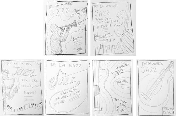
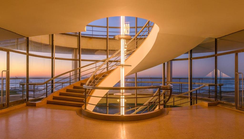
Above are 6 thumbnail sketches showing different potential compositions and designs. I think the designs are very different to one another but all have the potential to be developed into interesting designs. As you can see from the designs I decided to host my jazz evening at the ‘De La Warr’ in Bexhill as I found this venue to have interesting architecture and a wonderful spiral staircase in the middle of the building, this style of architecture made me feel like the building would have very good acoustics if a jazz night were to take place there. My thumbnail sketches focus mostly on the jazz instruments and have a very smooth/flowing vibe to the whole design.
2 Visuals Influenced By My Thumbnail Sketches

After creating my thumbnails sketches, I started on my two chosen visuals. I wanted to include the warped piano keys and also the saxophone in both the designs as I thought that this would symbolise that it was a jazz poster without people even reading the text. I wanted the elements within the illustration to flow and for there to not be any harsh sharp edges or corners in the image as this would defeat the purpose of the image ‘flowing’ like jazz music. After a while of judging both of the visuals I decided that I wanted to go with the 2nd design (on the right) more than the other one as it seems more basic. The thing that I will change before I create my final design is the text/typeface that I have used within the sketch, it seems to busy and boring sitting in the upper corner like that so I will perhaps incorporate the type in with the piano keys at the bottom of the image or around the guitar, basically somewhere where the type is easy to read but also looks and feel included within the image.
Creating my final design:
I decided to create my final design for assignment 3 using my Wacom Cintiq so that it looked more professional and clear to sea and read. I also decided to create the poster digitally as it meant that I could use vivid colours that would stand out.

I started off by scanning in an image of my chosen poster visual from the previous part of the assignment and making sure that the format was set to A4 as this is the size I wanted to work with. (As it says in the brief, I can choose the format I want to work with).

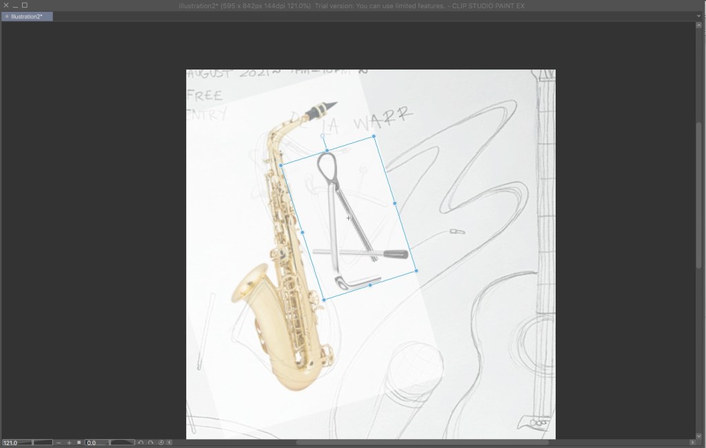
I then started importing photos of real instruments so that the illustration would have more of a professional feel to it, unlike the instruments on my visual design that didn’t look in proportion (my illustration of the saxophone was completely from memory so it looked really weird so I knew that I had to look at ‘real’ instruments when I created my final design). Here you can see that I have just started importing the images of instruments into the design, starting with the saxophone. My idea in the visual was to make the word ‘jazz’ out of the instruments in the illustration, so I start of with the saxophone ‘J’…
Then a triangle as ‘A’…

I was quite chuffed when I realised that my illustration of the guitar was pretty spot on and accurate! When I overlapped the imported image to check for proportions it almost fit right over my original illustration! I can only put this down to the fact that I play guitar and have looked at an acoustic guitar alot!
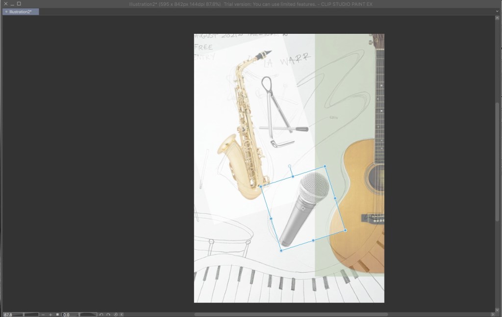
I then added the microphone and made sure it fit in with where I drew my original sketch of the microphone…
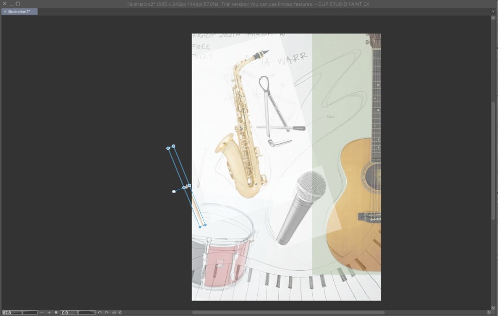
I then added the drumsticks, here is the first one off the page a little…

And here’s the other one…

This image is how my design looked after I had incorporated all the ‘real’ instruments into the image. Obviously the parts of the image where I couldn’t make it out of ‘real’ images where the wavey keyboard at the bottom of the screen and the lead connecting to the microphone.
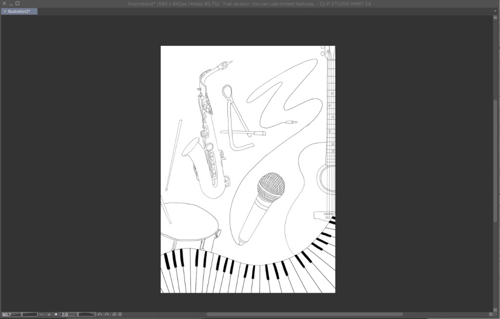
This is my finished drawing (outlines) using just black lines, here you can see how clearly I have made the instruments and how it looks in proportion and realistic.
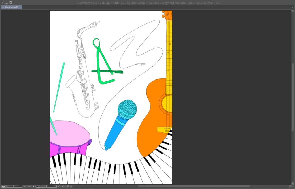
I then started incorporating colour into the image using the ‘layers’ feature on my digital drawing program. By using layers I made sure that I could add colour underneath the outlines so that the lines would still be clear. I wanted to have the biggest and boldest colours in my design on the instruments and took inspiration from the colours that I had found when creating my moodboard earlier on in the assignment.
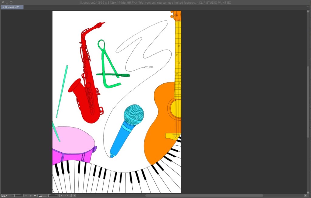
Here I have made the saxophone red in order for it to stand out and be almost the most important aspect of the image, the red (and all the other vivid colours) would draw people in to have a look at the poster and see what it’s for.

Here the background is now black. I thought initially that the white background and colourful instruments would look powerful itself but I then experimented and turned the background pitch black which I thought made the image extremely powerful and made the colours and the keyboard stick out even more then they did initially! As least now there was some contrast between the white keyboard and the black background as before it would be white keyboard and white background which would just confuse the viewer.

This is where I started to create the ‘Z’s’ out of the microphone lead. I tried many times to incorporate both ‘Z’s’ into one lead but this ended up just looking like a wobbly line or scribble so I had to rethink my design and came up with the idea to just use the lead to create one ‘Z’ and then use the shadow in the background to create the other which you can see in the image below…
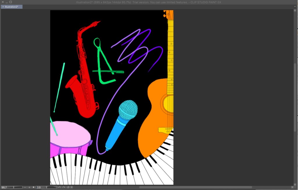
Here is the ‘Z’ lead with the overlapping ‘Z’ shadow in the background therefore creating two ‘Z’s’.

As I didn’t want to overcomplicate the image any further as the design is impactful enough, I decided to write the details of the event at the top of the poster in a white bold font. I know that the writing doesn’t look big enough right now on the screen but if the image format were to be reproduced (as said in the brief) to the format of A3, you would easily be able to read the text at the top. The most important thing is that people would be drawn in to see the design and if they were interested in music they would be able to recognise the instruments on the poster from a far.
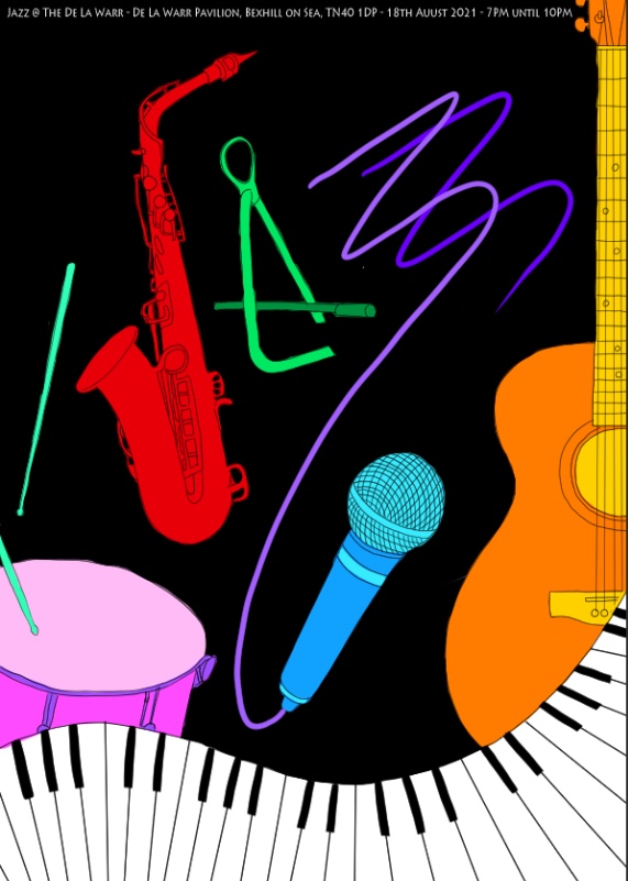
Here is my completed final design!
Overall I am really happy with how it turned out and I think this is my best assignment outcome out of the 3 I have already done. I feel as though the only thing I would have done differently would have been to be more careful when creating my outlines as when I look back on the final design now it looks rather messy. Other than that I am really happy with the colours, instruments and composition chosen.
