COMPOSITION & VIEWPOINT
Position & Scale
We create an illusion of ‘visual space’ when we arrange what is in an image or illustration, we are giving each aspect of the illustration space to occupy the frame and each part has a relationship with one another.
Scale: The relative size of one element to another.
Position: The relationship of components to each other and the frame.
Contrast: How much tone, texture and colour each element has relative to the other. Shape: The two dimensional form an element takes.
Space: The visual distance between elements.
Compositional pointers:
• Horizontals and verticals give a sense of balance, of order, of calm and strength.
• Diagonals suggest movement and speed.
• Objects or Subjects without a horizon line float. A horizon will anchor them and suggest space.
ILLUSTRATING VISUAL SPACE
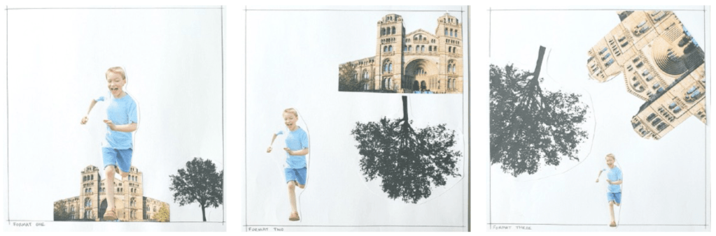
My sense of the image changes when the proportions of the objects change. The first image can be seen as rather normal. I could be taking a photo of a child as the child is running towards me with the building and the tree in the background. The second image is far more exaggerated! It looks like the child is screaming to get away from a building propelled by giant spinning tree. The third image looks like a complete apocalypse, almost like the destruction of earth by a massive split in the tectonic plates.
The image shown in the course book looks like a man scaling a large mountain with snow at the peak. I also can identify a cloud which shows the viewer how high up he is.
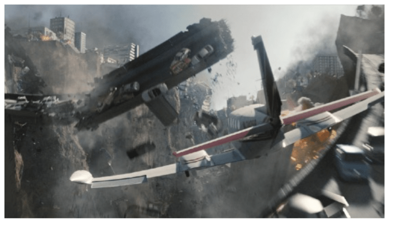
My favourite composition has to be ‘format three’ as I just feel the chaos in the image comes through to the viewer easily and looks like a scene from a disaster movie such as ‘2012 – the movie’.
WORKING IT OUT
HIERARCHY IN THE IMAGE
• Identifying the ranked importance of content within an image.
• Identifying the key component within the image in order to communicate the importance or meaning.
• Hierarchy is important within an image. If the hierarchy is wrong the communicative function of the image is
lost and has to purpose.
Hot Colours:
Hot colours (red, orange and yellow) within an image are visually dominant due to the colours our eyes and brain take in before other colours (green, blue, black). Purple sits on the fence as it is both visually dominant and also sits further back in the image hierarchy depending on what colours surround it.
READING AN IMAGE
I was asked to look carefully at this image from my course book:
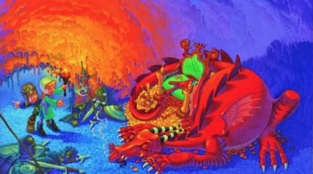
The image shows two people in the depths of a cave opposite a sleeping dragon who is guarding his treasures. The boy seems to be pointing to the exit of the cave as a way of signalling that they should turn back as what they’re doing is dangerous. The girl seems to be ignoring the boy and offering her hand to the dragon as a way of saying that she means no harm to the dragon, she is also holding a torch (fire) which is illuminating the insides of the cave, turning the cooler colours (blue & purple) to hot colours (red, orange & yellow). The illumination also brings out the hot colours on the dragon, revealing it (red) and its treasure (yellow) which is as bright and sparkly as the illumination of the fire itself. The insides of the cave are well textured showing exactly where they are as the roof of the cave shows stalactites and depth is described with cool colours. The same goes for the ground of the cave which is has a cobbled effect that shows many tiny stones. I think the connection between hot colours in this image is to show power and danger. The girl is holding a torch which could hurt the dragon and the dragon itself is powerful and dangerous as illustrated by it’s large red body and spiky back, claws and horns.
Identifying the hierarchy within the image from most important (1) to least (5) :
1. Dragon 2. Treasure 3. Fire 4. Boy and Girl 5. Cave
VISUAL PROPERTIES
Continuing on from hierarchy, creating focus within an image is important, this is referred to as ‘space within an image’. Creating the illusion of visual space is important if you are going to have any elements within one image. Hot colours are used within this concept as well as the hot colours demand visual focus from the viewer. The viewer will focus more on parts on this image with more tonal contrasts. More important parts of the image require hot colours and more tonal elements and less important parts of the image means that they require less contrast and cool colours.
IMAGE DEVELOPMENT
Format:
The application and shape of an image. e.g. ‘landscape format’, ‘portrait format’ or ‘square format’.
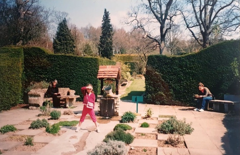
I chose to format a family photo of a young me (in the middle) with my mum on the left and my grandma on the right. There are also lots of other interesting elements within the image.
My 10 different formats with my chosen words (that come to mind) for each image:

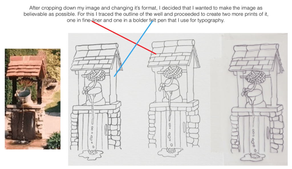
I used pens with different thicknesses because I wanted to see how the lines would come out and create a different tone for the image.
Typography:
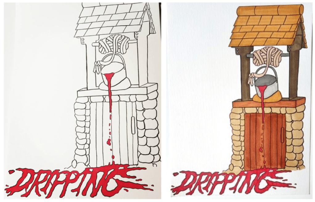
I then focused on how I could incorporate a typeface that would be relevant to the word ‘dripping’ that I chose as a word to describe the image. The well is ‘dripping’ water in the actual image but as I wanted to make the image more visually striking than ‘just water’ I thought about how I could improve the image. As I have a bit of a dark side I decided to make the well drip blood rather than water as I thought that the typography would really stand out in ‘blood red’.
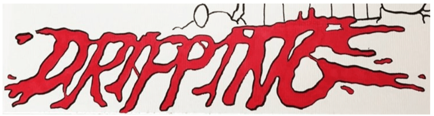
After drawing out the well again this time larger with the bolder felt tip pen I used in one of my initial designs I thought about how I could incorporate the word ‘dripping’ in the design. I thought it would be a good idea if I used the space below the well on the ground as there is alot of dead space under the well design. I also thought about where the ‘liquid’ is going to go after hitting the ground, this is where I came up with my typography idea. I literally made the word ‘dripping’ of out the dripping ‘blood’ coming from the bucket in the well. I created the typography so that the word looked like it had naturally spilt over time creating the word ‘dripping’.
The Final Design:
The struggle with this illustration was the decision of whether I should have left the illustration as just lifework and red from the blood or if it looks better coloured like I did for my final design? I like both the images equally as I feel like the first image where I haven’t coloured the well in, makes the ‘dripping’ of the blood really stand out as it is a hot colour but on the other hand I feel like it looks like the image isn’t complete. The second image (my final design) I feel also has strengths and weaknesses. On one hand I feel like the image is complete with colour as it gives the image more depth but on the other hand I also feel like the colours almost cover up the ‘dripping’ part of the illustration as the colour I used for the well door is too much like the red of the blood and the two colours seem to clash.
ABSTRACT ILLUSTRATION
For this project I was asked to listen to a piece of music. I decided to listen to ‘Rite of Spring’ by Igor Stravinsky as I have a connection with this piece ever since I was little and listened to it with my grandparents.
As I was listening to the piece I was asked to create marks on a piece of paper as a was of interpreting what I was listening to and how it made me feel. For this exercise I didn’t think about what I was doing, I just let the tool do whatever it wanted to do and once I knew what direction it was going in, I decided to create 3 more pieces but using different strategies and tools.
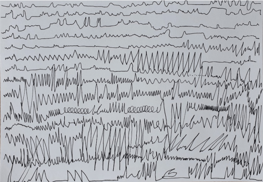
This was my first mark making attempt. For this I used a fine-liner as my tool and white cartridge paper as my material. I started the track and held my pen in the other hand so I could start drawing as soon as it started. I recoded all the fluctuations in the track from the calming start to the explosion of instruments after the first part. On the back of each of my pieces of paper I wrote down how long I played the track for (until I finished the page) and then I stopped. For this piece it took me from 0:00 to 7:11, I also kept my eyes open for this attempt.
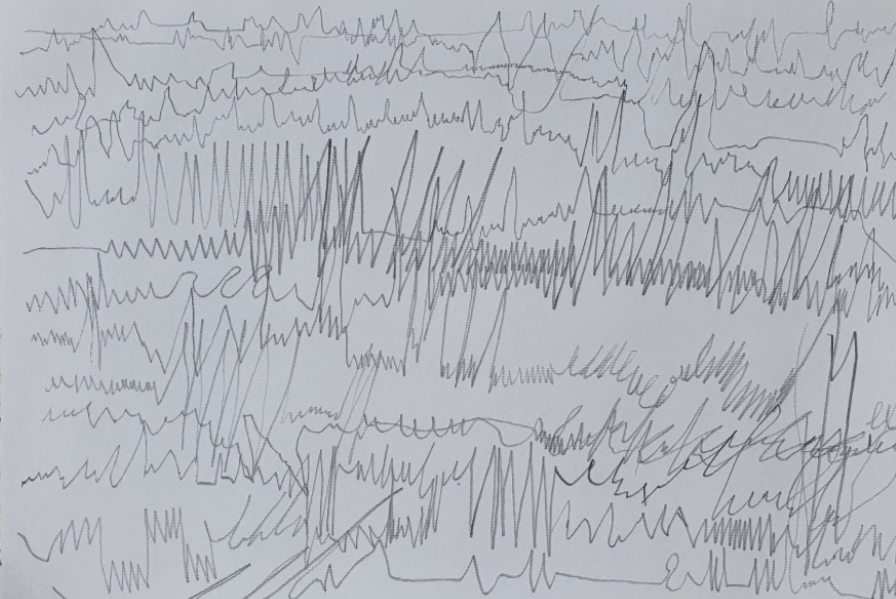
For my second attempt I decided to make it more interesting by keeping my eyes closed, I wanted to see the differences and similarities within my mark making. I listened for the track for a second time and this time it took me a slightly shorter time to finish the page, from 0:00 to 7:05. As I did have my eyes closed this time my drawing looks far more messy but I also find it interesting as some of the marks I made are very similar to when I had my eyes open on the first attempt.
For my last two attempts I decided to use different tools. I used crayons for one and watercolours for the other. The last two are quite similar, even though they are different media I decided to use the same technique. I wanted to see what colours my mind decided to pick up whilst listening to the piece of music for the third and forth time, I didn’t make any premeditated or logical decisions when picking up each colour, I just continued to listen to the music and then looked at the crayons and watercolours and went with it. Each time I rewound the track to the start to that I could see what correlations there were each time I started drawing. I had my eyes open during the last two attempts as I didn’t want to make it too messy and for the crayons and watercolours to blend into one horrible brown splodge on the page as I’d have nothing to work with on the second part of this project.


ABSTRACT ILLUSTRATION
My chosen square from my first attempt. Materials used: fine-liner and cartridge paper. I decided on this particular square as I felt it had depth and communicated the piece of music well as when I am listening to ‘rite of spring’ I like to imagine that it is influenced by the power of space. The instruments used for the piece of music are so strong when you hit the first real powerful part of the track. The piece below reminds me of the rocks on mars.
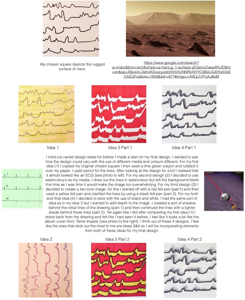
After creating my four initial ideas previously I decided that I wanted to take my chosen idea further by incorporating colours and depth to the image. The first image below shows my sketch and colour decision that I made, the lined areas are going to be black and the other two areas green and pink. I thought that using these very different colours would give a sense of depth. The second image shows my where I have incorporated the black. The third image is where I have incorporated green, and the forth and final image is my final design.

After creating the different coloured designs above, I decided to go with the forth one as after comparing the colours from that design with my original design, I thought that the colours in the edited design suited the music tone more than the original. I the red, black and green reminded me of the land when a volcano erupts which is what the ‘Rite of Spring’ reminds me of, the power of a volcano. For reference look at the below image of lava flowing through the land in Hawaii. https:// theconversation.com/lava-in-hawaii-is-reaching-the-ocean-creating-new-land-but-also-corrosive-acid-mist-96947

After making the decision to have the above image as my final design, I then thought it would be a good idea to show my design in a ‘real image’. I found two stock images on google showing a man holding a blank CD case, I then edited my design over it so it looks as if my design is on the CD.
I feel like overall the CD design is very abstract and interesting, I’d be attracted to this CD case if I saw it in a shop as it stands out. If I was to do anything else to it, it would be to add Stravinsky’s name and the piece name (Rite of Spring) to the front of it, maybe in white typeface.
I found this project exercise fun as I could really use experimentation when coming up with the initial ideas.

DIAGRAMMATIC ILLUSTRATION
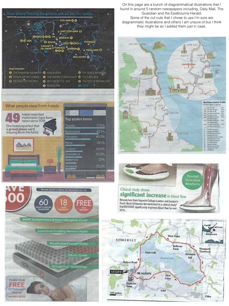
Diagrammatic Illustration: Diagrammatic illustrations are graphics or images with notes, labels and other information in the same image. They are used to show where things are (maps like below) or how they work (what I will be focussing on in this project).
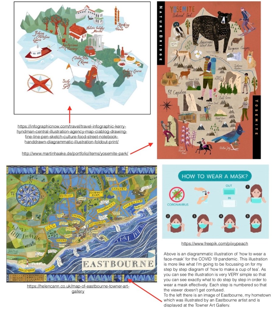
Travel infographic by Kerry Hyndman is an example of diagrammatic illustration, the illustration shows a few places to go in Italy for a cultural retreat. The second illustration is another travel infographic by Martin Haake, it shows all the wonders you can see at Yosemite National Park. Both of these illustrations are quite similar in many ways, from the slightly squarely drawn land and features on the maps to the typeface, but they are both very different artists.
‘How to make a cup of tea’ related diagrammatic illustrations found online:
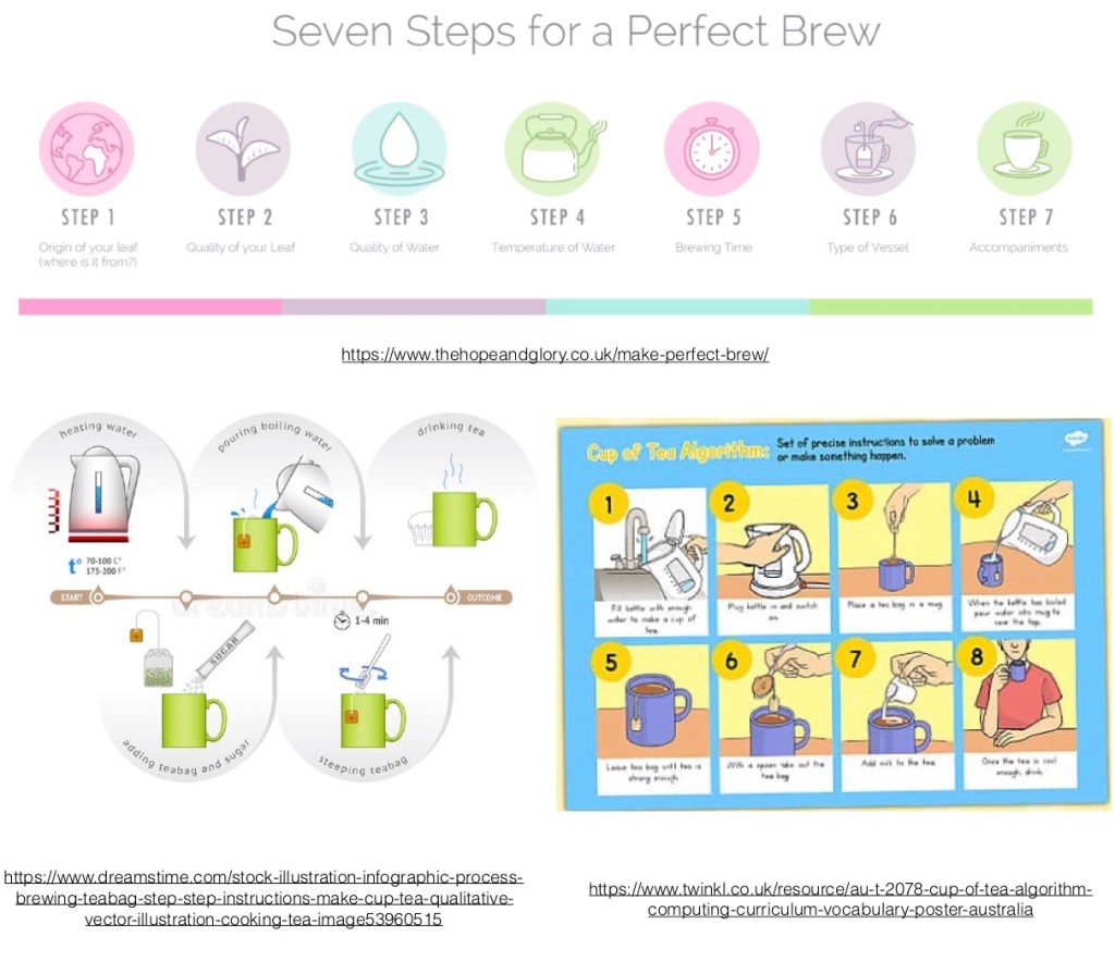
These 3 diagrammatic illustrations are very different but all show the same process.
Out of the 3 illustrations the first one is my favourite because of the colours they have used and how simplistic the design is, but at the same
time is doesn’t actually show the process. This illustration is from a very posh-looking tea stop and store online.
The second illustration has a lot more detail, both visually and written. The design is less attractive though and very basic in a boring way. It’s not very eye catching unlike the first illustration. The details show the entire process but it is laid out in a very confusing way, the steps aren’t numbered and you have to rely on the arrows in the middle of the design to see what steps you should take. This illustration is a stock image for anyone on the internet to use, you can also buy the illustration off of the artist for a price.
The third and final illustration shows a very clear set of instructions on how to make a cup of tea. This is from a website that creates posters and other academic support for schools in Australia. This poster is for Key Stages 1-2. Because of this age range the poster needed to be very simple and easy to understand but also show enough information for the child to learn how to make a cup of tea correctly. I like the fact that they have actually numbered the steps and have written a small passage of information underneath all the images. This clearly shows how to make a cup of tea.
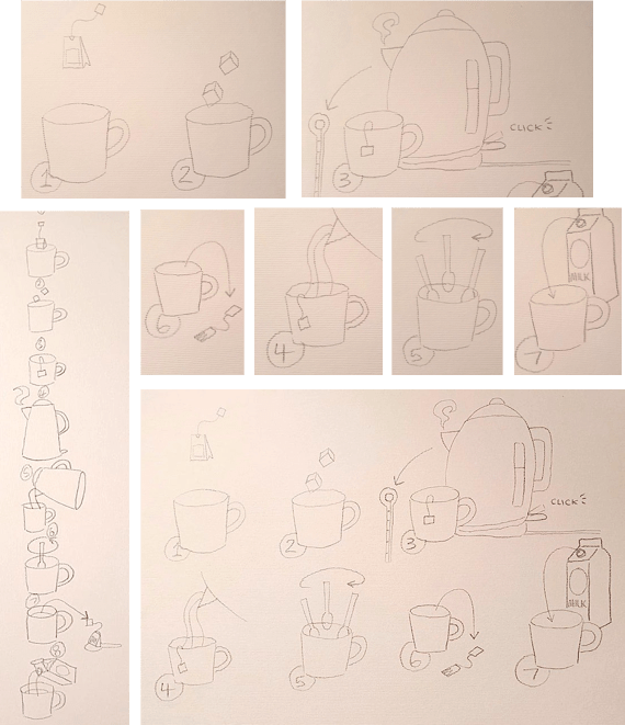
Below is a spider diagram based on “Making a cup of tea”. I wanted to add all the points that I will focus on when making my designs.

Below are a few initial ideas of what I want my final design to look like. I wanted to include everything that I wrote on my spider diagram.
The exercise explained that I should use as few words as possible in this design so I decided to not use any words at all apart from the word “milk” on the side of the milk container at the end. I will only use numbers to show the steps.
I wanted to make the steps as graphic in their design as possible as big, bold designs normally are easy to understand and catch people’s attention.
For my final design I will use my Promarkers on thick cartridge paper and outline my designs using a brush-tip fine-liner pen.
Below are photos of the process of my design. I used an A4 piece of cartridge paper for my final design as I wanted the ink to stay in place and not bleed through the lines. I first drew out my design in pencil based on my previous initial idea. I then drew over the bits that I wanted to make bold and stand out. I then added a very bold and bright colour for the cup as this object is the main point of the whole illustration.
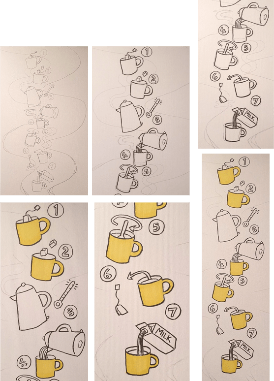
I then started adding in the other colours. For the actions within the illustration I wanted to make them a ‘hot colour’ so I coloured them red. The kettle is a less part of the hierarchy of the image so I decided to make it green. I then made the even lesser elements within the illustration a cooler colour, this includes the water from the kettle and the milk container.
To also show progression within the illustration I chose to colour the steps using the colours of the rainbow so people know what step comes next without even reading the numbers.
After colouring in my design with my Promarker pens, I decided to take the idea further by incorporating the idea of ‘tea’ into it even more. I brewed a teabag and used the colour from the tea to colour in the background and even used it to colour in the tea in the cups in my design.

Overall I am happy with the outcome of this design, I tested it out on my mum and grandmother to see if they were able to understand what I was trying to explain through the illustration. They both said that it was easy to understand each part of the process as it ‘flowed’ downwards until you are at the last step which is adding the milk. If anything the tea down the sides of the pages made the illustration seem a lot more childish and more like a badly painted watercolour in comparison with the well illustrated designs in the centre of the image.
Visuals
Visuals: A way to show your designs to the clients for their approval before created a final design. There are two types of visuals, Roughs & Thumbnails.
Roughs are to help with the formation of ideas and other properties within the image including the composition.
Thumbnails are small-scale sketches where you quickly draw your ideas. You consider viewpoints and content using this visual.
Roughs are more likely to be shown to a client as the image is more ‘finished’ than then thumbnail sketches, these are more likely to just be used my the illustrator for their own documentation of ideas.
Viewpoint
My small collection of items related to the theme of “the morning after”.
I decided to include a purse, a condom, some paracetamol & a lip gloss. I wanted to make the items to look as if they had fallen out of a girls handbag after a night out.
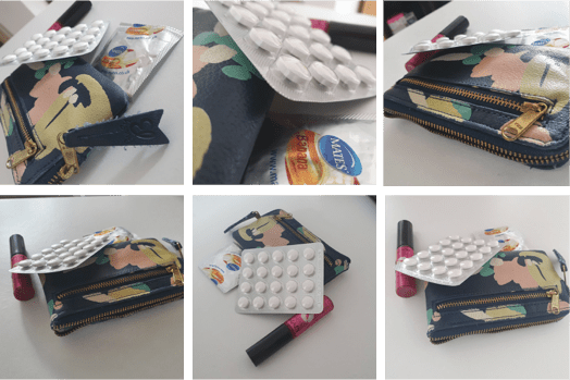
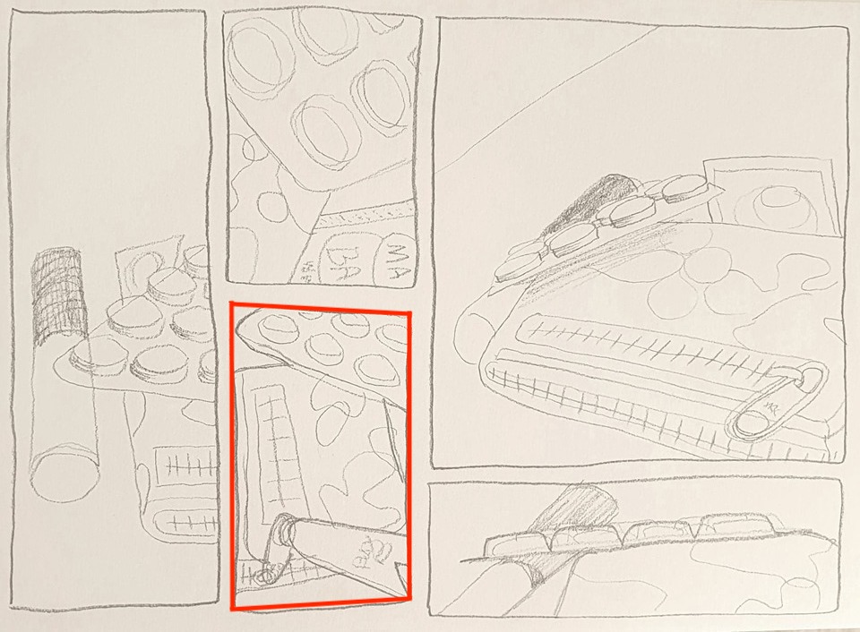
After taking photos of my chosen objects, I drew them from real life. I didn’t use a viewfinder because I was fine without. I drew the objects in different formats. My favourite design I have highlighted. I like the way the zip handle looks massive in comparison to the rest of the image. Also, referring back to ‘the morning after’ I chose this design as it looks like the type of view someone would have of objects on a side table once they have woken up after a night out. The purse being closest to the person’s eye as they wake.

I am happy with the way this visual came out. I think you’d be able to understand the image without looking at the photo above. The image is not a final artwork but a visual used for the purpose of explaining the image.
The format that best illustrates the words is landscape, like the one I chose for my final design. This is because (as I said previously) the picture looks like what the person is seeing on a side table after a night out, it’s the first thing she see’s in the morning as she wakes up. This is illustrated by the purse being closer to her as it her eye is right near the purse zip.
Changing the viewpoints did make me think differently about my choice of objects and arrangements of them because it changed where the focus was directed at in the images, sometimes I would focus more on the paracetamol and sometimes I would focus more on the purse or the condom.
Client Visuals
Scaling: To reproduce something so that it becomes bigger or smaller than it was originally.
Examples of client visuals from a book I have “Steven Universe – Arts & Origins: By Rebecca Sugar:


For my first design, I decided to create a visual of the ‘Steven Universe’ intro illustration. There is a lot of content within the image including the background (temple woman design, sea and sky), foreground (the main characters) and the typography (Steven Universe). For this design I decided to firstly take a proper look at everything in the illustration and how I could replicate it as it’s quite detailed. After enlarging the image by 2 1/2 times the size it was (scaling) I had to use an A3 piece of paper for the design. I worked landscape to try and get all the image in. After choosing the paper I took parts from the image (the typography mostly) and measured it on a page (this is why there are lines in the title in the first image). I then drew solid lines of where the most important aspects of the image were, this means I could draw in the characters in the spaces that they are supposed to be, making the image more balanced. After drawing the first image I decided to add a bit more detail, the design turned out still very sketchy but that’s what I wanted as that’s the purpose of the visual. I’m really happy with the way the second illustration turned out as it seems really neat and almost looks like one of Rebecca Sugar’s visuals.
For my other design I wanted to focus more on the diagrammatic aspect of visuals. I have a book called “Human Body” it is an illustrated guide to the human anatomy. Below are some examples of what you will find within the book.

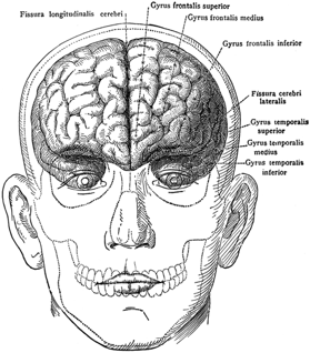
After looking though the book I decided to continue researching diagrammatic illustrations of the human anatomy. As the book only had coloured images I wanted to look for more images of older diagrammatic illustrations so I looked on the internet and found an image that I liked, it’s a diagrammatic illustration of the inside of a human’s head with the different parts of the brain labeled in Latin.
For this illustration I firstly measured the format of the image and enlarged the image by 2 1/2 like I did for the other image. I am working on A3 paper again for these designs.
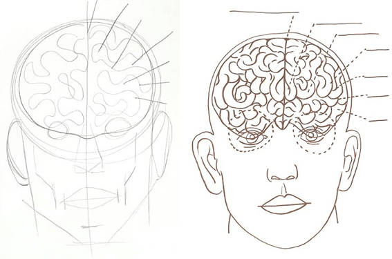
After scaling the image, I draw out a simple human head sketch like I would normally do when drawing someone’s face in still life. After that I added very minimal facial features so you know what you’re looking at. I knew that the main focus for this image was the diagrammatic side of the illustration so I then added the lines for the writing but didn’t actually add any of the type as you wouldn’t write down all the latin words if you were just creating a visual, that’s something you would do right at the end. I added the brain but drew it in a very sketchy way.
For the second illustration I wanted to add more detail like I did in the previous illustration of the ‘Steven Universe’ intro, I almost wanted to work backwards from the final design and show the steps towards creating the final image. The first illustration looks a bit like a thumbnail sketch (but it’s not as it’s full size) and the second is more like a rough.
I have no preference with these visuals that I have made for this second design as I feel like they both work equally well. You can really see how they could develop into the final illustration.
CREATING MOCK-UPS
Mock-up: A design of what the finished illustration will look like. Think of it as a ‘prototype’ design.
For this project I will be creating my mock-up on the computer using my Wacom Cintiq, this was I can show the layers as I make my design.
I chose to mock-up a book cover for “House of Darkness, House of Light” by Andrea Perron. The book tells the true story behind the horror film “The Conjuring”. It’s written by one of the children ‘Andrea’ who lived in the house during the hauntings that took place in the 1970’s. It is one of my favourite books as I am a horror fanatic. I must have read this book in about 5 days! It didn’t take me long at all as it was something that I was interested in.
I read the blurb of the book, examined the cover design and came up with the following brief:
“I would like for you to illustrate the front cover of a ‘haunted house’ book. This book is a record about the experiences that happened in the Perron’s farmhouse that they moved into in December of 1970. The book documents all the horrific experiences that the family had since moving into the farmhouse. This paranormal problems that occurred got so bad that they even had to ask for the help of well-known paranormal investigators Ed and Lorraine Warren to intervene. As the farmhouse is the main point of this book, please include an illustration of the farmhouse as the main image on the cover. The title of the book should be presented in a clear typeface, the title being: ‘House of Darkness, House of Light’, please also include the author’s name on the cover: ‘Andrea Perron’. This book is one of three in a trilogy so please also include the words: ‘Volume One’. And finally as this is a personal record of what happened in the house, I would like for include the words: ‘The True Story”.

My initial ideas (visuals 1,2 &3):
After creating my 3 designs, I decided to take the 1st idea further and use it for my mock-up design. I will keep to the same format as the original book cover. As the first design lines turned out a bit messy I will recreate the design again, this time making sure the lines are very precise, but I will keep the colours the same as I think it captures the feeling of the book well, that being ‘sinister’ and ‘cold’. After I have ‘hand-drawn’ and coloured the design, I will transfer the image onto my computer so that I can edit the image and transform the colours to make it very clean and stand out. I shall then add my typeface to the cover, including the Title, Author’s Name and the other significant details that are shown on the front cover.
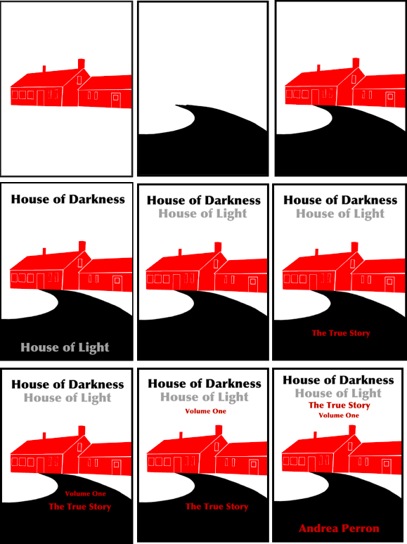

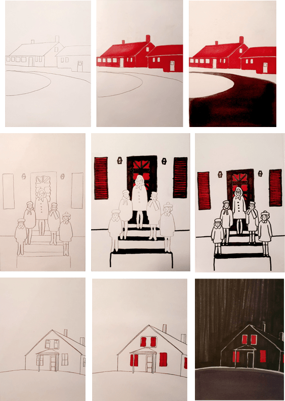
Above are 9 images showing my design process when creating my final image. I decided to base my design off of the real conjuring house photo shown above as i liked the way the path curved out of the image and I thought that I could do something with it. I started off with the farmhouse which I coloured red, I then created the black path running up to the house. (I wanted the colour of the book design to only be in black, red and white as these colours are very bold yet haunting, I wanted the black path to look like a sinister path of ‘darkness’ heading into the ‘bloody house’. I also decided to leave the background white to symbolise the time of year that the Perron family moved into the house (winter, like it is said in the blurb). I also wanted to keep the writing bold and easy to read, like I said in my brief for the cover. I created the typeface so that the ‘house of darkness’ was in black and the ‘house of light’ was in grey (the lightest colour I could use that is still readable). In the images above where I have shown my process, I have also added a few images of where I was thinking of where I could incorporate the type into the image, one of the images shows where I first put ‘house of darkness’ with the write background, and added the ‘house of light’ in the darkness of the path. I liked the way this worked but as I thought of where I should put the other parts of the type on the front cover, the reader could potentially read the cover as “house of darkness, the true story, volume one, Andrea Perron, house of light” and this could potentially confuse some people.

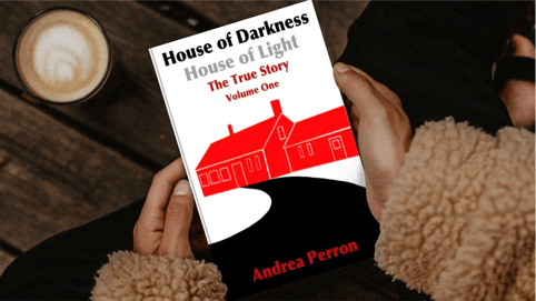

I am really chuffed with the way my final design turned out. The typeface is easily readable from a distance and the illustration is bold and would grab the attention of anyone who glanced at the cover. If I saw this design sitting on the shelf at my local library, I would be intrigued and want to know what it was. Above I have also added 2 photos of my design that I digitally edited onto a ‘real’ book cover. I used a site called ‘book in motion’ for this as I wanted to show how my cover would look if it was actually published and became a 3D cover.
