
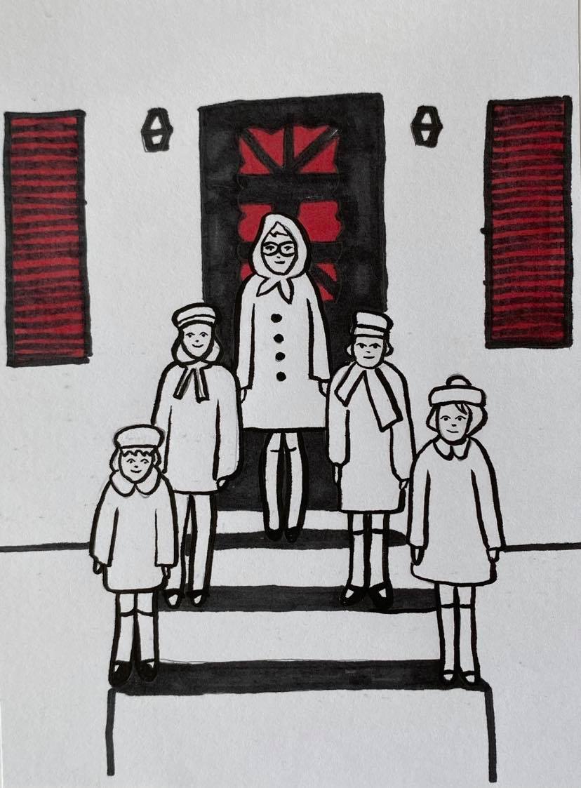
Authorial Practice – Your Own Work:
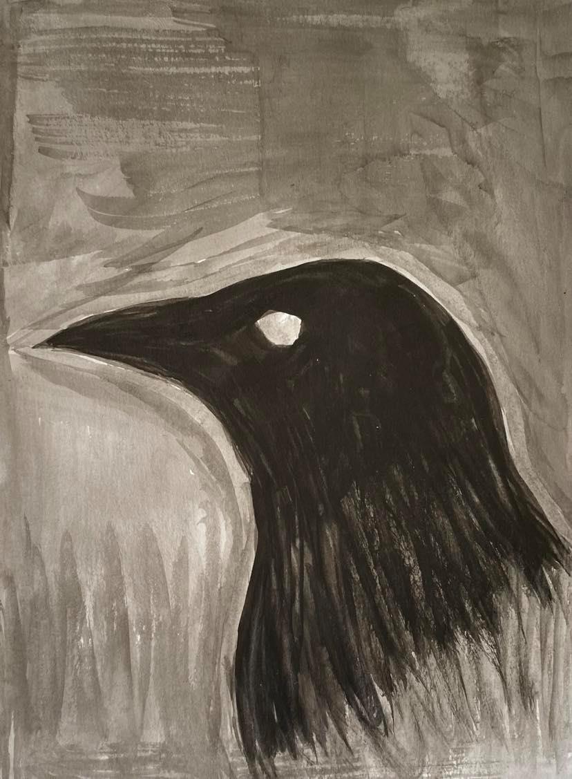
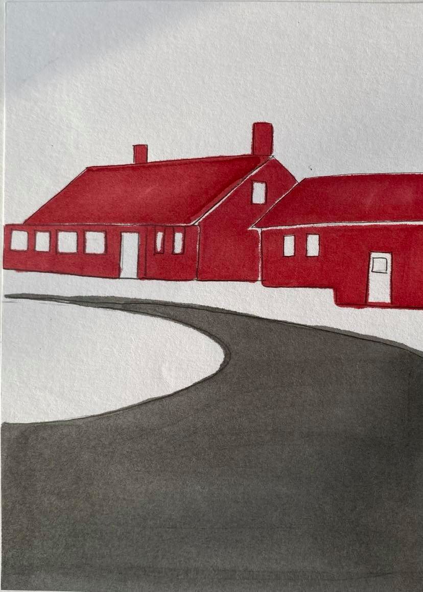
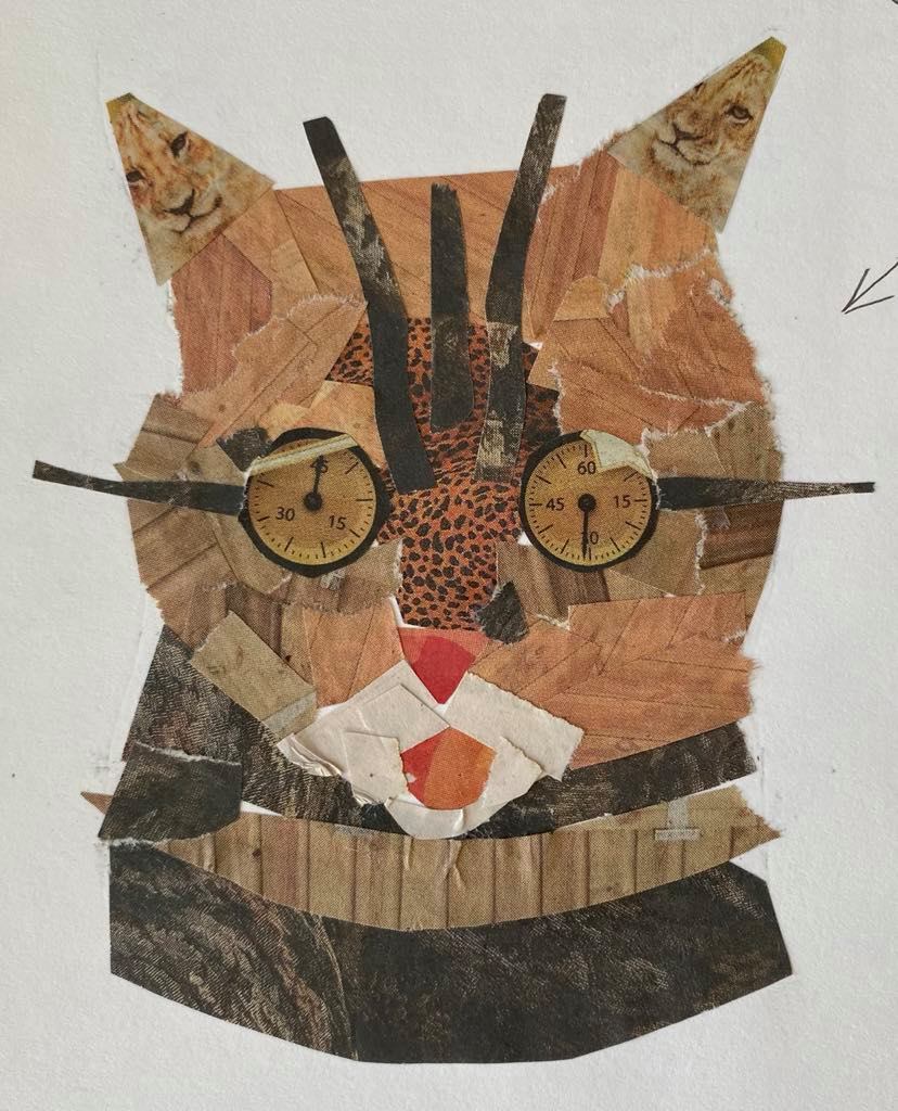
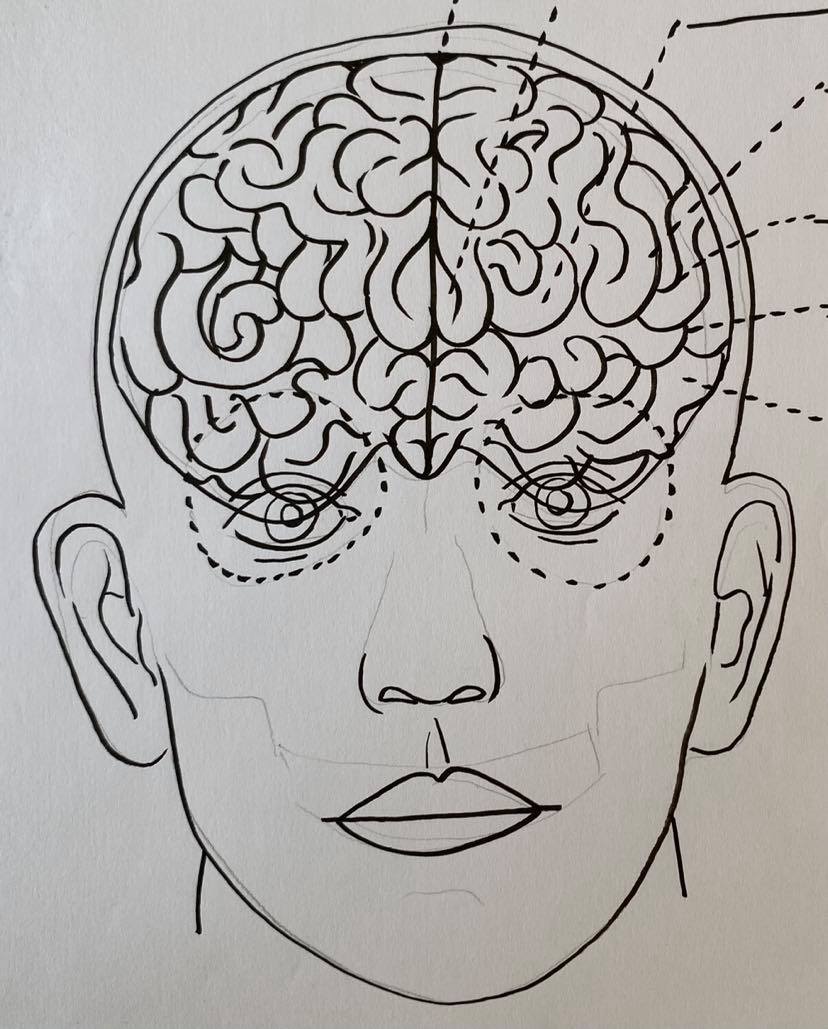
My chosen sketchbook illustrations including working drawings and final pieces:


My chosen area of authorial practice: Fashion & Accessories.
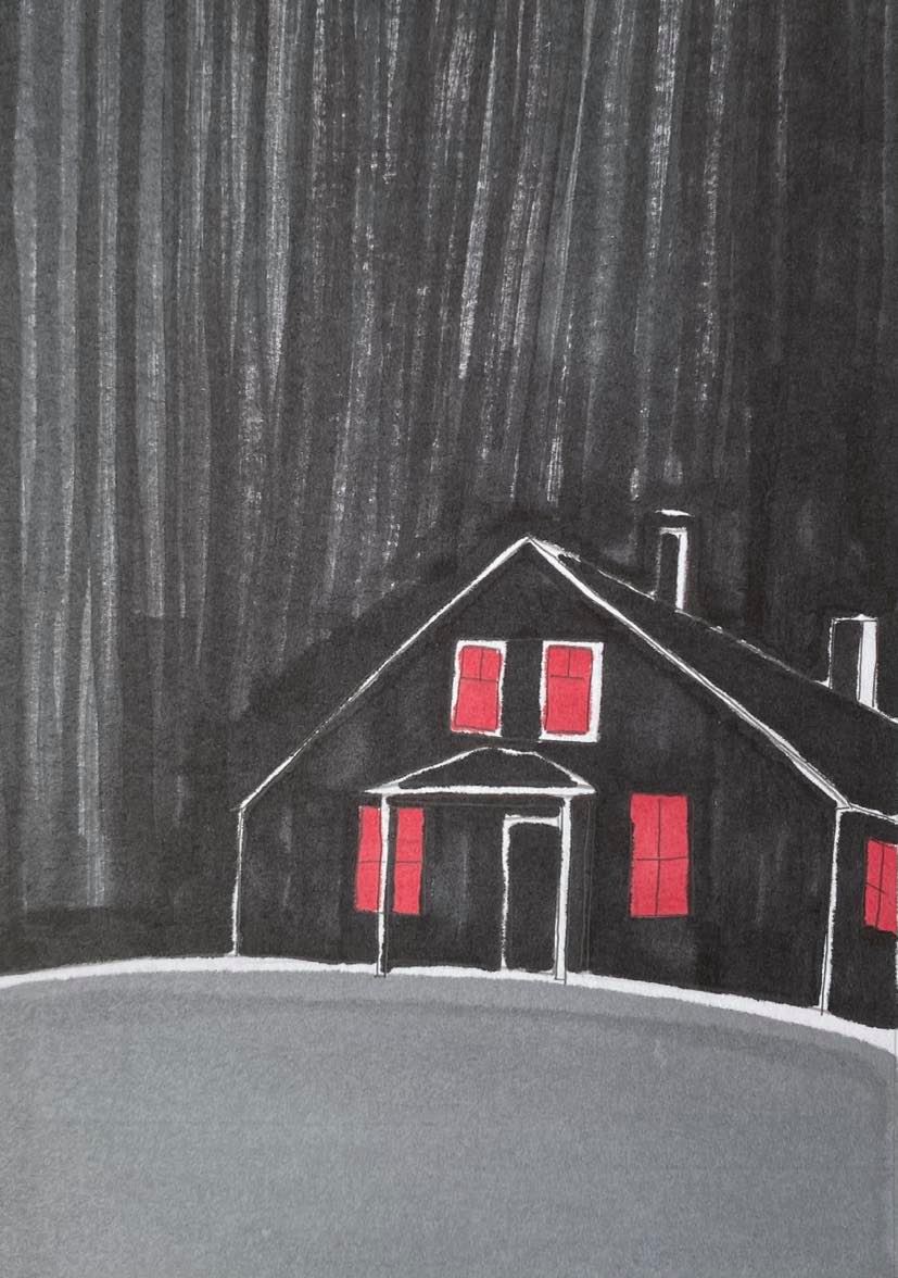
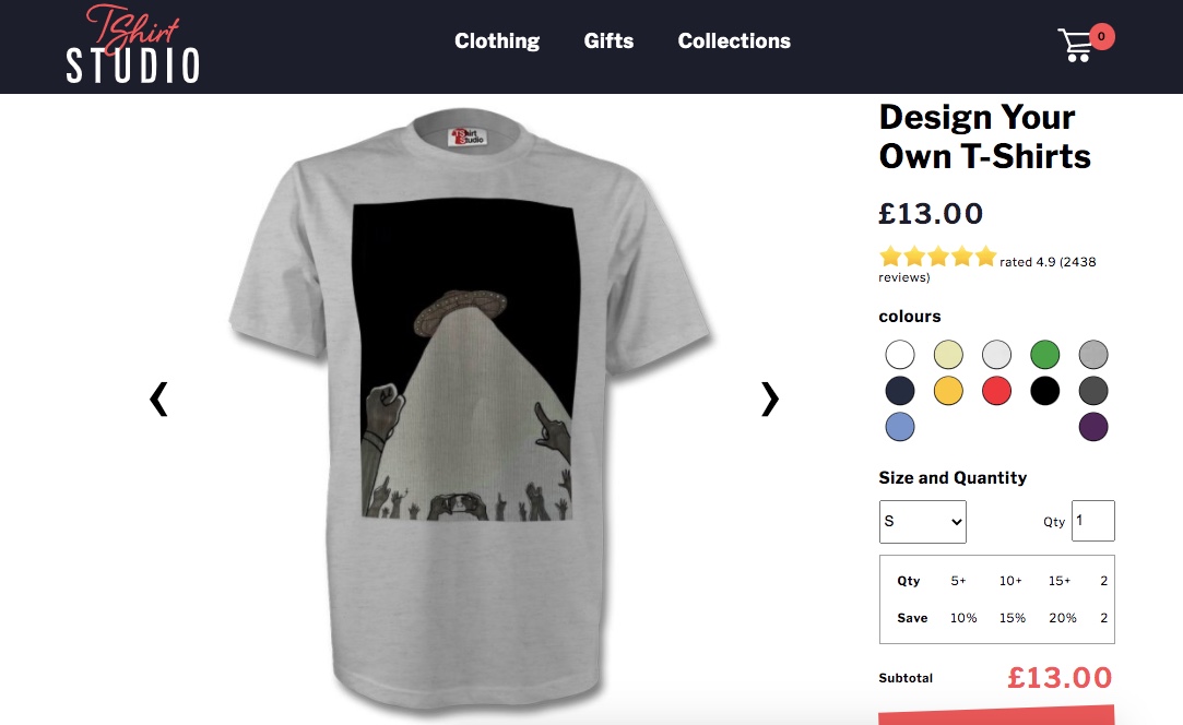
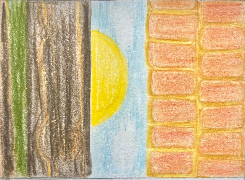
My chosen image from my collection that would be appropriate to put on a t-shirt, a bag and a mug.
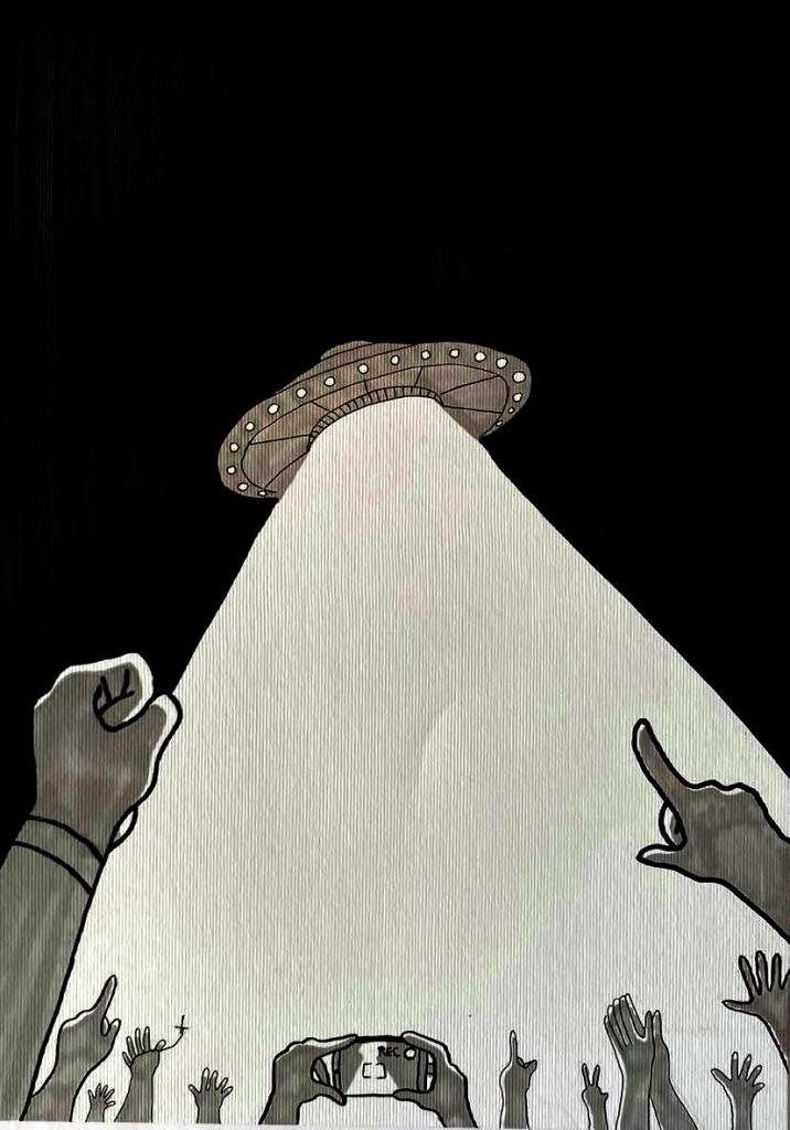

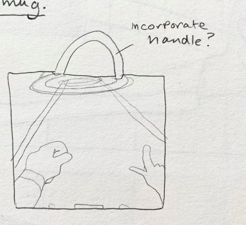
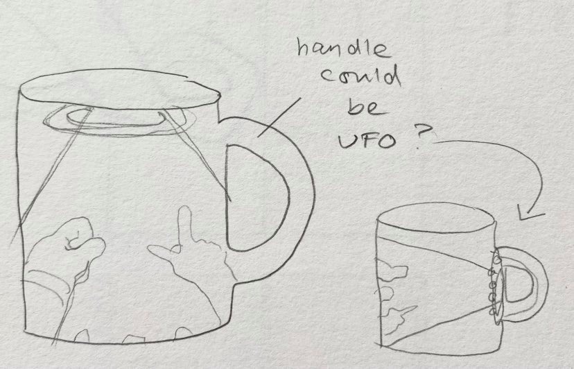
I found a website for the purpose of putting my chosen image on items. The website: https://www.tshirtstudio.com/ below are 3 examples of my design on a on a t-shirt, a bag and a mug. I think that this design would suit anyone who is interested in extraterrestrial life and alien-themed movies, most likely tens (but I can’t talk I love them too and I’m 22 almost 23!) I think they would be mostly attracted to the design featured on the t-shirt, looking at my design now, it reminds me of the “I want to believe” poster featured in X-Files!


Editorial Illustration – Editorial Illustration:
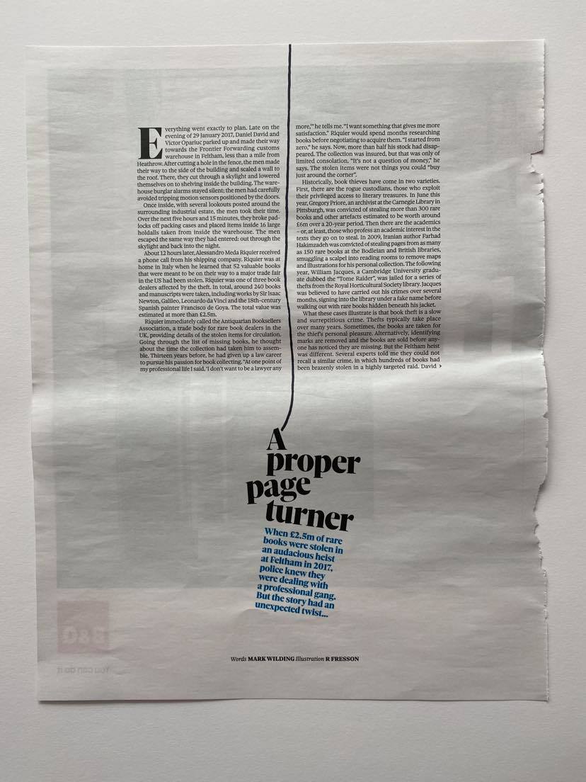
For this exercise I am to go through various newspapers and cut out any article that contains an illustration. I had one newspaper where I found a very good example of this but unfortunately it was the only illustration i could find out the entire newspaper! I decided to look at online newspapers and choose a few examples. Below you will find the illustration from the newspaper and a few other online newspaper articles also:
The actual newspaper article:


The digital newspaper articles:

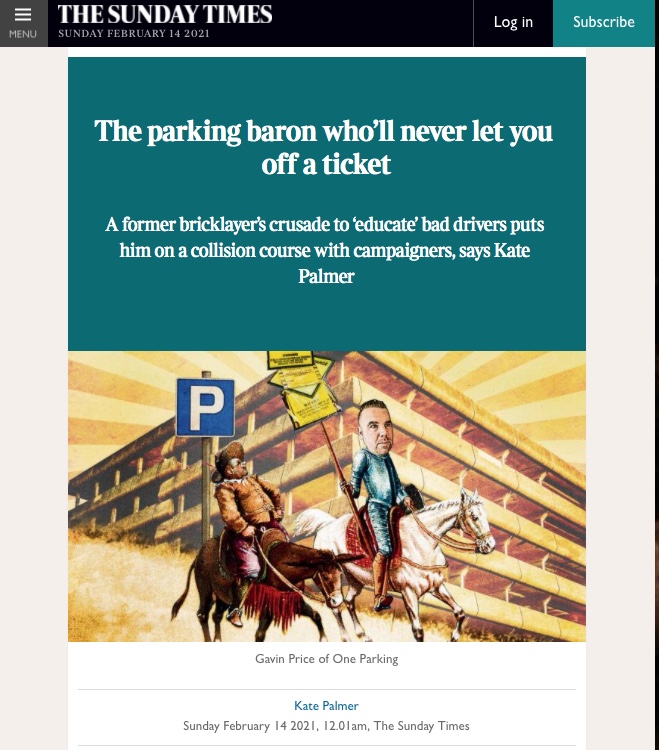
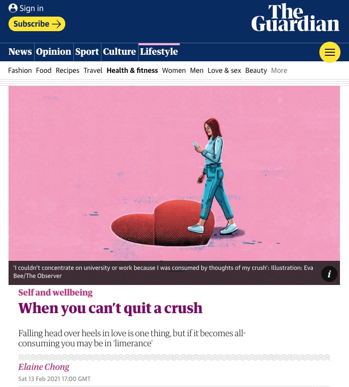

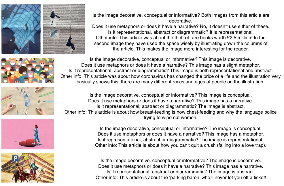
Newspaper image analysis:
Below are links to the newspaper articles:
https://www.thetimes.co.uk/article/the-parking-baron-wholl-never-let-you-off-a-ticket-czxjb5lch
https://www.theguardian.com/lifeandstyle/2021/feb/13/when-you-cant-quit-a-crush
https://www.theguardian.com/world/2021/feb/14/coronavirus-covid-19-cost-price-life
My own illustration based on the title ‘How green is your food?’:
For the brief I have been commissioned by a newspaper to create an illustration. The illustration should be a visual interpretation of my chosen heading ‘How green is your food?’. I will firstly research into medical, health and vegan articles and choose one that I can base my illustration on. Then I will sum up my chosen article in a few sentences and go through said sentences with a highlighter, identifying words that I consider to be important.
To start my research, I actually typed in the title ‘How green is your food’ and got greeted by multiple articles discussing this topic. Most fo the articles discussed the issue of climate change and carbon footprint when it came to meat. As a vegan myself I saw this topic as perfect as I already knew a lot about it! I firstly clicked on an article by the New York Times called ‘Your Questions About Food and Climate Change, Answered’ and read up about how what you eat can effect climate change. The global emissions and carbon footprint of various meat items that are imported and exported to countries around the globe is staggering, this is in comparison to other food items such as tofu, beans and nuts which explains why a vegan diet is overall better for not only yourself but for the environment.
In another article from the Earth Institute at the University of Columbia titled ‘How green is local food?’ they discuss not only how meat and dairy industries are affecting the planet and carbon footprint but also how imported and exported fruits and vegetables impact largely on this too.
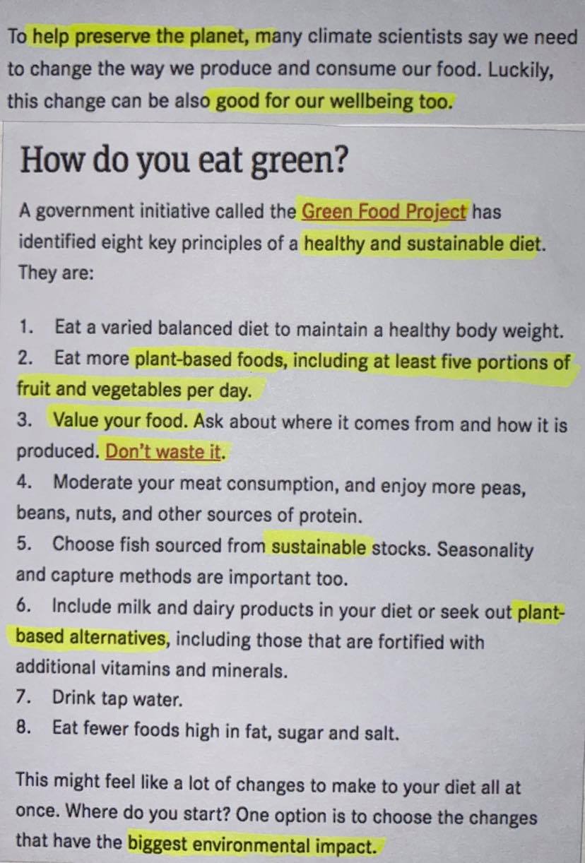
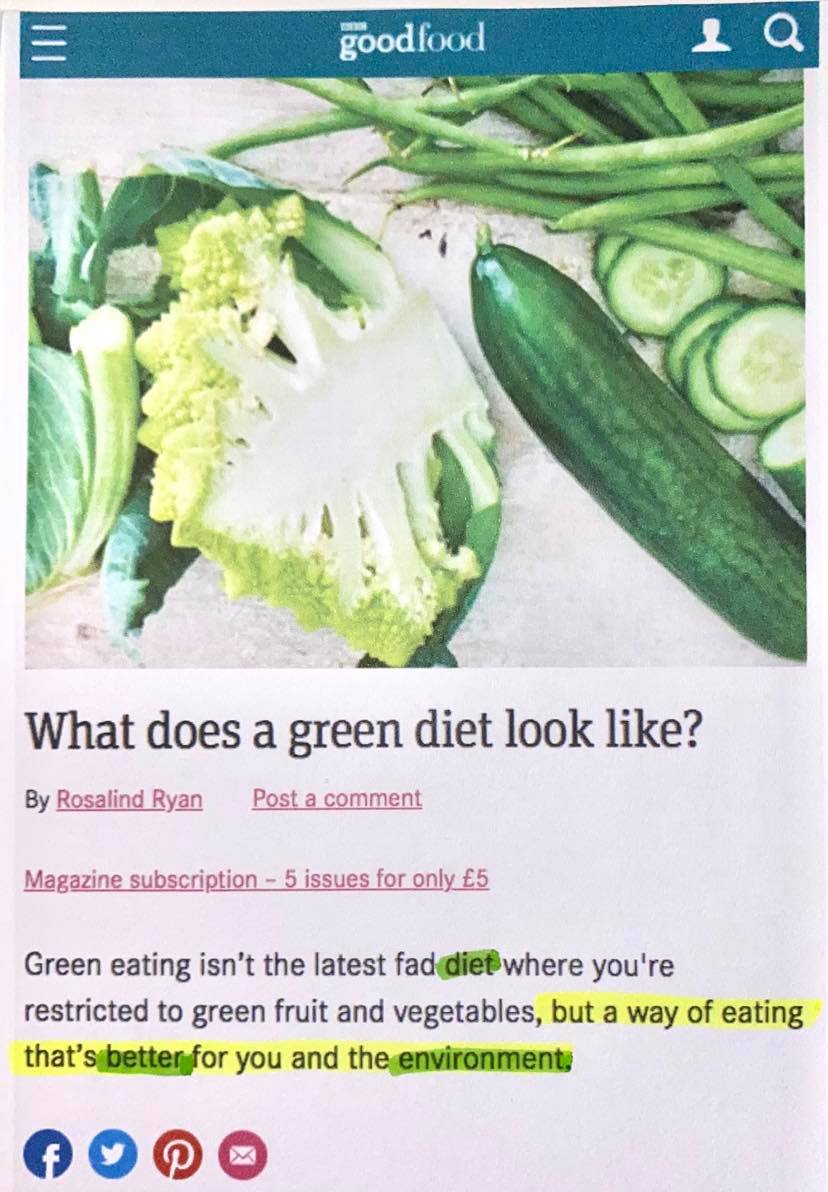
The third article I read was from BBC’s GoodFood website and the article was titled ‘What does a green diet look like?’ This article was also mostly discussing plant based diets, global warming and carbon footprint and interestingly wrote about a ‘government initiative called the Green Food Project’ where the government has identified ‘eight key principles of a healthy and sustainable diet’.
The articles:
https://www.bbcgoodfood.com/howto/guide/what-does-green-diet-look
I have chosen to my illustration based on the article from BBC’s GoodFood website as there are no illustrations featured on it already. I was originally going to choose the New York Times article but there are already numerous illustrations throughout the article and I wanted to keep a fresh mind and not be inspired by the illustrations already used. I cut the article down by half as it was a very long one! (I copied the link again below).
https://www.bbcgoodfood.com/howto/guide/what-does-green-diet-look
I used yellow to highlight the important sentences:

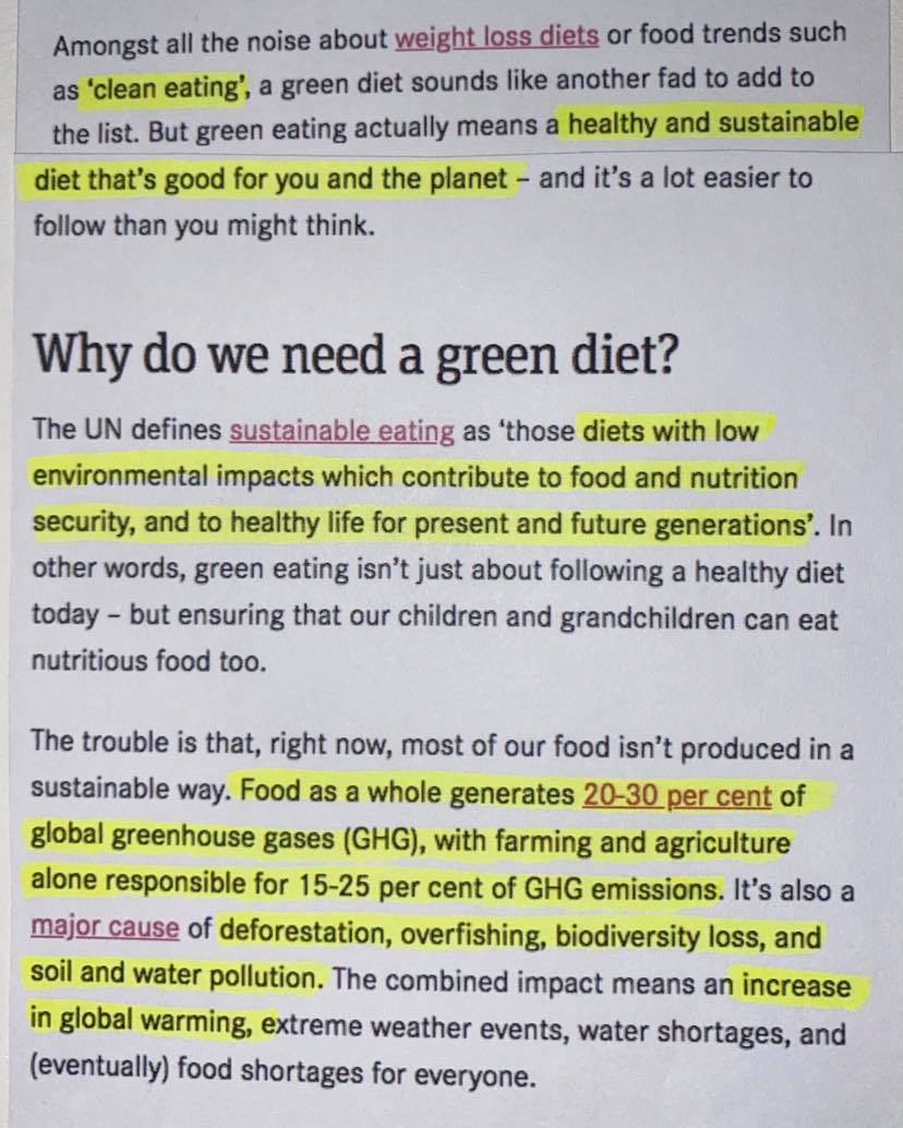
I used green to highlight the important words:


My important words that I will base my illustration on:
- DIET
- BETTER
- ENVIRONMENT
- HEALTHY
- SUSTAINABLE
- PLANET
- GREEN
- NUTRITIOUS
- PLANT-BASED
Next I drew a few thumbnail designs whilst reading through the article again and again:
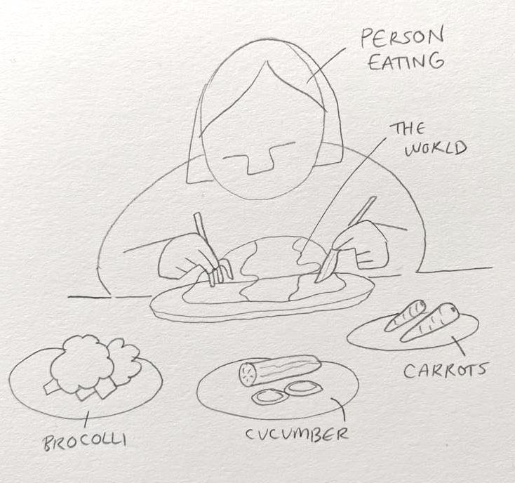

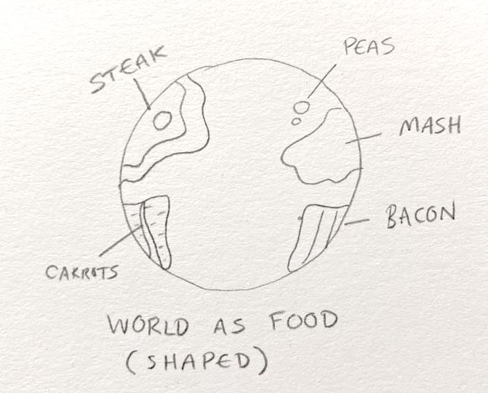
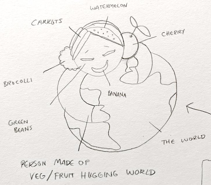
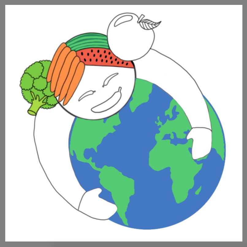
I wanted to focus my thumbnail designs primarily on the topic of ‘loving the planet by going plant-based’ so I knew that I had to incorporate vegetables, the planet and eating into the designs. I like all my thumbnail designs but I thought that most of them were quite basic and have ‘already been done’ so I decided to focus on the thumbnail where the girl (made of fruit and veg) is hugging the world as I haven’t seen this design before. Also it would be relevant to the title and text of the article.
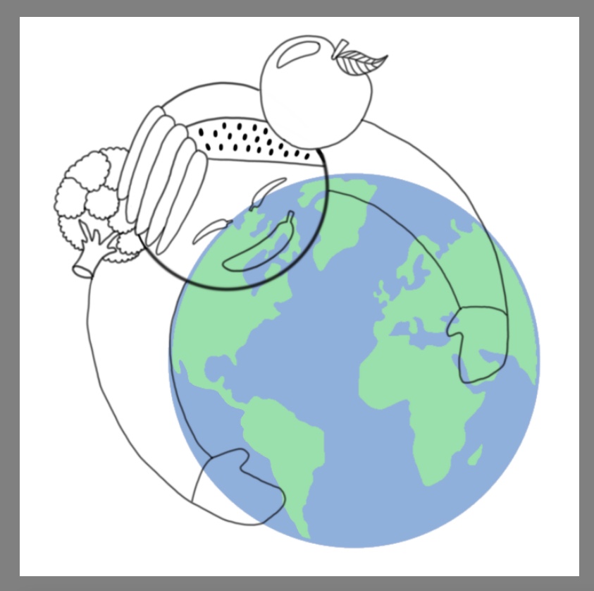
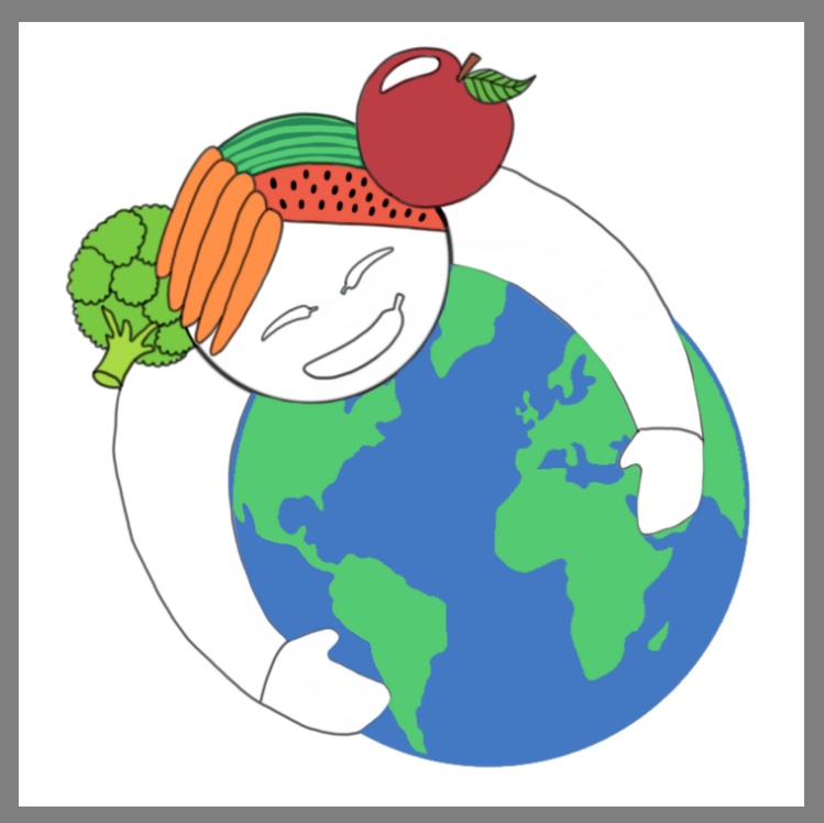
My process of creating my design:


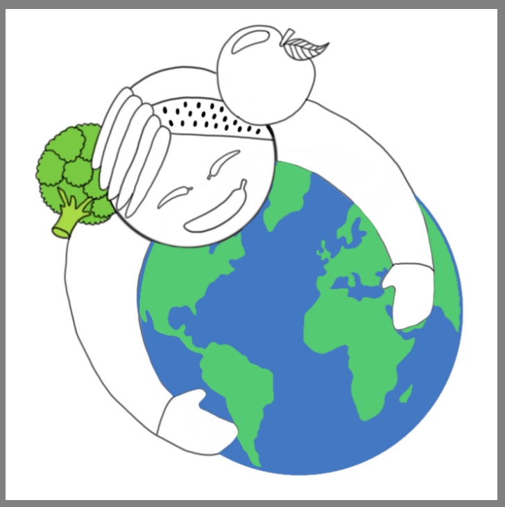


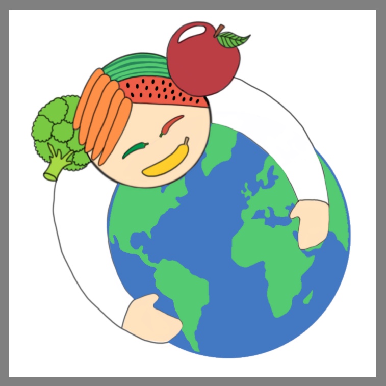


The final design:
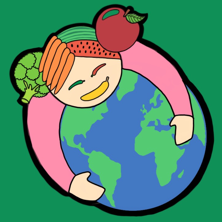
I decided to create this design using my Wacom Cintiq (graphics tablet) as most modern paper illustrations use this medium. I like the way this design worked out and I feel that it could even be used for various vegan news articles as the vegan lifestyle is about ‘loving the planet by going plant-based’.
I enjoyed this exercise as I felt confident about what I was writing and designing as I know quite a bit about this topic as (as I said previously) I am Vegan!
Editorial Illustration – Travel Guides:
My brief is to produce three illustrations for a series of book jackets at the size of an existing travel guide for the locations of Istanbul, Helsinki and Milan. My illustrations should be drawn in a diagrammatic way showing the main attractive locations in the three cities. I need to produce three client visuals as well as one mock up. I need to show my development process including research and thumbnail sketches.
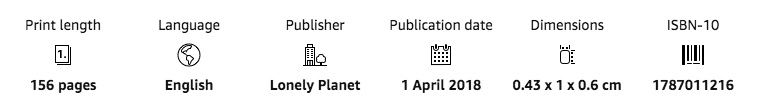
For my research I started by finding 3 travel guides. I decided to find them on Amazon as I know that they add all the details including the dimensions of the travel guides. There were 3 ‘lonely planet’ guides that I found useful so I decided to use them.
Istanbul:

Helsinki:
Milan:

Next I researched the best tourist attractions of each destination, I found a helpful site called ‘Planetware’ where I found all the photos below.
Istanbul:
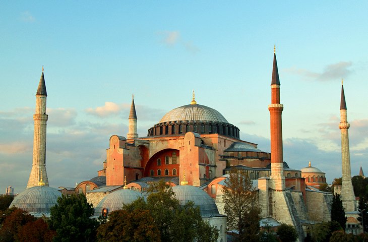
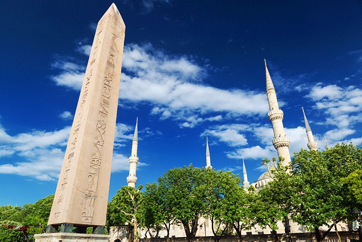

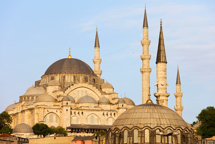


https://www.planetware.com/tourist-attractions-/istanbul-tr-is-i.htm
Helsinki:


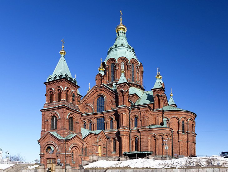
https://www.planetware.com/tourist-attractions-/helsinki-helsingfors-sf-udn-hels.htm
Milan:

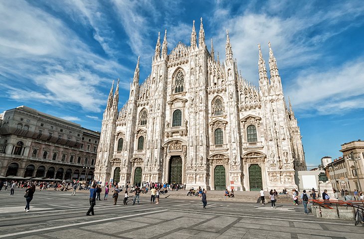


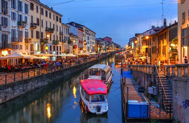


https://www.planetware.com/tourist-attractions-/milan-i-lo-m.htm
Next I researched the maps of the destinations, strangely when I typed in (for instance) ‘Map of Istanbul’ the first image of all three destinations came up from the same ‘Lonely Planet’ as the actual travel guides:
Istanbul:

Helsinki:

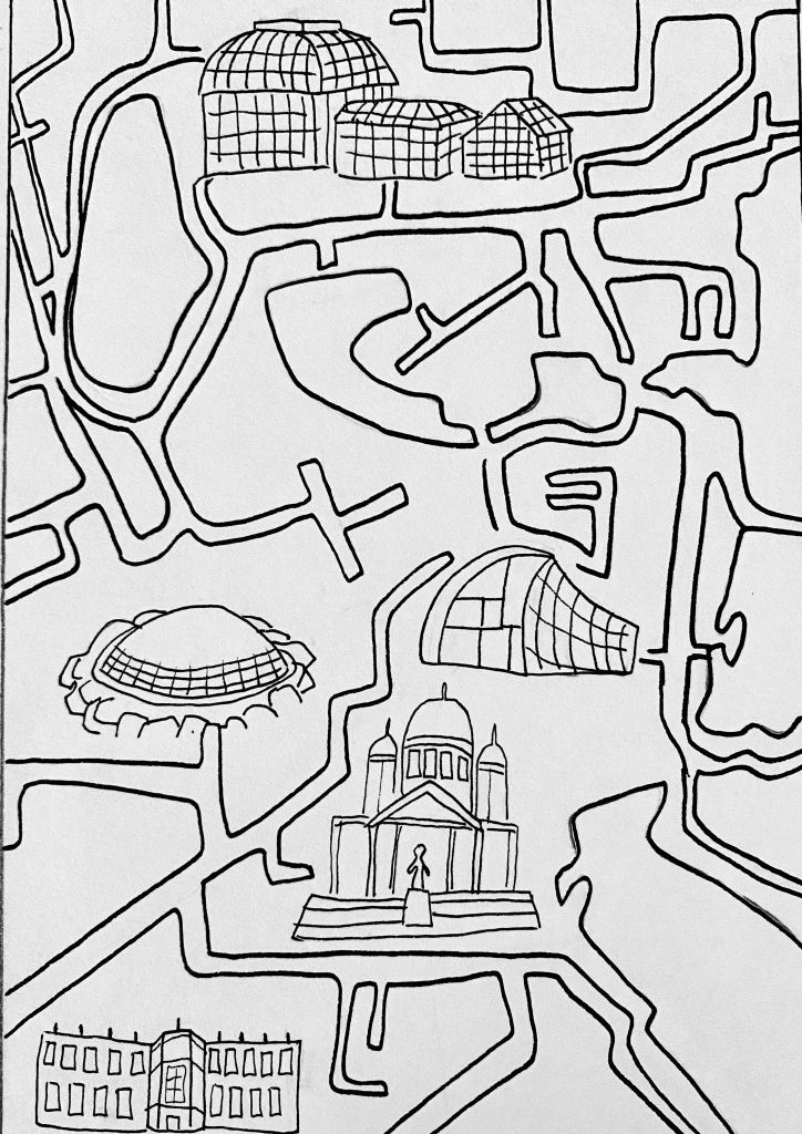
Milan:

Next I started on my thumbnail designs:

Then I created my 3 client visuals working in the dimensions of the travel guides:
Istanbul:

Helsinki:
Milan:

Finally I created my one mock-up design for one of the travel guides:


I found this exercise interesting and I think it only worked because of the amount of research I did as I knew pretty much nothing about any of these destinations as I have never travelled. I think that all of my visuals are good and meet the brief. I enjoyed creating the thumbnail designs and visuals for Istanbul the best which is why I decided to continue with the visual for this city and created the mock-up. I found the maps from ‘Lonely Planet’ very helpful because they helped me to figure out the size of the cities and where most of the tourist locations are.
Website that I used for my mock-up: https://mockups-design.com/
Project – Text & Image
Most imagery is commissioned to work together with typography.
My exercise is to take each pair of words in turn from the list below and write them in my own handwriting:


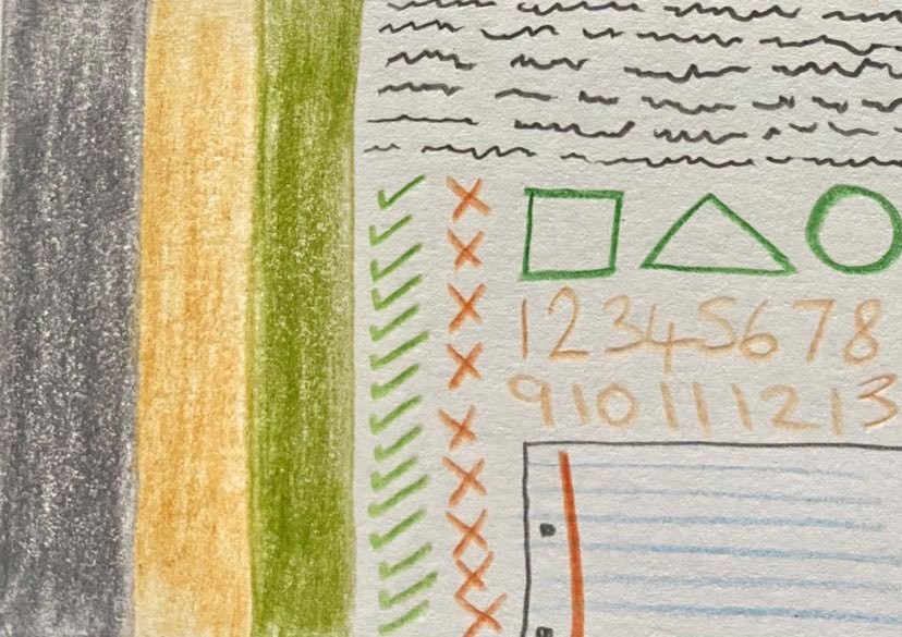
Now I write each pair of opposites in a way that is descriptive:

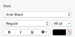
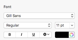
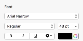
Next I find suitable fonts on my computer (Apple pages) document program:
Below are the fonts I used:


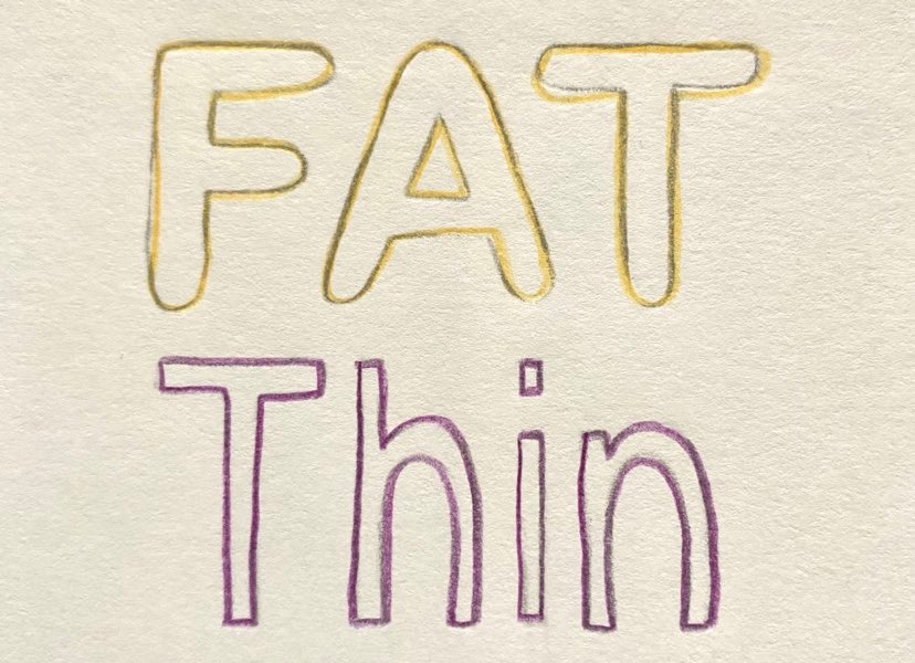
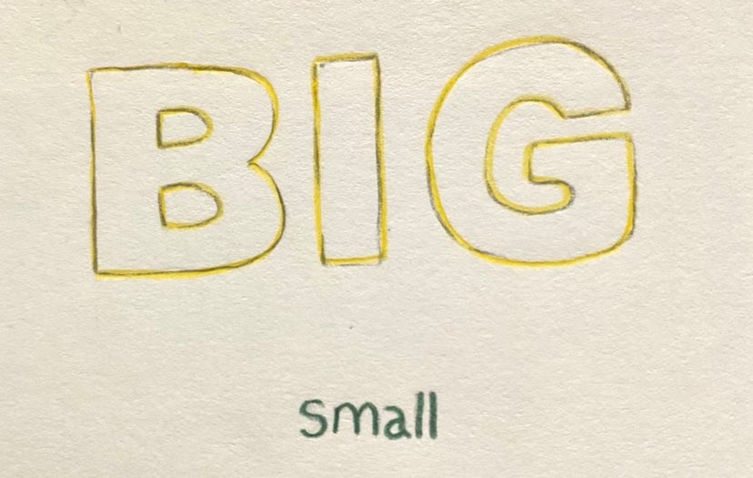
I then traced the typeface in pencil using colours that communicate its meaning:


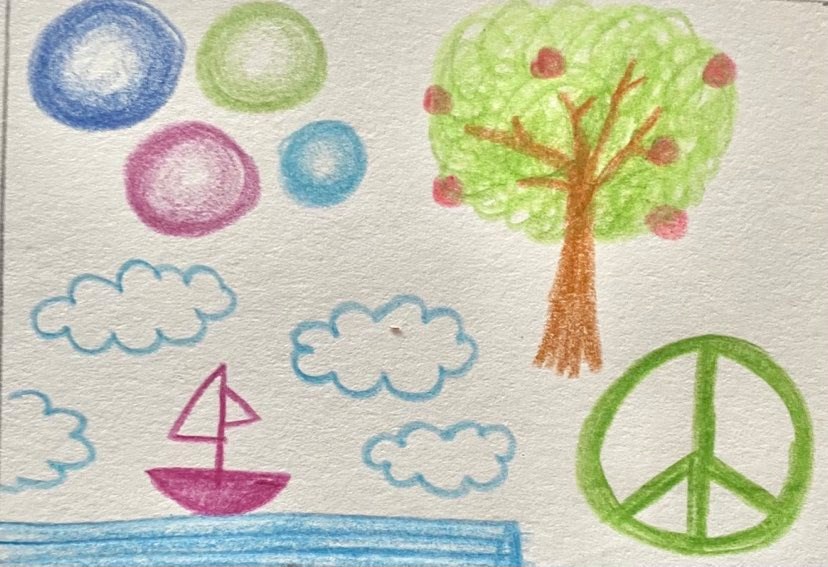
Next I created mood boards for all the words to explore texture, line quality and colour combinations:
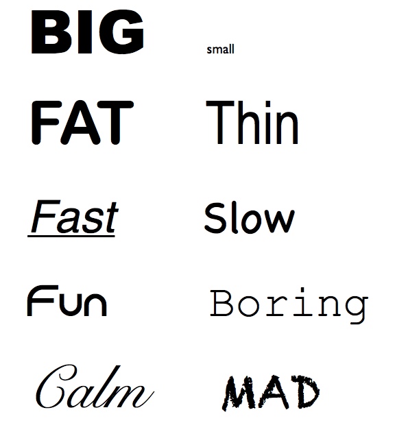
Big –
Small –
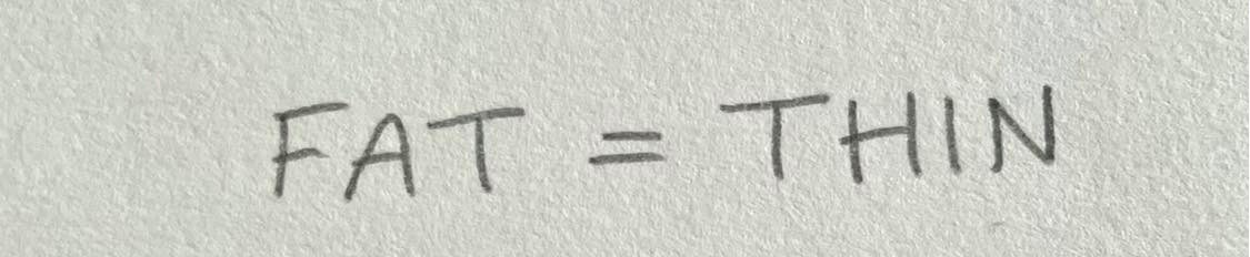
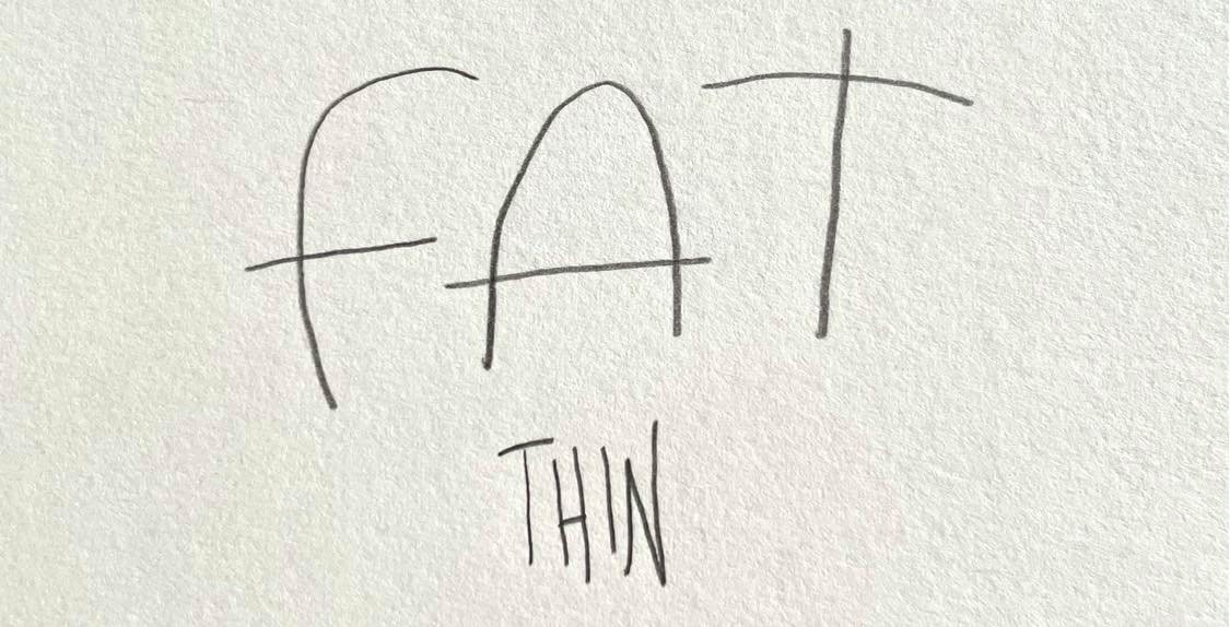
Fat –
Thin –
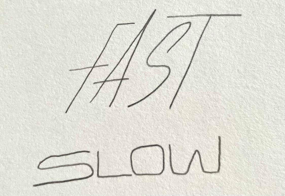
Fast –

Slow –

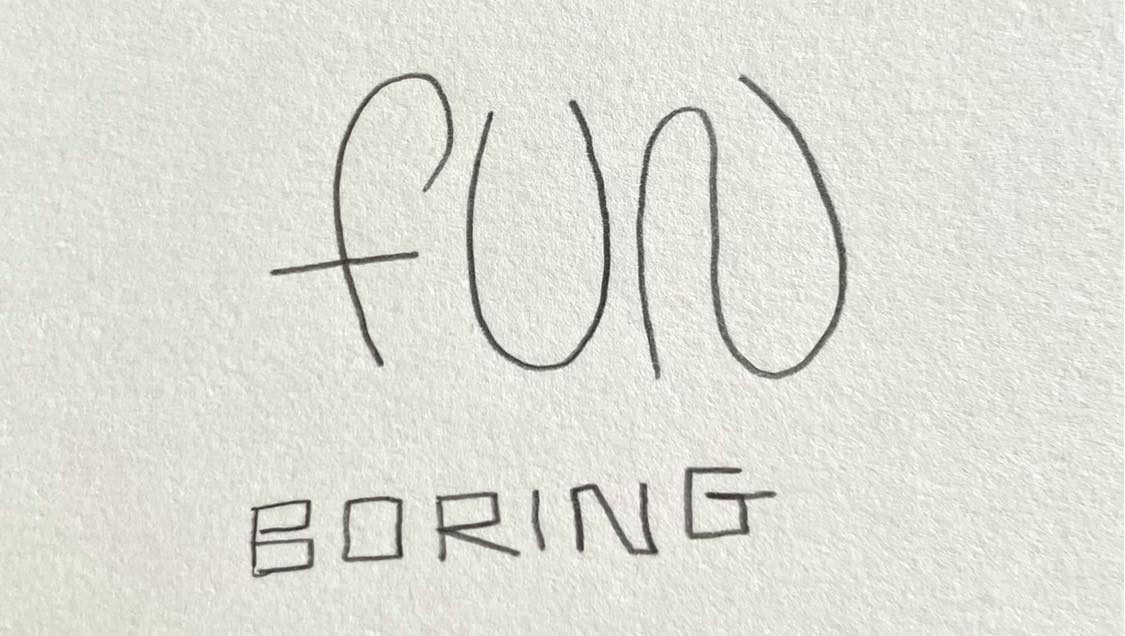
Fun –

Boring –
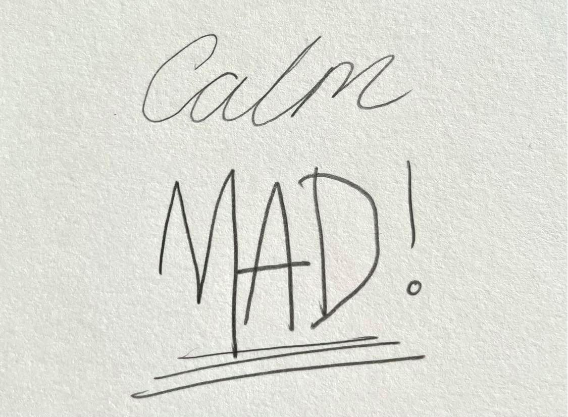
Calm –
Mad –

Finally I re-drew the words again and then rendered them using the colours, textures and line quality that I created previously:


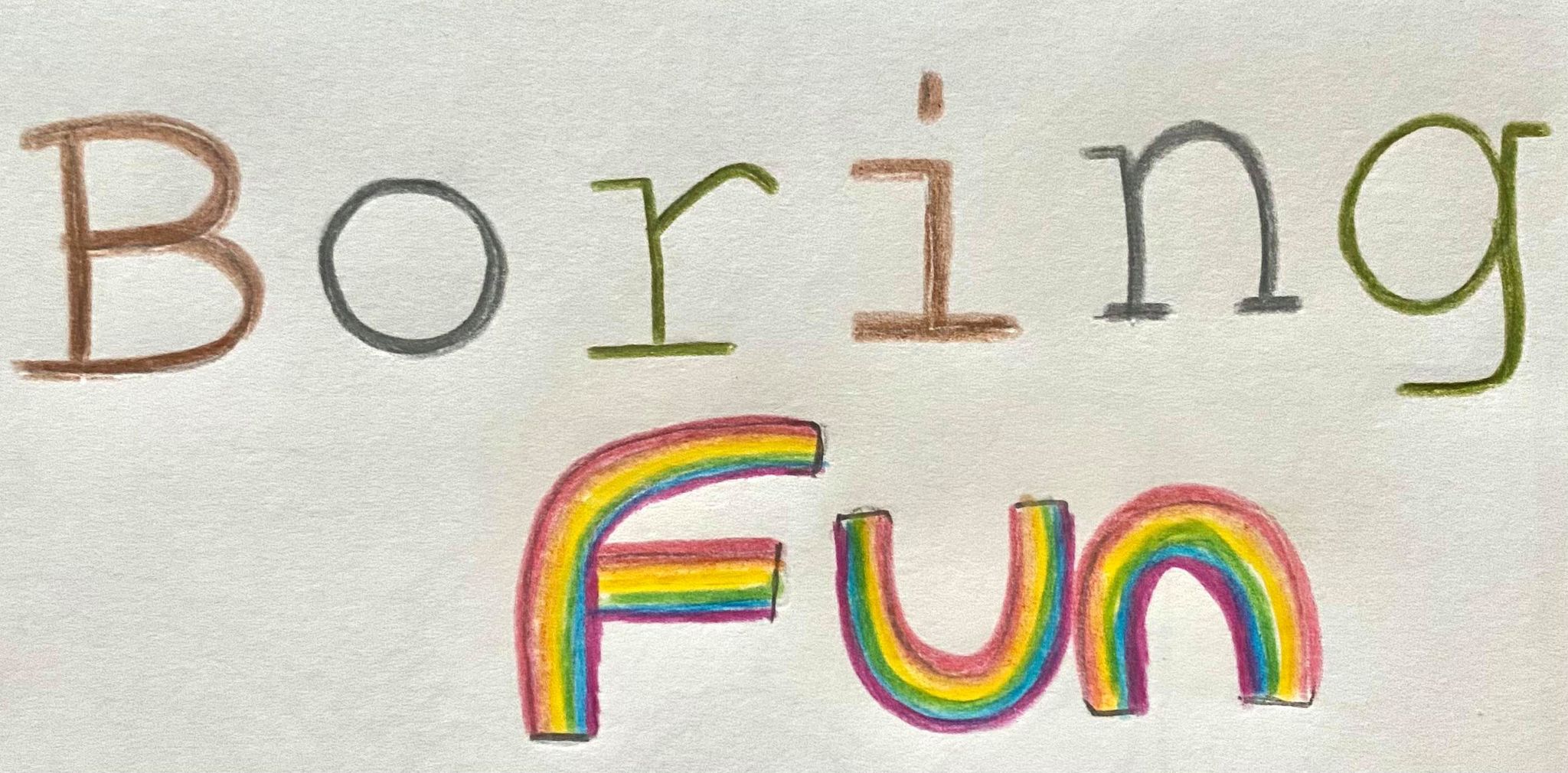


This project asked for me to design a number of words in a way that is descriptive. I enjoyed this project as it really made me think about how I wanted to design the words in a visual way. I had to go through a process of firstly writing the words down in a visually descriptive way. Next I had to find suitable fonts on my computer (Apple pages) document program and print them off,I then traced the typeface in pencil using colours that communicate its meaning. I found this part tricky as I had to really think about what colour matched the meaning of the word. For ‘big’ I chose yellow for the sun, for ‘small’ I chose green for a blade of grass, for ‘fat’ I chose a yellow/orange colour for fat in the body, for ‘thin’ I chose purple for the colour of food that someone wouldn’t want to eat so they’d become skinny, for ‘fast’ I chose blue for the blue skies in which an aircraft flies, for ‘slow’ I chose grey for grey clouds/smoke that pass slowly, for ‘fun’ I chose purple/pink colour for balloons, cakes and celebration items, for ‘boring’ I chose brown as it’s a horrible colour to write with, for ‘calm’ I chose green for nature and for ‘mad’ I chose red for obvious reasons (seeing red). The next part of my process was to create mini mood boards for each of the words, I found this part to be the most interesting and challenging part of the project as (yet again) like it did in the previous part I had to really think about what I was I wanted to express for each word. Finally I had to draw out each of my words using the colours, line quality and textures that I created in the previous part. Personally I think that all my outcomes are good for this project, my most favourite being the word ‘fat’ as I made the word out of fat molecules!
Exercise – Packaging:
My brief is to produce a series of illustrations for packaging to be used for a new range of organic biscuits for children. The three varieties are Raisin, Chocolate Chip and Ginger. I need to produce three illustrations featuring extinct animals interacting in some ‘fun way’ with a biscuit to be used on the boxes. The drawings should be in full colour and the colours should reflect the flavour of the biscuits. I need to research into Tesco and the organic biscuit supplier ‘Organix’ to understand how the ‘character’ on children’s biscuit packets connects with the biscuits themselves. How will my packaging stand out amongst others? The packaging has to appeal to both adults and children. I need to decide on what typography I will use (hand-drawn or font typeface?). I need to show all stages of development including thumbnail sketches, visuals for all 3 and a mock-up for at least one (but I will do a mock-up for all three varieties of biscuits).
My findings: Tesco
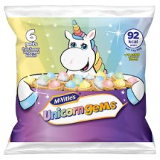


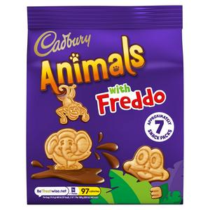
The biscuits that are shown about are not organic but I wanted to show how the brands use characters as a way of interesting the children to want to buy these items. All brands that create biscuits made for children use characters that match what the items flavour, colour and name of packet is. For instance, the Unicorn Gems from McVities use pastel colourings for the icing on top of the biscuits and have incorporated an illustrated unicorn character holding the Unicorn Gems on a platter. The colours of Unicorn Gems are more vibrant than the original Iced Gems shown above, I think McVities wanted to add some diversity by creating a ‘girl themed’ packet that they could choose over the blue original packet with a polar bear on it for the ‘boys’, the only change is packaging and a small difference in colourings in the icing, the actual product is exactly the same, a small biscuit with icing on top. Its similar with the other biscuits from Tesco, the Barney Bear looks the same as the sponge bar product, the pink wafer bars show the Pink Panther which is a well known character even before the wafers came out and the Cadbury’s Animals with Freddo show three different characters interacting on the packaging cover, the monkey biscuit swings from the ‘A’ on the animals typeface, the elephant splashes in the chocolate (to show there is chocolate in the biscuits) and the frog is hiding in the leaves in the corner of the packaging.
My findings: Organix
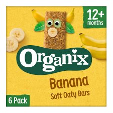
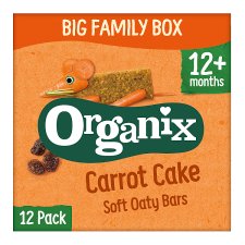
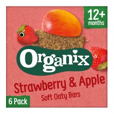


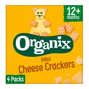
These five examples are from the ‘Organix’ company who supply food for children from the age of 6 months + and it is also organic (like the biscuits that I am supposed to be making packaging for). As all the items that they produce are exclusively for children they have a continuous theme running through the packaging, every package shows a character made from actual images of the product itself but they incorporate other elements into it to create characters from them. For instance on the ‘Banana Soft Oaty Bars’ the character’s body is formed using the bar, then other elements are added such as a banana and banana tree leaves behind the bar, the banana has created horns and the leaves have created ears, there is also a nose made from a slice of banana and they have added another element of goggly eyes on it to give it life. Overall you now have a character on the front of the packet that looks like a cow. The cow is also poking out from the logo on the front packet so it is slightly interacting with it. This pattern is shown through every other packet from the company, just using other items such as strawberries and apples.
On a different note the typography is very simple and bold so that children can understand what flavours are inside the packets. The logo is also green and white showing the ‘organic’ green element. The background of the packets are also bright but not artificially bright, they are bright enough to intrigue children.
Organix – https://shop.organix.com/collections/all
Moodboards for each biscuits:
Ginger Biscuits:


Chocolate Chip Biscuits:


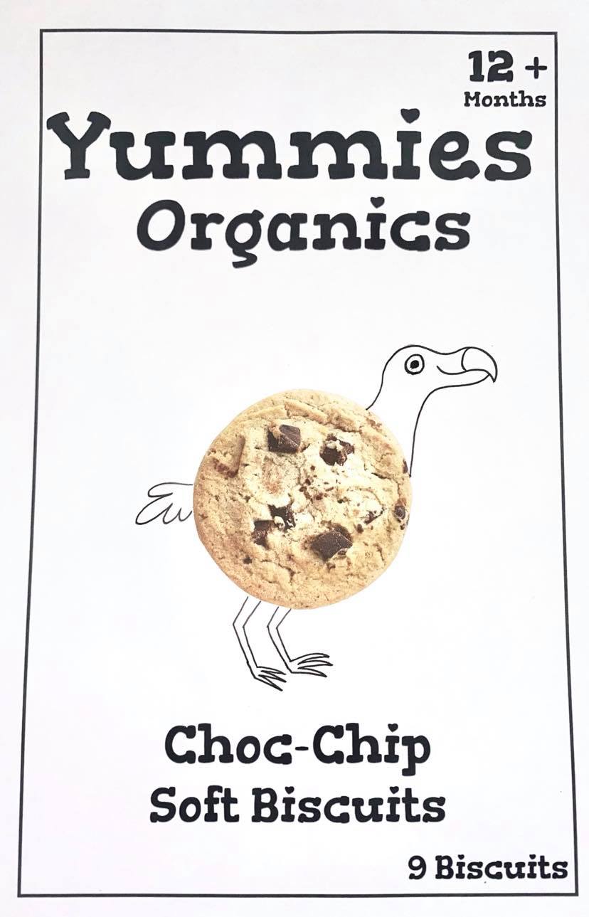
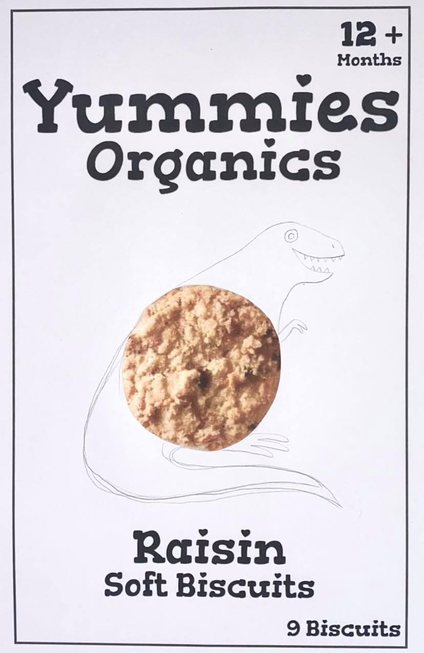
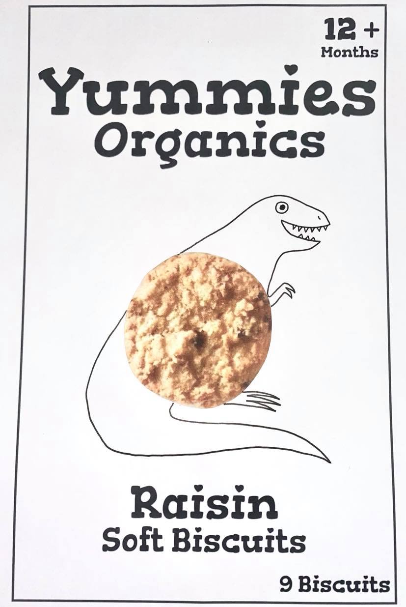
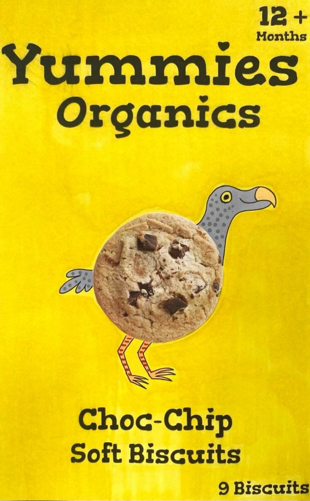
Raisin:


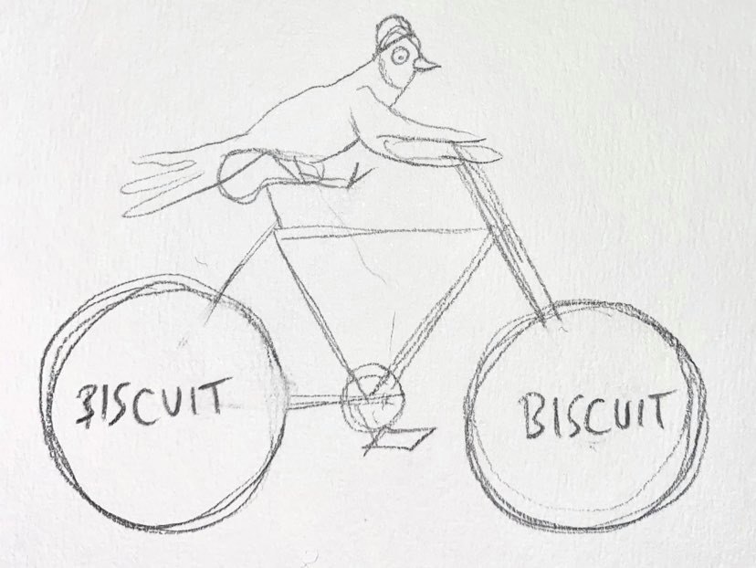
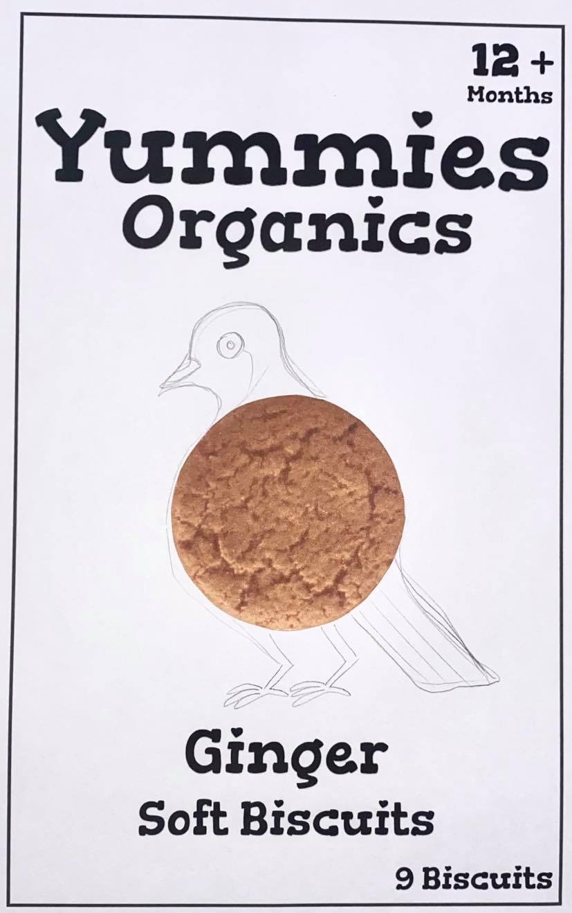
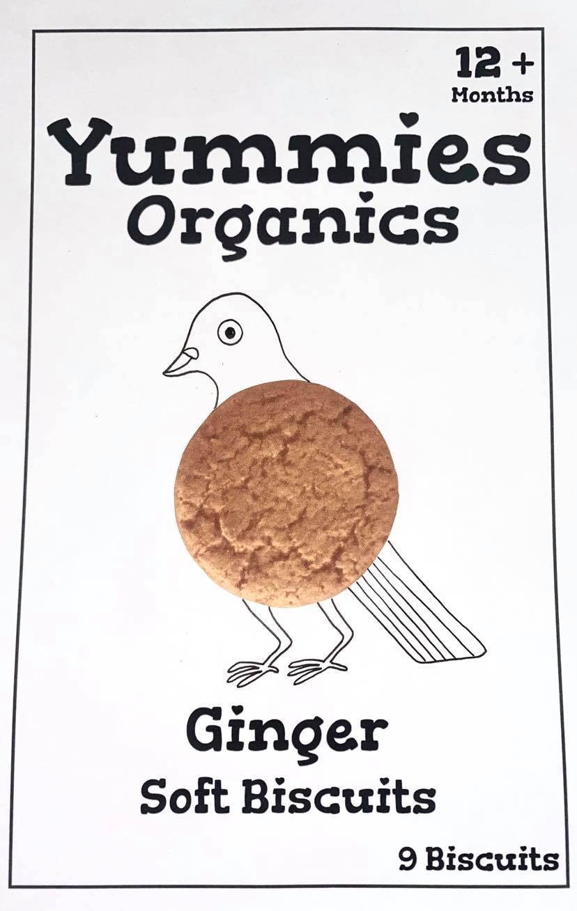
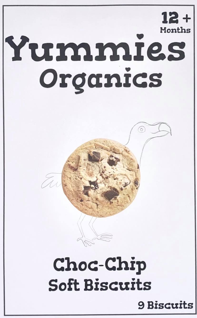
For my extinct animals I have chosen the Passenger Pigeon, The Dodo Bird and the T-Rex Dinosaur:
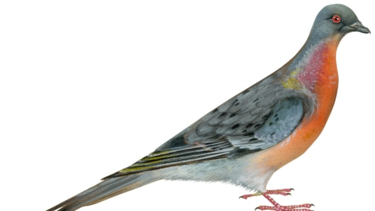


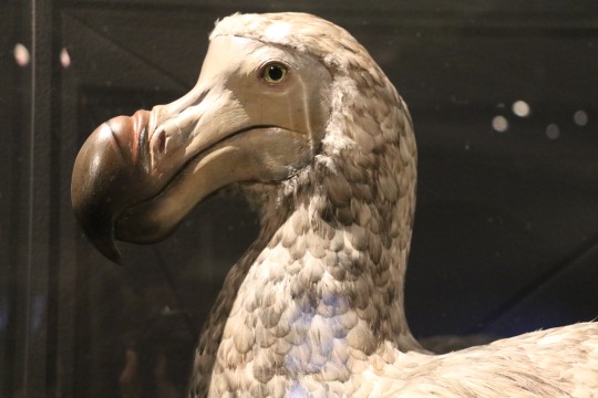


I chose these animals because they are easily recognisable, well liked and could easily be made into a character for my biscuit packaging as they are very comical. I have chosen to use the Passenger Pigeon as the character for the Ginger Biscuit because of its bright orange chest, I have chosen to use the Dodo as the character for the Chocolate Chip Biscuit because of its speckled feathers and brown beak and lastly I have chosen the T-Rex as the character for the Raisin Biscuits because of its bumpy skin and scales.
Designing my characters for each biscuit package:
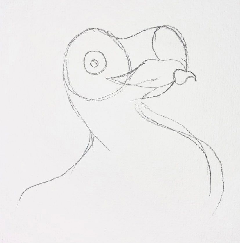
Passenger Pigeon for Ginger Biscuits:


Dodo Bird for Chocolate Chip Biscuits:


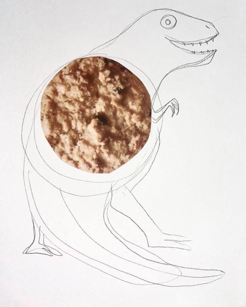
T-Rex Dinosaur for Raisin Biscuits:


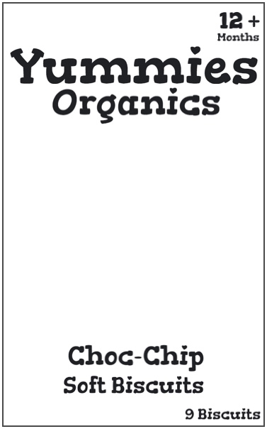
I am choosing to design my biscuit packaging at the average scale (for children’s biscuit boxes) of: W : 13cm x L : 21cm.
The font: I have chosen to keep to one font for the logo, the flavour, small description, amount and age suitable for. The font will range between large and small size letters depending on the importance. The font chosen must be easy to read but also fun.
To find the perfect font I chose to look on Google Fonts, a database where all the fonts used on Google are easily accessable. I typed in Organic Biscuits into the text bar to get an idea of what the font would look like on my packaging. I also used a filter on the search so that it only came up with fonts with a thickness of over a certain amount.

There were about 1043 fonts that I could have chosen from and to be honest most of them were quite similar so I chose 4 that I thought would look good on the packaging. The first one is called Organically – By PintassilgoPrints, The second is called Yummo – By Flat-it, the third is called Neuton – By Brian Zick and the forth is called Gorditas – By Gustavo Dipre.


Out of all four fonts there is an obvious winner, Gorditas – By Gustavo Dipre (the last font). The style of the font is child-like and the Tittle’s (dots on letters such as i’s and j’s) are created using hearts instead of round dots like the other fonts. I have chosen this font as the one I will use for the packaging.
Package Design with font (with no colour) in place, scaled down:

I have decided to hand draw the illustrations for the packaging, this I think would make the packaging seem more ‘organic’ because I would colour it in also by hand using coloured pencils rather than a synthetic feeling packaging with ‘perfect’ colours on them like for instance McVities use on there Iced Gems and Unicorn Gems packaging. I will then add the illustrations to the packaging template that I created for each package.
Line visuals for each biscuit package:
Ginger:
Choco-Chip:
Raisin:
Final designs for each biscuit package:
Ginger:

Choco-Chip:
Raisin:

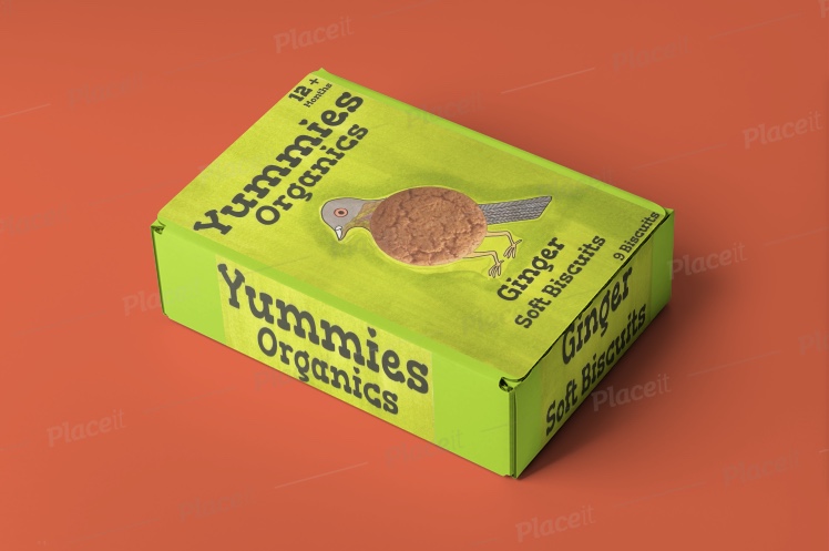
Mock-ups for each biscuit package:
Ginger:
Choco-Chip:

Raisin:
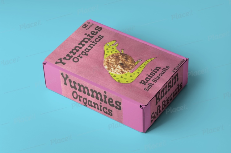
Overall I am satisfied with my designs for all three biscuit packages. I think I have covered the brief well, I have made it so that the characters on the front packaging interact with the biscuits, I made it so that the abdomen of all three characters are the actual biscuit. I enjoyed the developmental process of this exercise, I found it interesting to see my design without the colours or illustrations added to it. I used the website ‘Place-it’ for my mock-up designs and I found it really helpful to add a similar colour to the mock-up boxes as well so that I could see what the product would look like in 3D.
Project – Working for children:
For my brief I need to create an illustration of an animal engaging in an activity that communicates a word from a list. The list of words include: Festival, Scary, Wild, Growing, Journey, Sad, Family or Discovery. Firstly I need to collect examples of imagery for children, then I need to group the illustrations into target age groups. The age groups include: Pre-reader, Pre-School (3-5), Early Reader (5-7), Established Reader (7-9) and Older Age Group. I then need to choose two age groups and brainstorm around at least one of the words from the list above. Now I need to pick and appropriate animal for my chosen age groups and brainstorm to identify themes, images and ideas for my age groups. I then need to create a simple image of my chosen animal engaged in an activity that communicates the chosen word. I need to explore the use of colours and materials for my illustrations in this project.
I firstly created folders on my computer so that I could drag the images I found on the internet into them depending on the age ranges:

For the image searching I found it easier and more accurate to focus on the front cover of books for different age ranges. I found a very helpful site that helped me with this. The site is called penguin.co.uk (the book publisher) and it even has a helpful site bar where you can refine the books down based on the age ranges:
https://www.penguin.co.uk/genres/children.html

Pre-Reader:


Pre-School (3-5):


Early Reader (5-7):


Established Reader (7-9):


Older Age Groups:


Chosen Age Groups for Brainstorming:
Pre-Reader:
Growing:
- Height – growing as in getting tall
- Baby growing in womb
- Plant growing
- Baby teeth growing through
- Growing – hair, nails etc.
Older Age Groups:
Growing:
- Growing as in development
- Puberty – growing up
- Growing as a person – understanding bullying
- Vegetable growing from seed to vegetable
- What future will be like – growing up
Chosen Animal for Pre-Reader:
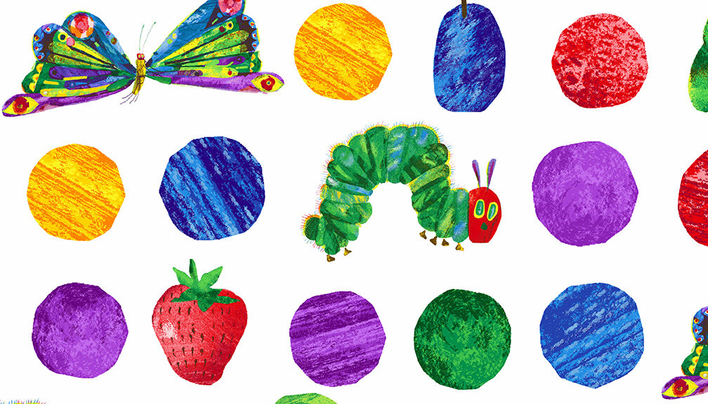
Butterfly (easy to understand what the animal is as most very young children see butterflies outside at any time of year in parks, forests etc.


The parent or carer normally points them out, “look a butterfly!”. There’s a good example of this butterfly development for pre-readers in a very well-known book ‘The Hungry Caterpillar’ by Eric Carle:
Chosen Animal for Older Age Groups:
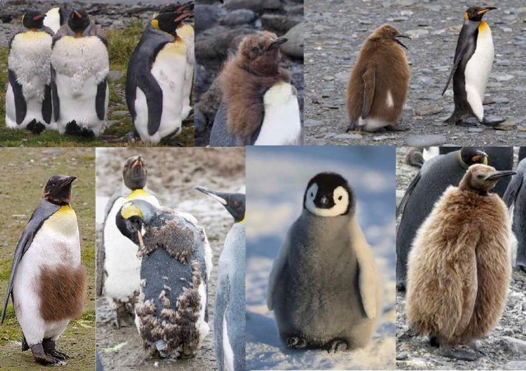
Emperor Penguin (the funny way that emperor penguins go through growth spurts like us humans when they reach puberty). The juvenile penguins go through the same annoying situations like we do, they start of as baby penguins with a very ‘cute’ grey, black and white colour scheme, then they molt again and turn into young penguins with big fluffy brown feathers that make them look sweet but when they eventually start puberty their brown feathers start falling out in order to make room for the adult feathers (yellow, black and white). But they don’t fall out all at once or easily, they slowly come out one by one giving the juvenile a very sad (teenage-like) ‘hairstyle’. Here’s two examples below (poor things!):


And here’s an example of what the penguin originally looked like (prepubescent):

And what the baby penguin looks like at the start of life:

There’s also a certain amount of humour for the older age groups (pre-teens onwards)
Brainstorming for pre-reader (butterfly – growing) illustration:

Brainstorming for older age groups (penguin – growing) illustration:
Thumbnail sketches for pre-reader (butterfly – growing) illustration:

Thumbnail sketches for older age groups (penguin – growing) illustration:
Visual for pre-reader (butterfly – growing) illustration:

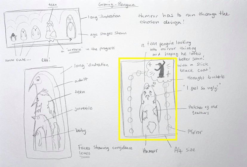
Visual for older age groups (penguin – growing) illustration:

Final illustration for pre-reader (butterfly – growing) illustration:

I decided to start the design by changing the placement of each stage of the process of the butterfly’s development so that it starts at 12:00 and ends at 9:00 this way it’s easier to see where the process starts. I think this design would be better if the colour scheme was different. I think there are so many colours that it’s actually confusing to look at, especially for a young child. I think out of my two illustrations for this project, this one is the weakest, it’s quite ugly when I look over it! The only decent element is the caterpillar in the first image at 12:00.
Final illustration for older age groups (penguin – growing) illustration:

Out of my two final illustrations for this project this one has to be my favourite, actually I think it’s one of my favourite outcomes out of the course! I am really happy with how this turned out as it’s easy to see what is going on in the image and I like that fact that I used a better colour scheme in comparison to the other outcome (butterfly). If I was to change anything it would be to add background so that it is easier to see that he is looking in a mirror. I think the fact that I chose this format really helps the overall feeling of the image and there isn’t any empty space also unlike the other (butterfly) illustration.
Questions to answer (from the course-book) about this project:
- Are the target age brackets for children really as clear-cut as we’ve made them here ?
I think it depends on the child’s personal developmental stage, sometimes children can be slower or faster than their peers, this could be due to developmental delay or other circumstances that create a lapse in the development of a child, this could be trauma or neurological deficit. For the majority of children though the target age brackets for ‘average development’ is fine.
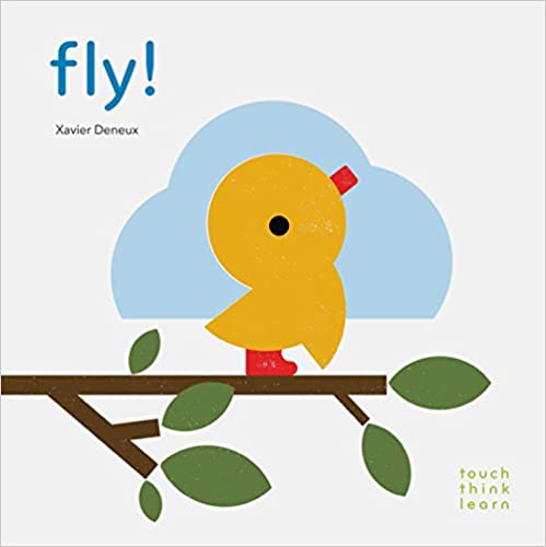
- How did the function of image and text differ within the different age groupings ?
The images and the text became less simplistic and got smaller also. The images and text for the very young children (0-3) mostly consisted of large shapes and colours making up what looks like a character. for instance this baby bird from the touch, think, learn book ‘fly’ by Xavier Deneux :
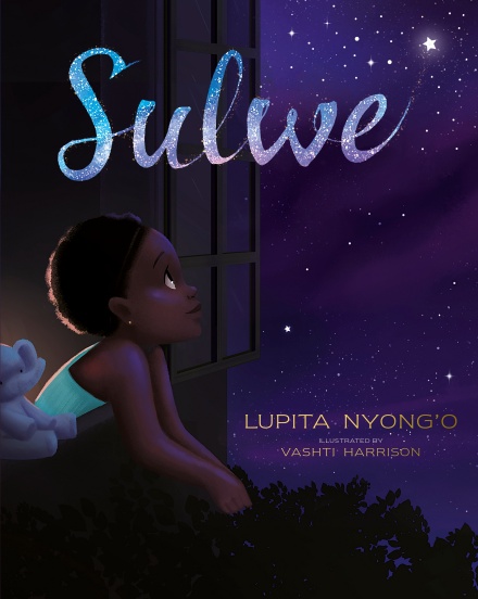
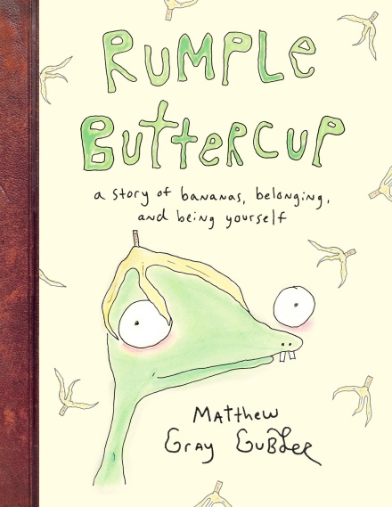
The images then get smaller and the text gets more stylised for instance this book ‘Rumple Buttercup’ by Matthew Gray Gubder. As you can see the writing is much smaller and harder to read, especially the authors name at the bottom of the cover. The illustration is must harder to distinguish, what is the creature I am looking at?

- What is your response to the idea ‘all children’s illustration has bright colours’ ?
I think it helps children to concentrate on what they are being shown. But it’s not necessary for all the colours to be BRIGHT all the time. I think very young children are more interested when illustrations are brightly coloured because as humans we can see many colours unlike dogs and cats so seeing these amazing colours as a young child must peak their interest. When children get older though they don’t need ‘as much’ visual stimulation as very young children do. It still helps a lot for children to see illustrations in colours though as I can imagine if you asked a child to read a book with a bright colour compared to a book with no colours they would automatically choose the coloured book, simply because it is more interesting. Even adults would be drawn to colours more than boring white or pale coloured books or illustrations. Would you choose the first book or the second?


Exercise – Educational Strip:
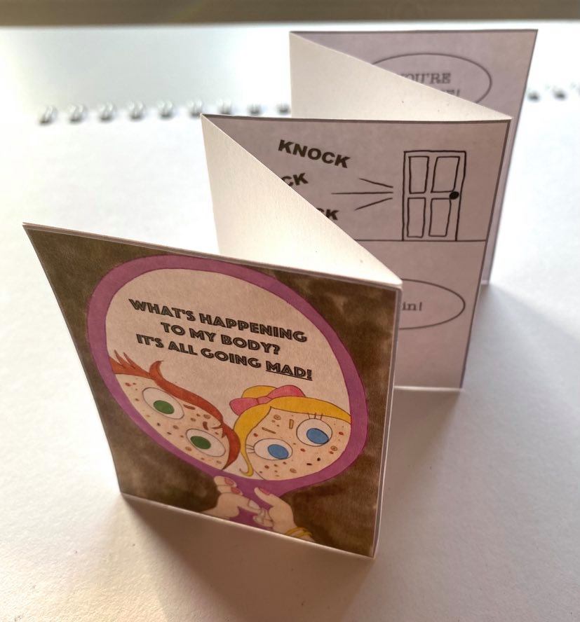
For my brief I need to produce an illustrated strip of up to five frames for use in schools explaining to young teens how to cope with the onset of puberty. I need to decide on which aspect of puberty I wish to tackle. Because of the subject matter I should use a metaphor and humour when conveying the message. I need to produce a single illustration of my character/characters for use on the front cover. The leaflet will be called ‘What’s happening to my body? It’s all going mad!”. I need to create my thumbnail sketches to work out how each frame would relate to each other. I need to show all stages of design work including thumbnail sketches, visuals, the cartoon strip in full and the standalone illustration for the front cover. Firstly I will research into teen health illustrations, some with the use of humour.
Boys Puberty Illustrations:
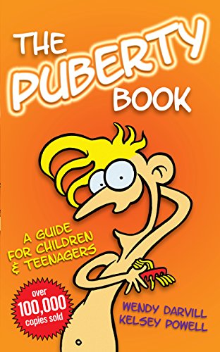


Girls Puberty Illustrations:
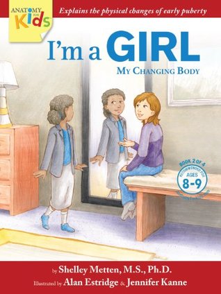


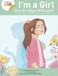
Puberty Illustrations for both genders:
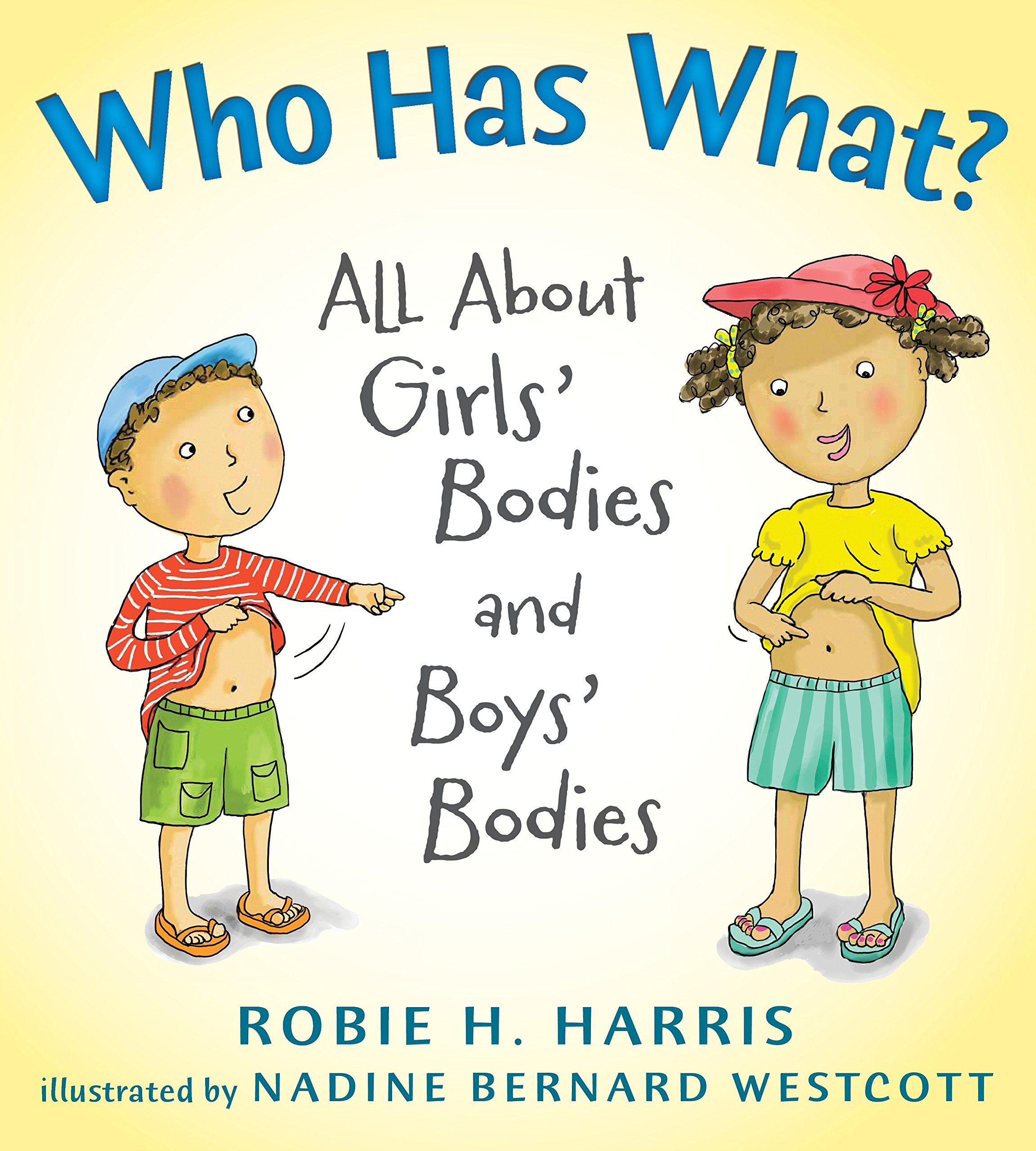


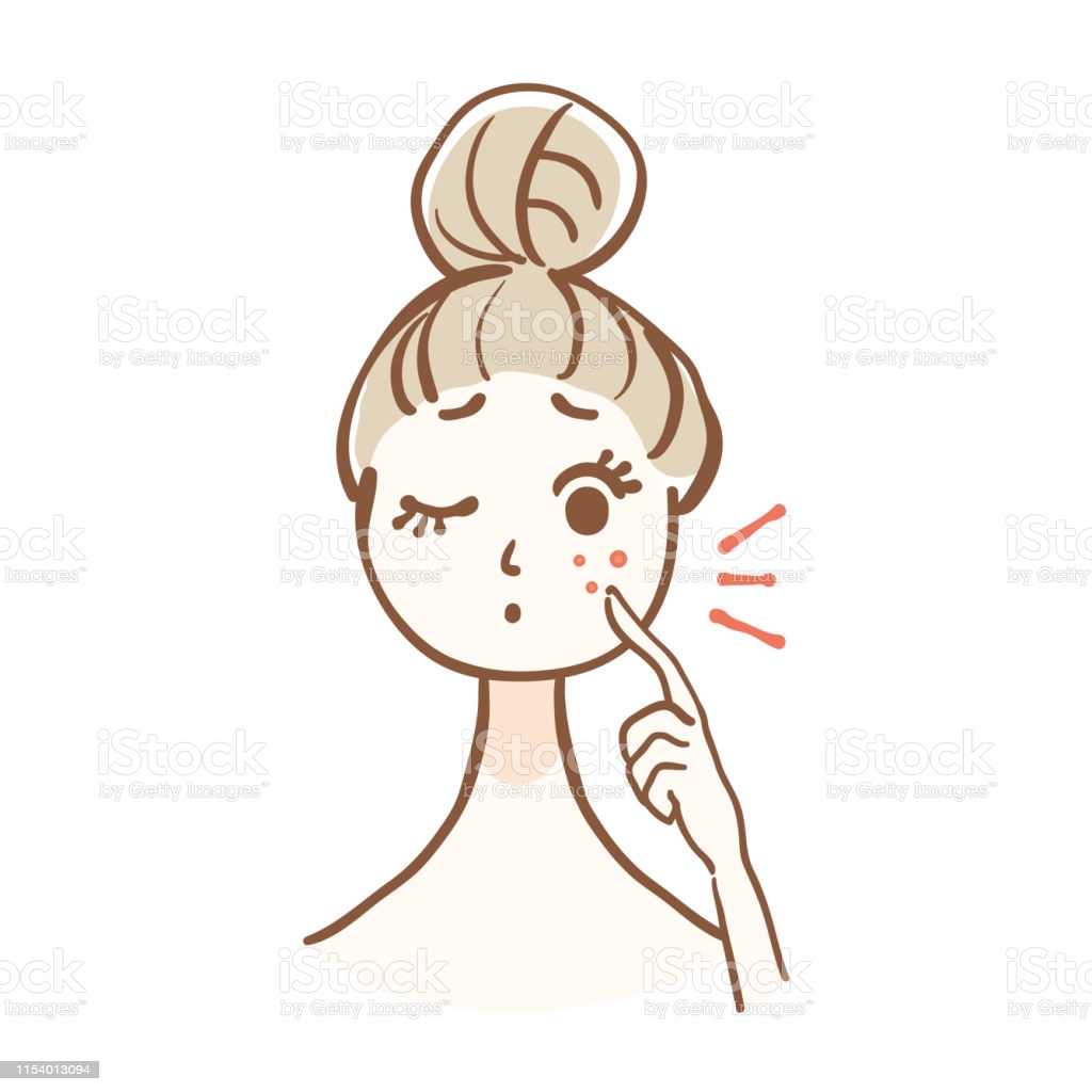
There any many different aspects/topics when it comes to puberty. I will be tackling the topic of ACNE!
Brainstorming of acne-related illustrations I found on google:


Thumbnail sketches of the strip (there are two ideas here, one at the top and one at the bottom:
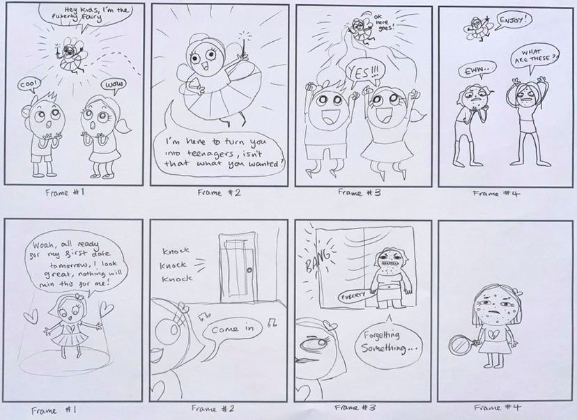
Thumbnail sketches of front cover with characters:
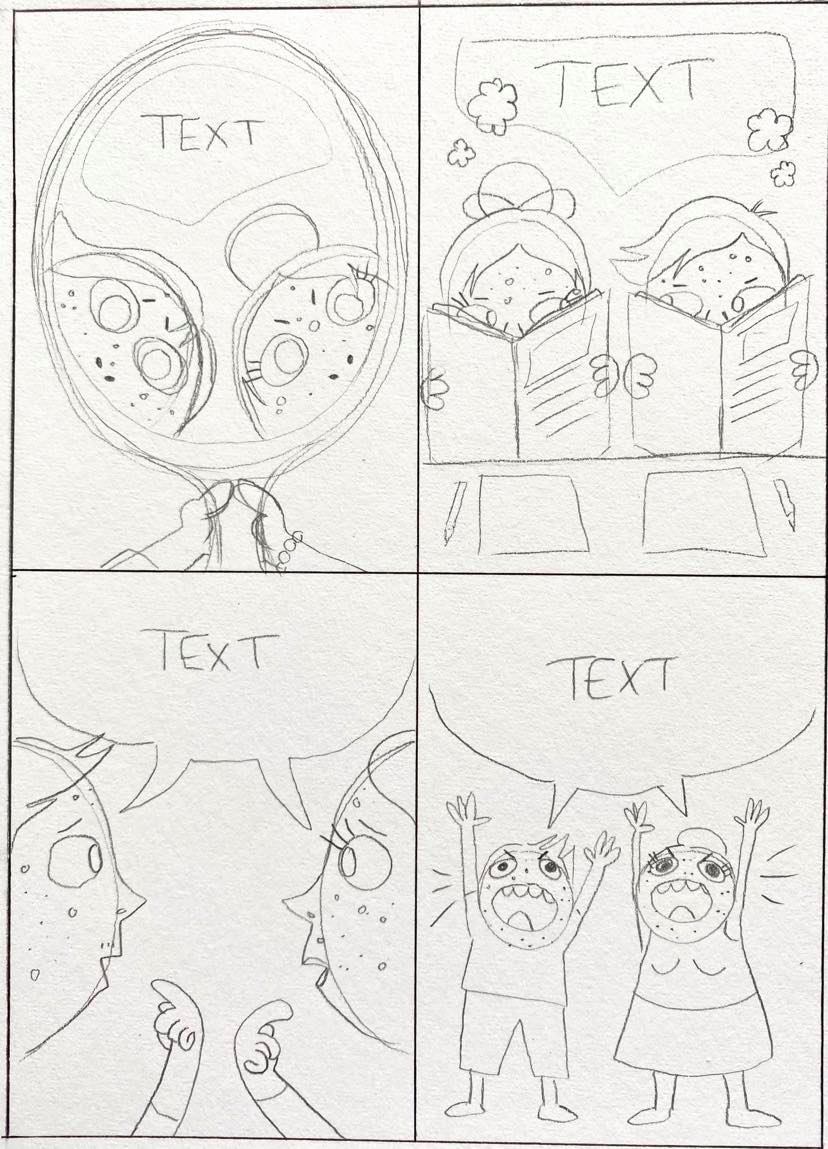


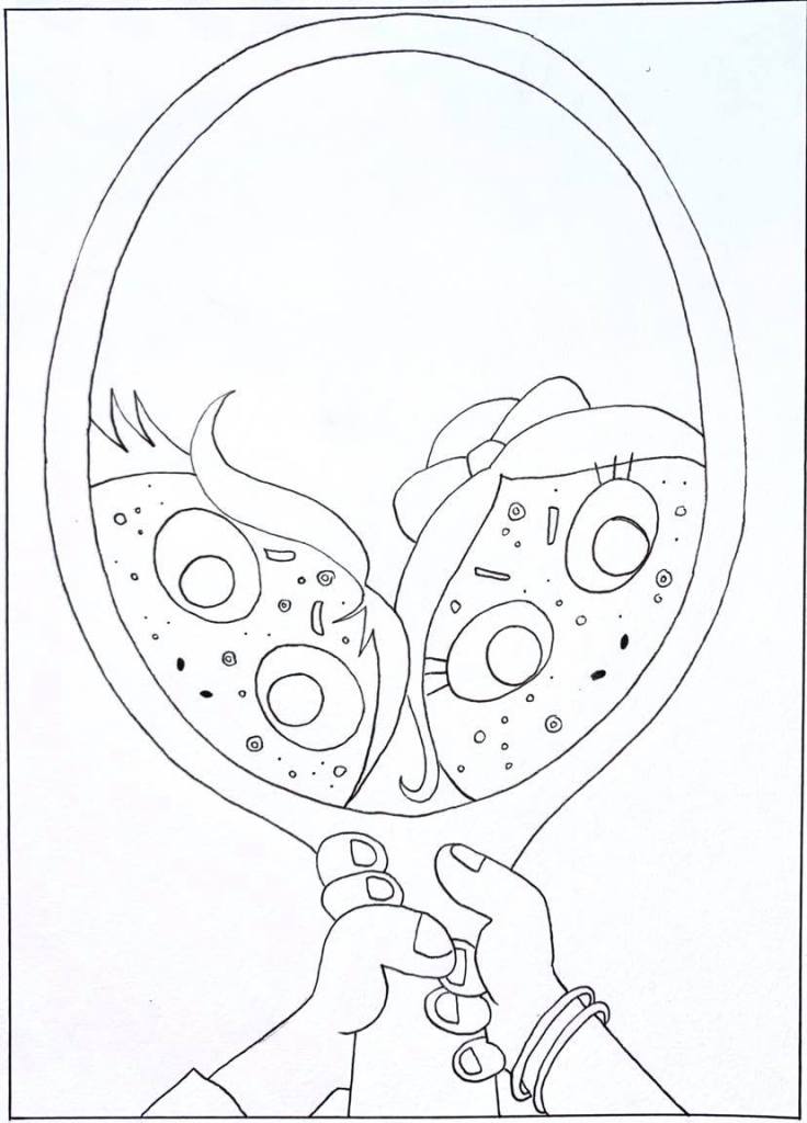
Visual of the chosen strip:

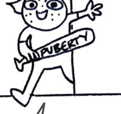
The bat “puberty’ up close as the photo above is blurry for some reason…
Visual of the front cover:
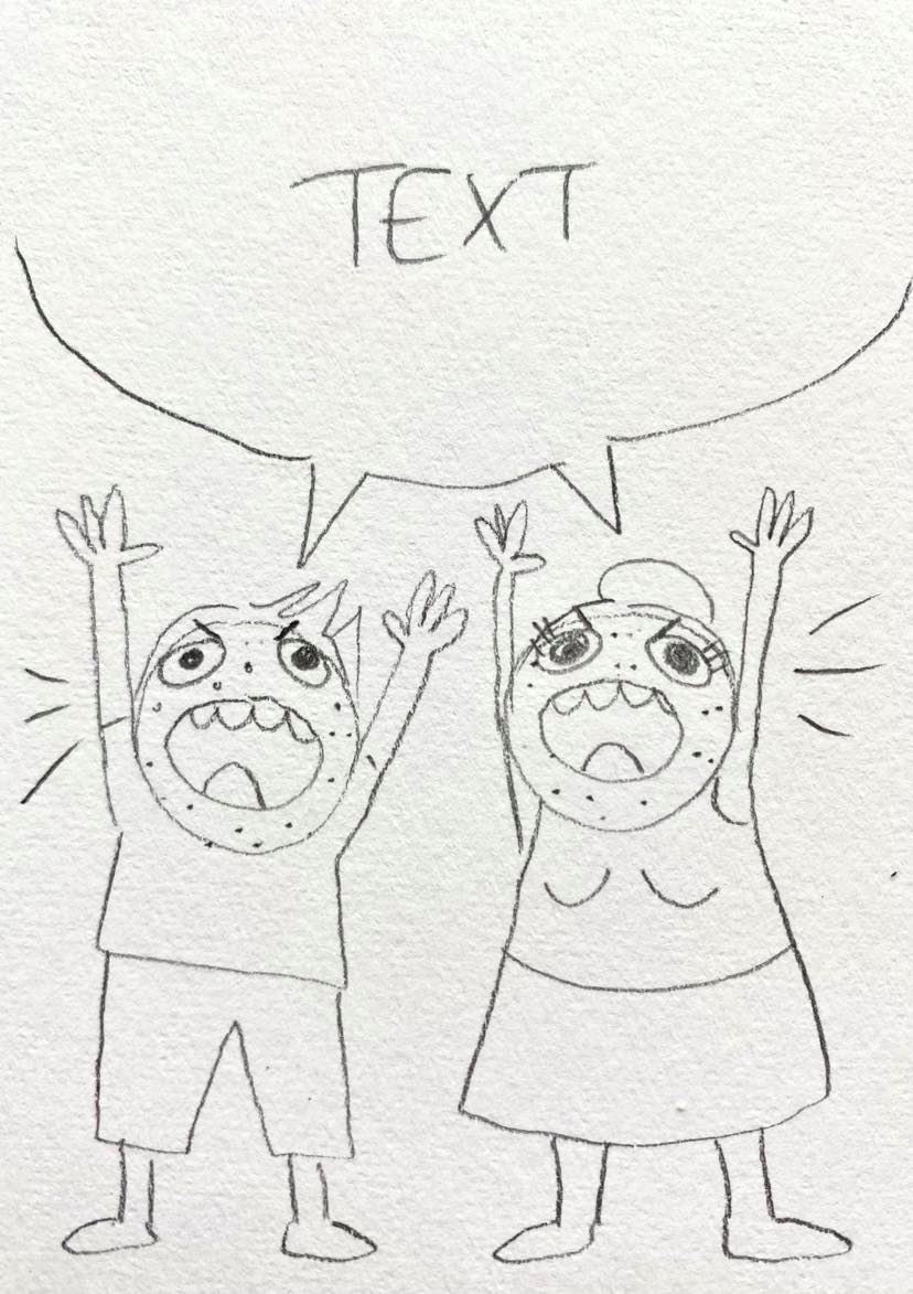
Final strip illustrations:

Final front cover:

Mock-up of entire leaflet:

Personally I think that my developmental process for this exercise has been one of the strongest due to the around of research I did on the various children’s illustrations depending on age range. I also think my creative process has been really clear for this exercise as well because of the fact that there are multiple design decisions and changes throughout the process that you can see for instance when I decided to change to look of the ‘puberty’ character in the thumbnail design from overweight with braces to just a simple character with acne. I changed this because as I thought that my illustration strip was just supposed to be focussed around acne it would be irrelevant for the character to be overweight with braces as not all prepubescent kids are overweight with braces!
For the mock-up I decided to make it pocket size as I know that pre-teens or teens are more attracted to leaflets that they can shove in their pockets. When I was at school, college and when I also went to the doctors surgery I saw that most teen leaflets to deal with teen issues are normally quite small so that it is small and private in comparison to issues let’s say, for the elderly which would be large using large print for the text, because as you get older you have more of a difficulty reading.
If I was to go back and change anything about my final design, it would be to colour in my cover illustration using my computer program so that the illustration was more professionally coloured in. I wouldn’t change the inside of the leaflet (the strip) through because I feel that it makes sense to leave it in black and white as most simple comic strips are, also it blends in with the fact that “all kids like colour” and these people aren’t kids anymore, there pre-teens!
