An artists own special way of creating their art.
One way an artist can show their ‘style’ is by the way they use drawing media and what they choose to use.
For most artists artist it takes experimenting with different media before they understand what media suits their style best.
“Your style is a genuine personal language, like a signature”. – Illustration Booklet – Part 4 – Style.
Project – Tools & Materials – Exercise: Identifying Tools & Materials:
For my first exercise I was asked to find a range of artists who work using a specific medium. I chose the traditional ‘pencil’ medium and will be only looking at artists work in black and white.
I used my Pinterest account in order to catalogue the 4 illustrators work I liked the best:
My first illustrator is Anja Sušanj who is an illustrator/storyteller. She is originally from Croatia but now is based in London. I like her art as it is very descriptive and detailed. I like the use of tone in her art. She mainly uses colour in her illustrations but as I chose to focus on the simplicity of monotone (black and white) illustrations for my research I have included only her monotone illustrations, in a way I find the use of black and white to be more powerful. My favourite image of her’s here would have to be the ‘raven-man’ (first image) as it is humorous to me yet also sinister.
Does this artist distort / exaggerate the elements in their work: YES
Do they use metaphors / symbols: YES
My second illustrator is Franklin Booth who was an American artist best known for his highly detailed illustrations. I enjoy the use of depth which he has depicted in his images. The line-work that he has used throughout his images is amazing but I am mostly drawn to his incredibly detailed line-work on the clouds in his artwork. You almost feel like your about to be engulfed! The images are strangely realistic yet dreamy.
Does this artist distort / exaggerate the elements in their work: YES
Do they use metaphors / symbols: NO
https://peoplepill.com/people/franklin-booth/
My third illustrator is David Álvarez who is a Mexican artist. Unfortunately as this artist is from Mexico most of the information that I could have used for reference online is in ‘Mexican Spanish’. I luckily found an interview online where when asked about working with graphite and in black and white, David answered:
“I like it because it’s a very personal experience, it’s about discovering the qualities of the paper, the material and mastering it to achieve what you want. The paper records the pulse, the pressure, there are no shortcuts, there are mistakes, you have to learn from them and you have to exercise them. I like black and white because I feel very comfortable working with lights and shadows”.
Does this artist distort / exaggerate the elements in their work: YES
Do they use metaphors / symbols: YES
My forth and final illustrator is Andrea Serio who is an Italian artist. I like the fact that her art is so sketchy, neat but graphic in its nature. Like Anja Sušanj she mostly creates her art using colour but I enjoy her black and white art more. Her black and white artwork seems to mostly focus on nature including trees.
Does this artist distort / exaggerate the elements in their work: NO
Do they use metaphors / symbols: NO
https://www.ecwid.com/store/andreaserio/
Next I had to choose an image that I liked the most: I chose Anja Sušanj‘s drawing below:
The image is of a ‘raven-man’ hybrid. It is drawn using a graphite pencil. The ‘raven-man’ sits upon a basically drawn chair, he wears a man’s suit and sits in an ‘anxious pose’. The chair has a shadow behind, shaded using the same pencil. The tone within the image is created using the same pencil but using different hardness. The darkest part of the image is the ‘raven-man’s’ beak and the lightest part of the image is the white shirt that the ‘raven-man’ wears under his black suit excluding the background as this is obviously white.
The use of distortion is shown with the ‘raven-man’s’ head. The body is also distorted due to the lack of proportion within the ‘raven-man’s body. This works as a positive due to the nature of the whole image, even if the ‘raven-man’s’ body was properly proportioned, the image would still be regarded as distorted because the head on top of the body is that of a Raven.
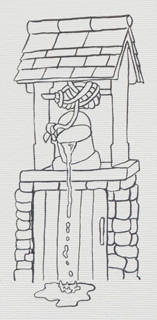
The next part of the exercise asks me to recreate 2 different visuals from my previous exercises on this part of the course (key steps in illustration) in the same style as Anja Sušanj‘s work using the same tools and materials. So I will be using one graphite pencil and simple white paper for my recreations.
I also drew out some examples of different pencil pressures and textures.

*my sketchbook pages show the exact same writing as what I have written here on WordPress.

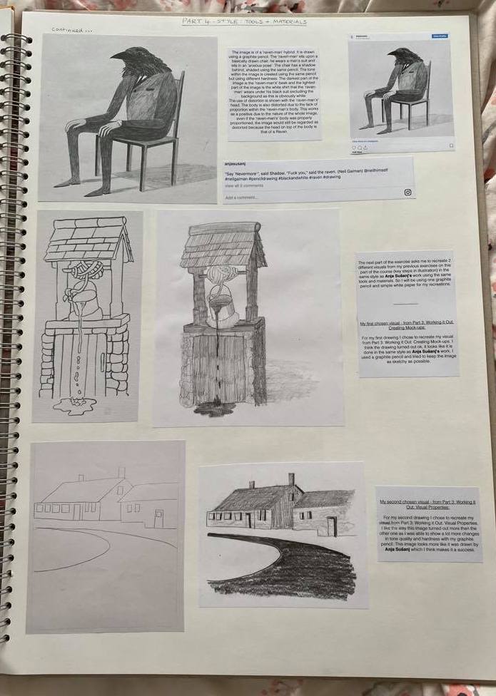
My first chosen visual – from Part 3: Working it Out: Creating Mock-ups:


For my first drawing I chose to recreate my visual from Part 3: Working it Out: Creating Mock-ups. I think the drawing turned out ok, it looks like it is done in the same style as Anja Sušanj‘s work. I used a graphite pencil and tried to keep the image as sketchy as possible.
My second chosen visual – from Part 3: Working it Out: Visual Properties:
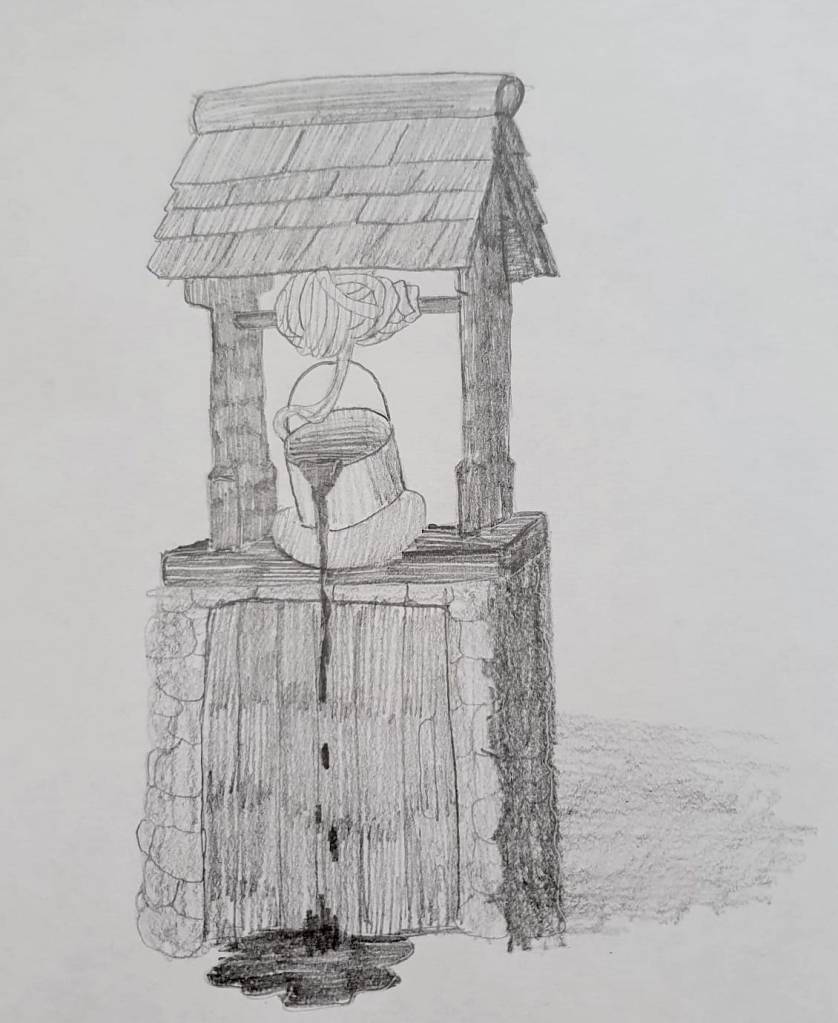
For my second drawing I chose to recreate my visual from Part 3: Working it Out: Visual Properties. I like the way this image turned out more then the other one as I was able to show a lot more changes in tone quality and hardness with my graphite pencil. This image looks more like it was drawn by Anja Sušanj which I think makes it a success.
Project – Audiences – Exercise: Museum Posters:
Having an understanding of how the audience influences the outcome is very important.
Target audience: illustrations that are appropriate for a type/age of people.
What makes posters effective?
Posters for any age group have to be straight forward with a good use of colours and typeface. If a poster has too much information on it as well as too many colours, characters or themes the viewer will become confused and overwhelmed by what they are looking at. I have chosen for my 3 posters to be very simplistic in design with the name of the museum “The British Museum’ on it as the only type. The colours should be bold and eye catching also. They should be readable from a distance and have a large image as the main centrepiece.
For this project I have been asked to produce 3 illustrations to be used as part of a series of A3 posters to publicise a museum for the following audience groups: Child aged 5-9, Teenager 13-16 and General Adult Audience.
I am going to be making 3 posters for the same museum: The British Museum.
The poster illustrations will be very different from each other. I will be working at the scale of A4 for my illustrations and posters.
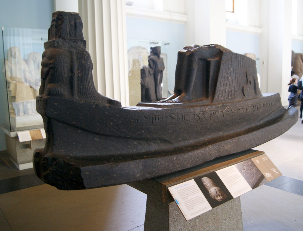
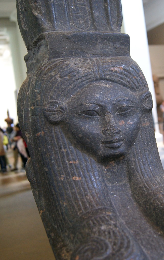
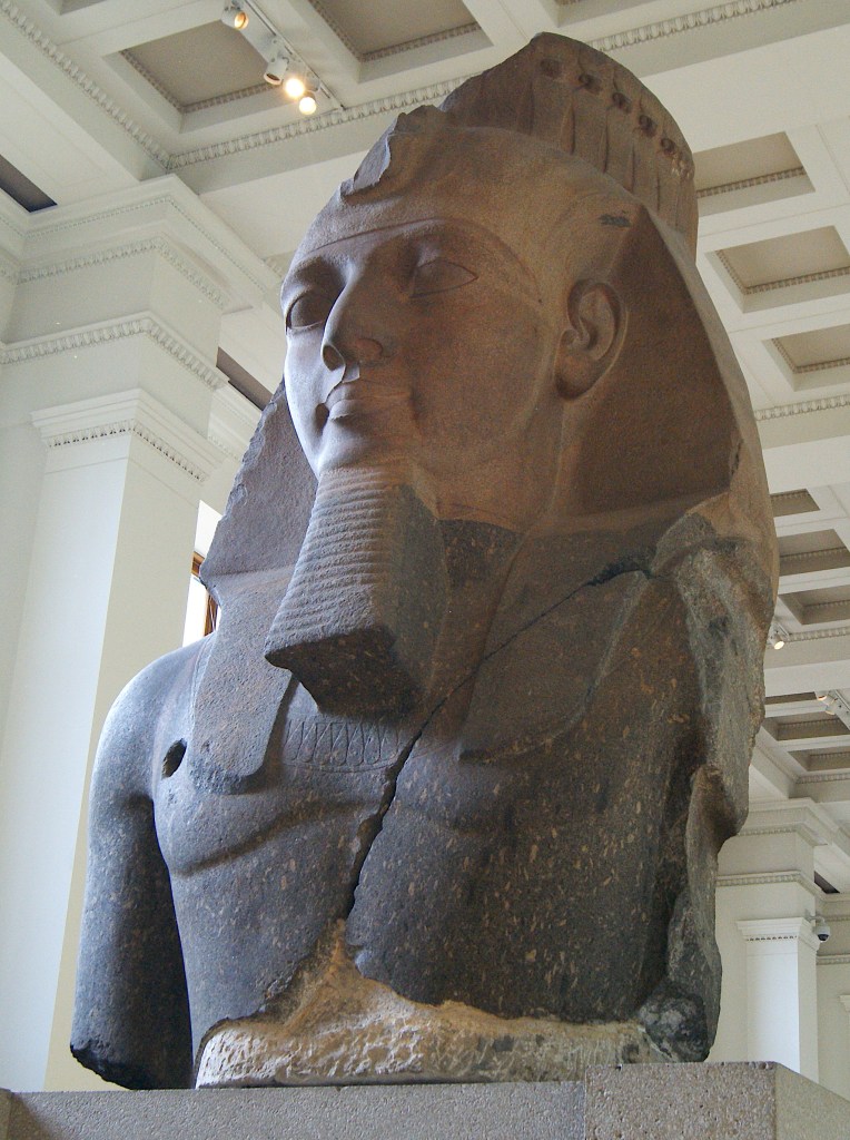
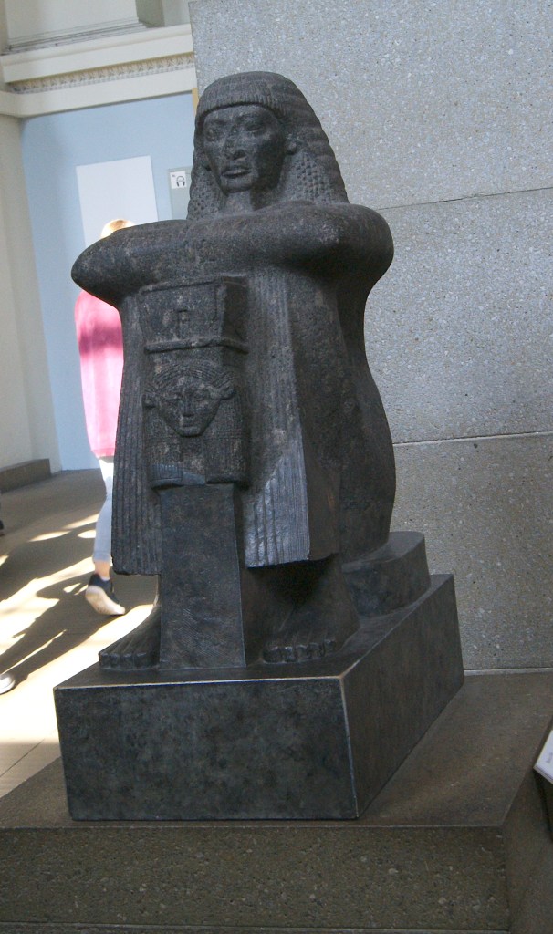
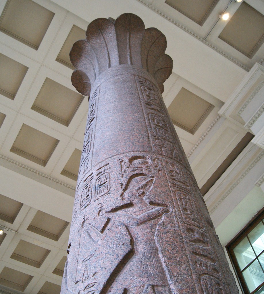
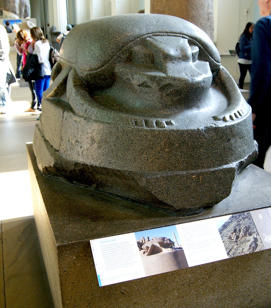
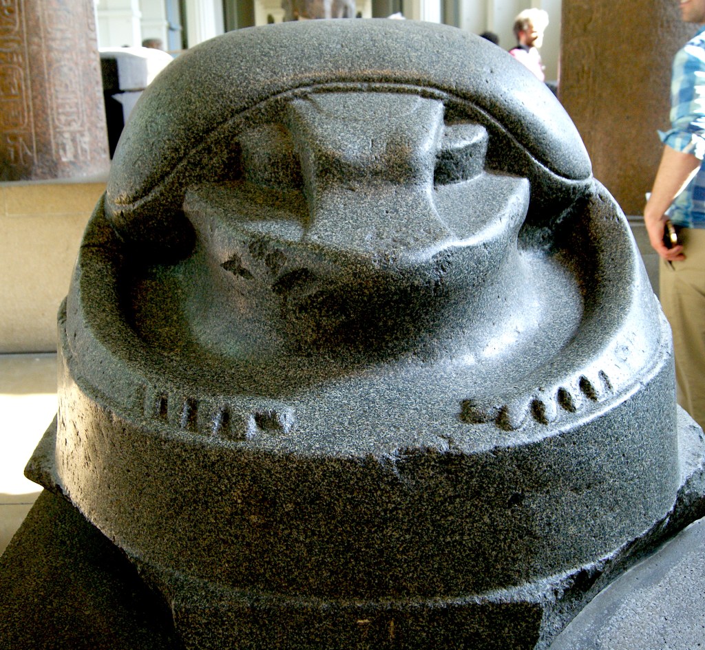
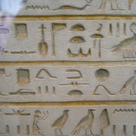
As the COVID-19 guidance is for people to only go to work etc if absolutely necessary I decided that it was safer to look back at a trip I took to the British Museum a year ago so and use the photos I took from there as a way of getting my research / visual referencing for this project.
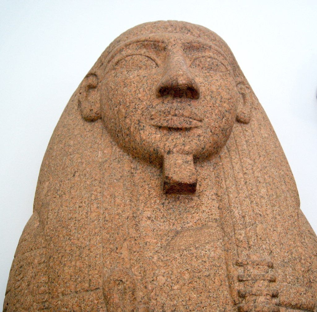
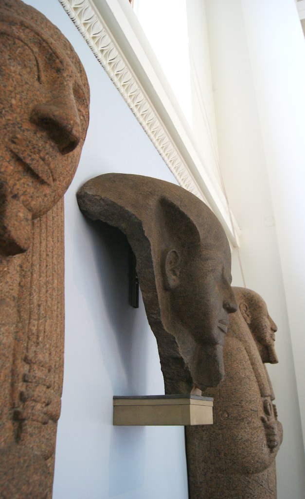
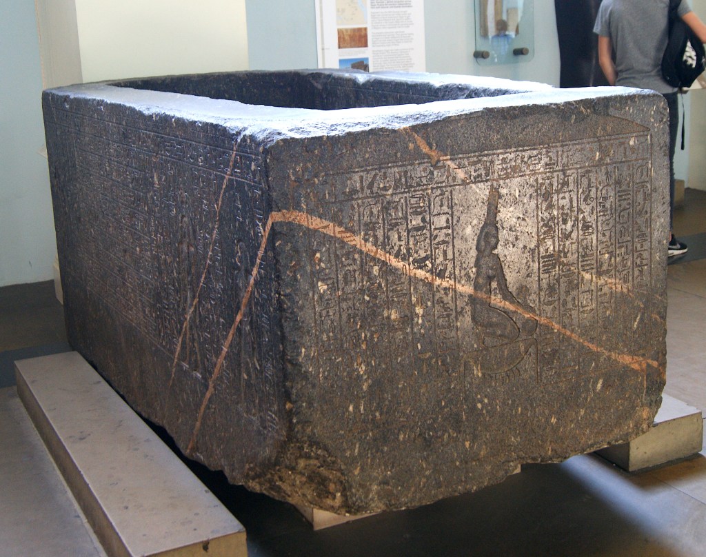
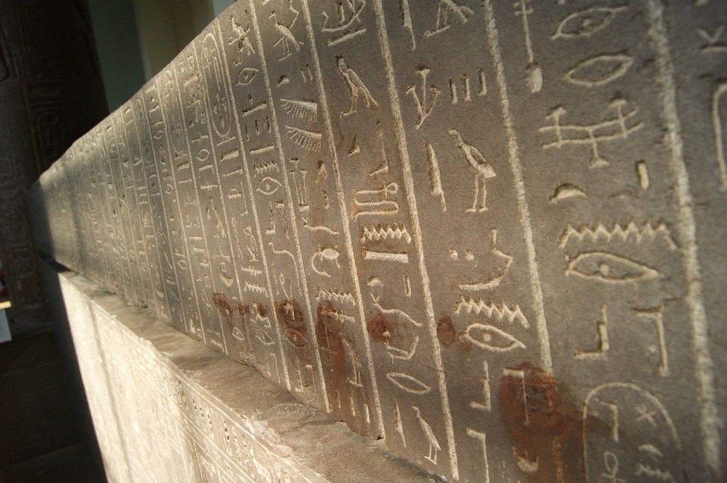
Below you will find my images that I took at the British Museum (I focused on Ancient Egypt):


Next I organised the images according to the different audience groups:
Age range: 5-9 (young children):
Age range: 13-16 (teenagers):
Age range: General Adult:
My chosen object for each of the audience groups:
Age range: 5-9 (young children):

Age range: 13-16 (teenagers):

Age range: General Adult:
My Thumbnail Sketches:
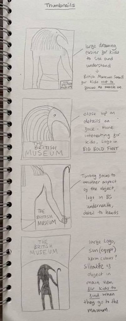
For age range: 5-9 (young children):
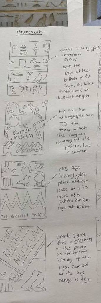
For age range: 13-16 (teenagers):
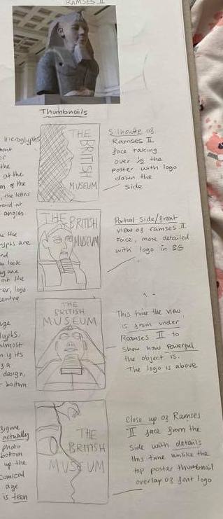
For age range: General Adult:
My Visuals:
For age range: 5-9 (young children):

For age range: 13-16 (teenagers):
For age range: General Adult:
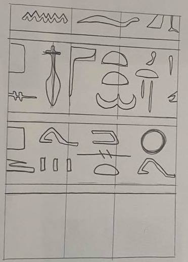
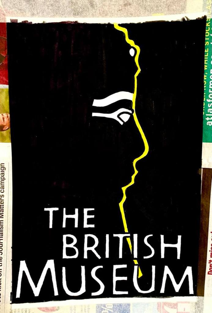
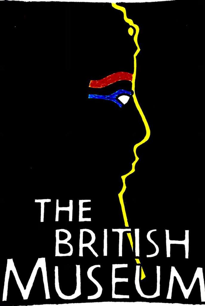
3 Colour Visuals:
For age range: 5-9 (young children):

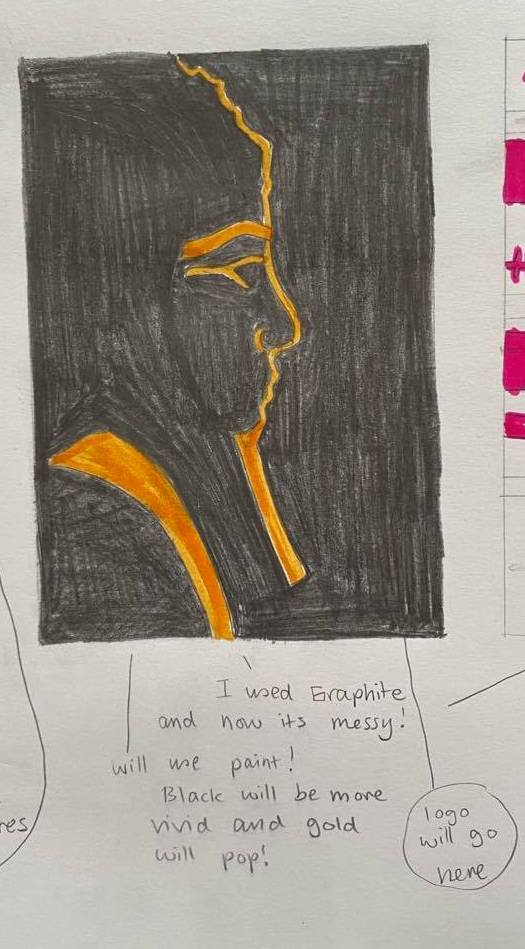
For age range: 13-16 (teenagers):
For age range: General Adult:

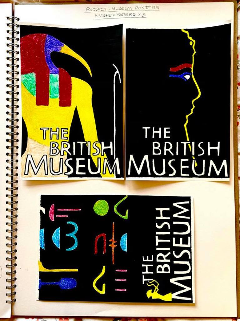
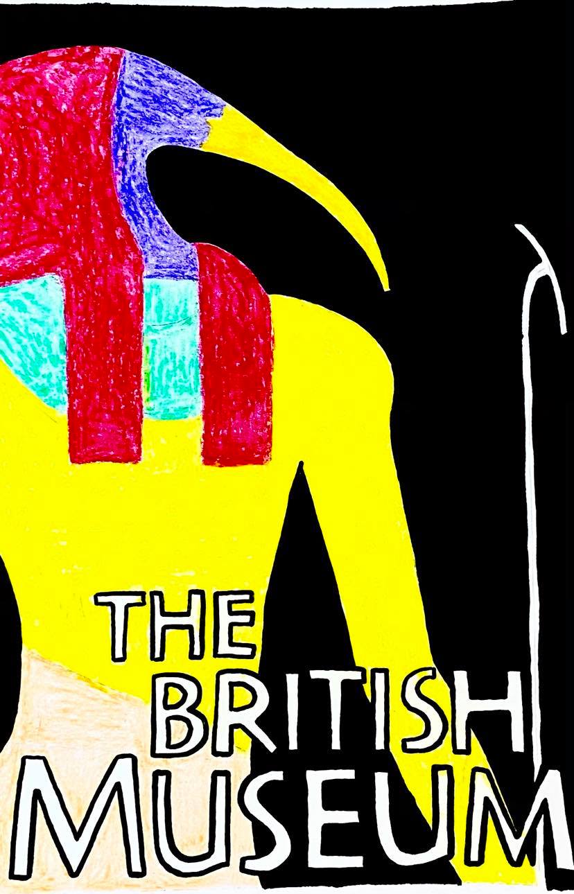
My 3 Finished Posters:
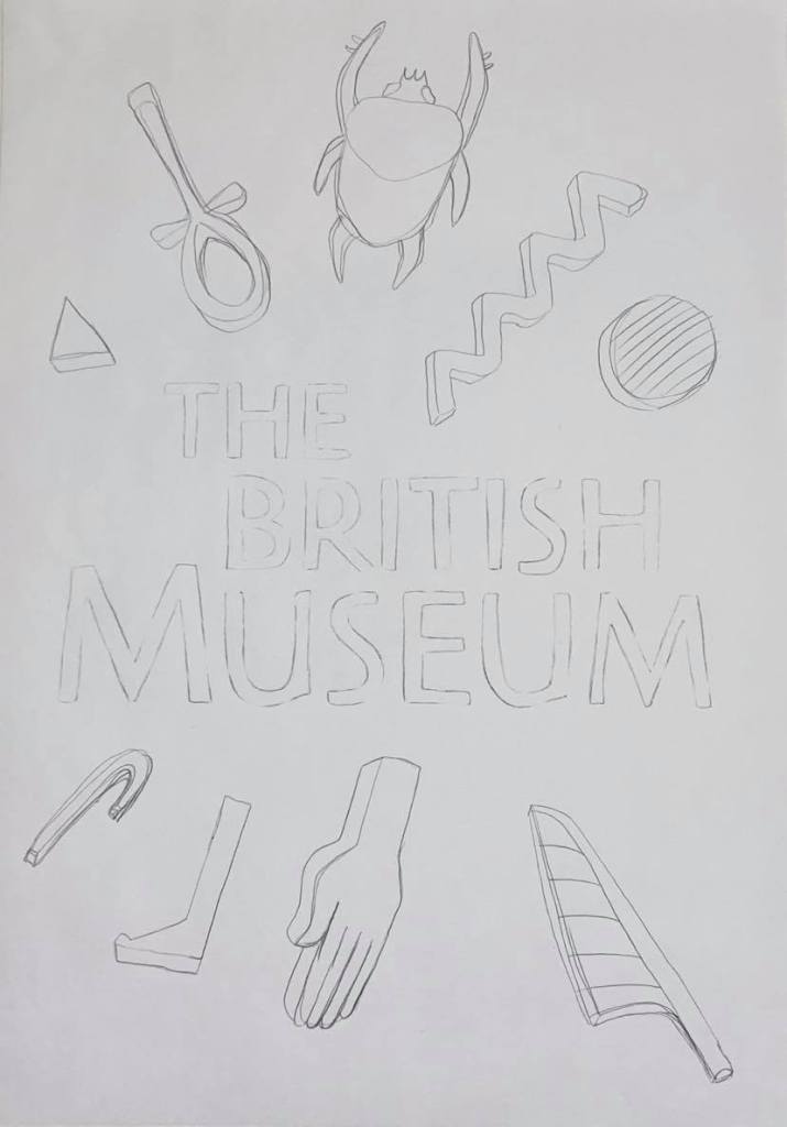
For age range: 5-9 (young children):

For age range: 13-16 (teenagers):


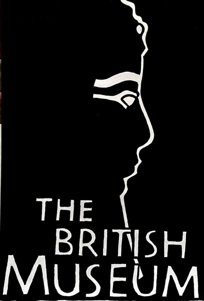
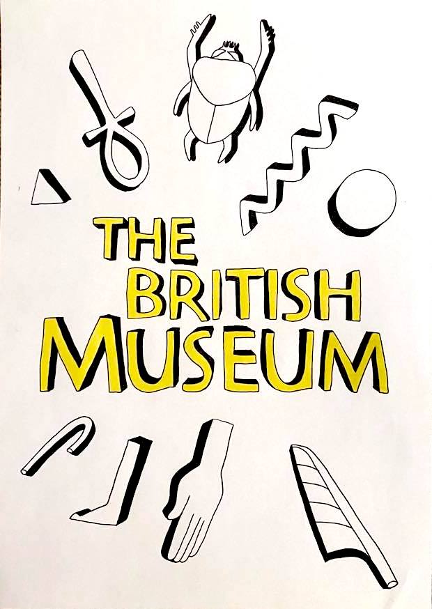
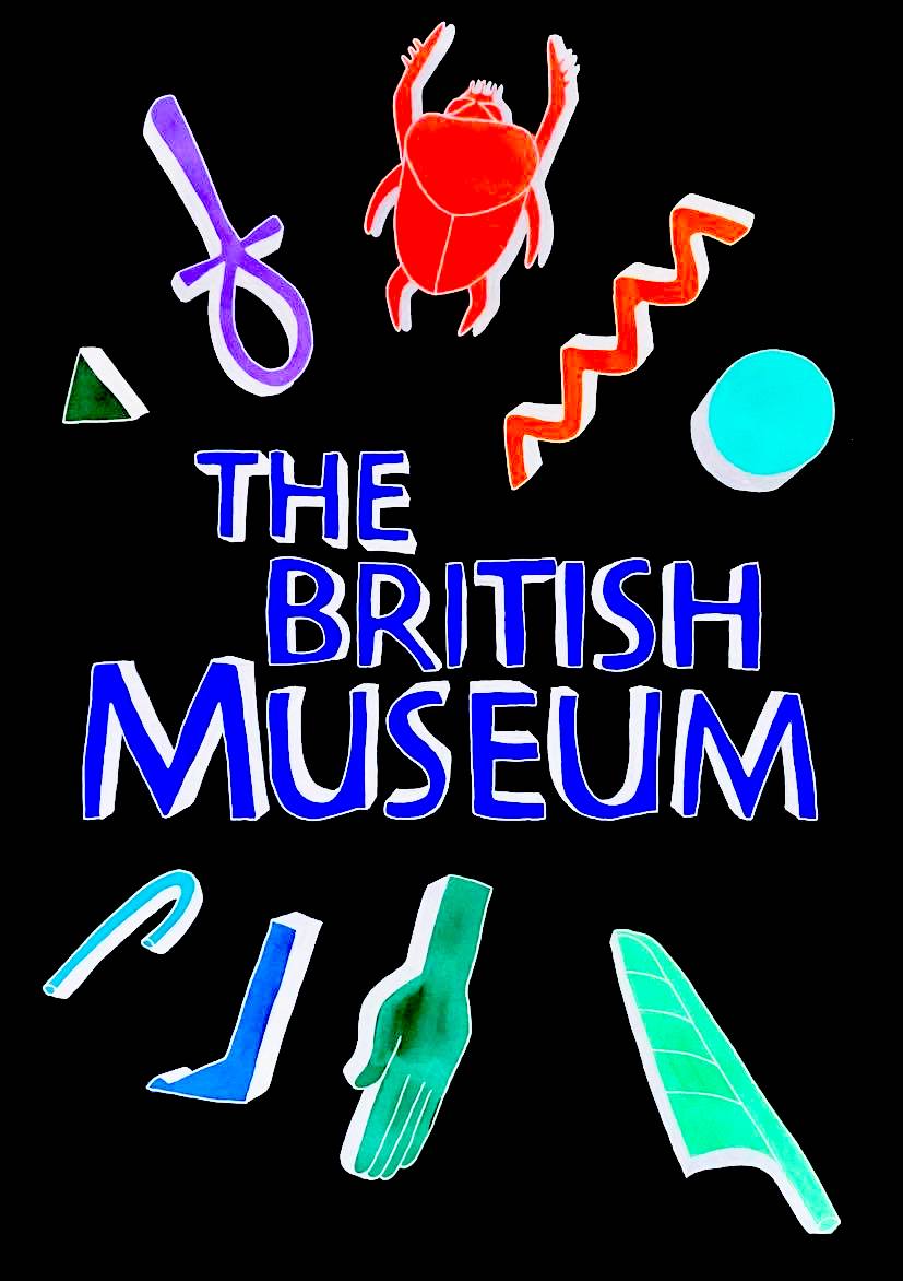
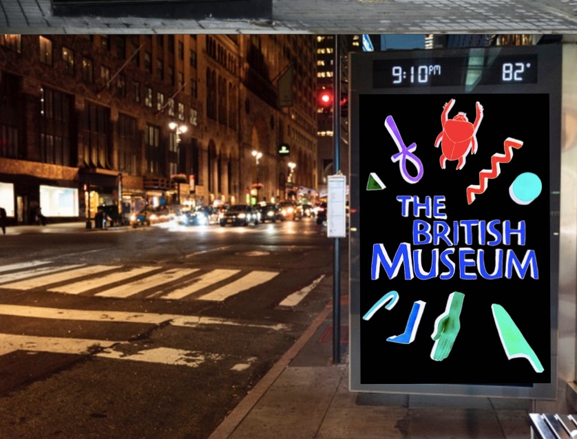
For age range: General Adult:


Since creating my first thumbnail sketches I have made quite a few changes.
My original intention was for the three posters to be very different from each other but looking at them now they all show a black background and a colourful neon crayon foreground (object).
I am happy with the way all the three posters turned out. I can even imagine them hanging in the British Museum if they were developed a little bit more and not coloured in crayon. If I was to change anything I would have used my graphics tablet to create my final designs as the black would be black and the colour would be perfect. I have tried to challenge myself in this project by using other forms of media in order to create my final designs. I didn’t particularly enjoy using crayon, but the reason why I did use it was that after watching a documentary on Netflix about ancient Egypt I realises that most of the vivid colours that you see on Coffins and in tombs were created using paint that consisted of dried up shells from very vividly coloured beetles. I thought that by using a media that reminded me of the texture of the ground up beetle paint that the ancient Egyptians used it would be more relevant.
I decided to change a few other parts of the designs including where the logo sat and what colours I used.
For the poster for the age range of 5–9 (young children) I decided to incorporate the first and second thumbnail design of the Egyptian God so that the full God figure was shown on the poster but the British Museum logo was shown very bold at the bottom of the poster I thought this was better as you would be able to see what the poster was about and where the item was located. You can see this easily from afar.
For the poster for the age range of 13–16 (teenagers) I decided that I was going to go with the first thumbnail design but change the bottom area of the poster where the British Museum logo sat. Like the first poster, I decided to incorporate to thumbnail designs as I liked the fourth thumbnail design as well as it gave some comical humour to the poster that is supposed to be for the age range of teenagers. I still like the idea that I had, to make the words jumbled to blend in with the hieroglyphics but I think that this would confuse people looking at the poster, especially from afar. So I decided to use the same font and size of logo, as I did in the first poster design. I then realised that this would probably be better if I made the three posters have the British logo at the same font and size in each, then it would be a collection. The three posters are now very similar.
For the poster for the age range of general adult, I yet again decided to incorporate two thumbnail designs into one. I like the idea of the first thumbnail but I thought that people wouldn’t be able to recognise what the silhouette was of so I incorporated the fourth thumbnail sketch by adding more detail to the outline. No you can easily see that the image depicts a pharaoh from ancient Egypt.
If I was going to choose one design out of the three that I have created to be my favourite, it would have to be my third design of Ramses ii. I like how simplistic the design turned out. If I were to change anything on this design it would be to choose a neater medium to colour in the design and also to draw the scarab beetle on the forehead so that it is more defined as right now it looks like a gemstone.
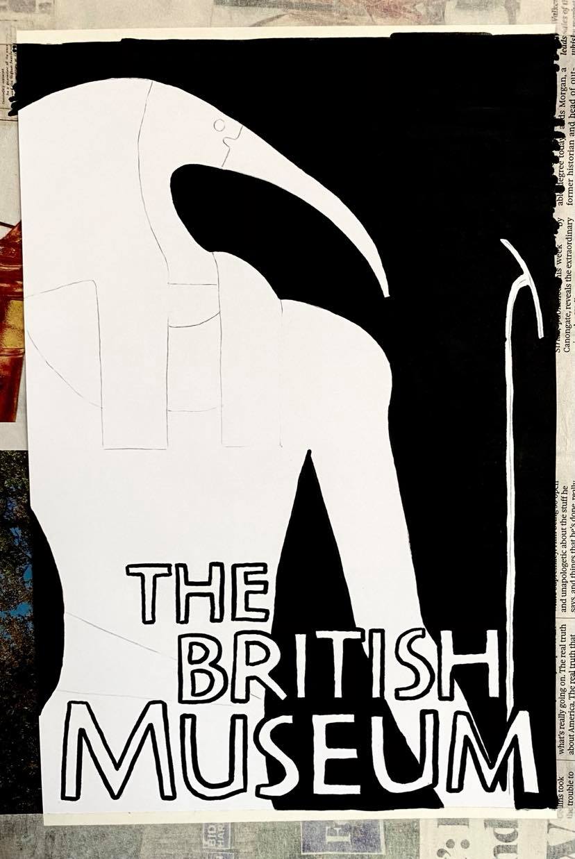
Development within the project:
After completing this project I wanted to expand more on my idea of the 3D hieroglyphics for the teenage audience as I thought this idea would be interesting and deserved to be more than ‘just a sketch’. I will develop the idea like I did with the others above. I will work at A4 though.
My original thumbnail sketch for the 3D hieroglyphics.

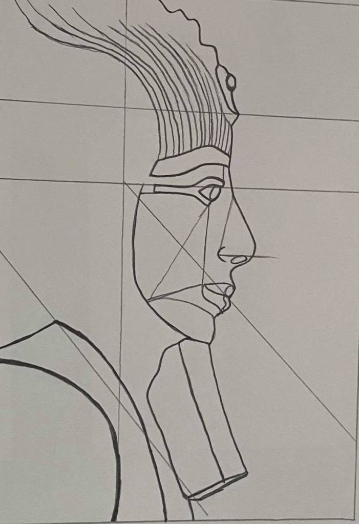
My sketch:
My line visual:

My typeface that I created:

My final design without colour:

My final design with colour – I also inverted the image using my computer to give a different coloured poster:

I am glad that I revisited this project and decided to develop it. I actually like this design more as it feels more modern than my previous designs. I decided to create mock-ups showing the final design and the inverted final design also as I felt that it would be good to show the normal design in the day and the inverted design at night. I thought this worked well because the inverted design looks like a neon light design that you see a lot at night.

Project – Areas of Illustration
There are several areas of illustration, they include:
Editorial, publishing, children’s publishing, design work, fashion, advertising, authorial practice, decorative, site-based work, graphic literature, animation, web-based working images within a screen-based environment, working in a team with other creatives.
Exercise 1/3 – A Children’s Book Cover:
For my first exercise I am to produce a cover illustration for a natural history book for children aged 7 to 11, the book will be entitled animals from around the world. The aim is to make the cover appealing to children aged 7 to 11. The image will be in full colour. I need to produce at least three ideas as coloured client visuals, I must include information on the size and format and where the type will be positioned. I need to remember that they are visuals and not the final outcome. I will be using the design process by researching first, brainstorming, creating thumbnail sketches, creating visuals without colour and finally creating the final coloured client visuals.
Before I start designing I will be researching how other children’s reference book designs have changed over the years, how I can make the book appear modern and appealing to children and I will also research how children read imagery rather than the actual writing inside of the book.
I have memories from when I was a child, my mother would read me books and instead of following along with the words I would normally focus on the imagery inside of the book. Whenever I went to the library I would pick up the books with the most interesting illustration on the front and then I would read the book, this is an example of how children read imagery rather than the actual writing inside the book, if the cover is boring a child will not pick up the book. The colours have to be vivid and bold and the image has to flow. If the outside of a children’s book looked like the map of the underground stations of London with so much detail and words, the child wouldn’t be interested. After looking at many photos of children’s reference books online, I found a correlation in how the title of the book and the front cover illustration are relatively the same size. I think this is so that children can focus on the few words that are written on the cover. Taking this into consideration I will make sure there is enough room for the title to be placed on the coloured client visuals.
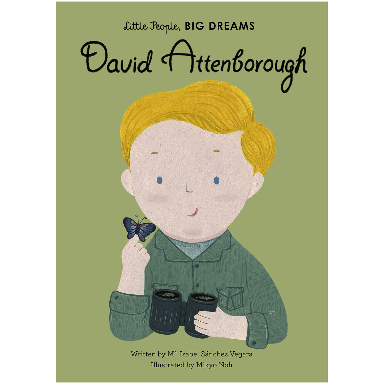
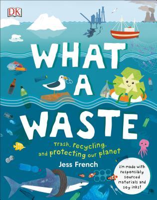
Below are 4 examples of modern children’s reference books that I have found online. As I said in the previous paragraph there is a correlation between space used for text (title) and the illustration on the front cover. The style of the four covers below are very different in many ways, the font used on the front covers change from book to book, the illustrations obviously depict different subject matters. The styles are all very different showing the illustrators unique styles. The front covers are all very similar in other ways including how the title on each book is very big but the authors name and illustrators name (if shown) are small in comparison. All the books use a vast array of colours as this is what draws the attention of children to pick the books up in the library, bookshop etc. On the subject of colours I realise that every book focuses the colour choices on what the books topic is about, for instance ‘The Egyptians’ book features many colours found during this era, there are a lot of blues, reds and yellow colours which are a combination of hot and cool colours if I was discussing hierarchy. Still on the subject of hierarchy the next book ‘What a Waste’ shows a lot of cool colours as the book cover depicts an ocean so the cool colours are relevant. The third book ‘Up in the garden and down in the dirt’ is a very busy but clever image. It is clever because the title is placed in such a way that the word ‘Up’ is closer to the top of the page surrounded by leaves and flowers and the word ‘down’ is closer to the ground and the dirt. The fourth book ‘David Attenborough’ has the most simplistic design out of all four books. The character on the front is a boy but you would need to read the story inside to know who it was as a child. If an adult was looking at the book cover and knew who David Attenborough was the image would be clear who it was. All four books show a vast amount of creativity and detail on the covers, they are all unique but would equally get the attention of the child.


References
French, J., 2019. What A Waste. DK Publishing – Dorling Kindersley.
Marx, J. and Prabhat, C., 2020. The Egyptians. Little Tiger Press.
Messner, K. and Neal, C., 2015. Up In The Garden Down In The Dirt. Chronicle Books.
Vegara, I. and Noh, M., 2020. David Attenborough. London: Frances Lincoln Children’s Books.
Sketchbook Pages:

2 brainstorm diagrams and 1 image showing format and how the book would work:


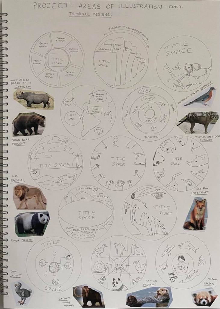
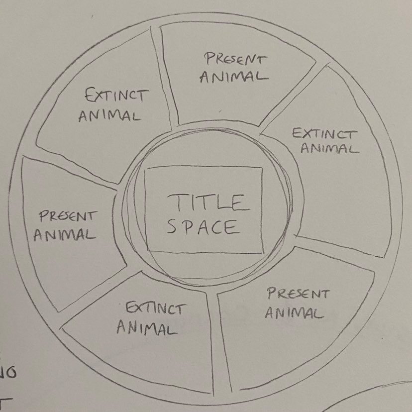
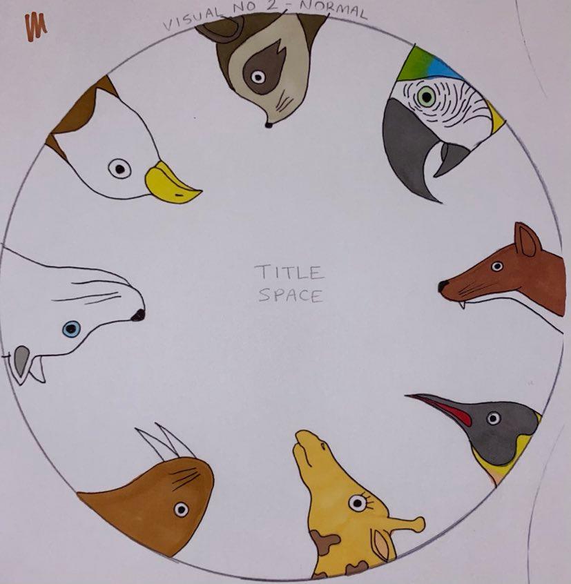
My 9 thumbnail designs:
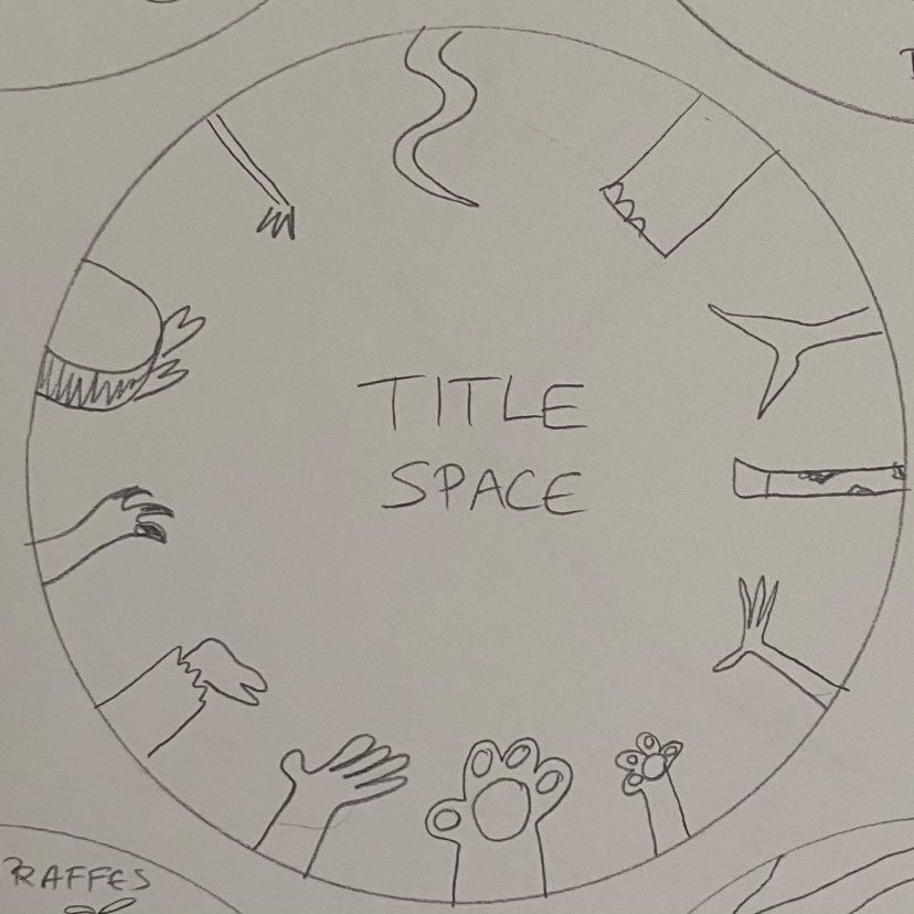

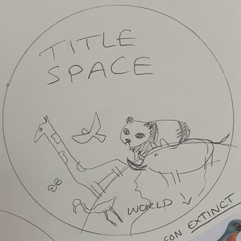
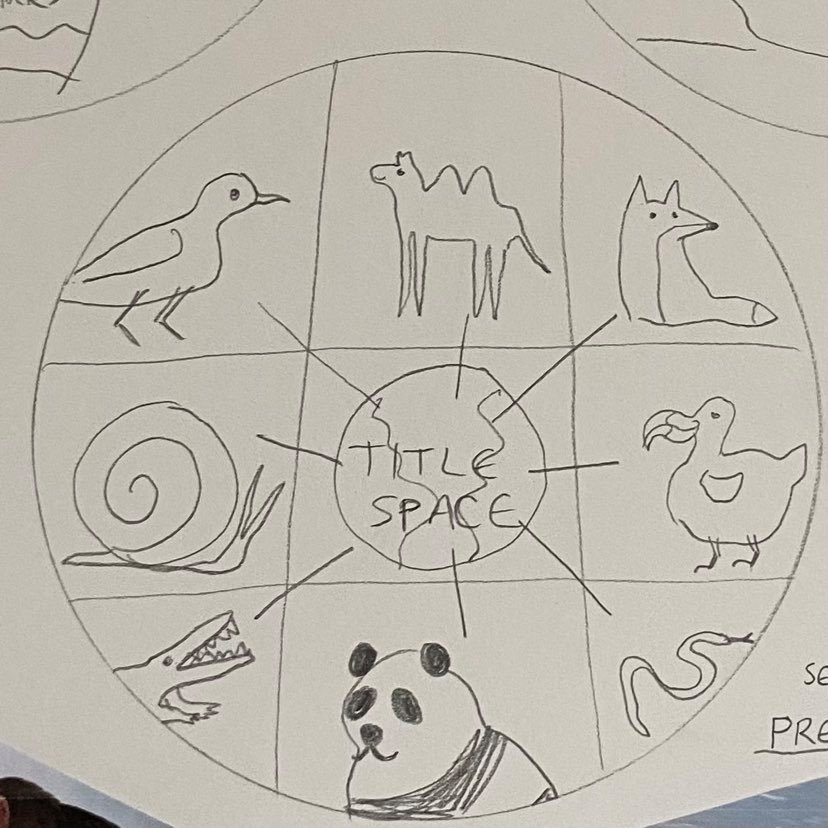


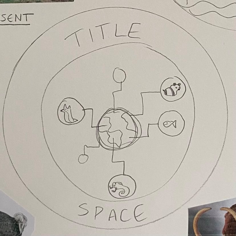
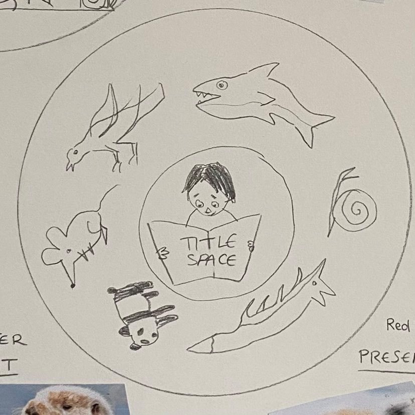

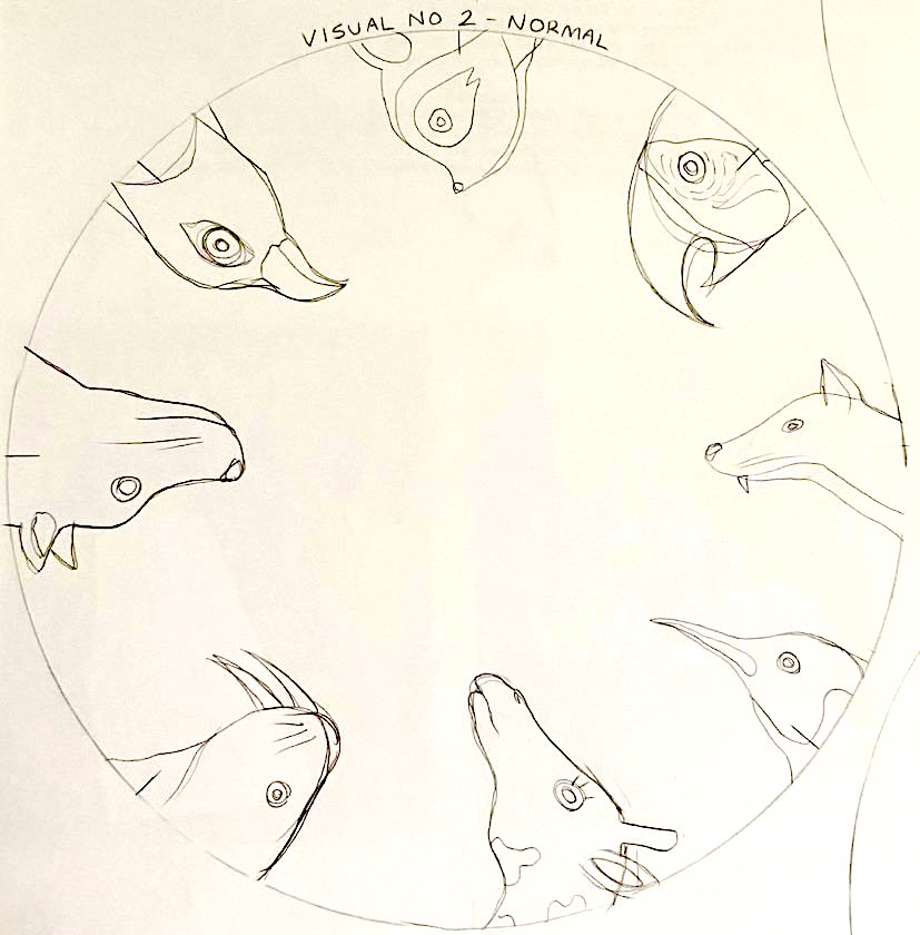
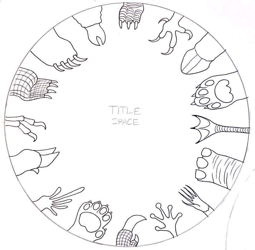
After creating various thumbnail designs I have decided to go with the three that I like the most these include the thumbnail design with the animal feet all around the outside of the design, the similar design of the animals heads all around the outside of the design and thirdly the design where there are six different sections that show different animals including extinct and non-extinct animals. I find that all of my designs have potential but I have decided to go with the three that I have chosen as I feel this would show my style of art the best.
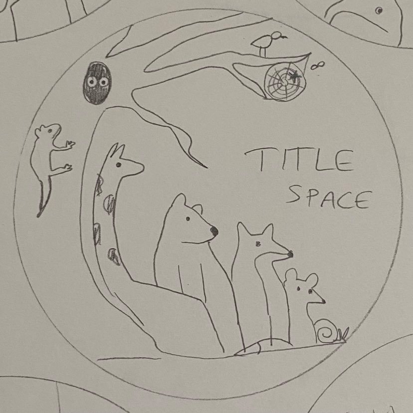
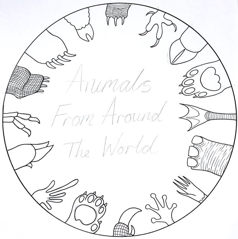
My 3 chosen designs:


Creating my visuals:
1st Step sketching out designs:

Finelining the outline on my visuals:


I printed out my finished line visuals and coloured in the print outs:


Evaluation:
I really enjoyed this exercise because I was able to have complete creative freedom.
The brief for this exercise was so small in fact that I had to create my own brief as a reminder of what I wanted to achieve in this exercise.
I enjoyed all aspects of this exercise from the thumbnail designs to the finished visuals. If I was to choose one part that I enjoy doing the most it would be creating the various different thumbnail designs as I was able to jot down everything that came to me.
If I had to choose a finished visual design that I liked the most, it would have to be the design where all the animals feet are circulated around the inside of the shape, I like it because I feel like it shows the largest amount of information visually out of the three finished designs.
If I had to choose a design that I liked the least it would be the third version where the animals are mostly shown in full, I feel it is the weakest design because of the way I have drawn the animals and the lack of colouring skills. Annoyingly the pens that I used to colour all of the designs decided to bleed through the paper and spill over the lines of the designs.
In hindsight I should’ve used pencil to colour in the designs or even used my graphics tablet as the line work and the colouring in would’ve both been a lot neater. Like I have done in my other recent projects, I have tried to test myself and my art skills by not relying on digital media to create my artwork otherwise all of my projects would be drawn using my graphics tablet.
Development within the project:
Like I did in the previous project I decided to expand and develop on this exercise as I felt that it hadn’t fully been completed or developed properly. I will continue with one of my final designs showing the typeface incorporated into the design. I will also create a mock-up showing the cover on the children’s book.
My original design:
My sketch:
My Line Visual with Typeface:

My Final Design:

My Mock-Up design showing the cover on a ‘real’ book:

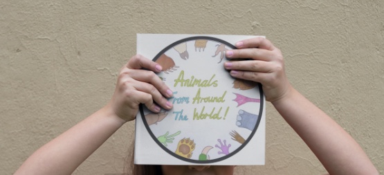
Credit: https://placeit.net/ for the mock-up photos
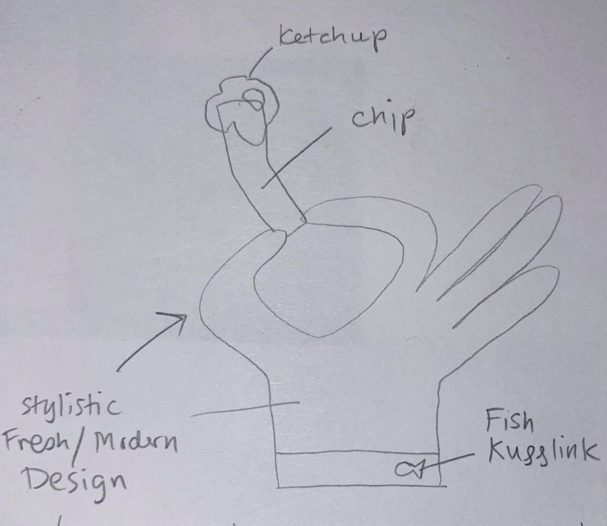
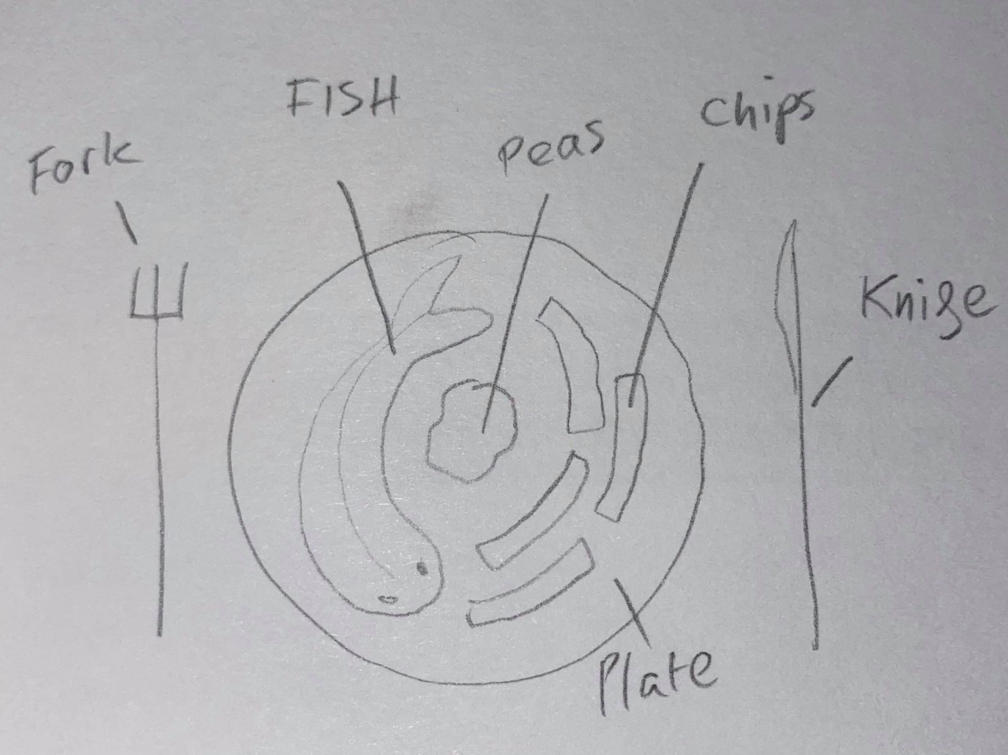
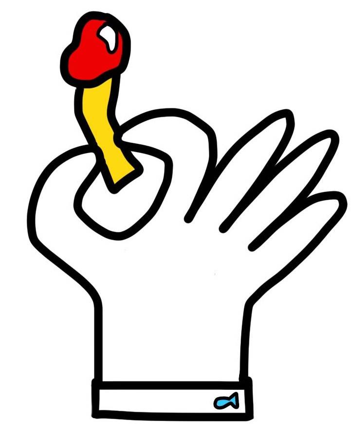
Exercise 2/3 – A Menu Card:
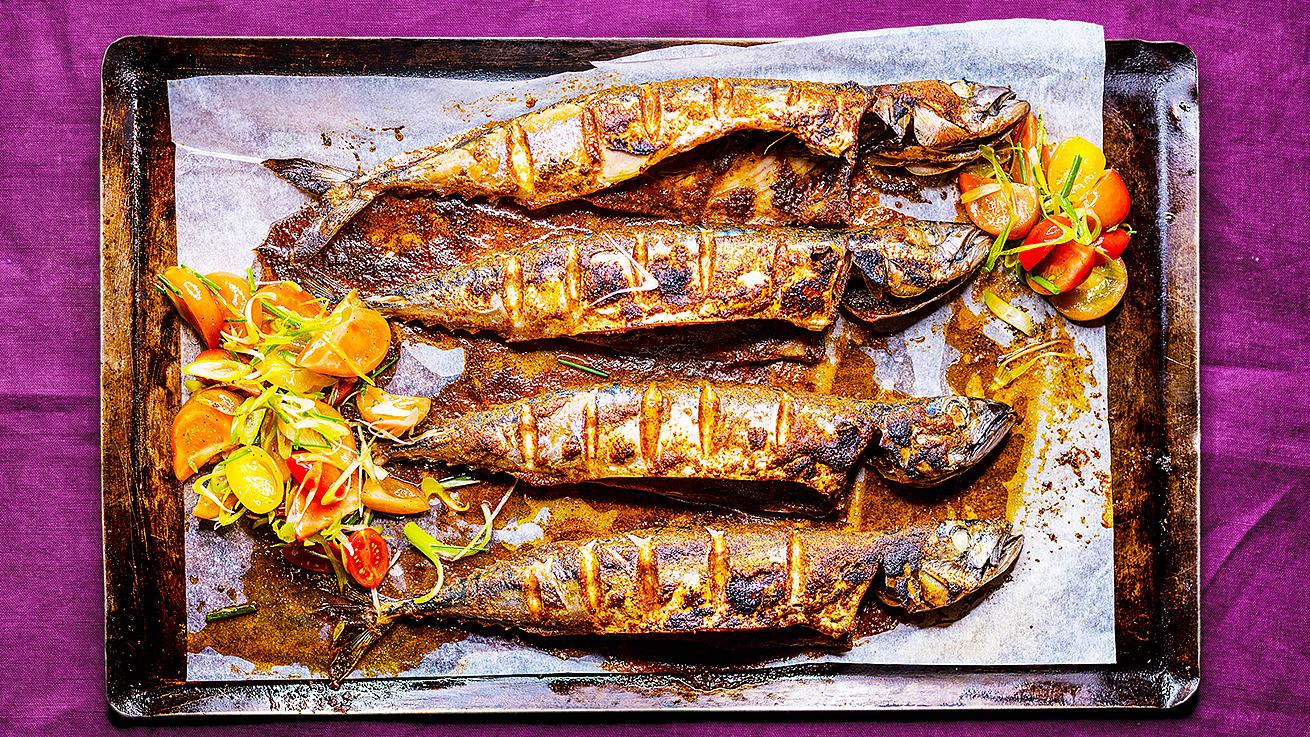
For my second exercise I am to produce an illustration for use on a menu of a sophisticated quality fish restaurant. The ambience of the restaurant is modern and bright with a comtemporary design. As the rstautn is so ‘high-class’ the menu wants to show how fresh their ingredients are.
For the exercise I am to produce an illustration for use on the menu but also to be used as a logo on stationary and company vans. To make this possible, the image has to be able to be seen clearly at a small sixe (on the menu) and at a larger size (like on the side of a van). The illustration needs to be a simple and clear design that depicts the food as visually appetising.
I shall be working at the larger scale of A3 to produce my design, I shall then produce a range of other sized examples to include in my sketchbook from A3/A4/A5/A6 and 40mm x 40mm. Like I have done in my first exercise, I will firstly research into different sophisticated restaurants and what their menus look like (focussing on how they depict their food and if any of the images are illustrations and not just photos of the food). I will research 4 restaurants and include my findings in my sketchbook. I will then create a mind-map of what I want to include in my design. I will show my thought process and show why I made certain decisions. Next I will show my design process by including many thumbnail designs, visuals, colour visuals and my final design.I will digitally add my image to an existing menu from a sophisticated quality fish restaurant and analyse my design. Finally I will evaluate my design, talking about the good and bad points of my illustration.
Researching my 5 chosen restaurants:
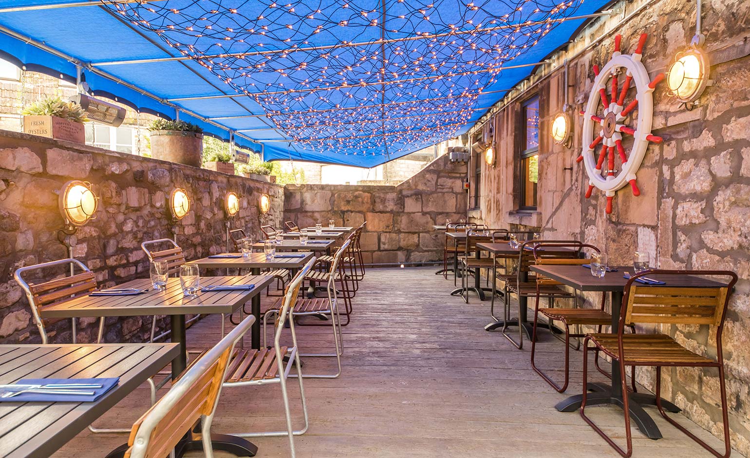
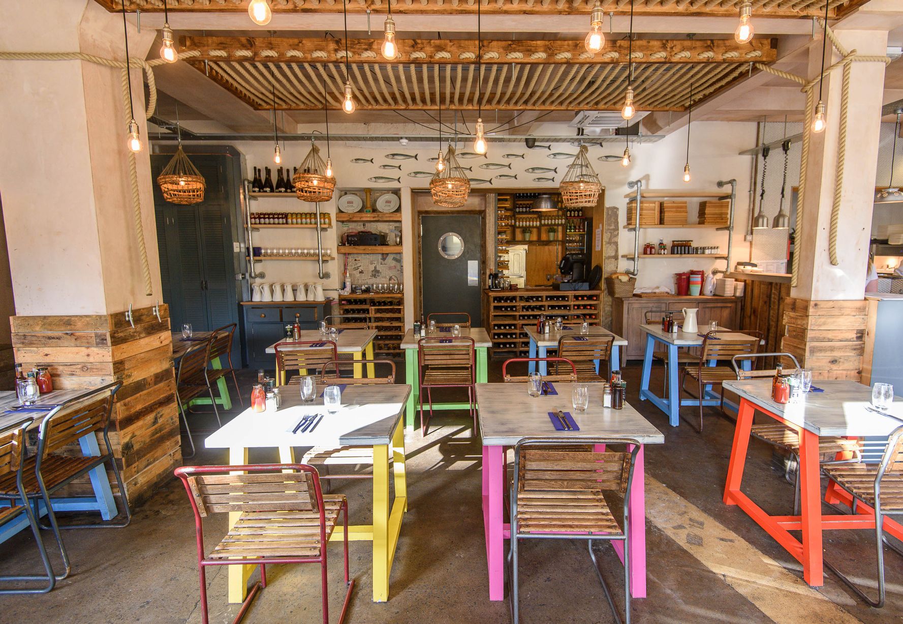
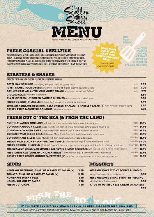
Restaurant 1 – The Scallop Shell
The Scallop Shell in Bath was my second favourite restaurants. The ambience of the restaurant was fresh and bright. I like how they use small bits of colour in their restaurant on the table legs, this gives the restaurant a modern feel. Like ‘Prawn on the Lawn’, the outside of the restaurant is very basic and not very attractive. It doesn’t ‘wow’ me but the interior is very different. I like the way that they have incorporated an actual bath in the restaurant for display purposes to be quirky. This seems to be the main feature of the interior design of this restaurant. The restaurant is a lot more graphically illustrated than the previous restaurants menu from ‘Prawn on the Lawn’. But still the illustrations shown are very basic. Just a fish, boat and spatula are shown and drawn in a child’s style. The colour scheme on the menu is good though. The menu items pop out as most parts of the menu are very lightly coloured using colours like light blue and light beige. The font is a dark brown-black and relatively bold. If I was to incorporate my illustrations into this menu I would make sure that I kept to their colour scheme by colouring my art with pale colours. I would never use dark colours or thick line-work on my design.


https://www.instagram.com/thescallopshell/
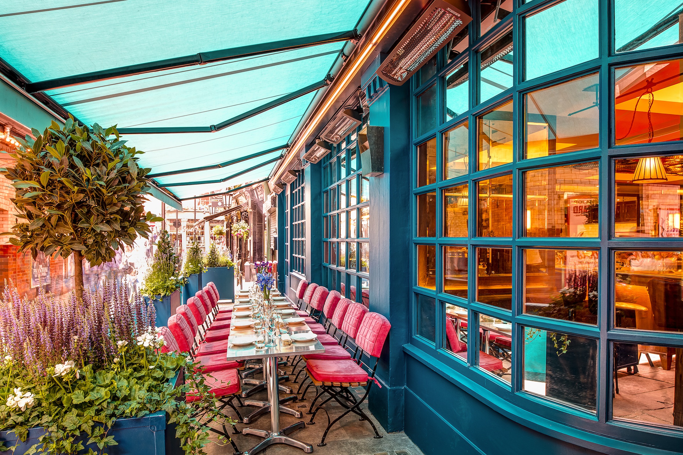
Restaurant 2 – Prawn on the Lawn
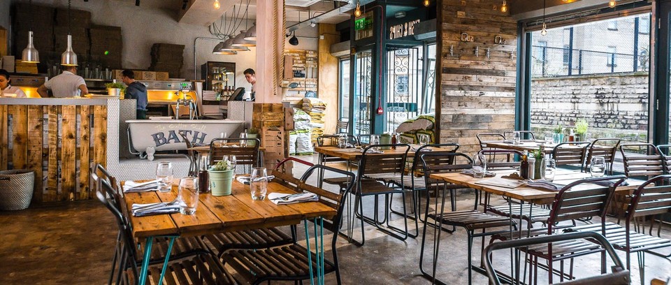
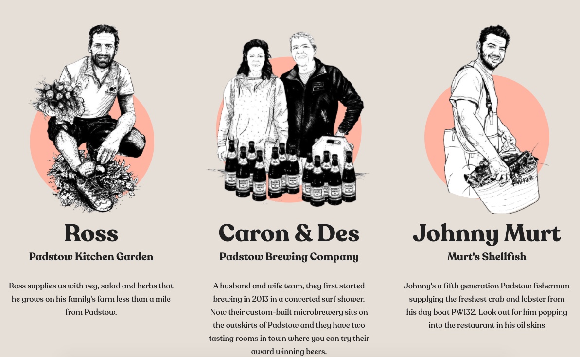
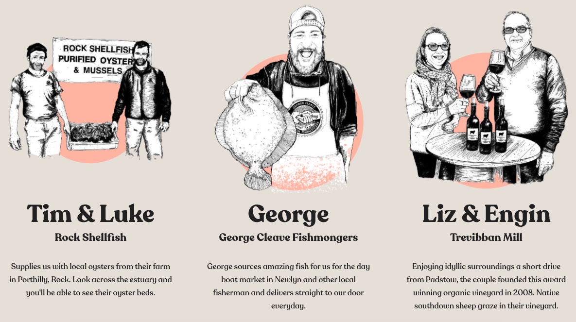
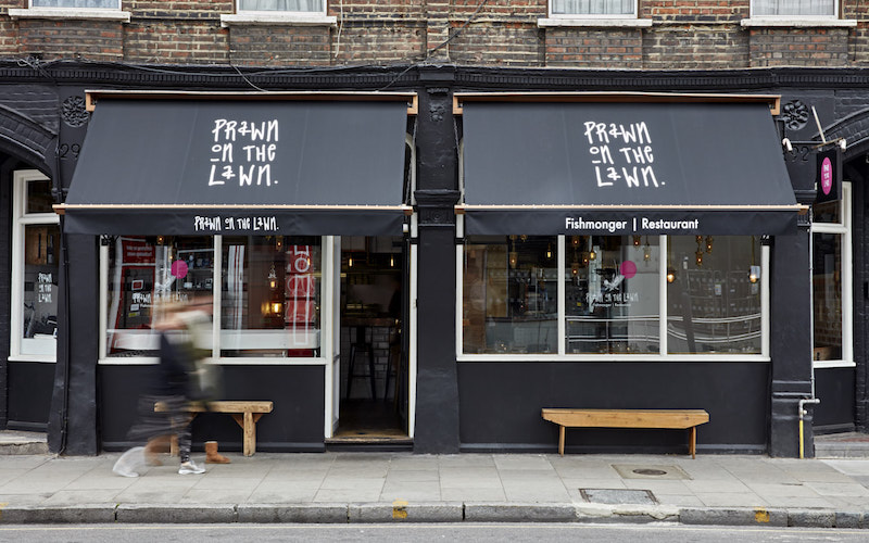
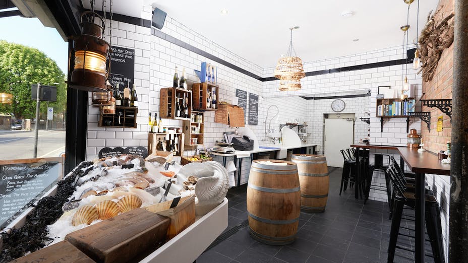
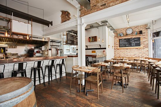
Prawn on the lawn in London was one of the first restaurants that really caught my eye. As you can see from the photos that are shown both on my WordPress page as well as in my sketchbook The ambience of the restaurant is very modern and bright with a contemporary design and I found to be the perfect example of a sophisticated fish restaurant. On the outside of the restaurant it’s relatively basic in design and the architecture isn’t amazing. The logo shown on the outside of the restaurant it’s very unique and not in the font style that has been taken from word for instance. When you enter the restaurant it is very open and airy with many seats. Annoyingly as this is a restaurant and a fish mongers, the fish that they catch on a daily basis changes continuously so the menu featured on their website it’s just a sample menu of a few items that they may or may not have in stock. Within the restaurant there is a blackboard showing today’s catches and features about 10 different menu options. Interestingly I found some illustrations on their website showing the different people that make up the business. Each image is a portrait drawn in pencil in black-and-white showing what each person does for example there is a man called George who runs the George Cleve fishmongers in London which is where they get their produce from and he delivers straight to their door every day. The illustration shows George holding up a flatfish and he is wearing an apron with his logo printed on the front. I thought this was a really unique and interesting way to show their customers or anyone who looks online on their website where they get their produce from rather than just names and addresses. It’s quite personal. If I was to create a logo/illustration to be used on the menu I think I would draw it in the same style as these illustrations that I mentioned above so I would draw the logo in black-and-white but not add as many details as in the illustrations shown on the website. So that The illustration would connect with the other illustrations on the page I would also add the peach coloured circle that is featured behind the illustration showing on their page already. It’s quite lucky that the sample menu shown on the website features no illustrations so I may use the sample menu as a way of showing my illustration on a quality fish restaurant menu like I said in my brief for this exercise.

https://www.instagram.com/prawnonthelawn/
Restaurant 3 – J Sheekey
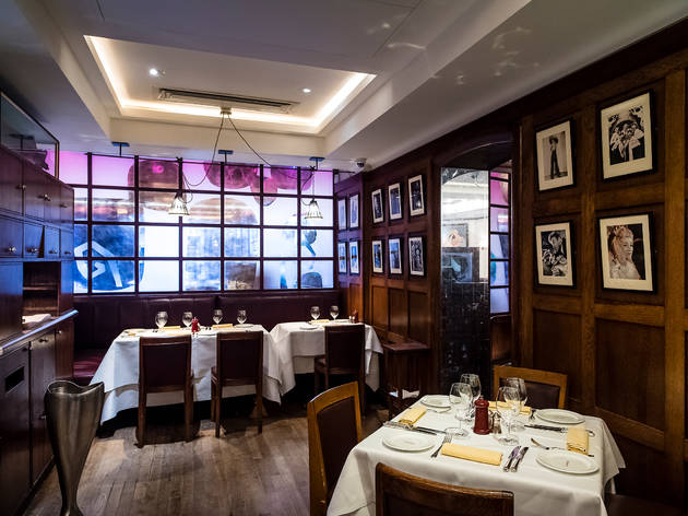
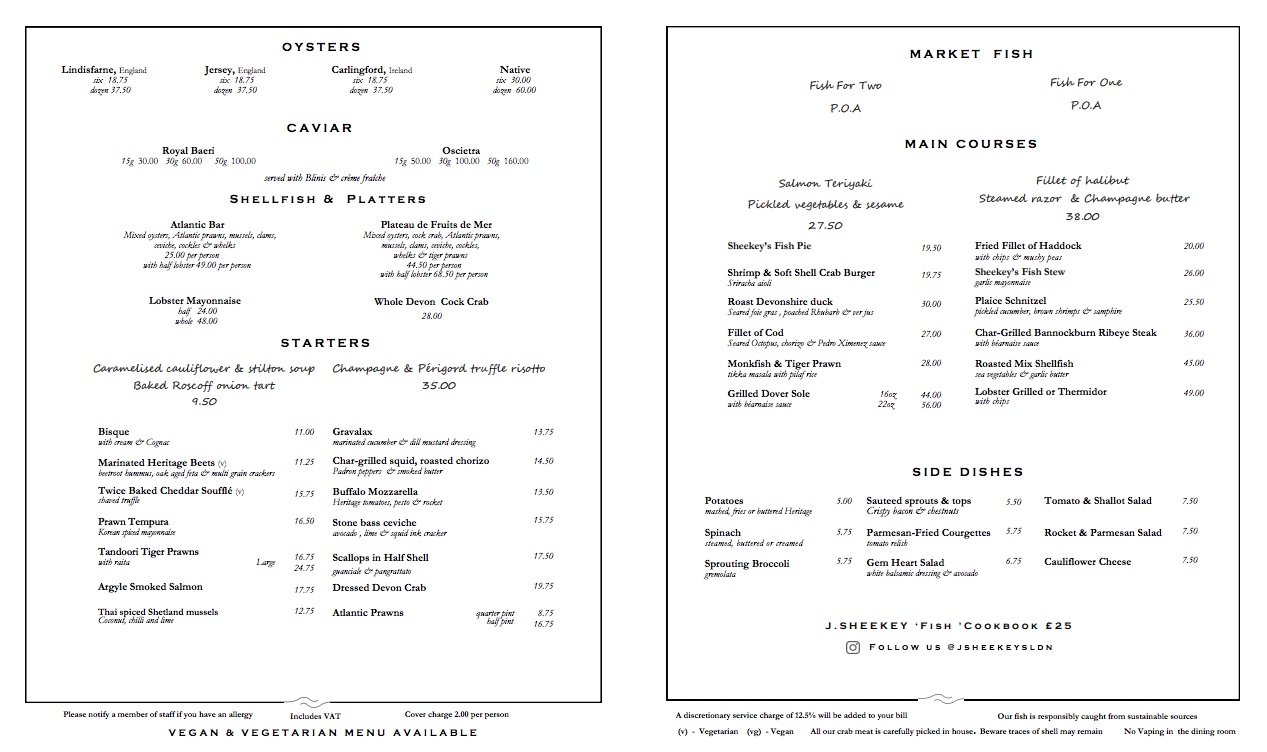
J Sheekey’s in London is my favourite restaurant out of all the restaurants that I have researched. The outside of the restart is bright and modern in design. Their colour scheme is very colourful and bright using reds, blues and greens. Strangely though the menu from this restaurant is very basic and doesn’t have any colour. There are also no illustrations on it. The food from the menu though looks colourful and rustic. If I was to create an illustration for this menu I would make it colourless and use thin lines so that the illustration blends in with the font on the menu. The interior of the restaurant is very dark in contrast to the outside of the restaurant which I found strange.

https://www.instagram.com/jsheekeyldn/
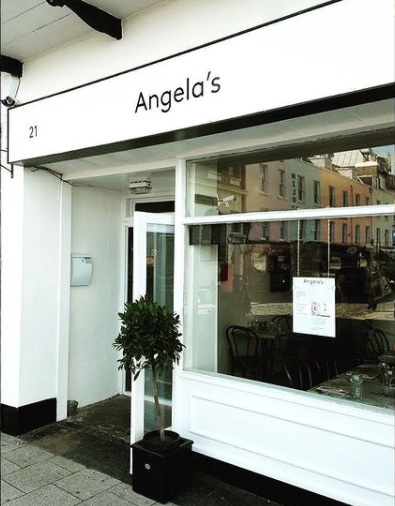
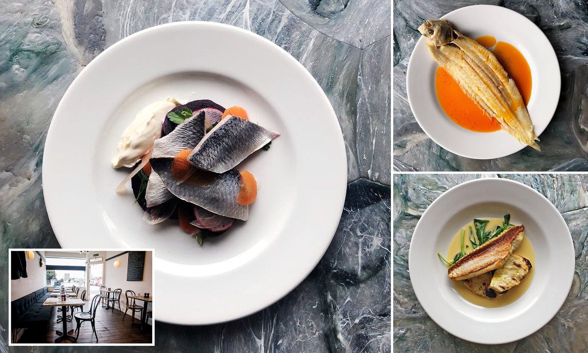
Restaurant 4 – Angela’s/Dory’s
Angela’s/ Dory’s in Margate are what you would call ‘sister companies’ meaning two restaurants partnering up and sharing profits. There seems to be a pattern with the restaurant exteriors of all the restaurants I have researched, the outside of the restaurant yet again is very bare and basic. The inside of the restaurant has to be the most bare out of all the restaurants, still is still has a modern and contemporary feel to it. The dishes served at the restart are very minimalist and neat. I think this is a pattern within this restaurant. Nothing it too fancy, it just ‘is what is’. The menu from these two restaurants are very basic as well. It’s a ‘catch of the day’ menu, so there is a small list of what in stock that day. The menu is displayed on a small blackboard on the outside of the restaurant so with this menu it would be difficult to say what sort of illustration I would do for them. I would probably suggest that they create a new menu with dishes that they can get ‘all the time’ on a regular basis, I would then keep to their traditional blackboard design and create my illustration using a blackboard and create the entire menu in black and white so that it looks like a blackboard.


https://www.instagram.com/angelas_of_margate/?hl=en
https://www.instagram.com/dorys_of_margate/?hl=en
Sketchbook Pages:


My Mindmap:

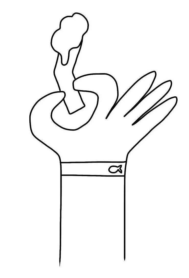
My Thumbnail designs:


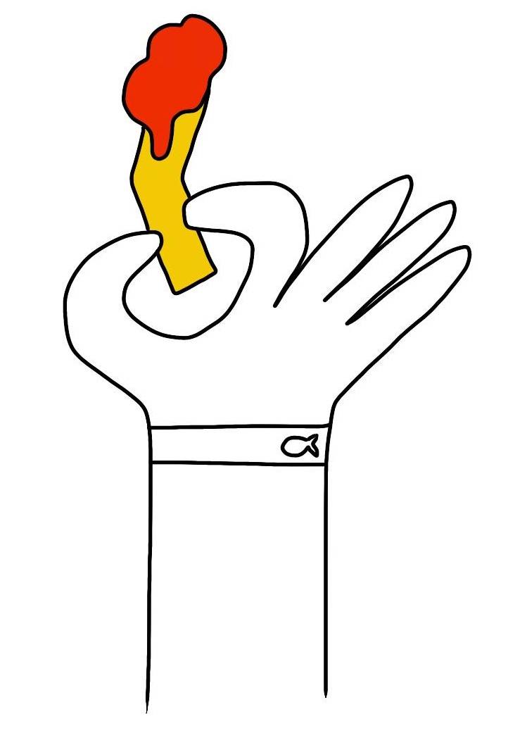
My Visuals & Colour Visuals:

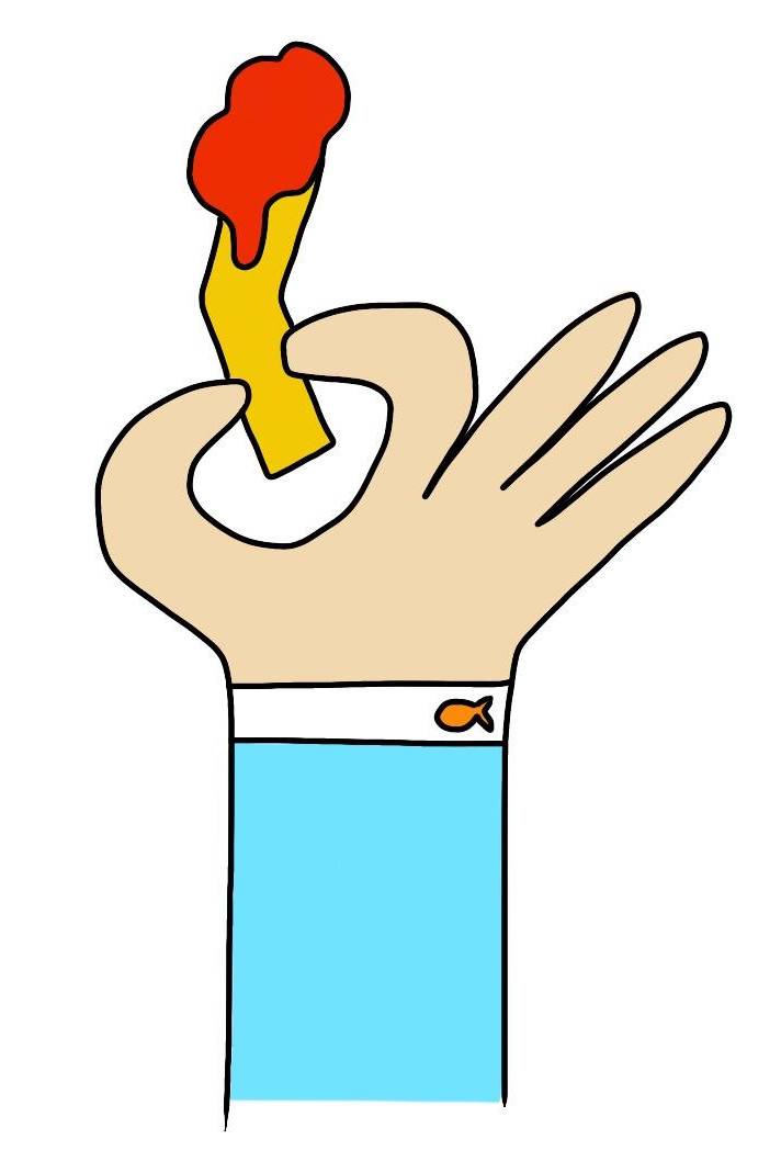
My Final Design:


40mm x 40mm example:

Evaluation:
I really enjoyed this exercise, I had a lot of creative freedom. The part that I found most difficult was researching the restaurants. It was hard to find ‘sophisticated’ fish and chip restaurants, I searched on multiple websites for this and found the only ‘sophisticated’ restaurants that served anything like fish and chips were under different names like ‘oyster bar’ and ‘seafood restaurants’. I liked creating the thumbnails for this exercise as I had quite a few different ideas of how I could create an illustration that could also be a logo. I like my final design and find that it meets the brief. If I was to change anything it would be to change the colour on the person’s sleeve as I think this makes the design less attractive. I decided to make my design look like a cartoon-y design as I think that a lot of sophisticated restaurants use this type of style in oder to attract a wider audience, including young people. I also didn’t include ‘realistic’ looking food as I think illustrated food mostly looks unappetising which is why people mainly rely on photography to advertise their produce in menus.
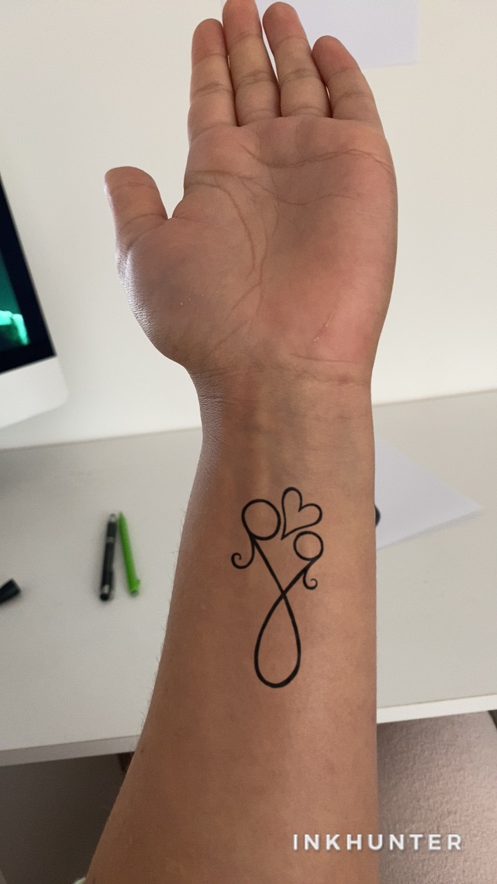
Exercise 3/3 – A Tattoo:
For this exercise I am to design a tattoo based on the word ‘mum’. The tattoo design should also be able to be displayed on the front of a greeting card. As I don’t have to include the word ‘mum’ in my design I will be creating a ‘mum’ themed tattoo. I will firstly research the history of tattoos. I will then create a mind map in order to decide what I want to include in my design. I will decide how complex the design will be and whether there would be colour. I will show my design process by creating various thumbnails, visuals, colour visuals and final design. I will show how my tattoo would look on a human body (large scale) as well as an example on a greeting card ‘small scale).
Research:
“Tattoo is a type of body modification known for thousands of years. To create it, people insert ink into the dermis layer of the skin which changes colour of the skin pigment and stays there for a long time. People tattoo themselves for many different reasons”.
Reference: Historyoftattoos.net. 2021. History of Tattoos – Origin and Meaning of Tattoos. [online] Available at: <http://www.historyoftattoos.net/> [Accessed 28 January 2021].
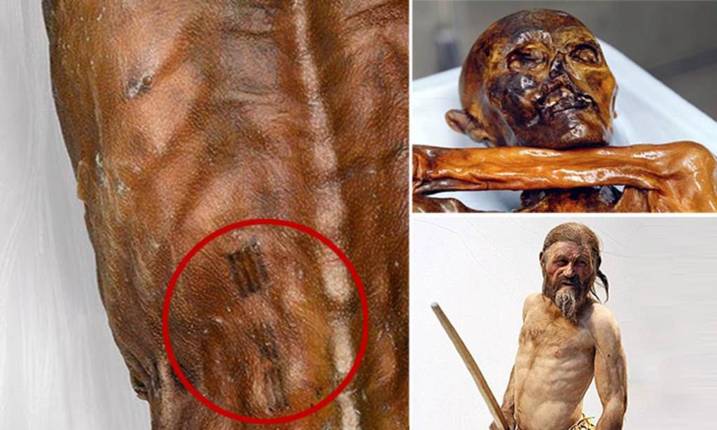
Picture Of Maori Chief With Moko Tattoo 1784
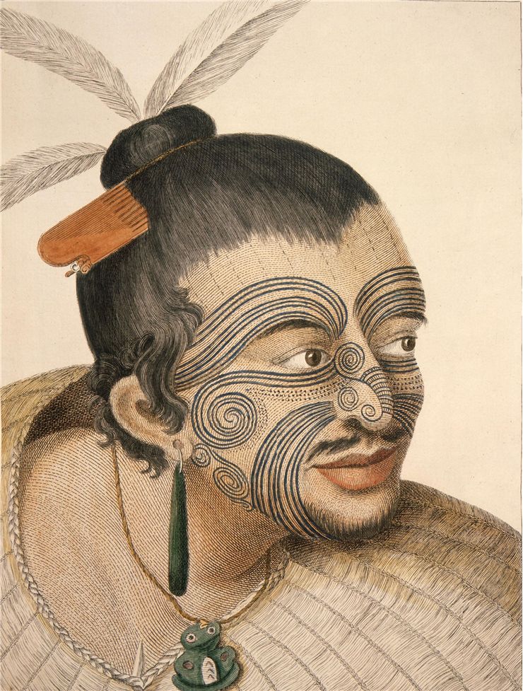
The art of tattooing has been practiced for over thousands of years. The oldest evidence of tattooing dates from Neolithic times. There is a well-preserved mummified Icelandic man called Ötzi from 4th Millennium BC that was found in the Alps. He has carbon tattoos in dots and lines. All through history, tattooing has been used for different reasons and meanings. Nowadays tattooing is normally cosmetic and a way of artistically expressing someone’s love for something. In the past tattooing could be a way of marking someone’s rank within an army, identification, skills, devotion, healing and punishment. Tattooing was seen as barbaric amongst Christians in Europe as it was defacing a body that God had created.
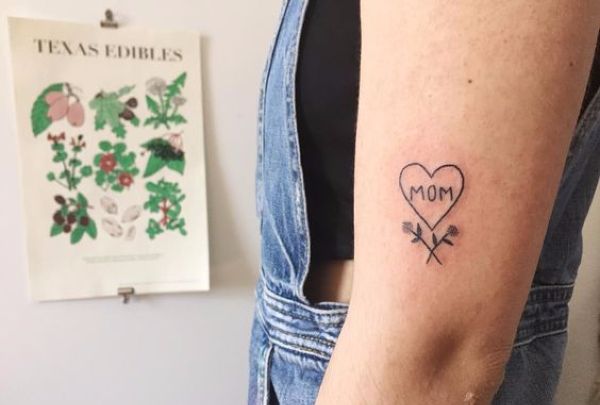
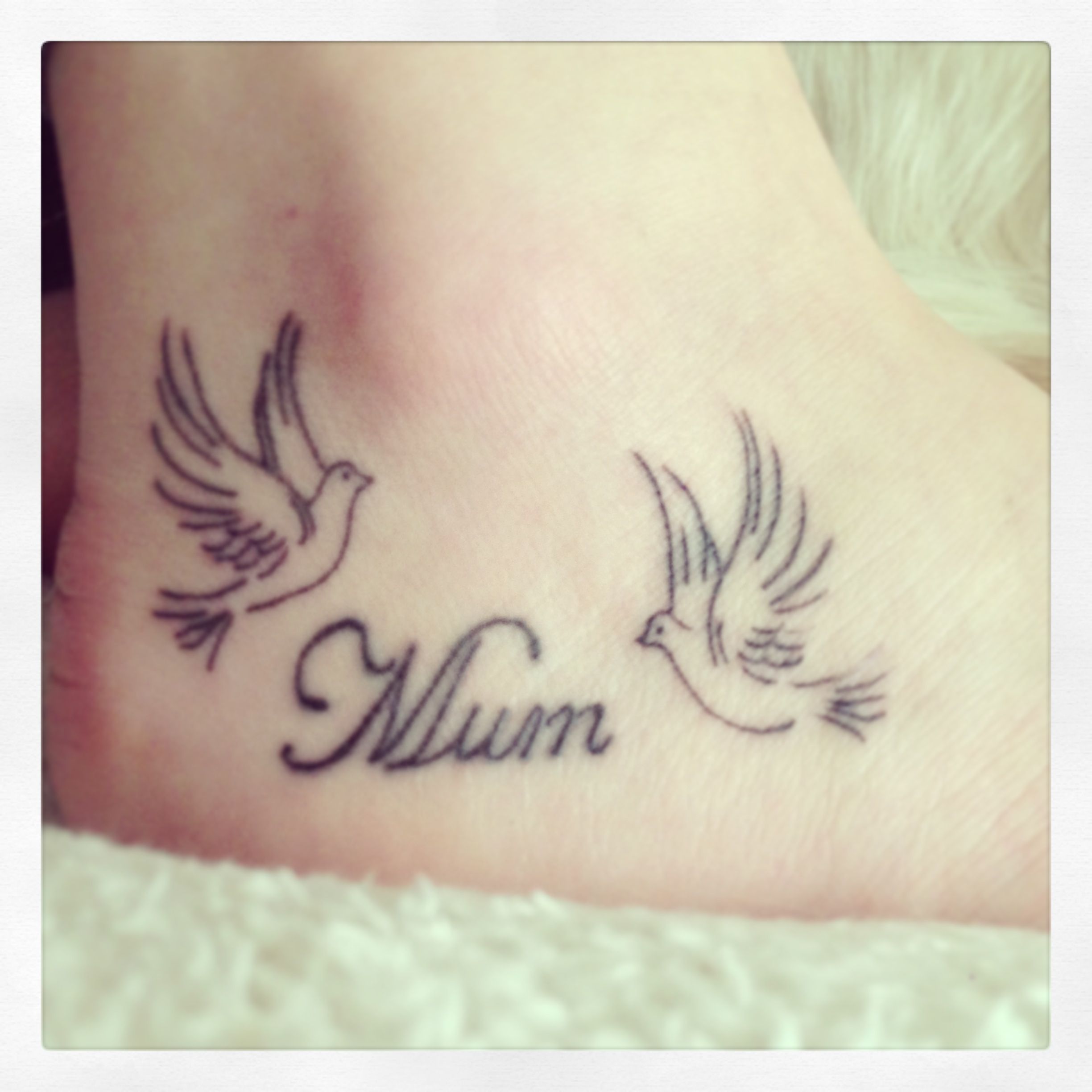
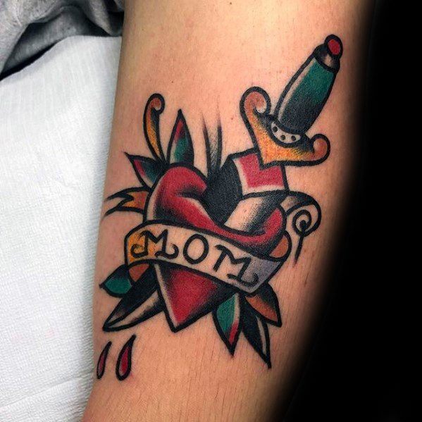
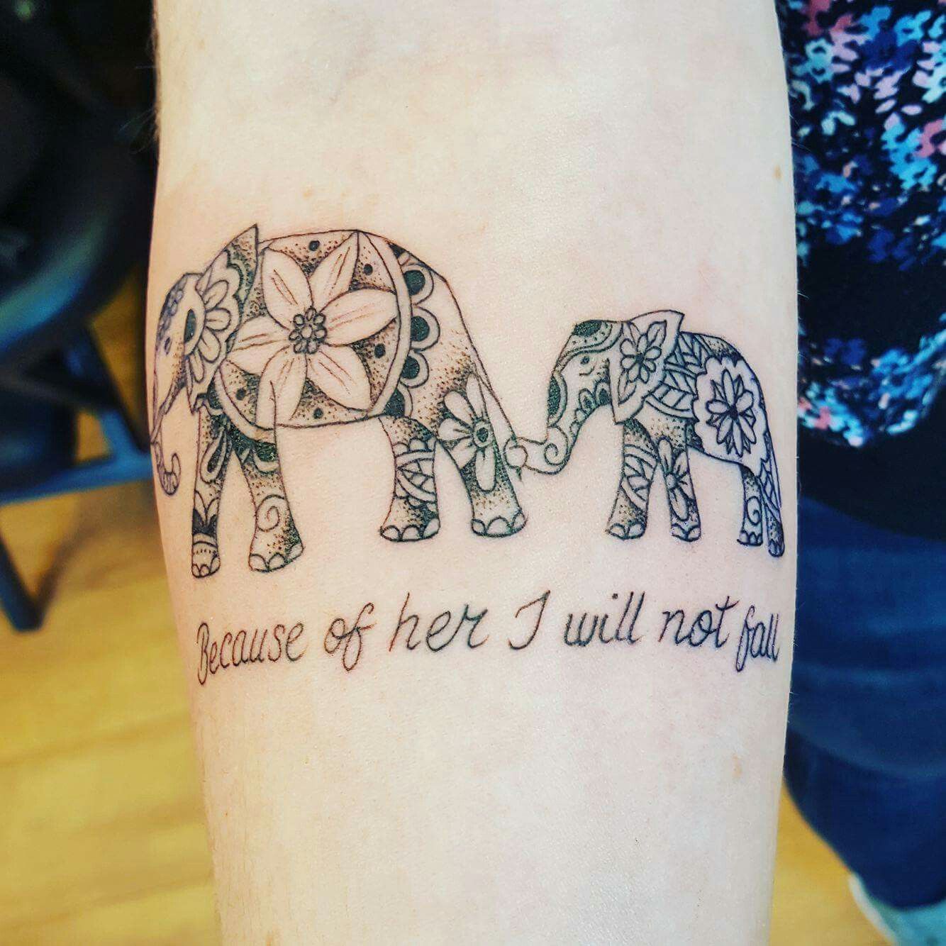
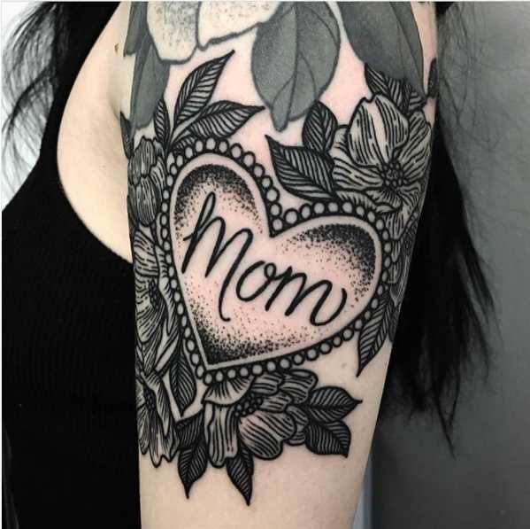
Example of ‘mum’ tattoos found on Google:


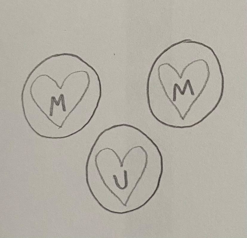
Thumbnail Designs:
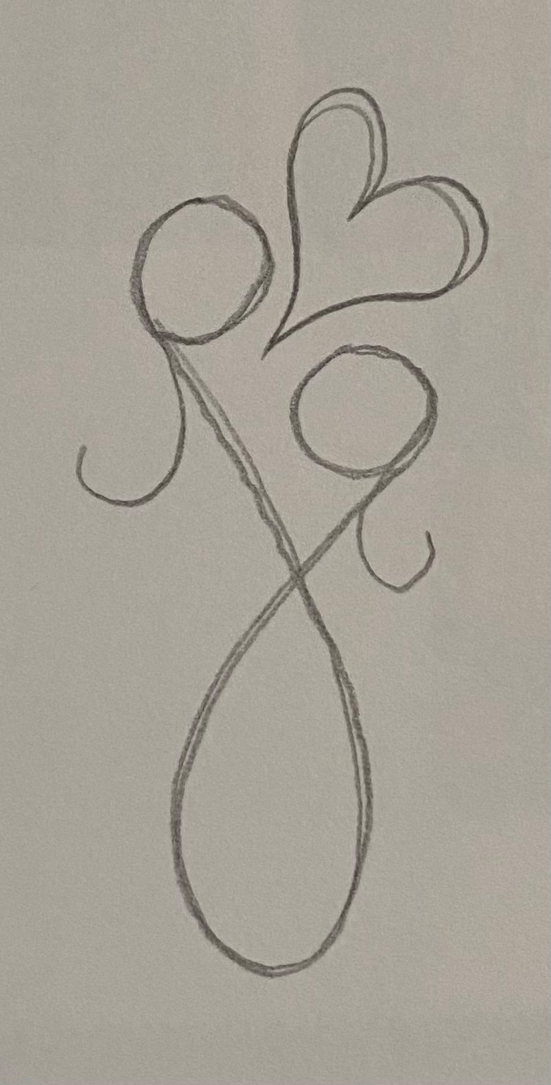


Visual:

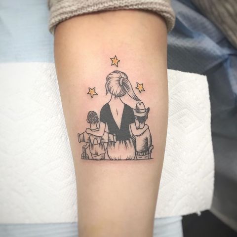
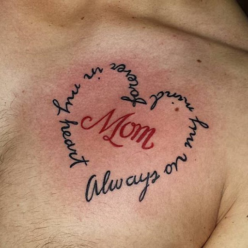
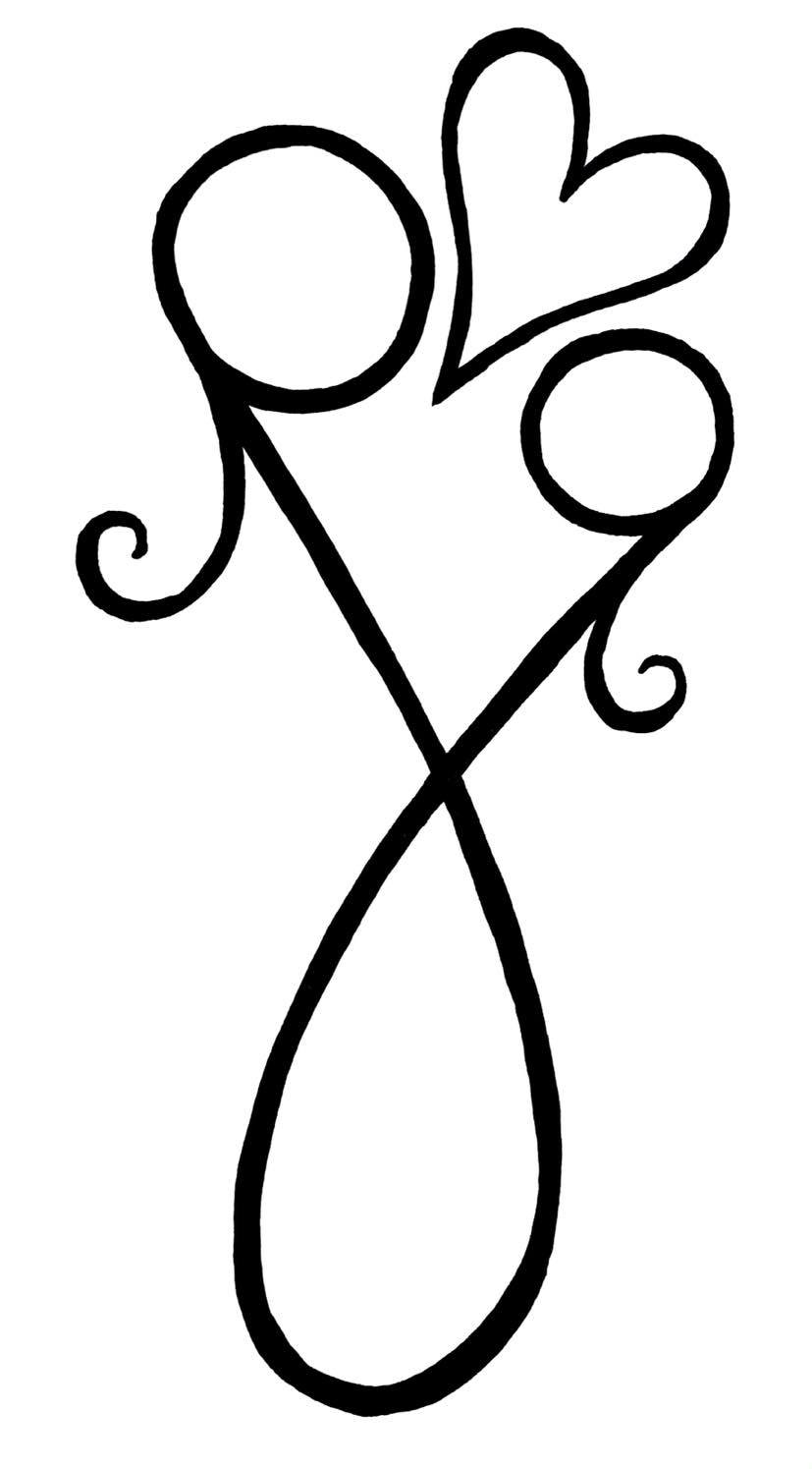
Final Design:

Evaluation:
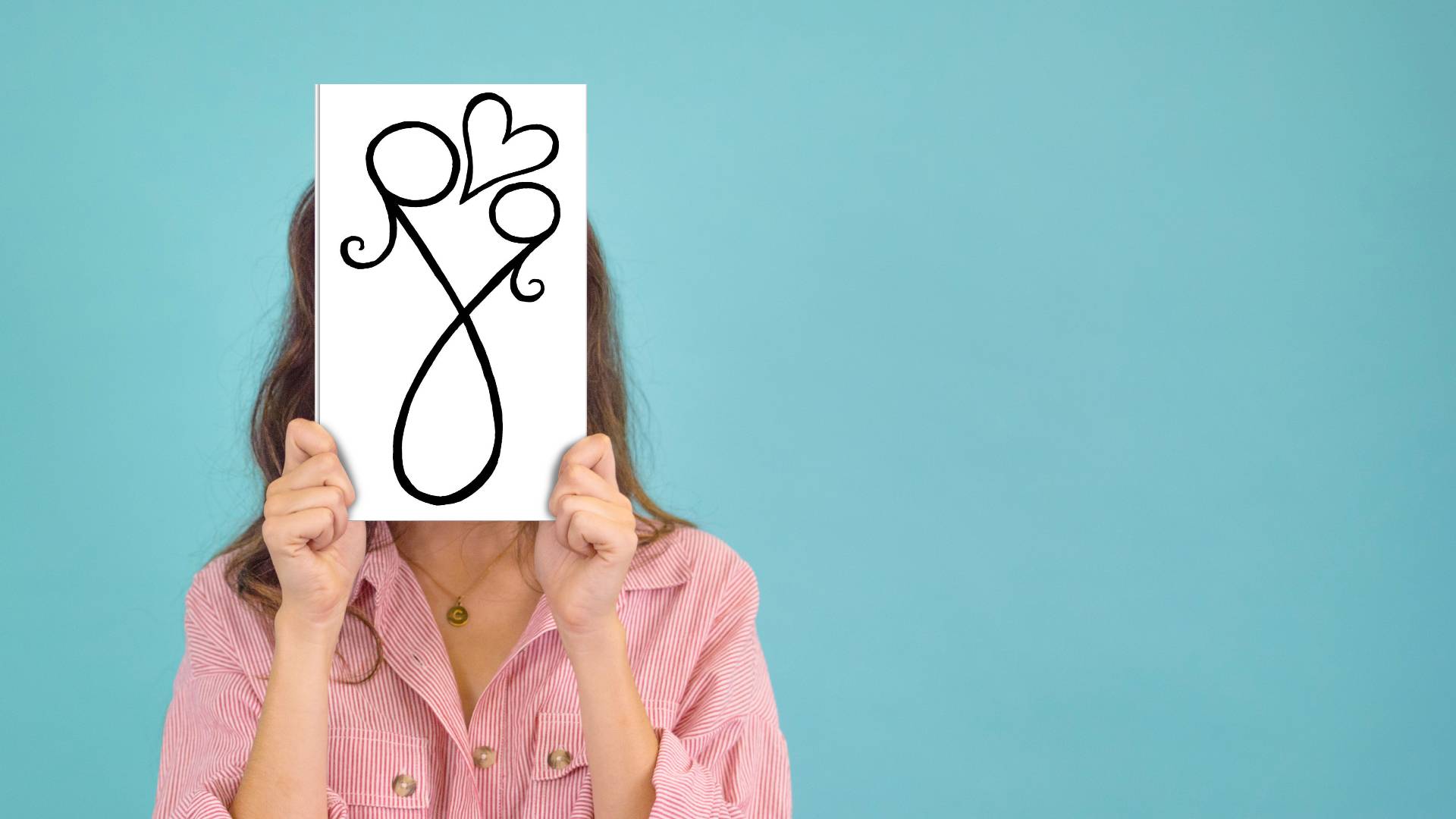
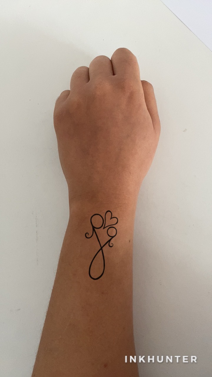
I was really happy with the way this exercise turned out I feel that my tattoo illustration meets the brief. I enjoyed the fact that I didn’t have to actually write the word ‘mum’ in the tattoo design because of this, I was given more creative freedom to make up a unique design. For the brief I was asked to decide on how complex my design would be and whether I’d be using colour. I wanted to go for a simplistic design that would stand out at the same time not be too bold. As the tattoo itself doesn’t have the word mum written on it I thought the design would be more private and personal to the person wearing it. The design shows two girls, a mother and a daughter, hugging. But as the tattoo would possibly be placed on somewhere small like a wrist or an inner arm I decided to make it simple I’m not too complex otherwise the design would would be hard to see. I showed this design to my mother and I thought it would be relevant and she understood what the image showed straight away. If I were to change anything about the design it would probably be adding a bit of colour, maybe in the heart or an outline in pink or something. In order to show my designs on both a greetings card and on the human body I decided to use an app called ‘InkHunter’ to place my design on my arm. I also use the same websites that I use for my mock up book design in part three.
Project – Visual Distortion:
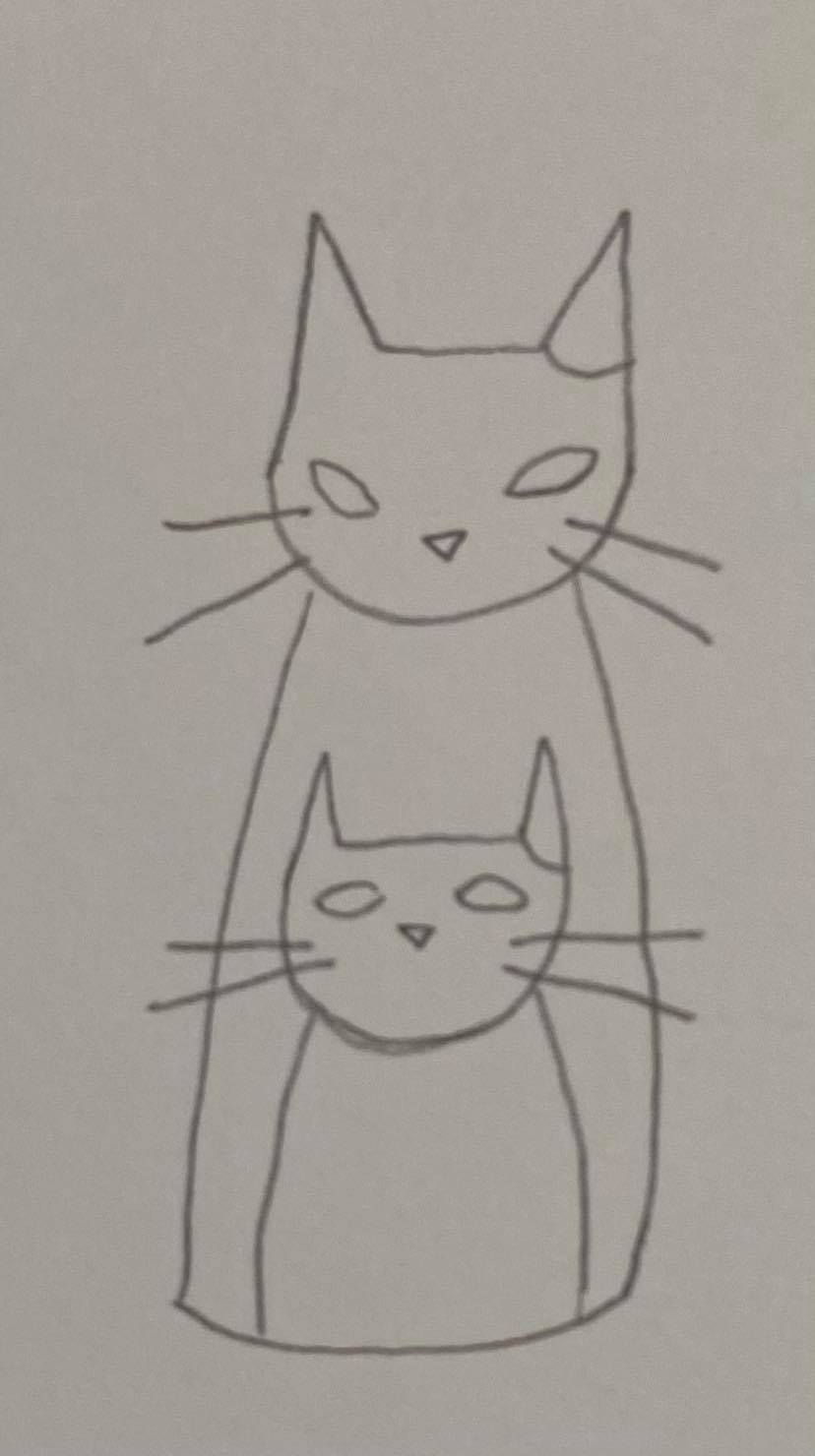
A drawing of my cat Tilly:


A drawing of Tilly using only 5 lines:

A collage of Tilly using newspaper images:

A drawing of the collage of Tilly:

Let’s see what the model thinks?:

My refined and distorted image incorporated in a bigger image with a narrative:

Evaluation:
For this project I decided to focus on my cat Tilly as the model for the visual distortion. I enjoyed this exercise because I was able to focus on a lot of different ways of creating my designs, including using different media. Overall I have completed five different designs of Tilly. For the first image I was told to create an image of Tilly that made it seem real life like. I was also asked to describe Tilly’s appearance or personality by focusing on a big part of her which was her eyes. Her eyes are massive so I decided to make this the main point in this project. For the next Image I was asked to draw Tilly using only five lines. Tilly has very distinctive markings on her face including four stripes or lines across her forehead and two lines coming out the corners of her eyes to the sides of her head. Obviously I had to include her markings within the five lines. I think the outcome of this five line drawing came out well. For my third image I had to create a collage of Tilly made using found textures and objects from newspapers or magazines. I went through about five different newspapers focusing on getting different textured brown objects including wooden floors, sheds, a brown jackets and even some lions from a safari trip advertisement. I made the nose and the tongue from a handbag image and Tilly’s eyes were made from a Rolex watch advertisement. The eyes are actually made not from the watch face itself but from the two small dials at the back of the watch face. My fourth image is of a drawing of my collage. I decided to draw only the boldest parts from the collage. The fifth and final image is of my refund and distorted image incorporated into a bigger image. I decided to remove the lion heads from Tilly’s ears as I thought this would make sense in a narrative. I decided to focus on the dials in Tilly’s eyes as I thought this would make a good narrative for either ‘running out of steam’ or ‘burning out’ , because of this I decided to introduce the element where Tilly’s stripes have turned into pipes that are steaming out of control. I really enjoyed this project as yet again like I’ve said in the past projects I have creative freedom yet again but I also was able to focus on illustrating my cat Tilly which I enjoyed doing.
Project – Character Development:
Different characters that I found in a few different newspapers, categorised:
Politics:

Science:

Pharmaceuticals:
COVID-19:
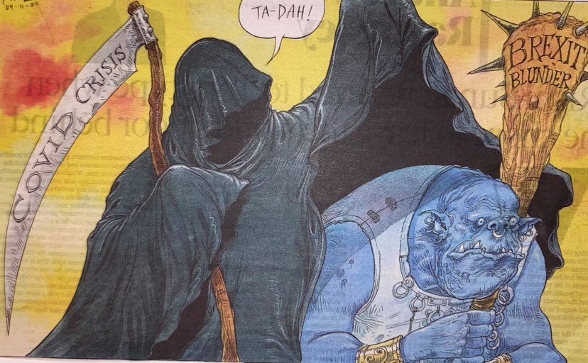
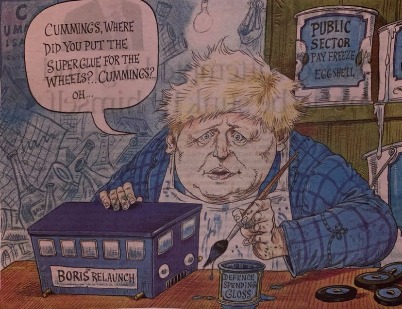
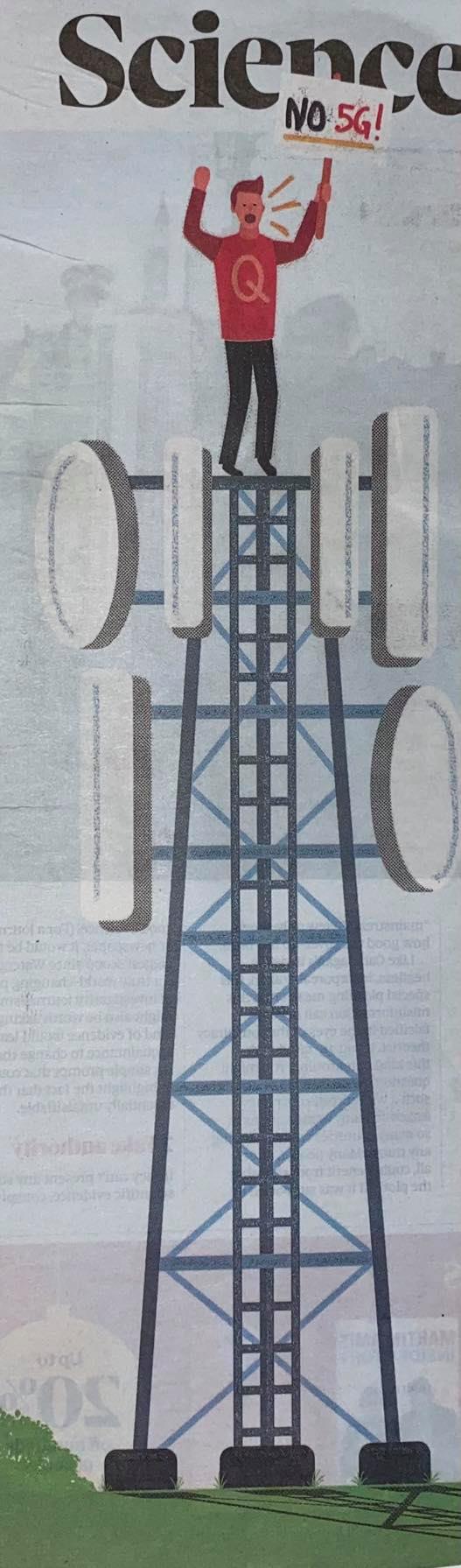
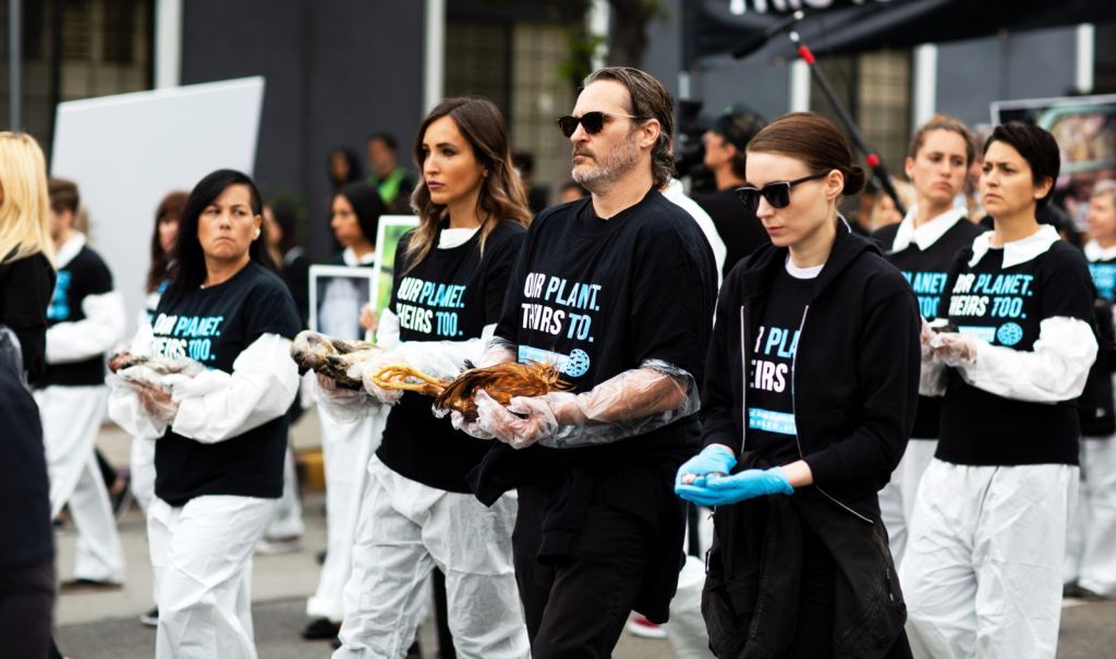
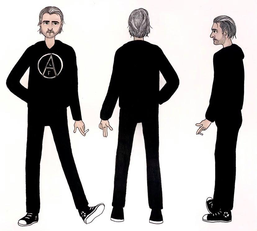
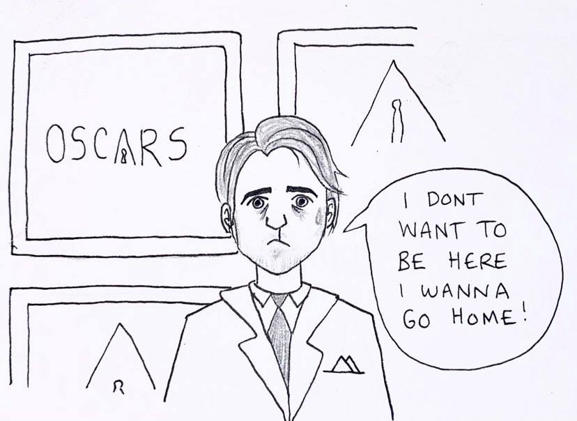
For my final project in part four of this course I have been asked to create and develop a character from either real life, media or book. Before I create my character I have been asked to go through newspapers and collect examples of different characters and categorise them. I went through five different newspapers and found six examples of different characters. A lot of illustrated characters that you see in newspapers are normally based on real life people including politicians. Because I live in the UK most newspaper illustrations feature Boris Johnson (see photo) but are the illustrations feature more of a topic than a person and it is normally a narrative that is illustrated for instance COVID-19 or Brexit. The characters that I chose and cut out all very different in the way that they are illustrated. For my character development I will be creating a character based on a real person from the media Joaquin Phoenix. I will be illustrating him as himself and not as the many various characters that he has acted for instance Arthur Fleck from Joker 2019, Arthur is already a character so therefore this would work, I think it will be interesting to illustrate Joaquin himself. I have chosen working because he seems to be a very animated person in general so the idea of creating him into a ‘character’ seems like a lot of fun to me. He is very expressive and his facial movements in general and I think that’s one feature of him that draws me in when I am watching him act in films. I will try and find as much as I can out about him including hobbies, clothes that he wears and analyse his personality and features of his body/face. I will include pictures of Joaquin Phoenix to show what this person actually looks like in reality so that you have a better judgement of him and the character that I will be creating.
Joaquin Phoenix:
Age:46, Height: 1.73m, Born: 28th October 1974, American actor/activist/producer/environmentalist. Star sign: Scorpio, Lives in: Los Angeles USA.
Wins: Academy award, grammy award and two golden globes.

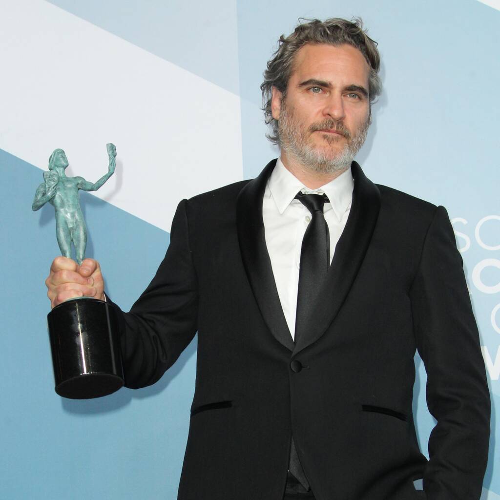

Best known for: Joker (2019), Gladiator (2000), Walk the line (2005), The master (2012) and You were never really here (2017).
Personality: Quiet, shy, funny and quirky.
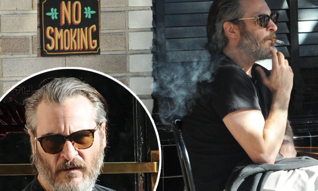
Physical attributes: scar on upper lip, uniquely coloured eyes (dark ring around outside of eye), small circular tattoo under right arm, short dark to grey beard and large dark eyebrows.


Likes to wear: Odd quirky socks, black hoodie with “support the animal liberation front” and black converse shoes.
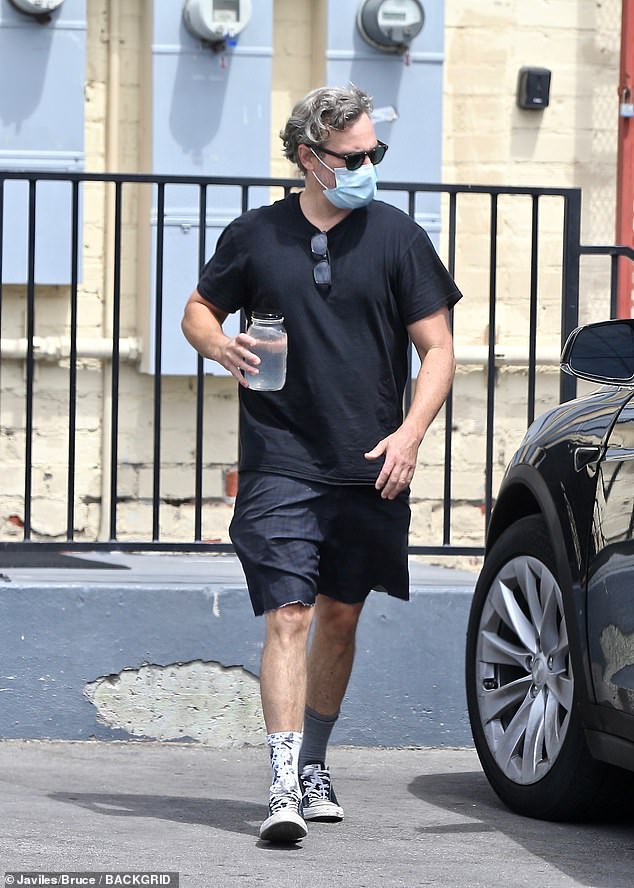


Bad Trait: Very big cigarette smoker (American Spirit)
Good Trait: Well known vegan, environmentalist and animal activist.
My 360 drawing of Joaquin Phoenix:


My other comical drawings:

Tabitha White (me):
Age:22, Height: 1.67m, Born: 3rd March 1998, British, Student, Artist, Photographer. Star sign: Pisces, Lives in: Eastbourne, UK.
For my second character I chose to design myself. I thought this would be a fun and interesting challenge and as I am not a Hollywood award-winning actor who lives in LA I will analyse myself completely the same way that I did Joaquin. I thought this would be a good self-esteem exercise also.
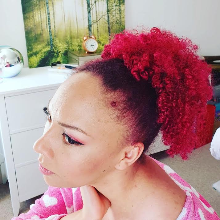
Physical attributes – fluffy pompom hair, tan skin all year round and brown eyes.
Likes to wear– Bright colours, converse shoes and spotted leggings.
Personality–shy, loner, artistic and dreamer.
Bad trait–I overthink everything and dwell on anxiety and depression.
Good trait–I try to be kind, thoughtful and caring.
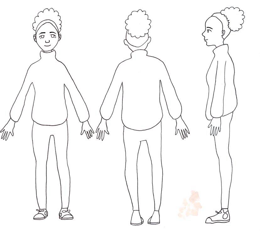
My 360 degree drawing of myself:

My other comical drawings:
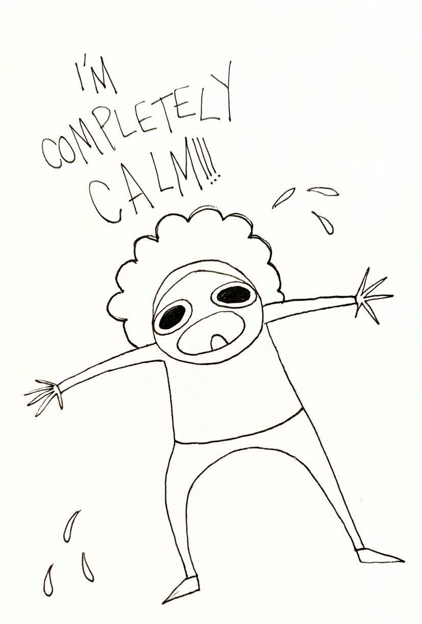

For this project I decided to create characters based on real life, the first one being Joaquin Phoenix and the second one being myself. I found this exercise challenging because of the fact that I have never drawn Joaquin Phoenix and I don’t like drawing myself but I wanted to challenge myself as I love Joaquin Phoenix and wanted to draw him and I wanted to try and boost my self esteem by drawing myself. I think both outcomes came out well but I actually prefer the cartoon-y designs of Joaquin and myself more than the 360 degree drawings. I think they are more expressive and show personalities. For Joaquin I drew a little image of him running out of a Vegan Whole Foods shop trying not to get caught by fans and for myself me having a panic attack in the corner, I thought illustrating myself in this way would comically shown what a panic attack looks like to me! If I was to change anything it would be to redraw the 360 degree drawings as they aren’t exactly accurately proportioned.
