For my research task, I have to choose an illustrator to research. I must visit their website, blog, or read any articles I can find about them.
• Alice Wellinger
• Lucinda Rogers
• Lisk Feng
• Peter Kuper
• Holly Wales
I found it really hard to decide on what illustrator I wanted to research. I managed to narrow the list above down to three that I felt connections with: Lisk Feng, Peter Kuper, and Holly Wales, I have attached the links below:
Lisa Feng: http://liskfeng.com/ – I felt a connection with Lisa’s work as I was interested in the media she uses for her work. Her work feels like it is influenced by 50’s artwork of that time in the style she draws people as well as her colour pallets. Her illustrations have a certain ‘warmth’ to them which remind me of the illustrations in my children’s books that my Mum would read to me before I went to bed.
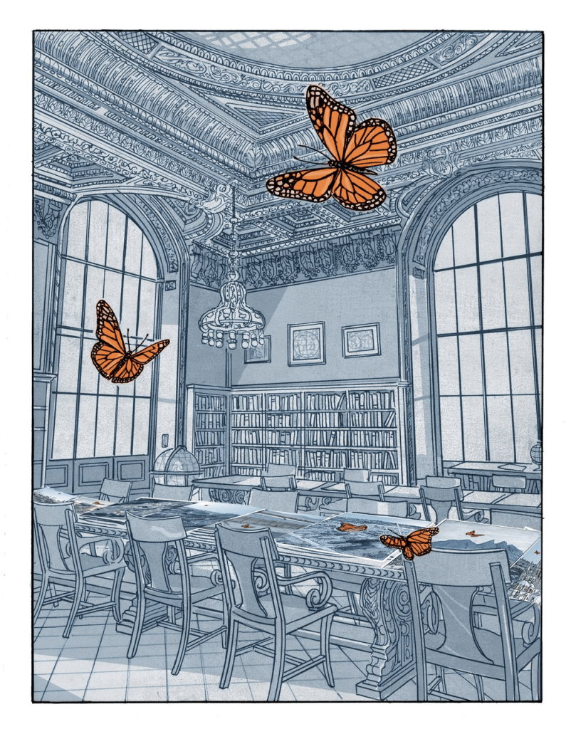
Peter Kuper: https://www.peterkuper.com/ – I felt a connection with Peter’s work as it was very intricately drawn. I also think he uses both traditional media as well as a graphics tablet/computer to make his designs stand out. I enjoy his muted backgrounds and bold foregrounds/subjects, for instance, his design below:
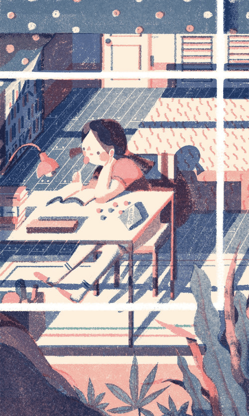
Holly Wales: https://www.hollywales.com/ – I felt a connection with Holly’s work as I feel like it’s such an interesting mix of abstraction as well as realism. I find her use of media interesting also as from what I can see on her portfolio, most of her work is created using felt pens or maybe even ‘pro markers’ (the same ones I use). Her drawings of makeup products including the image below of random cosmetic items that she drew for Marie Claire’s monthly column in the magazine have a very professional feel:

Finally, I decided to go with Holly Wales as her illustrations really stood out to me, I found a lot of similarities between her work and mine.
I will make a list of keywords that I think reflect the visual language of their commissioned work:
- Bold
- Bright
- Sharp
- Colourful
- Flawless
- Eye-catching
- Intricate
- 50’s & 80’s (mixed)
- Editorial
I need to write a short statement of no more than 200 words, to describe their work and visual language. What connections do I think exist between their sketchbooks and their creative identity or illustrative style? I will consider how they use media and mark-making, whether their commissioned or professional work is political, dealing with issues, interpretative, reflecting narrative, informative, representational, decorative, or stylised, is it 2D, 3D, or 4D?
My Statement:
Holly Wales’ art is a mix of chaotic colours and well proportioned ‘still life’ objects. Her use of typography is very good, this is something she is strong at as there is a separate category on the website dedicated to her ‘lettering’. I enjoy the mixture of abstraction and realism in her work. The colours that she uses in her work are also ‘spot on’ and can even make her drawings of, for instance, cosmetic items seem real. There is a mixture of 50’s and 80’s styles in her work as well, especially her typography. There are a few times where she uses mixed media including using felt pen and crayon in the same image, this gives a collaged feel to the piece. I enjoy the variety of her work including different types of commissioned work. She creates maps, lettering, prints and patterns and food and drink advertisements, but throughout she seems to stick to the same medium; felt pens. I find it amazing how she can create images of food/drink and still make it look appetising, I myself find this very hard to recreate and have tried in previous exercises on this course to do this.
*Whoop* 200 words exactly! 🙂
