
Exercise 1 – Mixing and Matching:
Working around the theme of ‘hybrid’ I will create a series of illustrations using the following processes:
- DRAW – SCAN – COLOUR
- COLOUR – PRINT – DRAW
Process One:
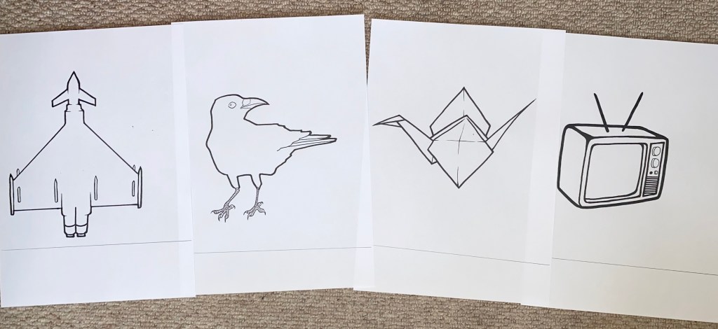
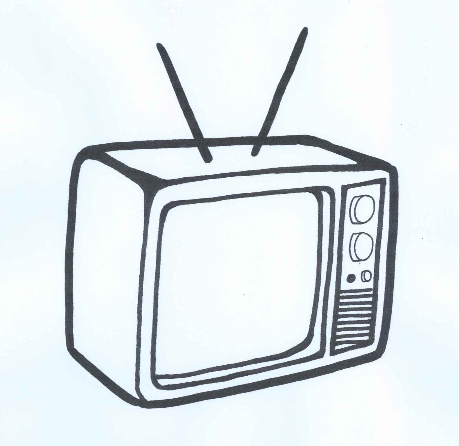
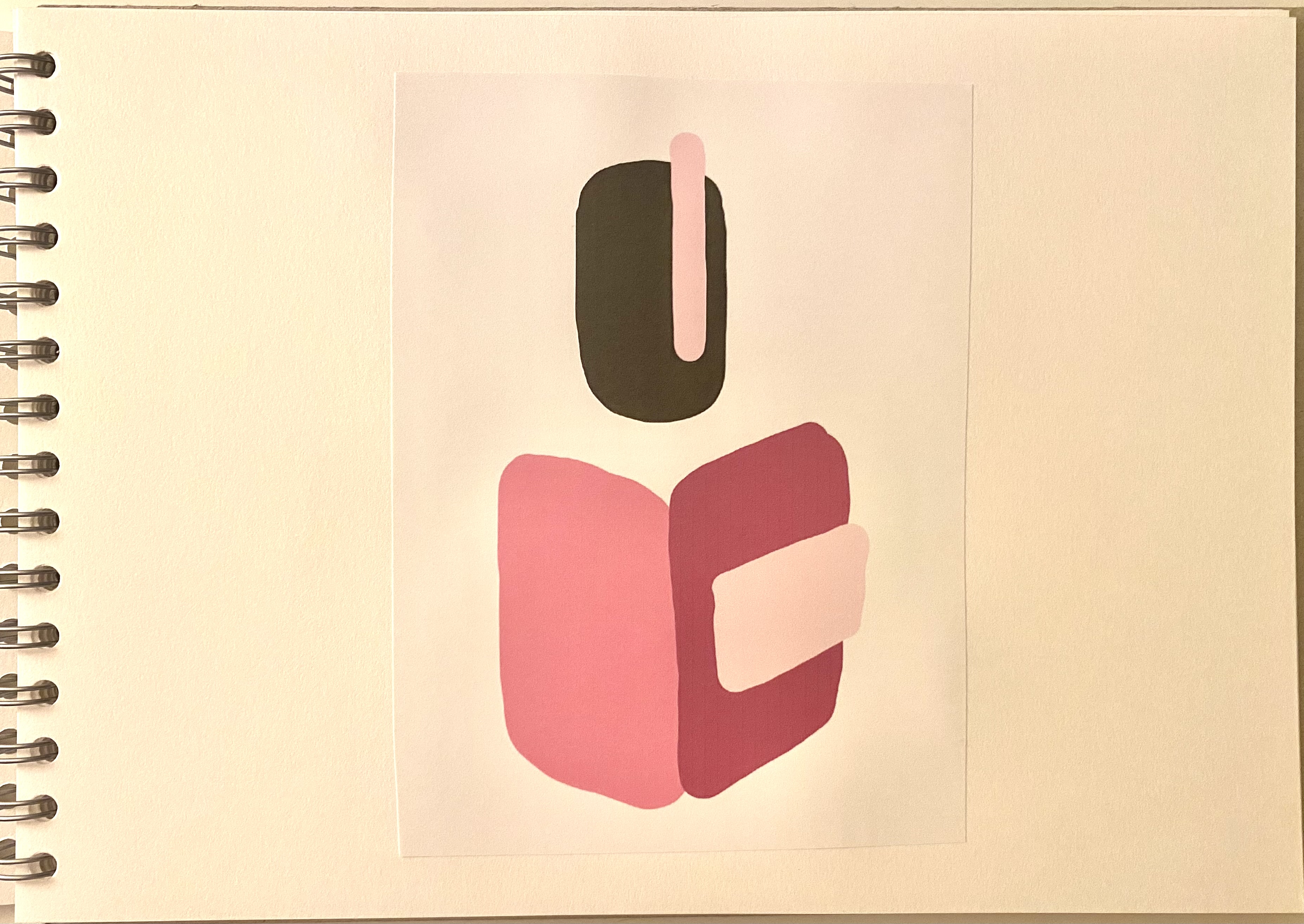
Image 1: DRAW – SCAN – COLOUR:


Image 2: DRAW – SCAN – COLOUR:

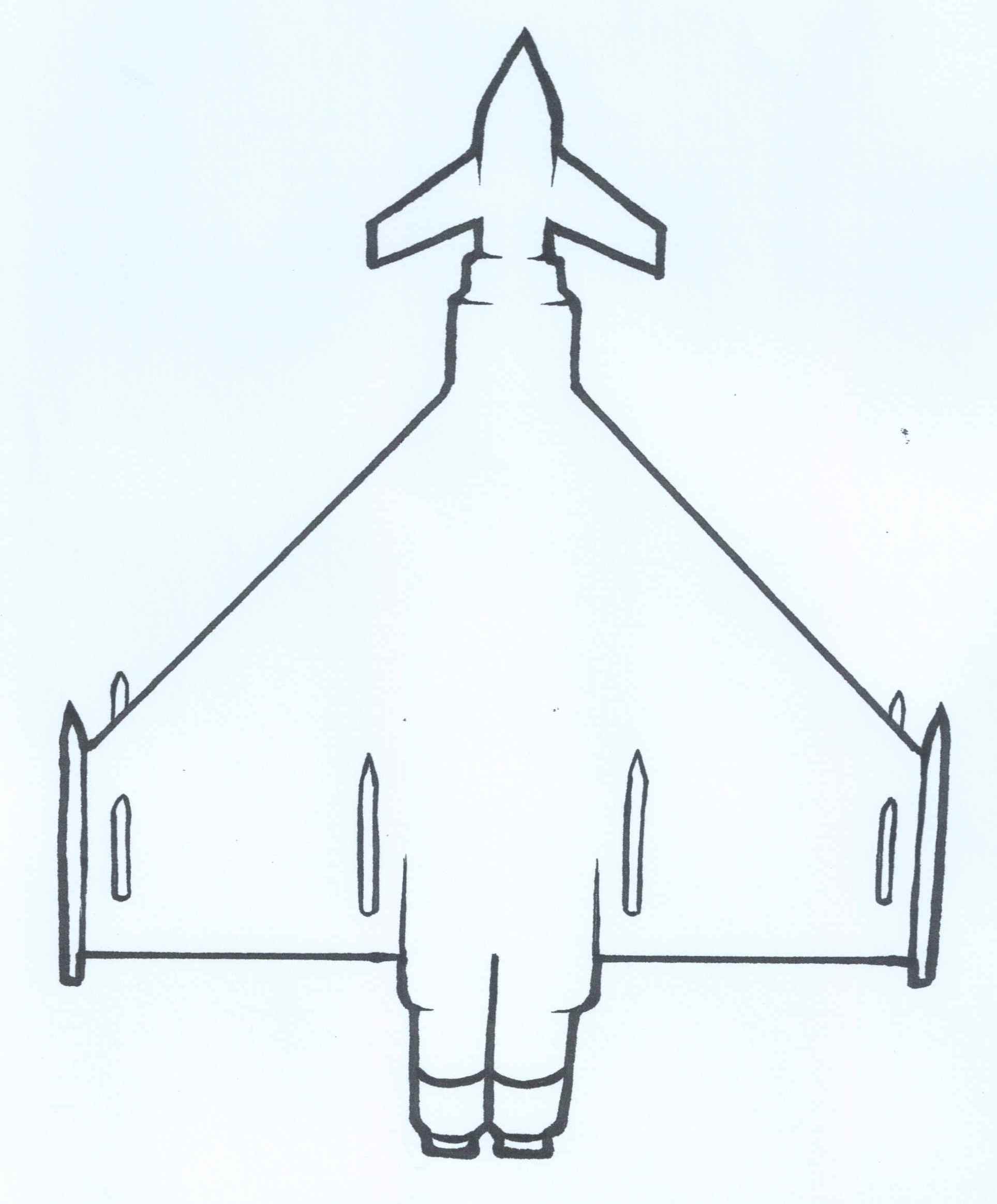

Image 3: DRAW – SCAN – COLOUR:

Image 4: DRAW – SCAN – COLOUR:


Process TWO:
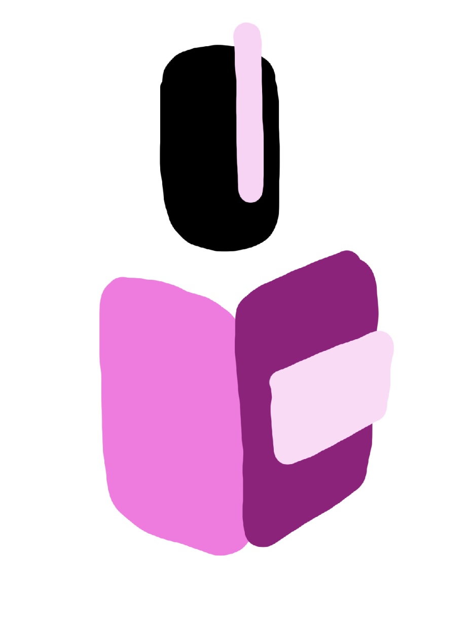
Image 1: COLOUR – PRINT- DRAW


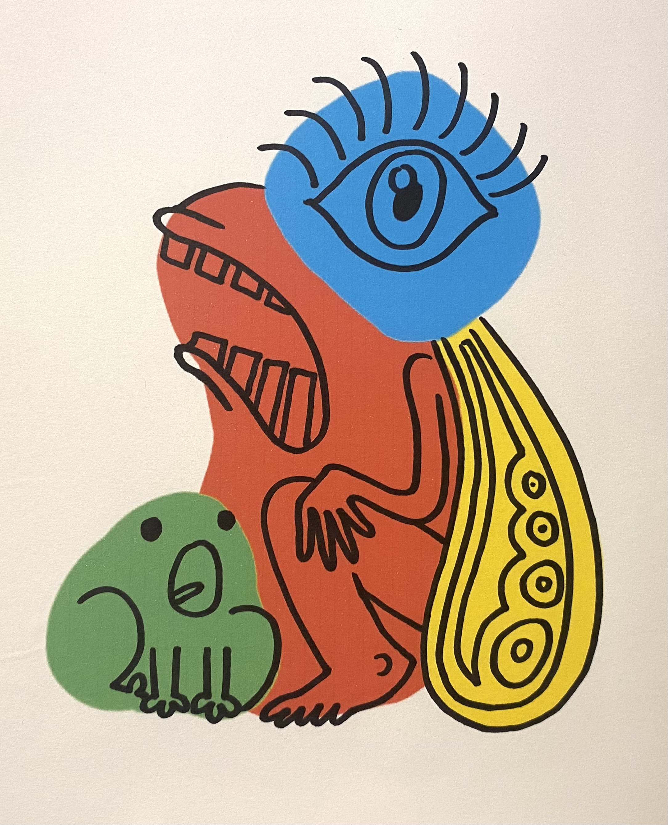
Image 2: COLOUR – PRINT- DRAW


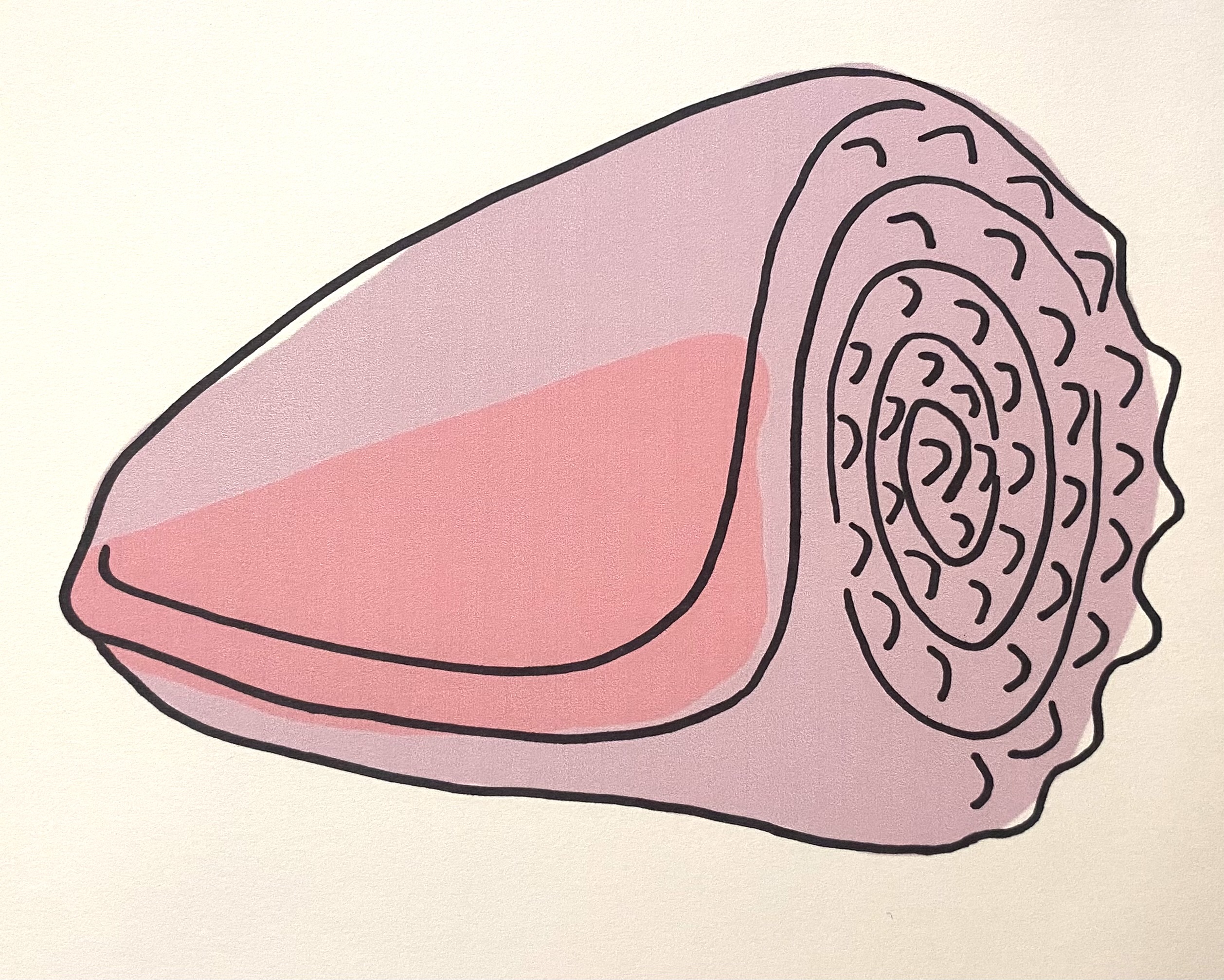
Image 3: COLOUR – PRINT- DRAW
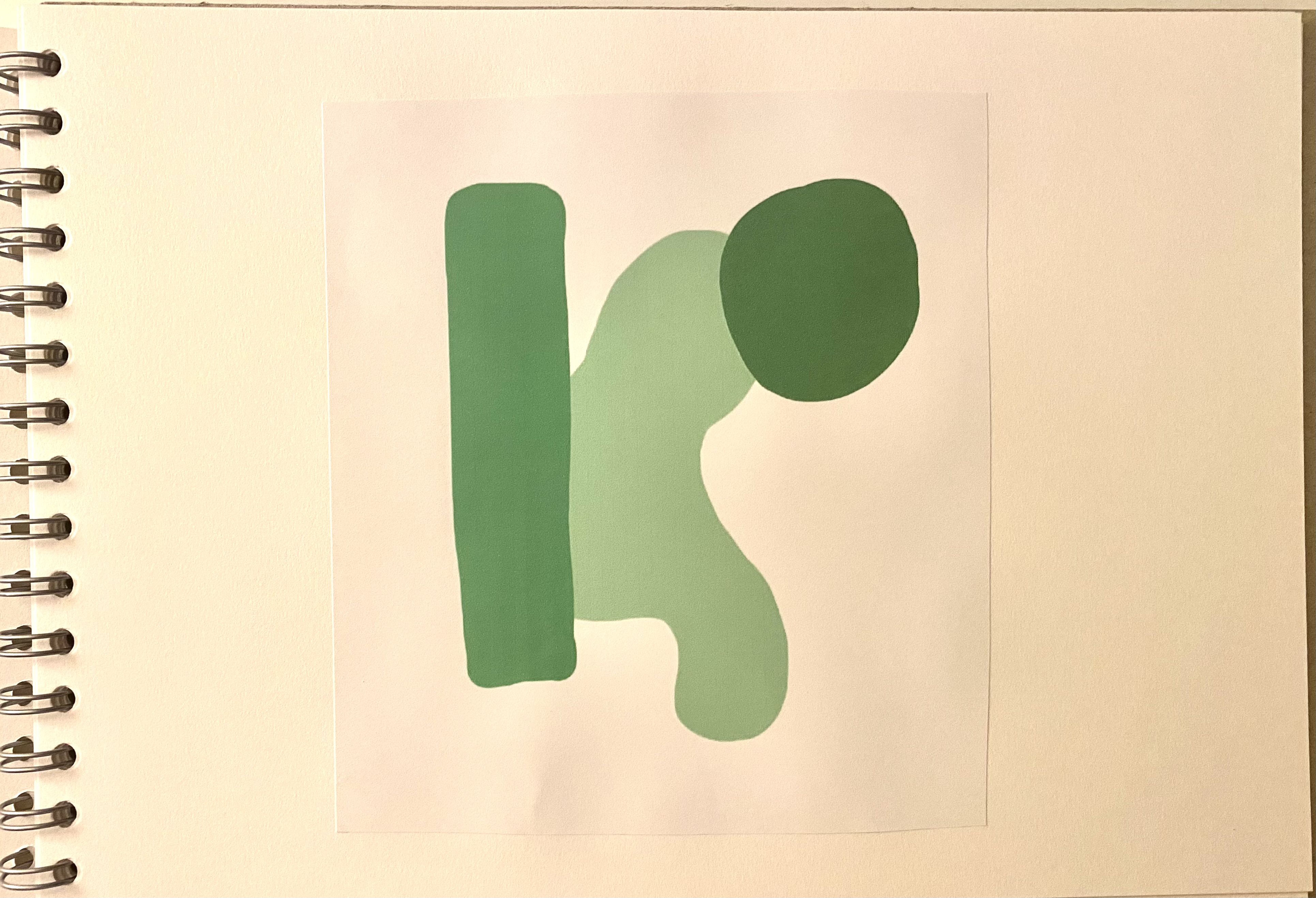


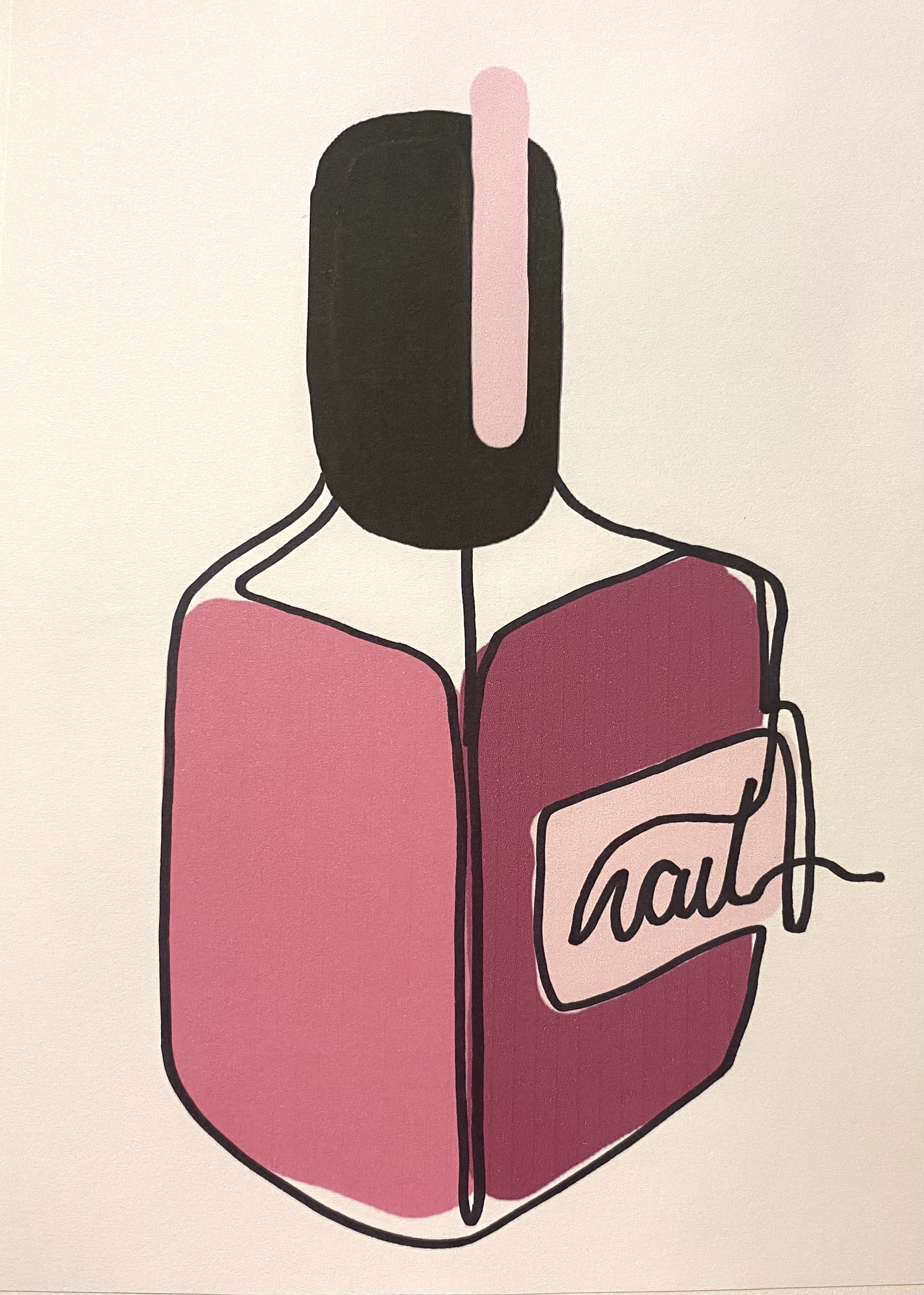
Image 4: COLOUR – PRINT- DRAW
Reflection:
This was a really fun exercise, I think one of my favourites out of the whole course! It’s such a simple exercise but was really creatively enlightening to me, I think this is because I could draw whatever came to mind and colour the illustrations digitally, which is something I enjoy doing as I dislike colouring in traditionally because once the colouring is done you cannot change your mind, digital colouring has endless possibilities. I wanted to really let loose with the second process creatively as you can see from my outcomes. I think this is because I was able to figure out what my illustrations were going to be after creating some random blobs of colour on the pages (apart from the nail polish one, that one was planned).
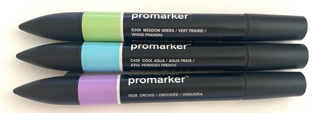
Exercise 2 – Less is More:
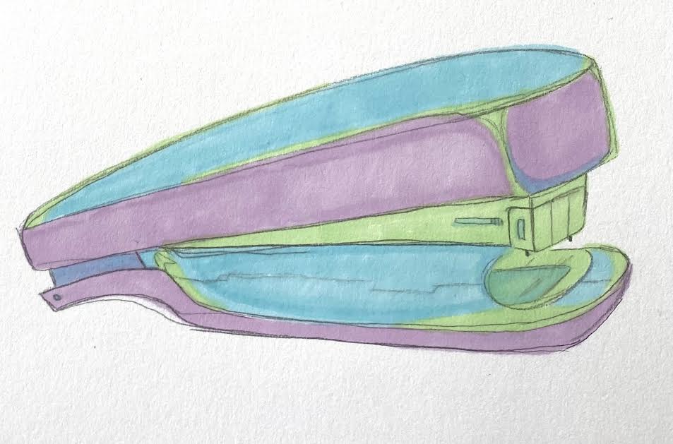
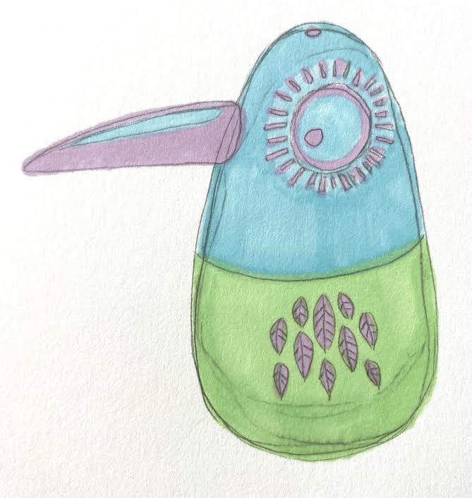
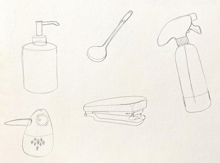
For this exercise, I will identify a palette of three colours (Dark, Mid and Light Tones) and illustration 5 domestic items beginning with the same letter using the palette only.
This was a helpful colour wheel to refer to in the coursebook:
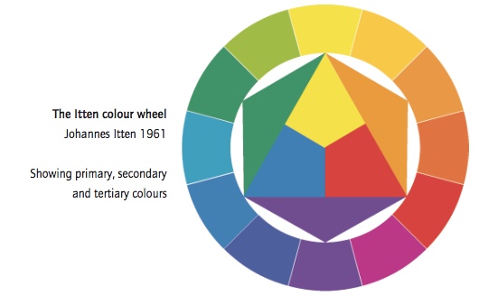
The Itten colour wheel – Johannes Itten 1961
Showing primary, secondary and tertiary colours
My palette experiments:

My chosen palette:
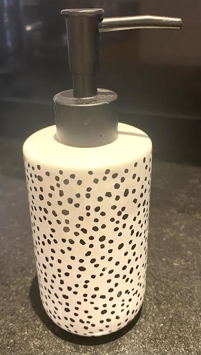
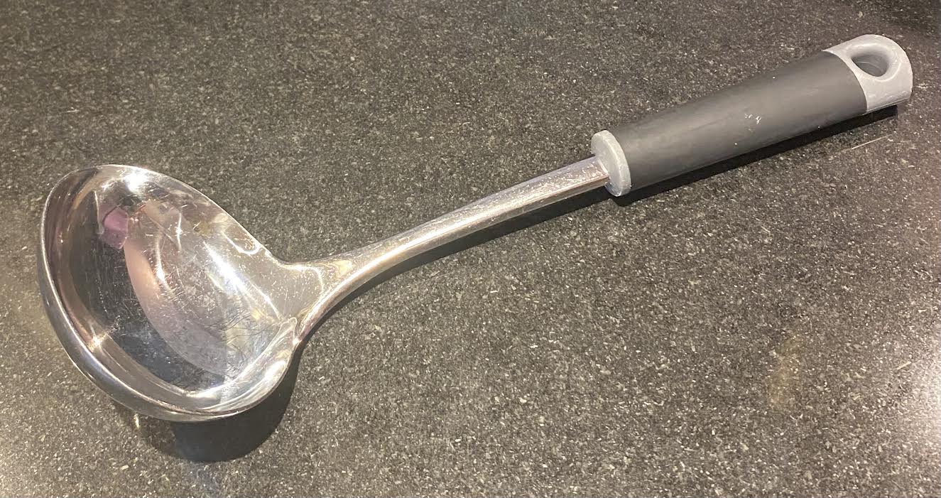
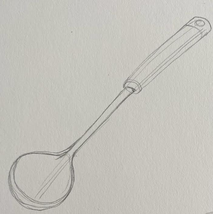
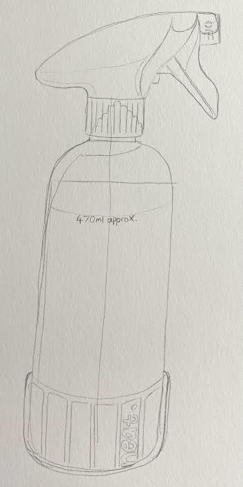
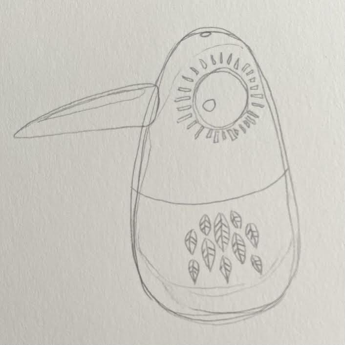
The 5 chosen items – Soap dispenser, Soup ladle, Spray bottle, Stapler, and Salt shaker:


My sketches without colour:


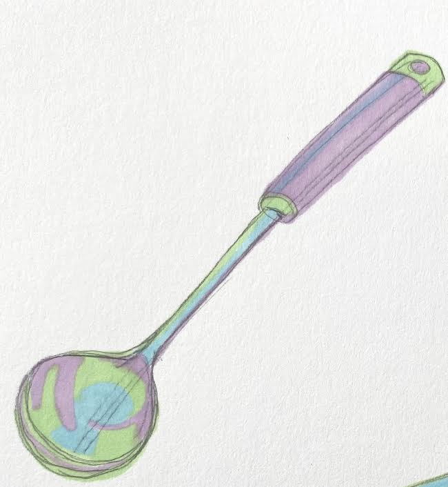
My outcomes with colour from the palette:


Next, I am to do this again, but this time with only two colours from the palette.

Reflection:
I really enjoyed this exercise as I was able to experiment with a very limited palette of colours to create interesting outcomes. At first, I found it quite hard to group the colours into dark, mid and light tones as I think I may be partially colourblind or just not good at knowing the order of the colours? So I made sure I got it right so I asked my mum to check as she studied art also at college. I enjoyed sketching the domestic items and trying to get the proportions right, I think my outcomes have come out well and I really like the palette that I chose, it gives the illustrations a bit of an 80s feel. When I did the second lot of illustrations but this time only using two colours from the palette I think it still turned out well but I personally think the blue gives the illustrations more depth and makes the images stronger.
