
For this assignment, I have been asked (fictionally, I haven’t actually been!) by my local tourist board to produce a series of reportage illustrations that celebrates aspects of local culture. I need to base my illustrations on real local events, locations, and people. I need to capture a sense of place by drawing from life. I will produce between three and five pieces of work, at least one of which should be in colour. The tourist board wants something that portrays vitality and life. They want to see people at a destination, engaging with activities or enjoying themselves taking in the views. I will use my sketchbook and learning log to gather information, my final illustrations will be a selection of reworked illustrations based on my sketches. I will reflect on what sort of reportage I am most interested in and base my illustrations around that.
Research into my real chosen local event:


The photos above were taken by me last year from my roof terrace.
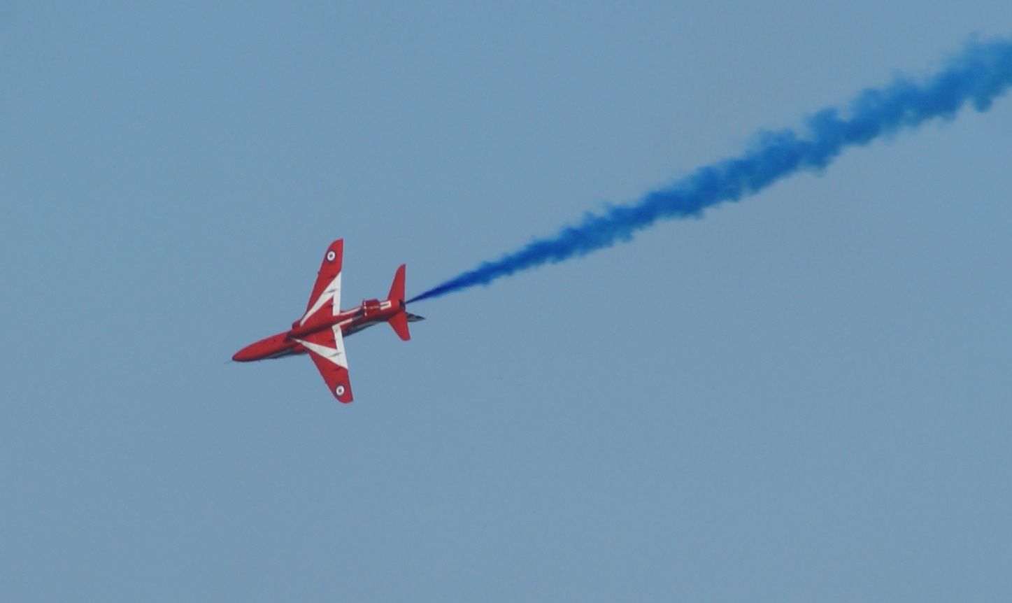
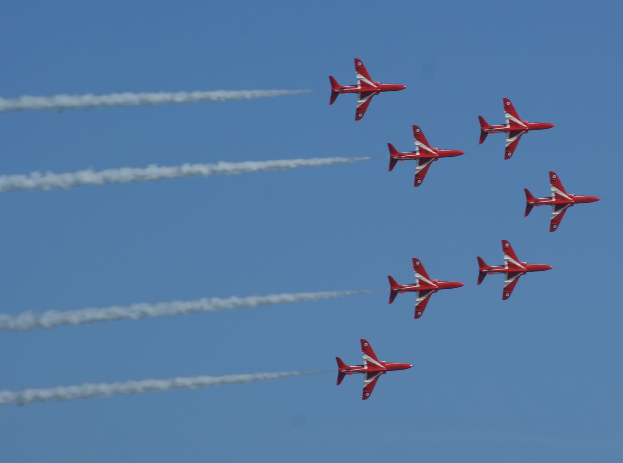
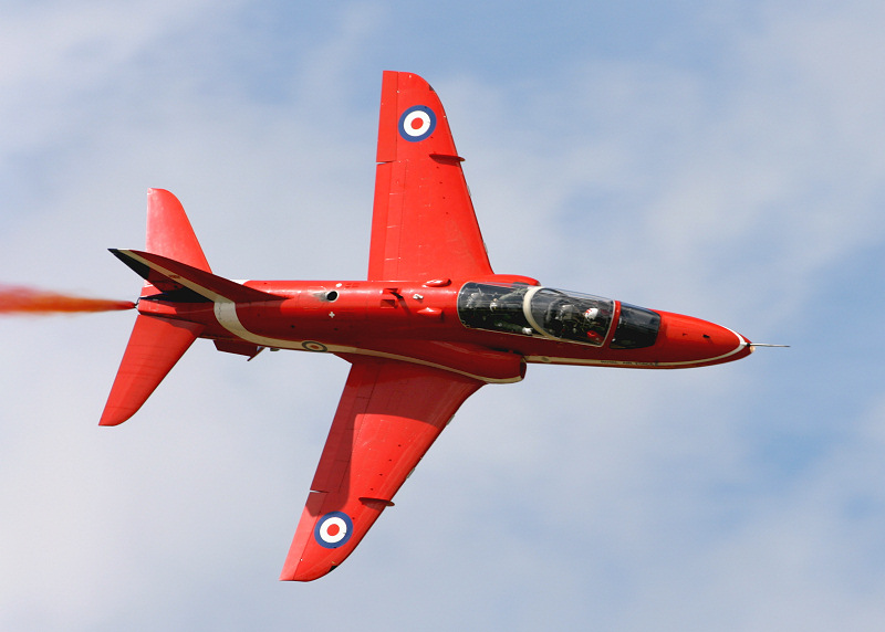
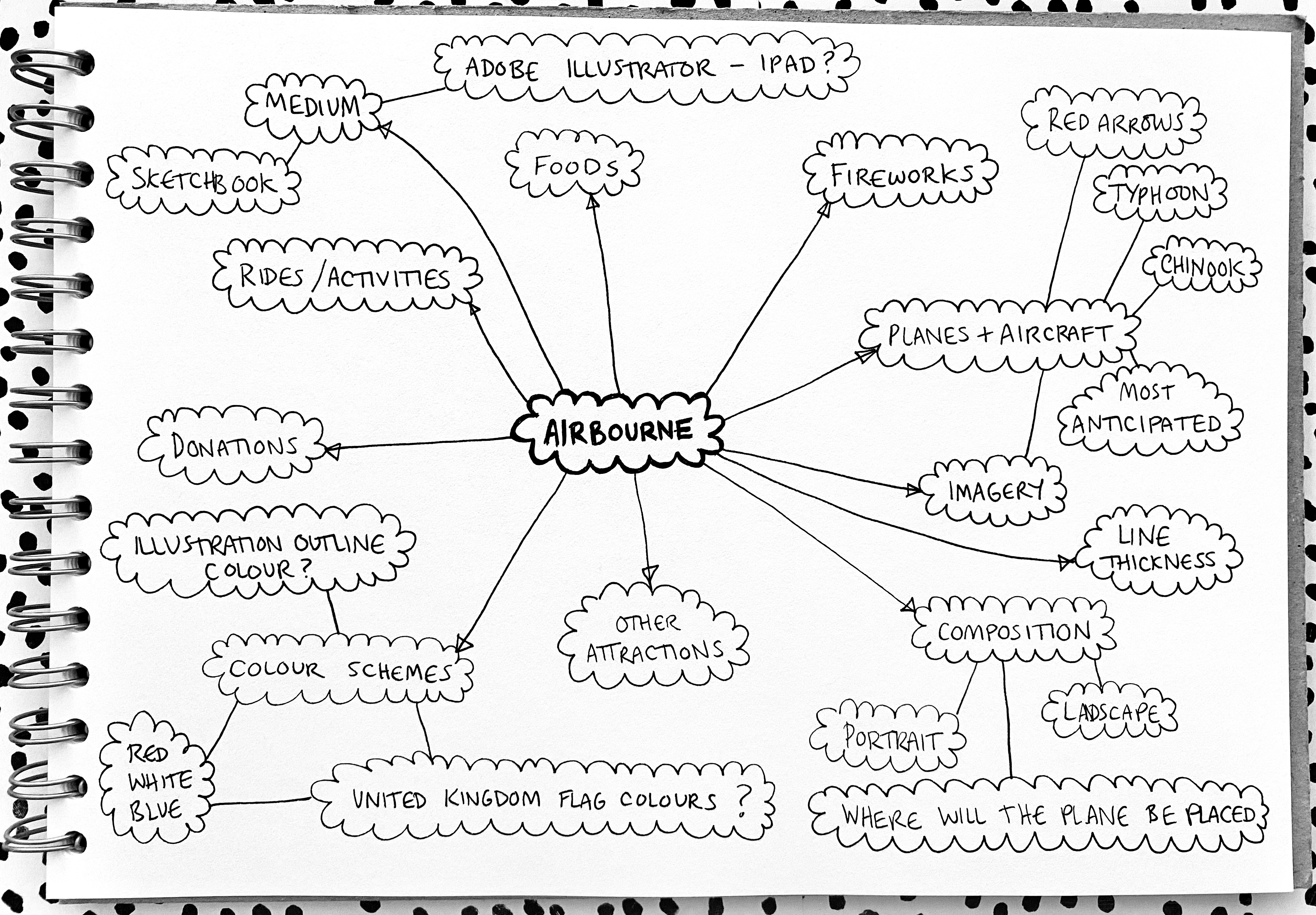
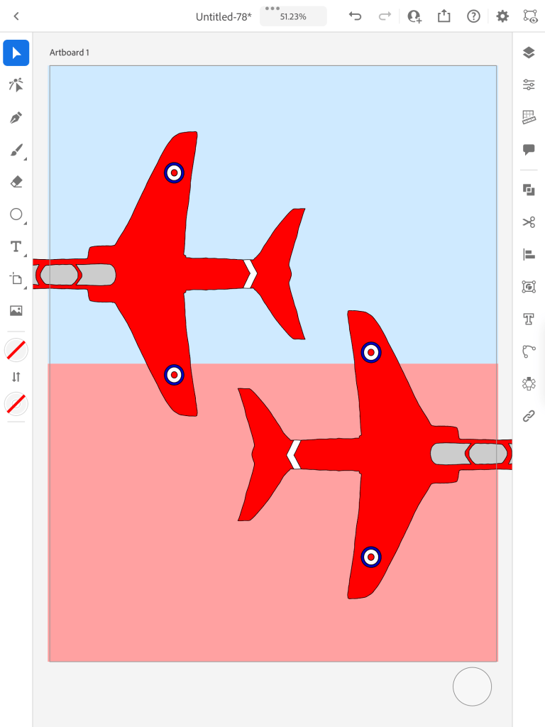
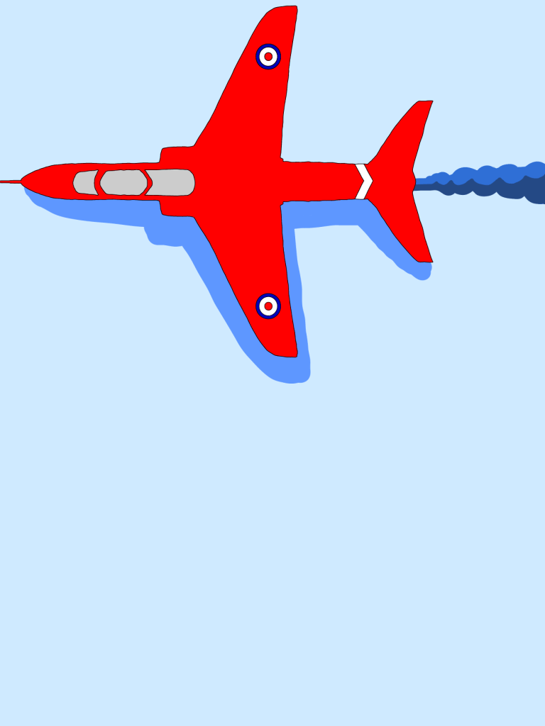
For this assignment, I chose to produce a series of illustrations to be used in three posters to advertise the local event ‘Eastbourne International Airshow – Airbourne’. This is an event run by ‘Visit Eastbourne’ my local tourist board and Eastbourne Borough Council. I have been to every Airbourne since I was born – literally! The event features Battle of Britain memorial flights and aircraft from the RAF and USAF, among others. The Red Arrows display team has been displaying each year starting in 1993. At the end of the four days of displays, there is a firework display to close.
This is the event – https://www.visiteastbourne.com/airshow
Mind Map:
Thumbnail Sketches:

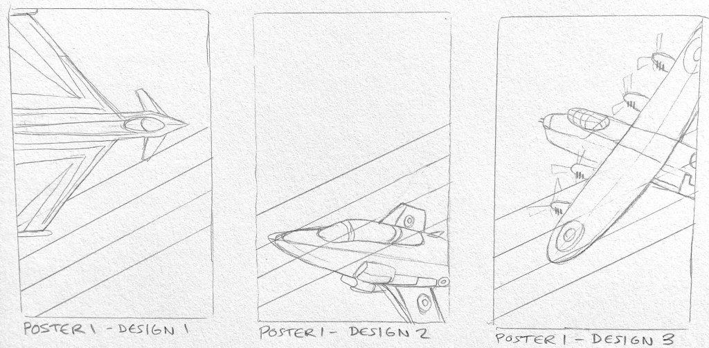


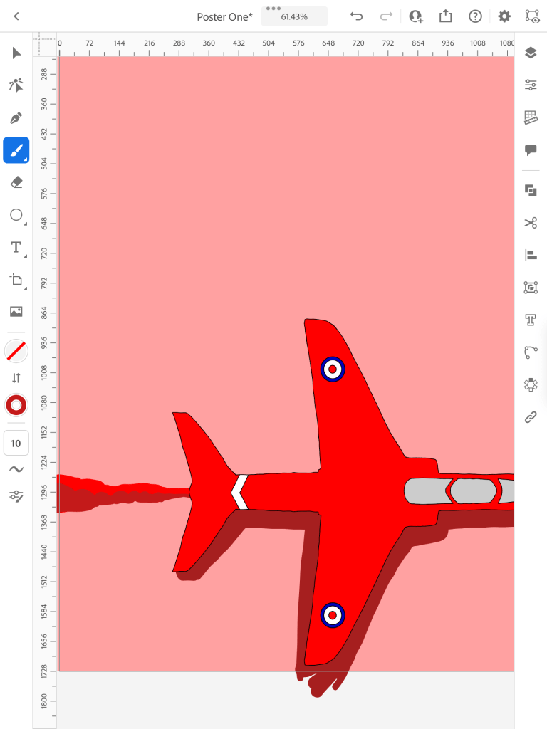
Initial Designs & PROCESS OF CREATING:

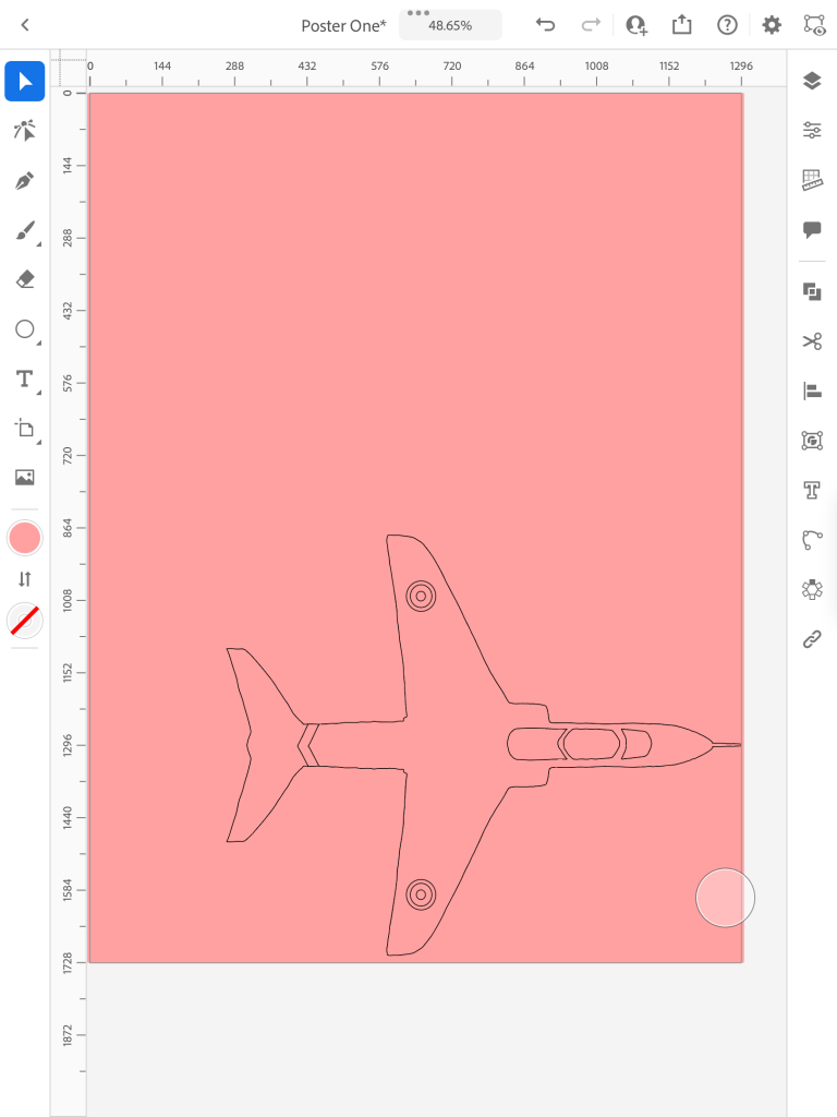

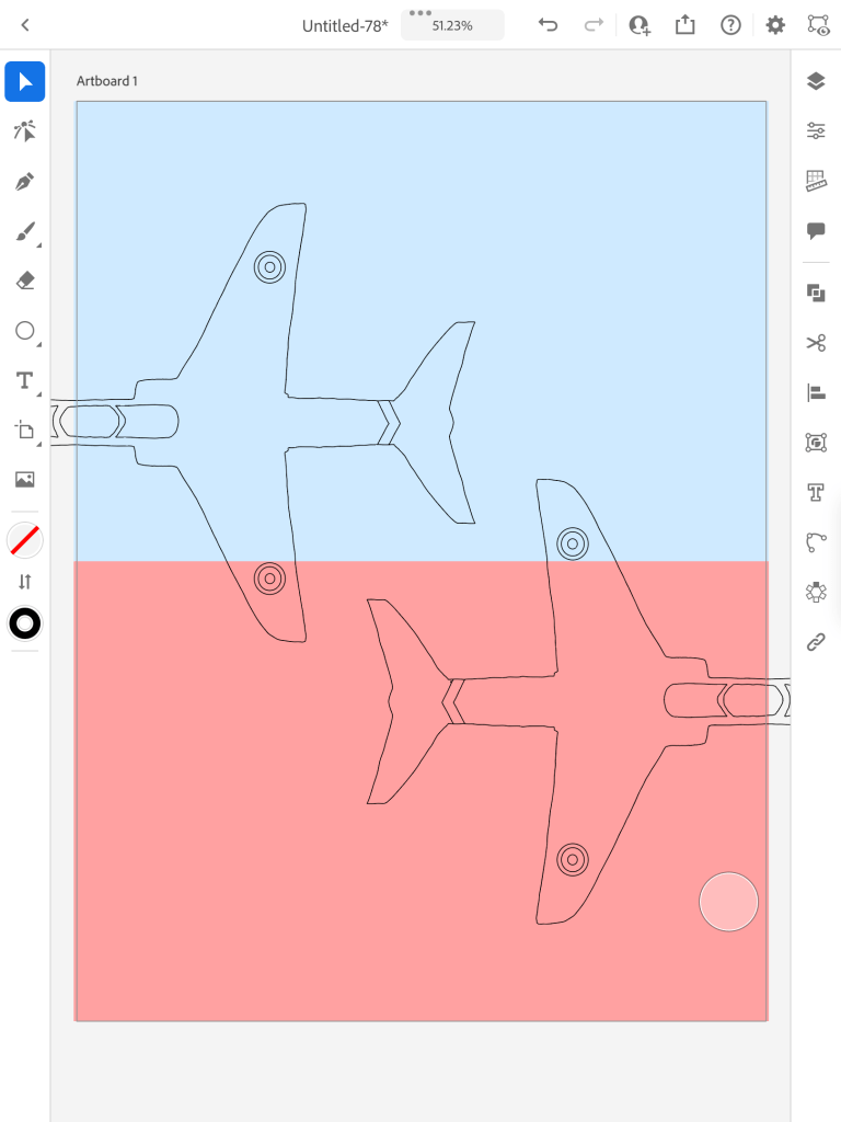


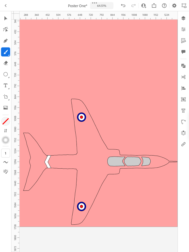


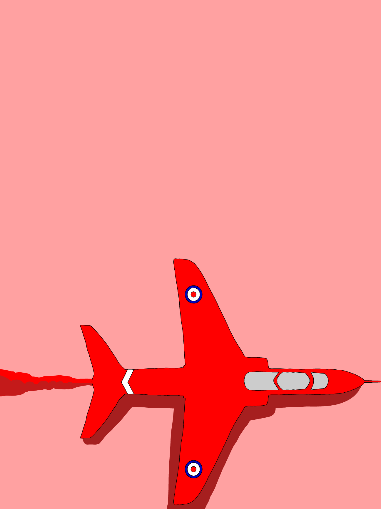
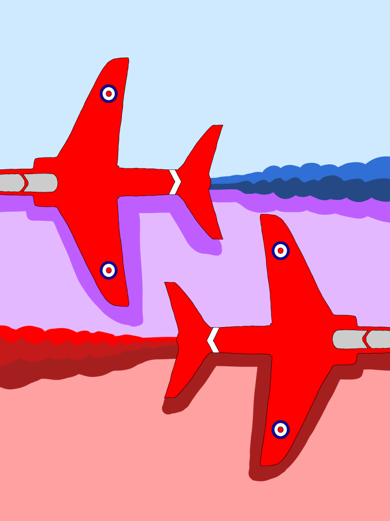
FINAL DESIGNS:


EVALUATION:
I am happy with the way the triple posters turned out. The Red Arrows are what most people come to see and are the most well known in the airshow so I chose them to be the main aspect of all three posters. I feel as though the linework is well done (although always could be neater!) and the colour scheme is good. I wanted to use the iPad Adobe Illustrator program for this assignment so that the colours are consistant and well pigmented unlike when you colour in traditionally. The triple poster shows the two Red Arrow’s crossing eachother which is one of the main display tricks that they do, the red and blue vapour that comes from the back of each Red Arrow gets mixed when they come in close contact which in turn creates a purple vapour so I wanted to show this in the middle poster. As this assignmnet only asked for the illustartions that would be featured on posters for a local event, I decided to leave enough space on each of the three posters (just in case you saw them as sparce in composition, this is on purpose!). There are more photos this time showing as many steps of the create process as I could take as this is something I need to improve on as I have a habit of showing JUST my finished work! I’m happy to say that all the photos above are my own so I didn’t need to add any citations.
Reflection
I need to think about how well I have done against the criteria.

I feel as though I have covered all these criteria points which is nice to know although there is always room for inprovement so I feel like I still need to focus on improving:
- Try out different mediums
- Improve my quality of outcomes
- Improve my presetation of work
- I need to try and find my personal voice still – this is a work in progress
- My research and essays still need some improvement
