For this assignment I have been asked to choose a short story and turn it into a mini graphic novel. As the length of the graphic novel will depend on the story I choose, I will pick something manageable. I will work over two or three pages.
I will think about how I will edit the story, the kinds of shots I will take and the relationship between the dialogue and the characters.
I have also been asked to design a cover for my graphic novel that includes the name of the short story, the author’s details and my own as the illustrator.
Choosing a Short Story:
I decided to search using Google for short stories and looked through a lot until I found a helpful list on the website ‘Literary Hub’.
https://lithub.com/11-very-short-stories-you-must-read-immediately/
I read all 11 short stories on this website but one really stuck out to me and started to fill my brain with ideas.
‘Likeable’ by Deb Olin Unferth – This was a short story written and published through the ‘Noon’ a group of short story writers that produce an annual of short stories.

The Short Story:

I chose this short story as 1. It was very short which means I could focus more on the art in each panel instead of panicking about the amount of panels I can fit into 2/3 pages from a long (short) story! I liked the feel of this story as it’s dark and emotionally deep. I thought about how I could create interesting panels to go alongside the story. As the story is so short I will be aiming to use 2 pages only.
I will be using my sketchbook to draw thumbnails and initial designs and will then move onto my iPad to use Procreate to outline and colour in each panel. I will also be using the same process for the front cover.
Story Arc:
As this story is very short it was harder to identify a story arc but I tried my best and I think I identified a beginning, middle and ending:
Beginning: She identifies that she is becoming more unlikable, life carries on.
Middle: She is questioning herself, why is she so unlikable? Excuses for being unlikable. She does not like herself.
Ending: She focuses on age being a possible reason why she is unlikable? Has age made her worse?
Identifying sections of the Story to divide into panels:
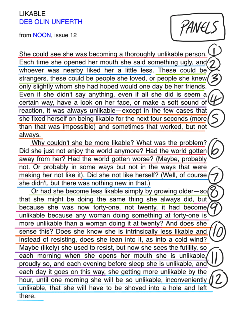
I have identified the best sections to divide the story into. I will work on 12 panels for this short story. Each sections in underlined above.
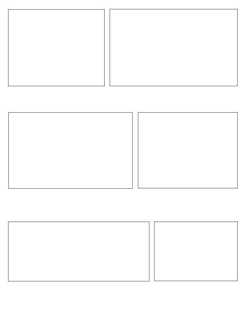
BLANK PANEL PAYOUT:

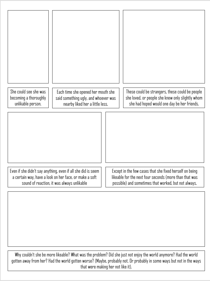
Story to Panel layout:

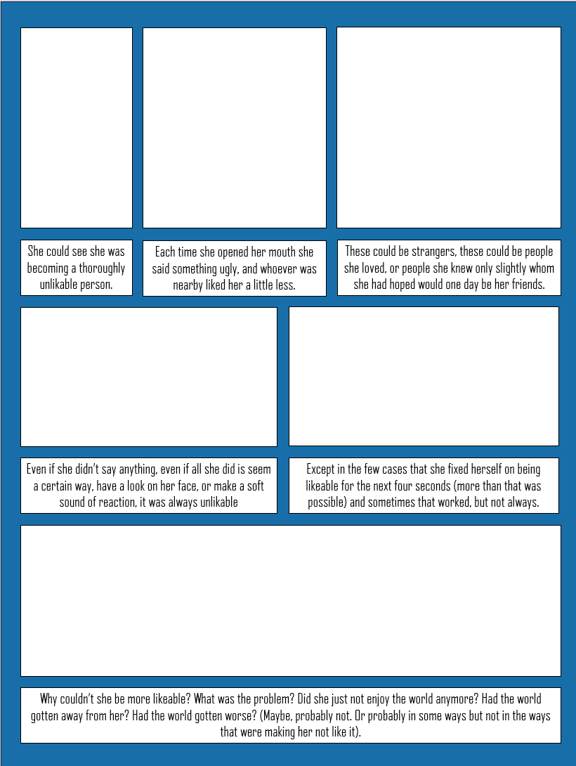
PANELs with background colour:

character idea designs:

chosen character development:

Panel Thumbnail Designs:
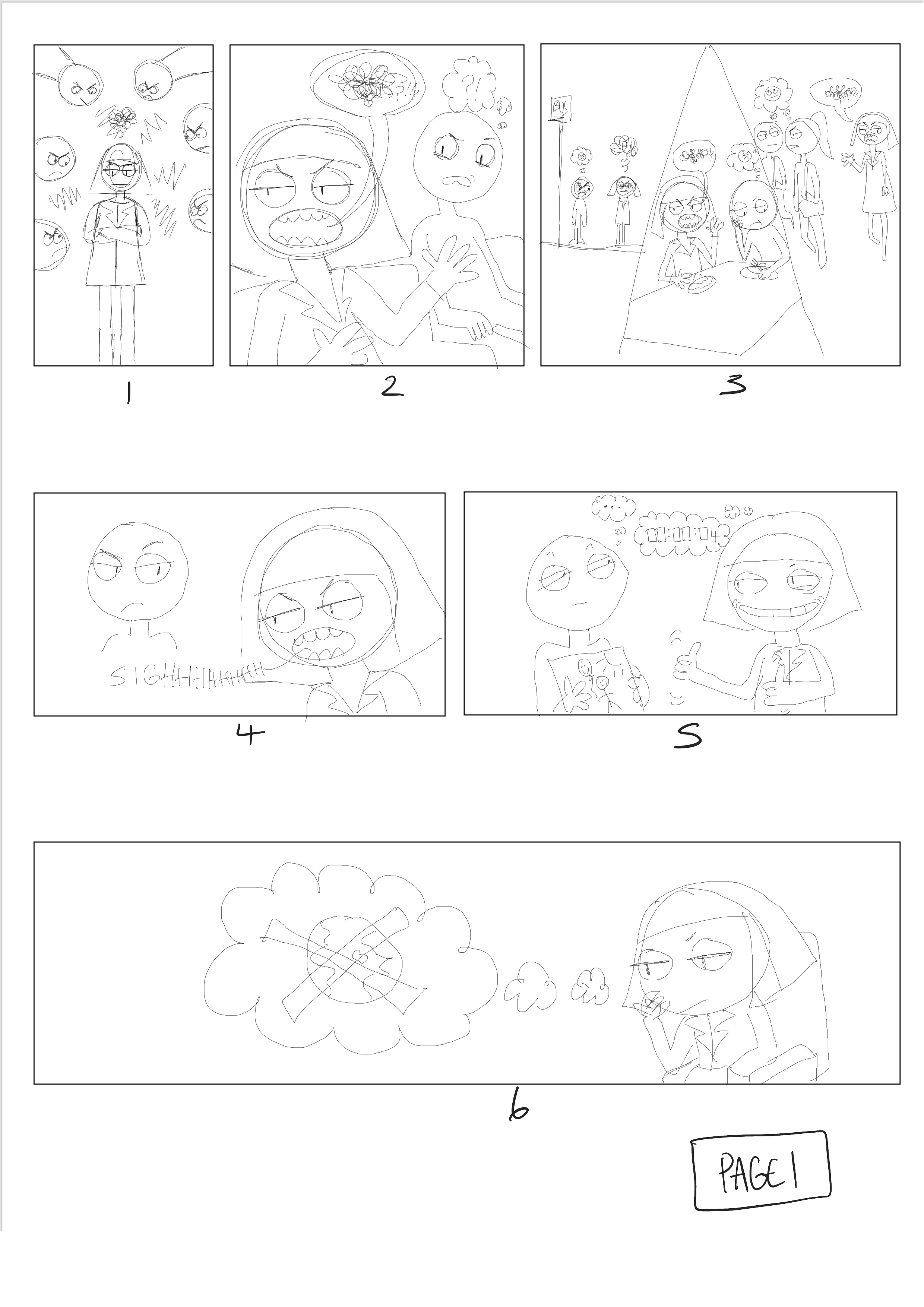
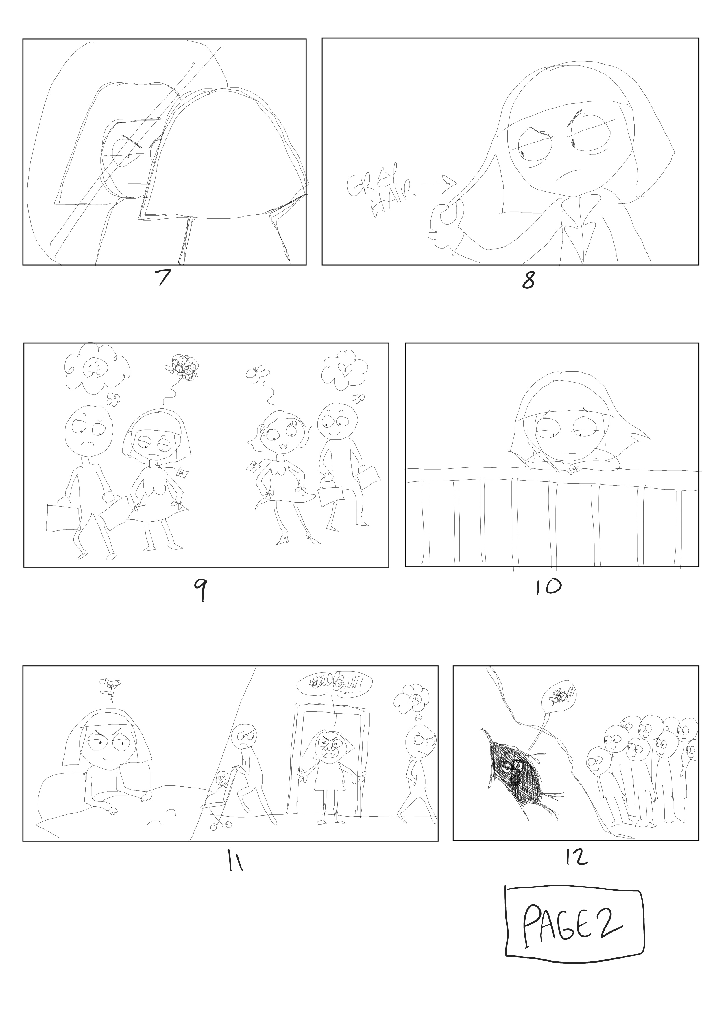
thumbnail panels with text:
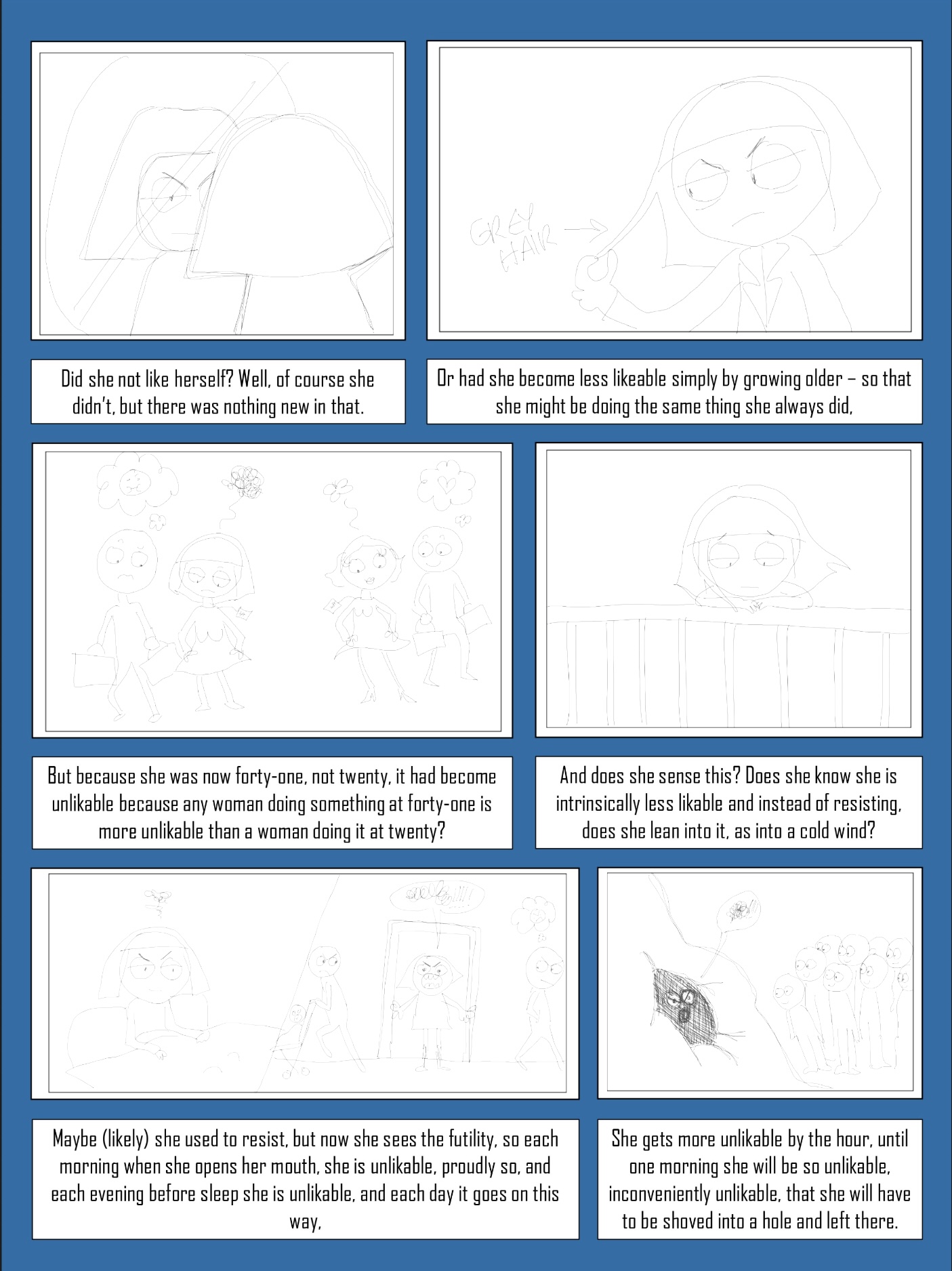
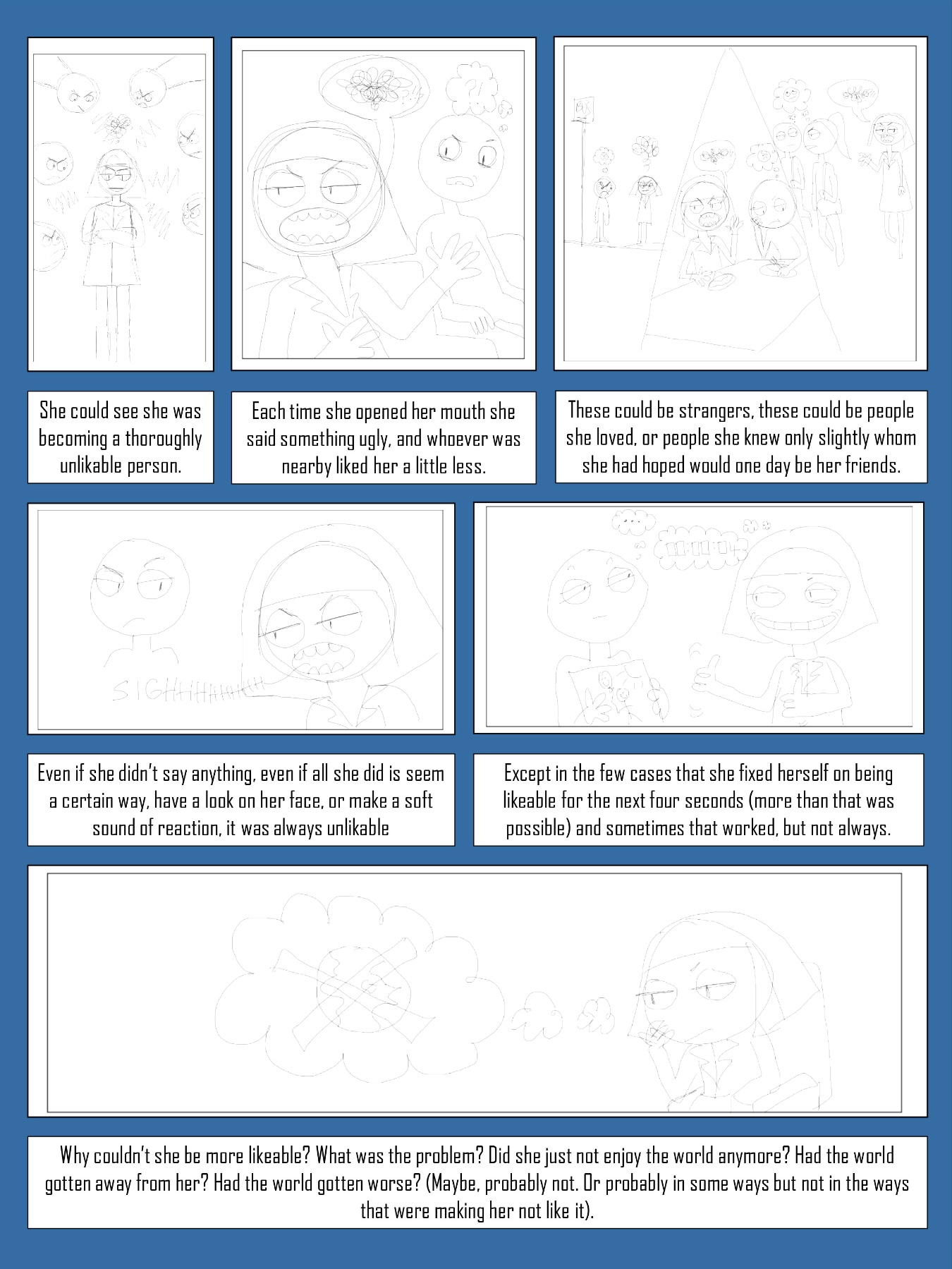
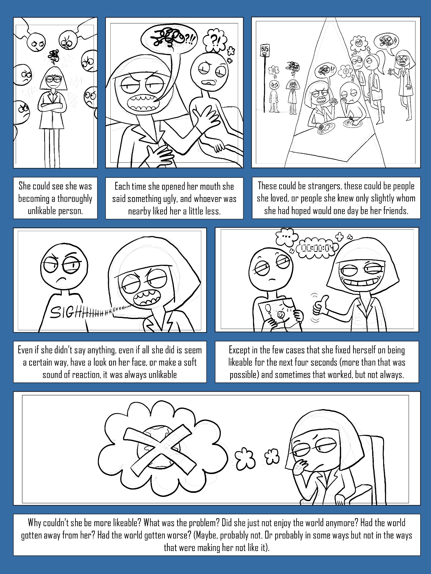
2-page spread of graphic short story (without colour):

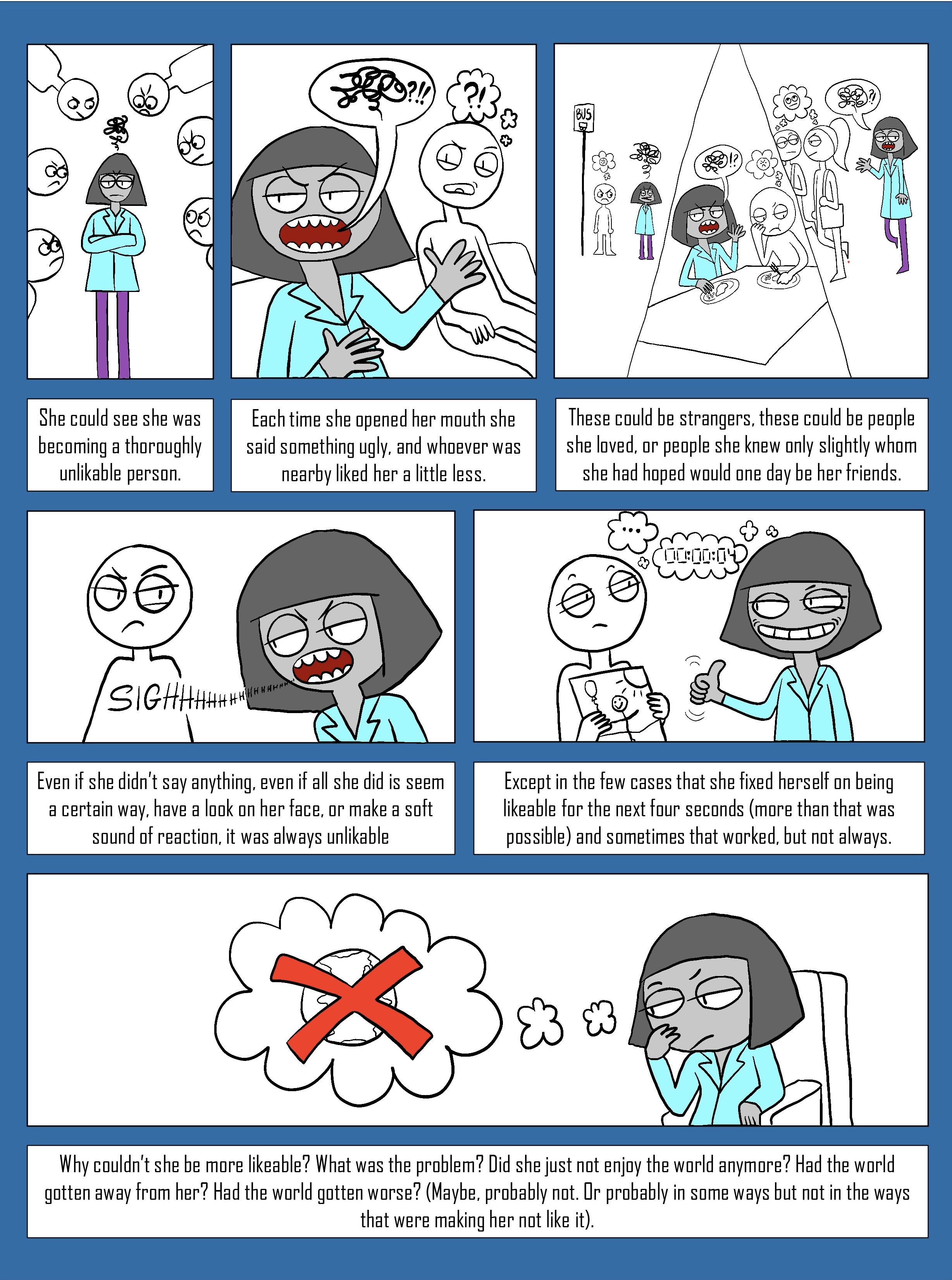
2-page spread of graphic short story (with colour):

thumbnail designs for front cover:

initial sketch for Front Cover:

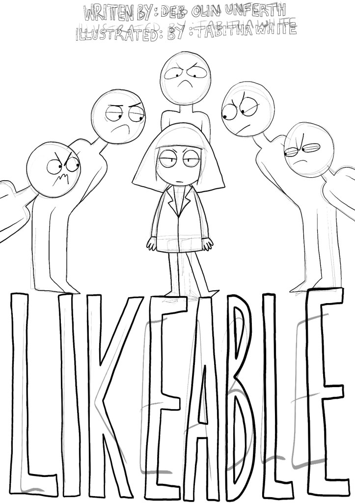
lineart for Cover Design (without Colour):
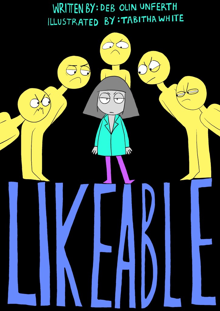
Cover Design (with colour):

Final Outcomes:


Questions from the brief:
What did you learn from this experience?
I learnt how powerful imagery is and how it can work so well alongside text. It can make the text more powerful and focus people’s attention on the story for longer if they are visual learners.
I also learnt how powerful colour is and how each colour tone can give a feel to a specific section in the story e.g. blue = cold and red = passionate.
How have your illustrations developed to accommodate the demands of the narrative?
I feel as though they are more expressive and work with the narrative well. I can see my illustrations working well in the Noon Annual alongside the story.
The composition of the images are more interesting than before, they show more details within each panel.
The panels also work together well, they don’t feel as though I have cut out random illustrations from random sketchbooks and stuck them on a piece of paper.
Reflection:
What went well?
I feel as though my front cover is stronger than the illustrations within panels but this might be down to me experimenting with colour.
My front cover is in full colour in comparison to the limited colour within the panels. I used limited colour for a reason, I wanted to draw the attention to the main character only.
I decided to make the main character grey and turquoise as I felt as though these colours made the character ‘unlikable’ or ‘ugly’ because the colours are. But in a few panels I wanted to illustrate this character in the way that makes her look like she also has her own things going on in the background and that maybe you shouldn’t judge a book by it’s cover.
What I could do differently/better?
I think maybe I should have either used colour or not but not both in the way I have done as it isn’t as eye-catching as the cover. I think I should have looked over the colour scheme more than I did and this is something I definitely need to improve on in future exercises and assignments.
Assessment Criteria for Part 3 – Narrative Illustration:
Demonstration of technical and visual skills – materials, techniques, observational skills, visual awareness, design and compositional skills:
I’m becoming a bit more confident and happy with my choices within the design process.
I need to focus on drawing more in my spare time in order to improve my art skills for use in my university work. I will focus on life drawing, composition and anatomy to make my animations and illustration proportions better.
I explained in my critical review draft that I wanted to focus more on animation as this is something career-wise that I would like to continue. I have created a decent number of short looped animations but I would like to incorporate this into my remaining parts of this unit.
Quality of outcome – content, application of knowledge, presentation of work in a coherent manner, discernment, conceptualisation of thoughts, communication of ideas:
I have continued to use the design process including the use of: writing stories, the use of the narrative arc, storyboarding, character design and layout.
I feel as though my content is strong and the quality is improving.
I still need to work on the presentation of my illustrations when I use traditional mediums on paper. I will focus on making my photos better quality in Part 4.
I have identified a pattern with what medium I like to use, digital. I enjoy using my iPad and Wacom for design. There is also a benefit of this, my outcomes are clear in comparison to when I use paper.
I have joined the OCA Discord and regularly speak to others on this course to ask for critique and give my critique to them.
Demonstration of creativity – imagination, experimentation, invention, development of a personal voice:
I think I have improved when it comes to my art style (which is still developing) as I am trying new styles and becoming more curious. I feel as though this assignment is a good example of this. My illustrations are showing more ‘character’ than before. I am going to continue to work on this.
There are always drawbacks when working digitally. I currently lack experimentation in my art but I have thought of a way around this. I can continue to work digitally but experiment with using digital tools as there are a wide variety on my various computer software.
I will also try to not fixate on using digital as my only medium, I will start to try and use different traditional mediums in order to create some balance with what mediums I use.
Context reflection – research, critical thinking (learning logs and, for second and third level courses, critical reviews and essays):
I feel as though the level of research is increasing, I can see the different from Level 1 to Level 2.
I continue to use my learning log well and hope that the my use of WordPress is up to standard.
I have completed my first draft of the critical review.
