
Research Task:
For this research task I need to research into self-published comics, graphic novels, artist books or fanzines online. I will find examples of self-publishing that I find interesting or entertaining. I need to think about the form of this work, how it has been produced and what materials were used.
I chose to use Etsy and Instagram for my research as I knew that all the zines and comics on there would definitely be self-published. I looked through and found three that stuck out to me on Etsy and one on Instagram.
Reviewing self-published comics:
Hana Berggren:

6-page long zine book. Can choose between an A6 booklet with a large fold-out print on the reverse, or a lovingly stitched easier-to-read A5 book. At first I thought this had been created using a print press but looking closer I think this has been created using pen and ink. I like the fact that she doesn’t use colour for her zines. It gives a more unique feel to them. Her use of texture is really interesting and her illustrations are very detailed.
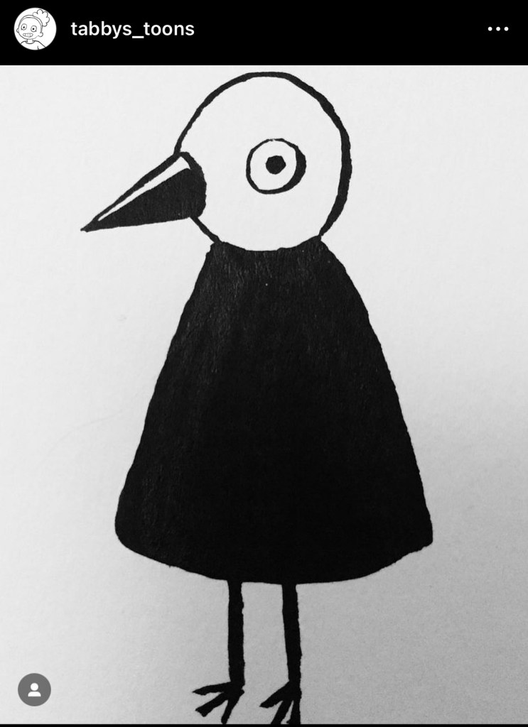
This one really reminded me of my drawing below that I did a while ago.
https://www.etsy.com/uk/shop/HanaBerggren?ref=l2-about-shopname§ion_id=33294734
Micha Huigen:
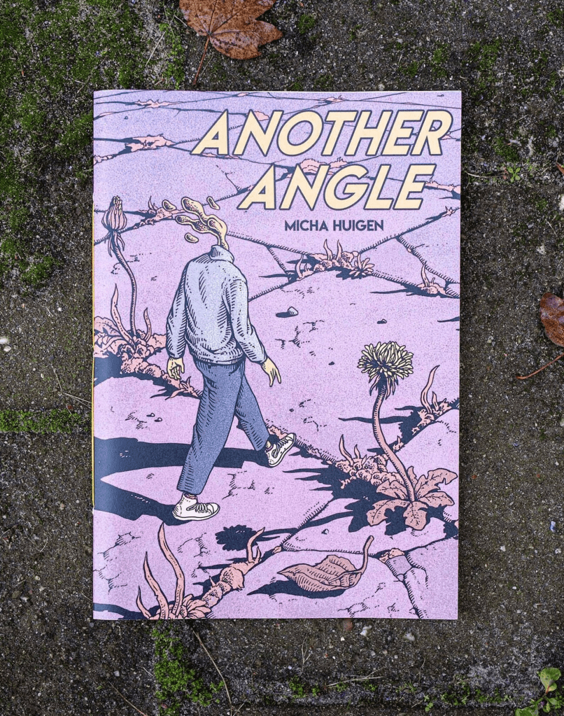
This A4 (21.0 x 29.7 cm) digitally printed “graphic novel” contains 120 pages and is made in an edition of 500. Printed on recycled paper (200g Favini Crush cover/ 110g Circle inner pages) and then hand-bound it with a cahier stitch binding. It looks as if the illustrations for this graphic novel has been created digitally or at least coloured digitally? I like the muted pastel tones used, it gives an 80s aesthetic feel. The use of etching brings out the details. The character on the front is intriguing. If anything I’d say the typography on the front should be different and maybe not so close to the edge of the book.
https://www.etsy.com/uk/shop/MichaHuigen?ref=l2-about-shopname
Savannah Storm:

8-panel zine book. A7 size (10.5 x 7.4cm), 8 pages, Risograph printed in blue ink on lilac or yellow paper. Printed in the UK. I feel as thought this zine was created digitally because the linework and the thickness changes feel very familiar. The typography on the front doesn’t stand out very much an the composition doesn’t feel right. On the other hand the illustrations have a nice feel to them, they remind me of illustrations from children’s learning books from the early 2000s. It would be interesting to know if she uses different ink colours when printing as on the yellow paper the ink looks black and on the blue paper the ink looks dark blue? I wonder if this is a a trick of the eye or she does use different coloured inks?
https://www.etsy.com/uk/shop/savannahstorm?ref=l2-about-shopname
Victoria Vincent aka ‘Vewn’:
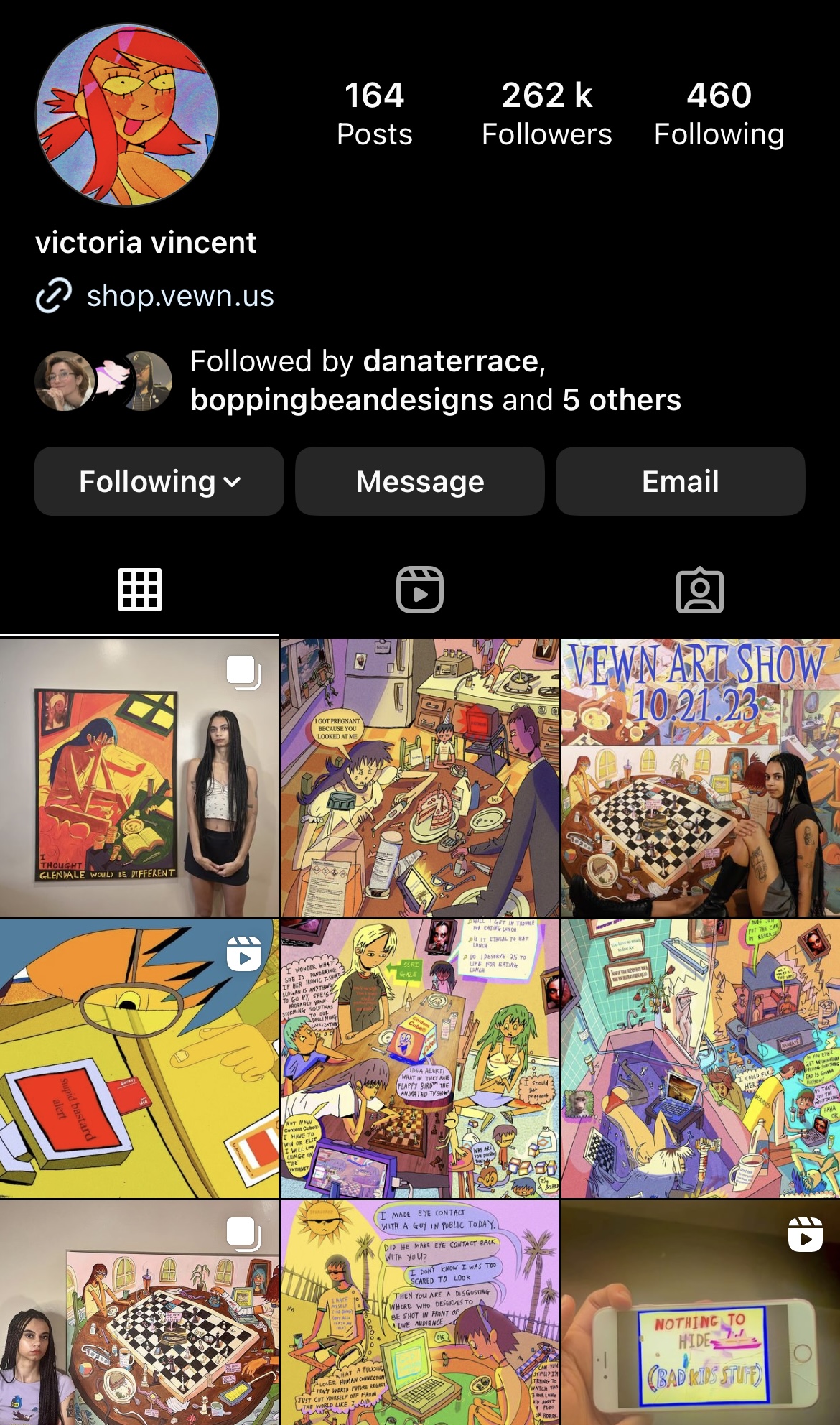
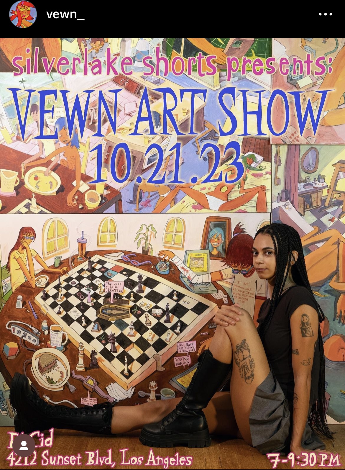


Prints on matte paper. Different sizes. Vewn normally sticks to digital illustrations and animations. I found her animations on YouTube first and then found that she creates prints and has a shop. She advertises her work and shop through Instagram. She sells original pieces and prints. Her art is extremely unique and really inspiring. It’s good that she prints her art on matte paper too. It would be good to see her put more on her shop.
https://www.instagram.com/vewn_/
Self-publishing links:
https://www.etsy.com/uk/search?q=illustrated%20zines&ref=search_bar
https://kdp.amazon.com/en_US/publish-comics-graphic-novels
https://www.morrispublishing.com/comic-book-publishing/
https://blog.reedsy.com/guide/how-to-make-a-comic-book/publish/
Exercise – Self-Publishing:
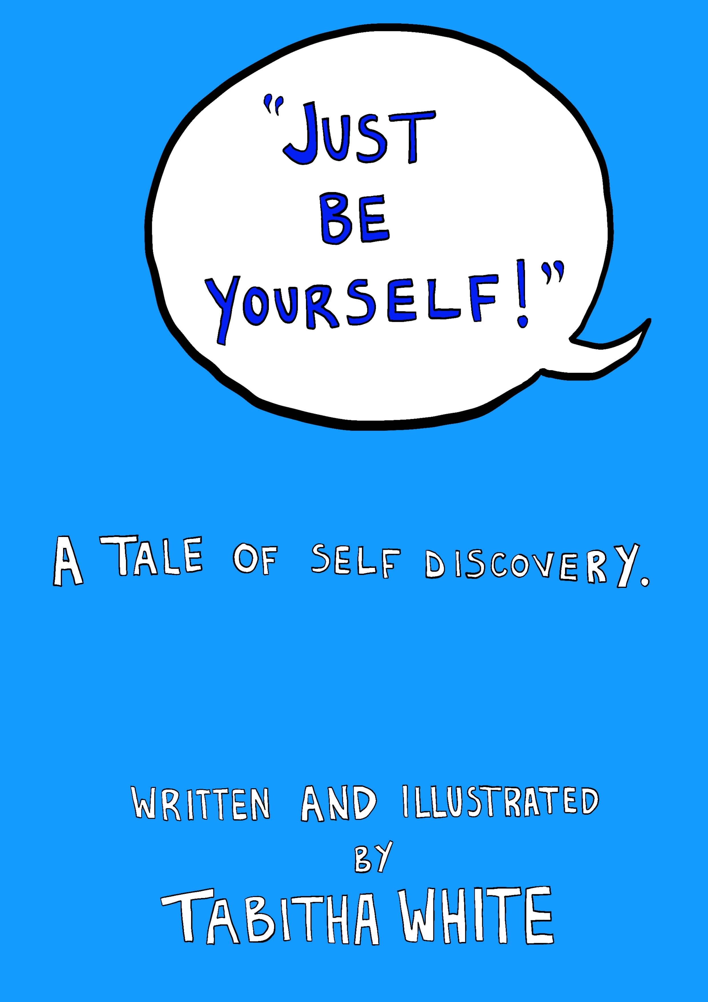
For this exercise I need to develop a small self-published book based on an idea from one of my sketchbooks. I will produce a small photocopied fanzine or a one-off artist’s book. I will look at my sketchbooks for ideas of work that could be developed into a self-contained narrative or collected together to form a publication. I need to think about how I would title my work and how the title feeds back into the development of my idea.
Brainstorming – Finding my character:
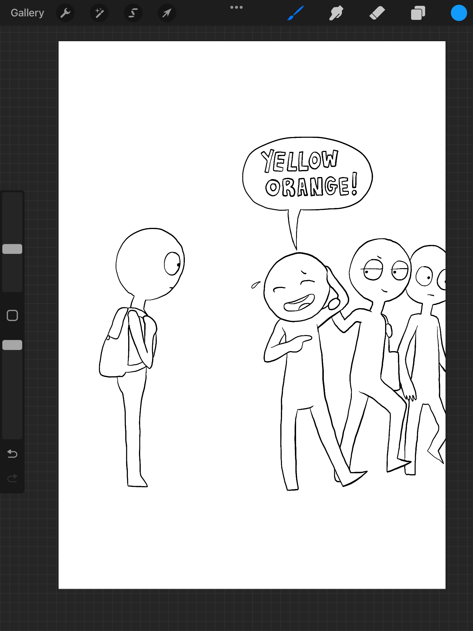
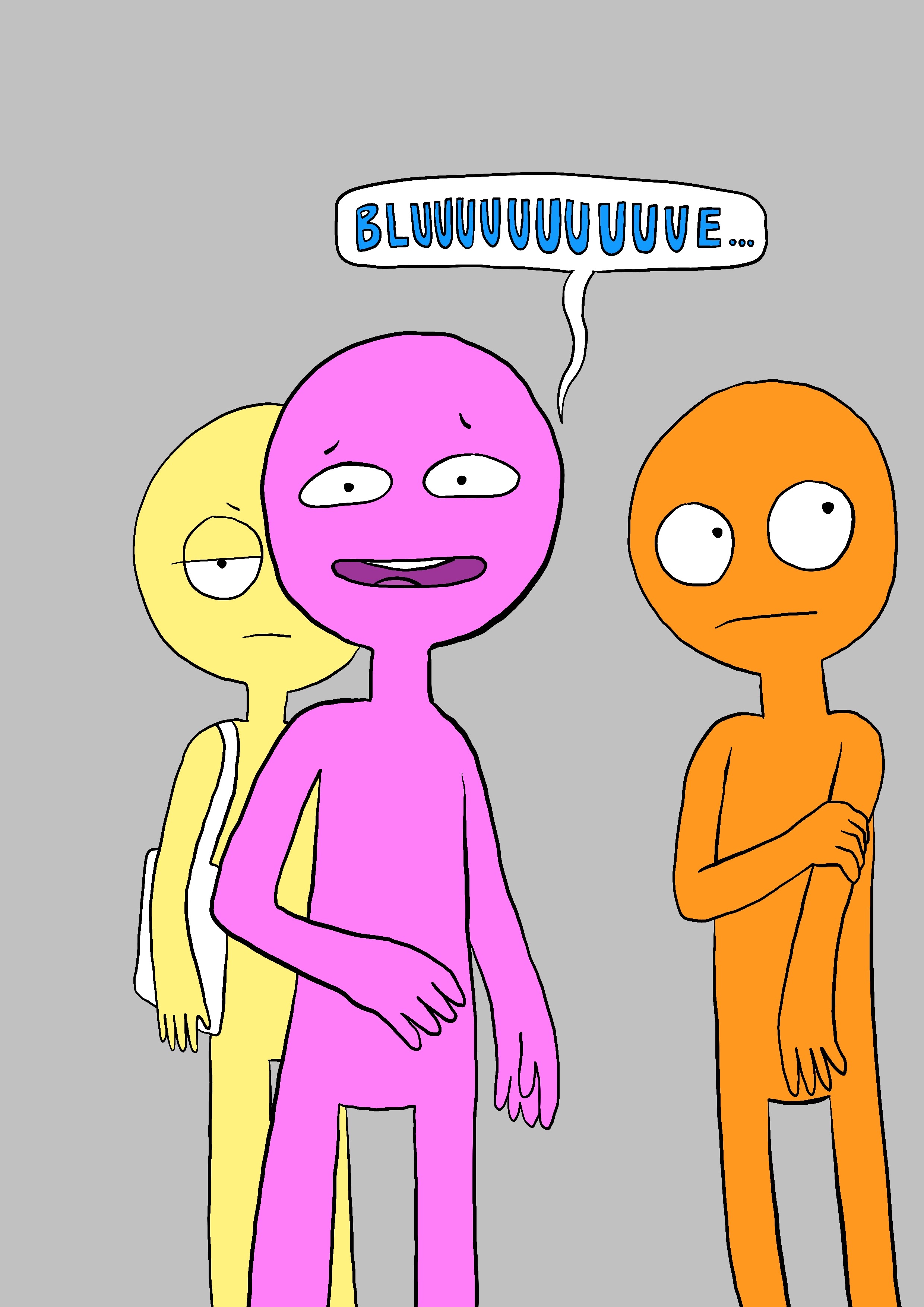
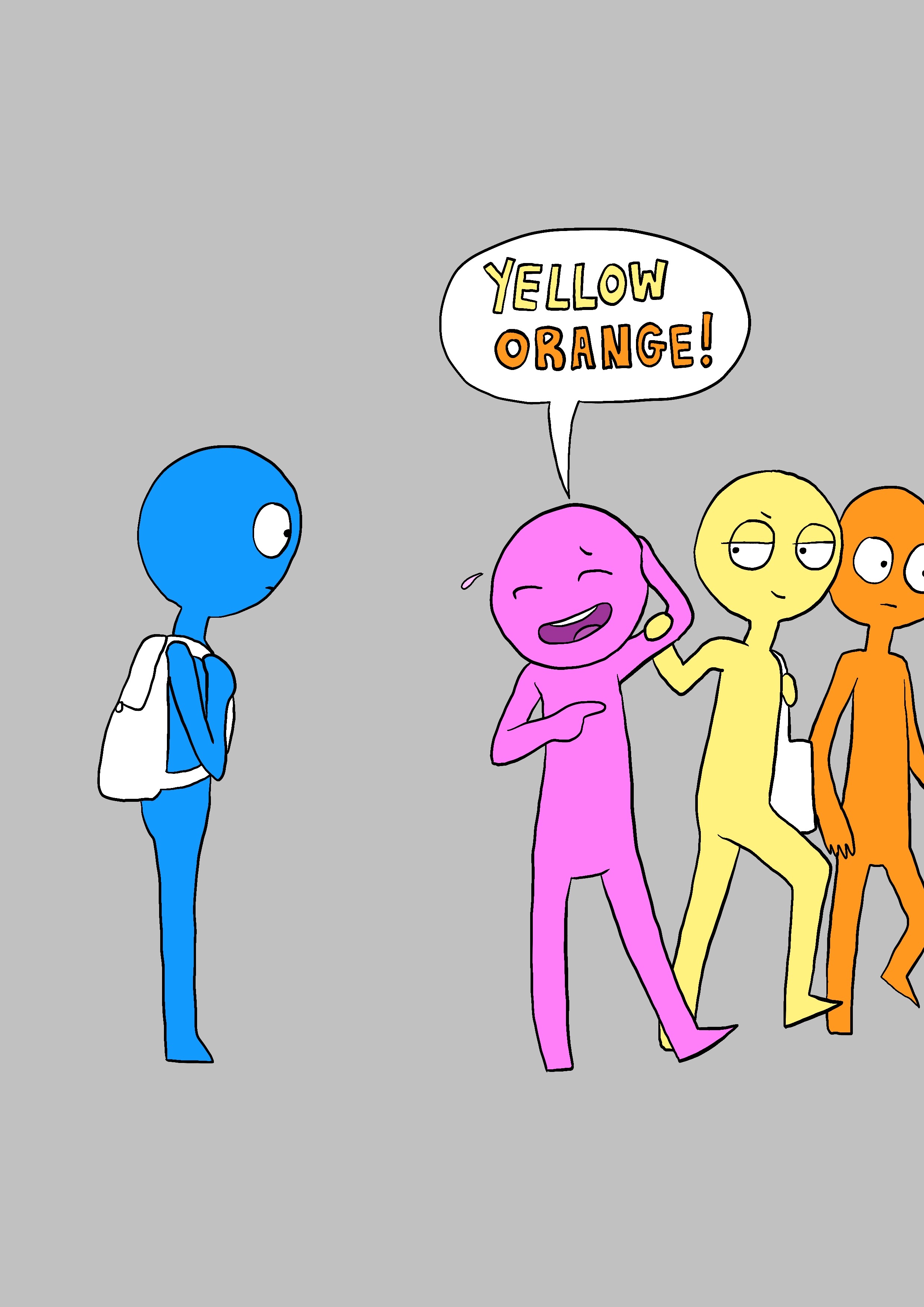
I looked through my previous illustrations on this unit and I was attracted to the yellow background characters that surrounded the main character of the cover from Assignment 3: A Graphic Short Story.
I wanted to make a new story for this small self-published book using one of the yellow characters as the main character.

Brainstorming – How to make a zine:

Thumbnail Sketches & Panel Layout:

Initial Linework:


Creative Process:
Final Design:


Digital Mock-Ups: (I did the mock-ups using books, they didn’t have zines!)
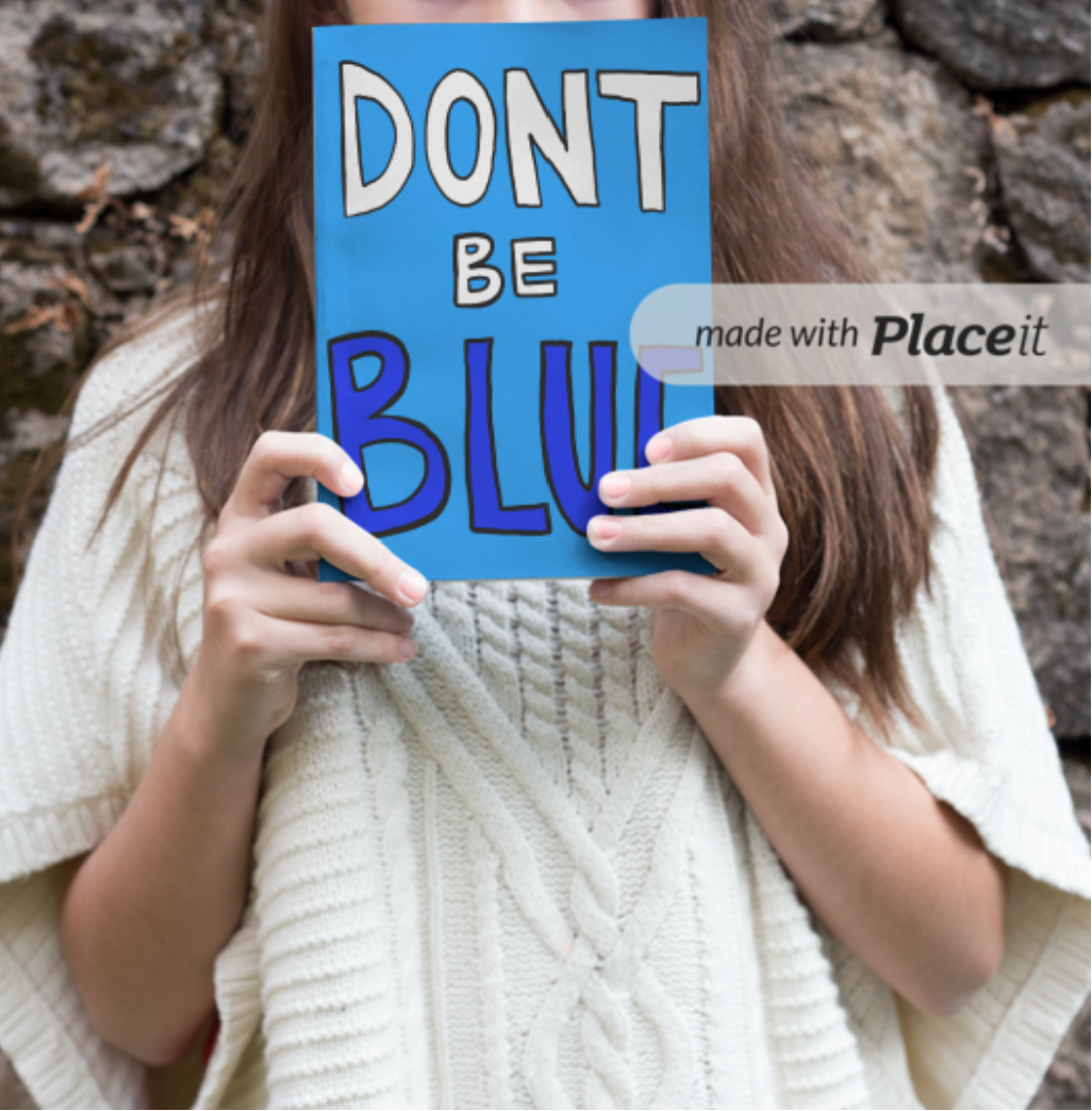


Question – What sort of audience do you think would be interested in your work?
Children & Teens – people who are being bullied at school? It’s a reminder to stay true to yourself and that there will always be people who like you for who you truly are, don’t try and fit in with others who make you feel inferior.
Evaluation:
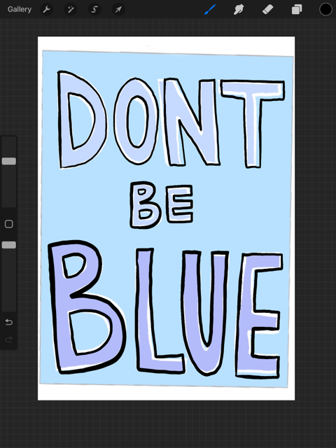
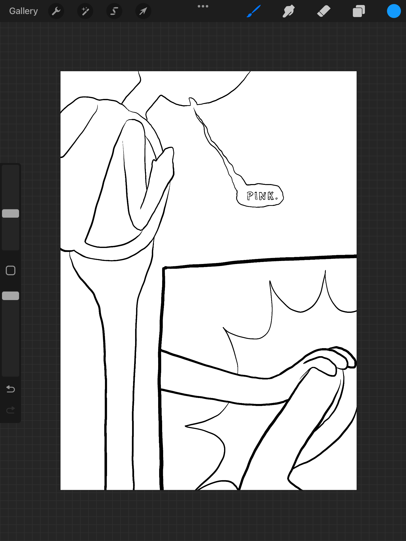
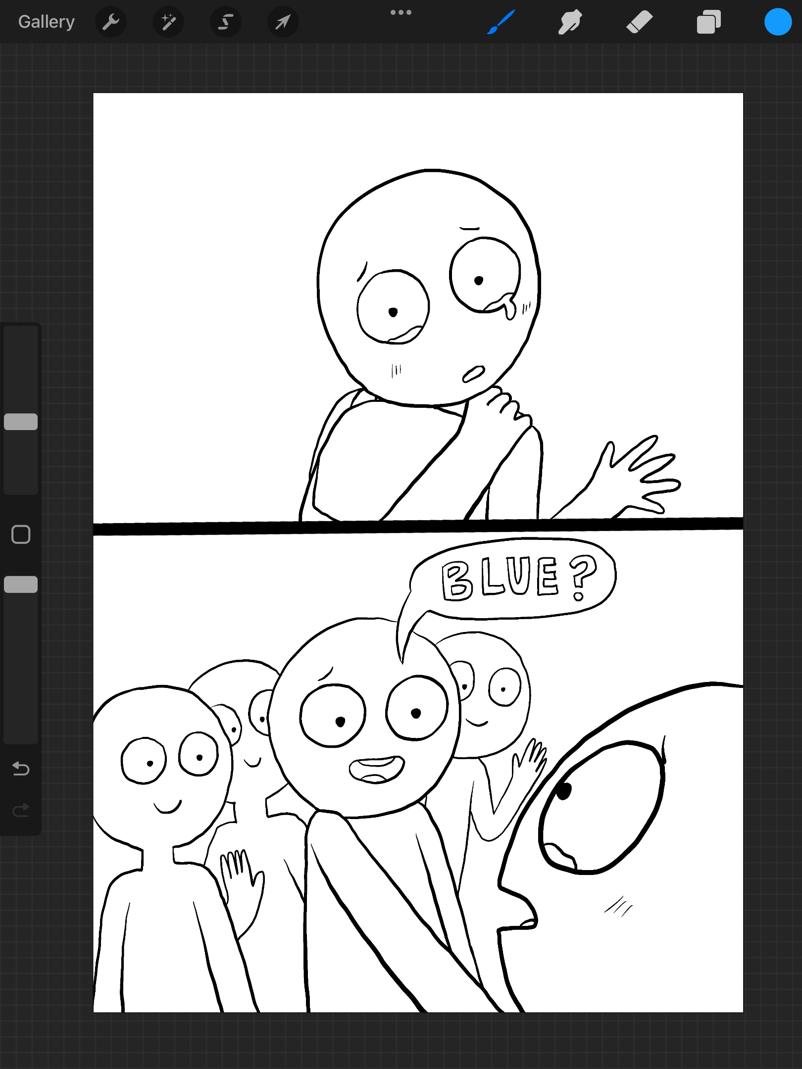
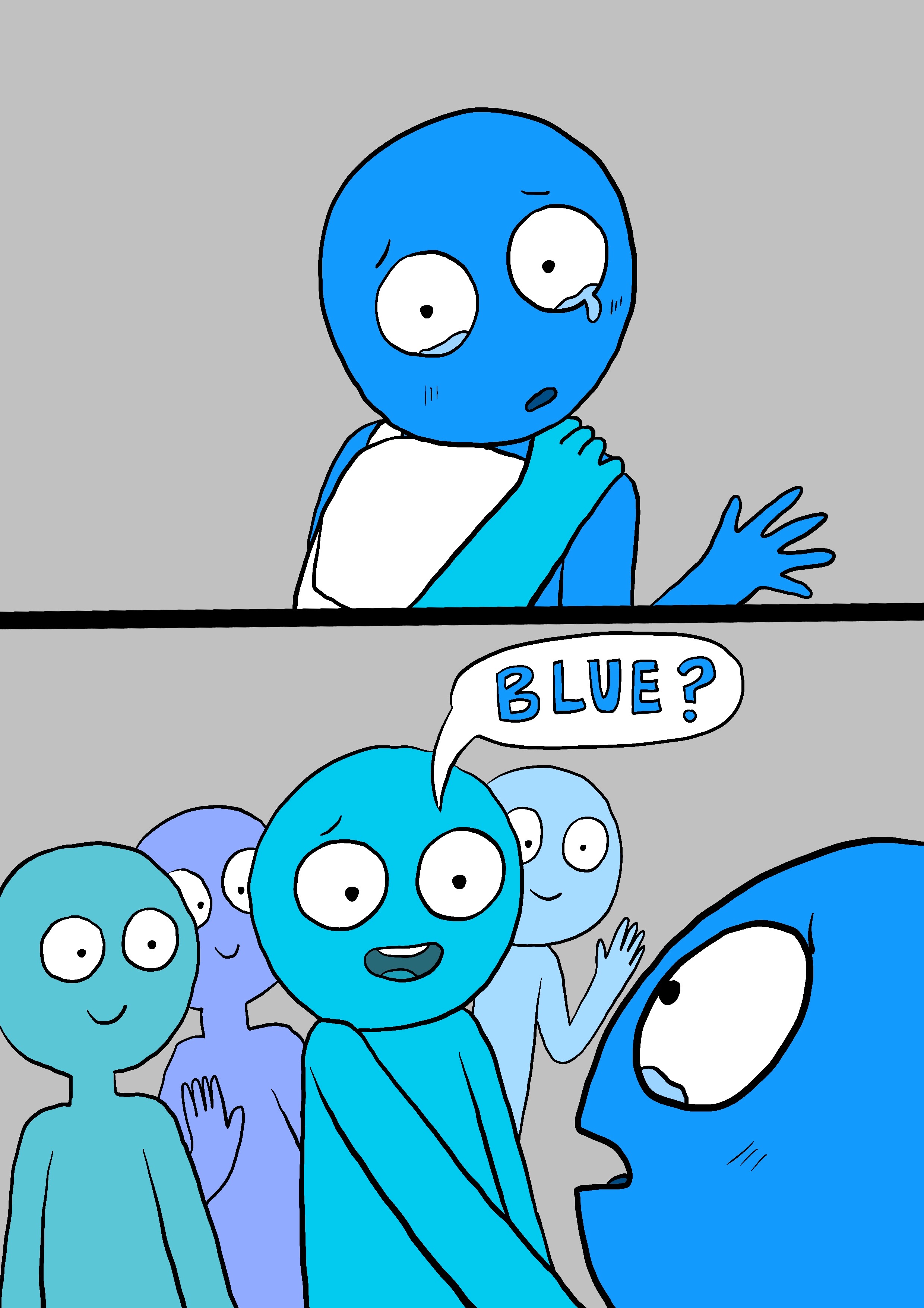
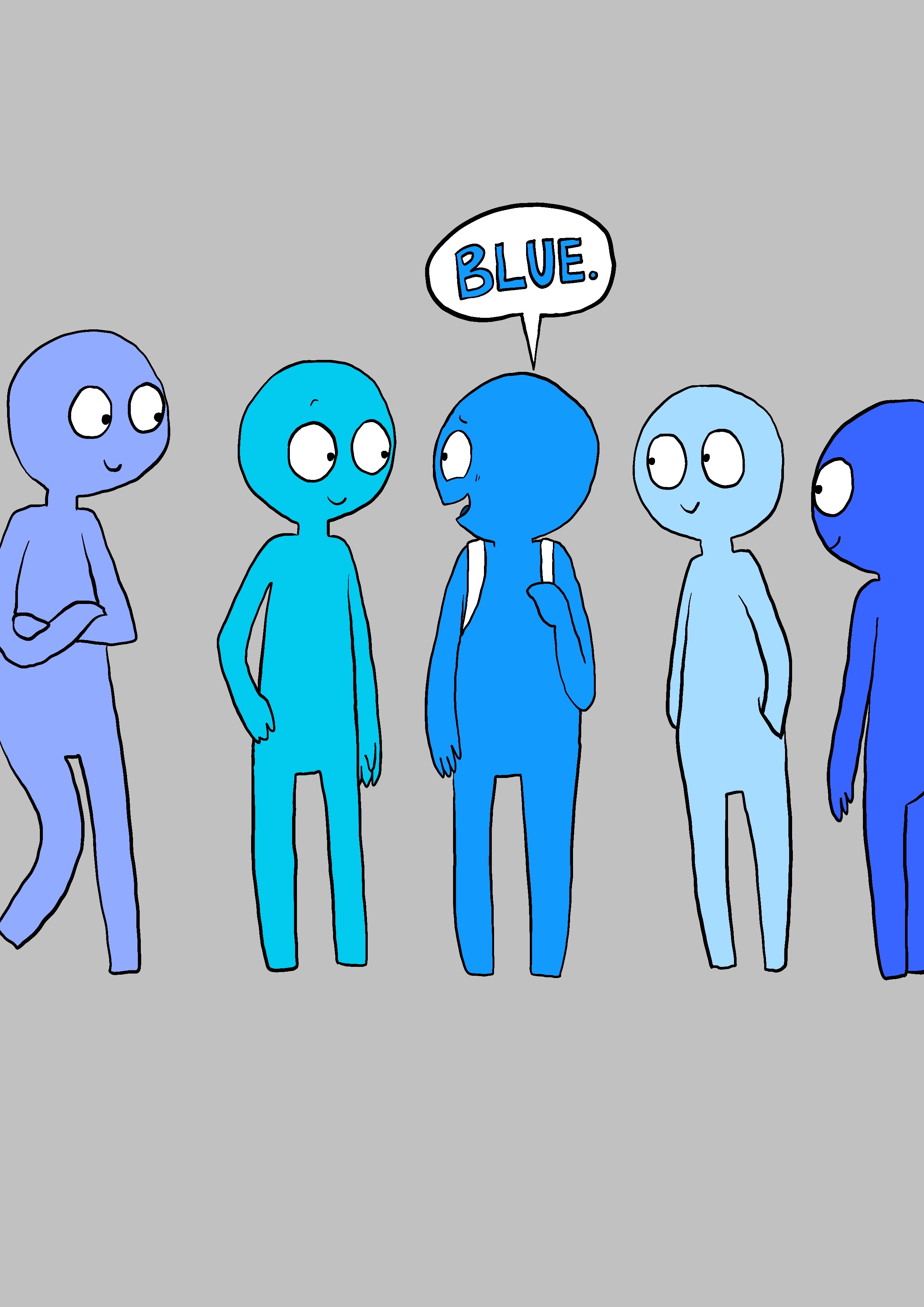
This exercise was really interesting as I was able to develop an idea from a background character in a previous assignment. Considering the initial background characters were all yellow and the main character was grey I wanted to focus on colour for this exercise. The yellow character ends up being a lesser character again who shows up as ‘pink’s friend’ but is then not seen again. As I was focusing on colour I wanted to stick to the same selection of colours for each character, for instance if ‘Blue’ is saying ‘Pink’ to ‘Pink’ the pink text will be the same pink as pink… if that makes sense! Also ‘Blue’ has the same colour as the blue on the front and back covers. There is limited text as I wanted to test myself and create an emotive story that relies on the characters facial movements and gestures only. I think you can understand what is happening from the way they are calling each others names and from body language. The title was a ‘no-brainer’ as the context of the story is about bullying and not being valued which makes people sad, so ‘Don’t Be Blue’ is what I thought about when looking at the sad blue character! Four out of six panels are full-bleed and the remaining two are split, one consists of a smaller square panel with the normal size panel on the outside and the other is a panel cut in half to create two smaller panels. Personally I think the story and panels work really well and I’m really happy with how it turned out.
