
Research Task 1:
For this research task I need to look at a range of illustrators and artists who use paper as a medium rather than just a surface within their work.
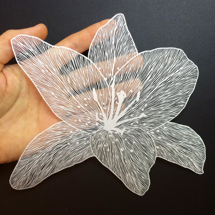
Maude White

How have they used paper and what processes have they put it through?
Maude has used paper by using a scalpel and cutting holes out to create intricate details. The paper is white and there is no colour used. She has photographed the outcomes on their brown or black backgrounds so you can see the details clearer. The outcomes are beautiful and delicate designs that would damage easily. They remind me of paper doilies but even more intricate! She must have an incredible amount of patience in order to create these beautiful pieces. I can imagine that the only way you could preserve such a delicate art piece is in a gallery behind glass or pasted into a book with a protective sheet on top.
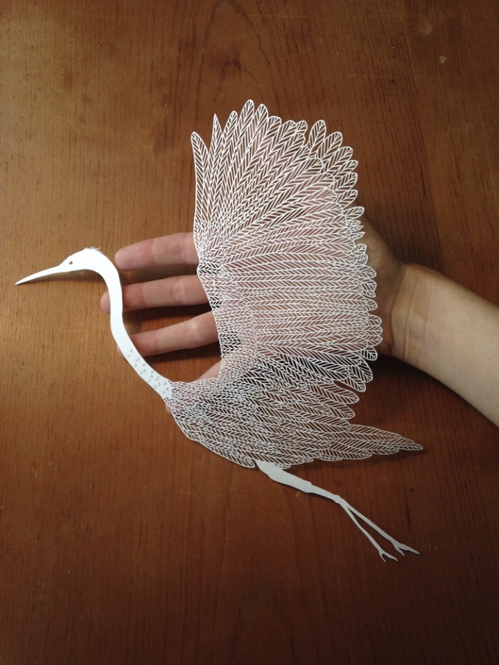
Eiko Ojala


How have they used paper and what processes have they put it through?
Eiko has used paper by creating intricate designs similar to Maude but the detail is different. Instead of creating numerous holes to create texture, Eiko has used holes to create scenery and give context to her cutouts, for instance in his first image relating to COVID-19 he has created numerous smaller cutouts of DNA and People and cleverly placed them into a design that symbolises a face, this is then made even clearer with the mask added over the top. The second image is so simple but very clever, he has taken colour, lighting and composition into consideration when creating this image, the larger person speaking into the microphone has a mouth created by a smaller version of themselves facing the opposite direction and strangling a person created from black paper, this is to make the person made from black paper fade into the background so you only truly see them when you are focusing on the image. The images are crisp and taken with a good quality camera so you are able to see the edges of the cutouts better.
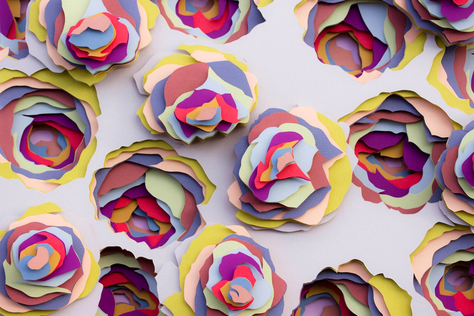
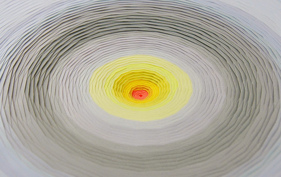
Maud Vantours
How have they used paper and what processes have they put it through?
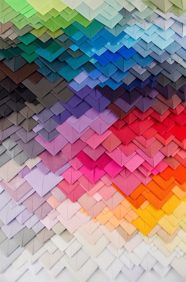
Maud has used paper through the processes of cutting with a scalpel and folding. The first two images show scalpel cut illustrations of roses and what looks like a solar system without planets? She has incorporated depth into both images. The third image shows many folded triangles, it reminds me of origami. The paper has been organised into a rainbow of colours. It also reminds me of feathers or scales close up, or when you look at a magnified image of a butterfly wing. Maud has also used lighting effectively by positioning the light source so that you can see the depth of the roses in the first image. Her scalpel work is very detailed, precise, intricate and balanced.
Exercise 1 – Paper circus:
I have been asked to create a poster for a circus advertising what’s on, where and when, but only use paper to do it. I can use coloured paper, work with collage, cutting and layering, folding or sculpting.
For the subject I decided to focus on a people-based circus with traditional imagery including circus tents, jesters and juggling.
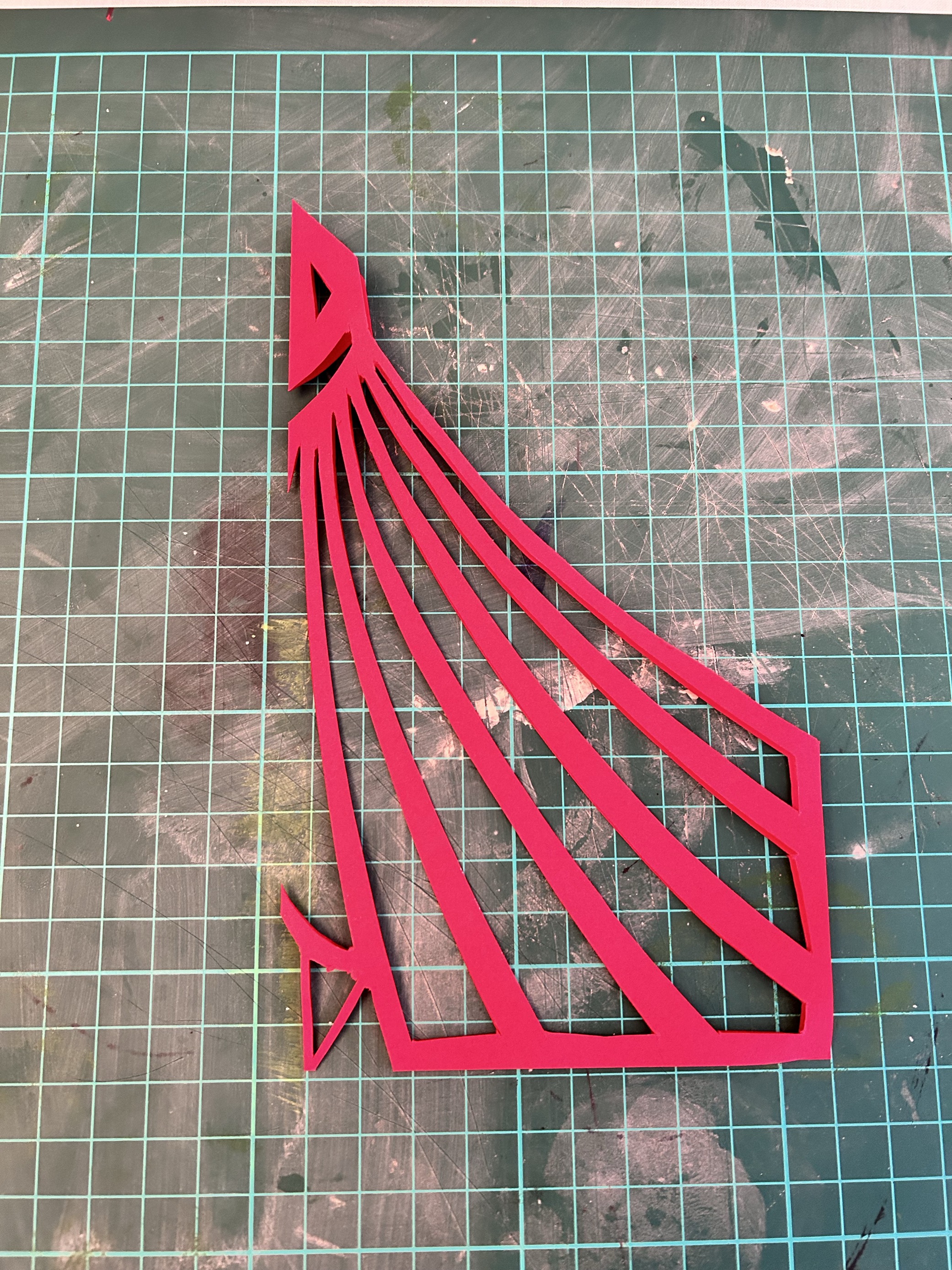
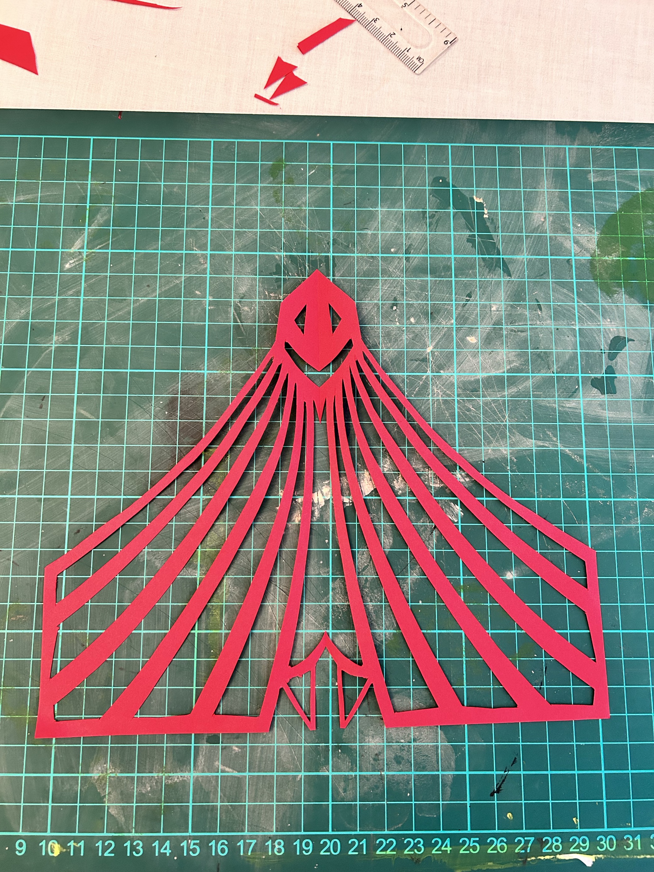
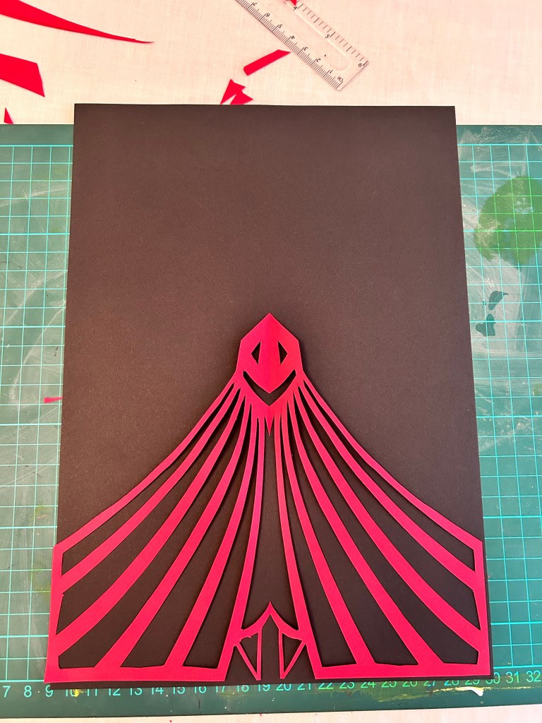
Circus Tent:
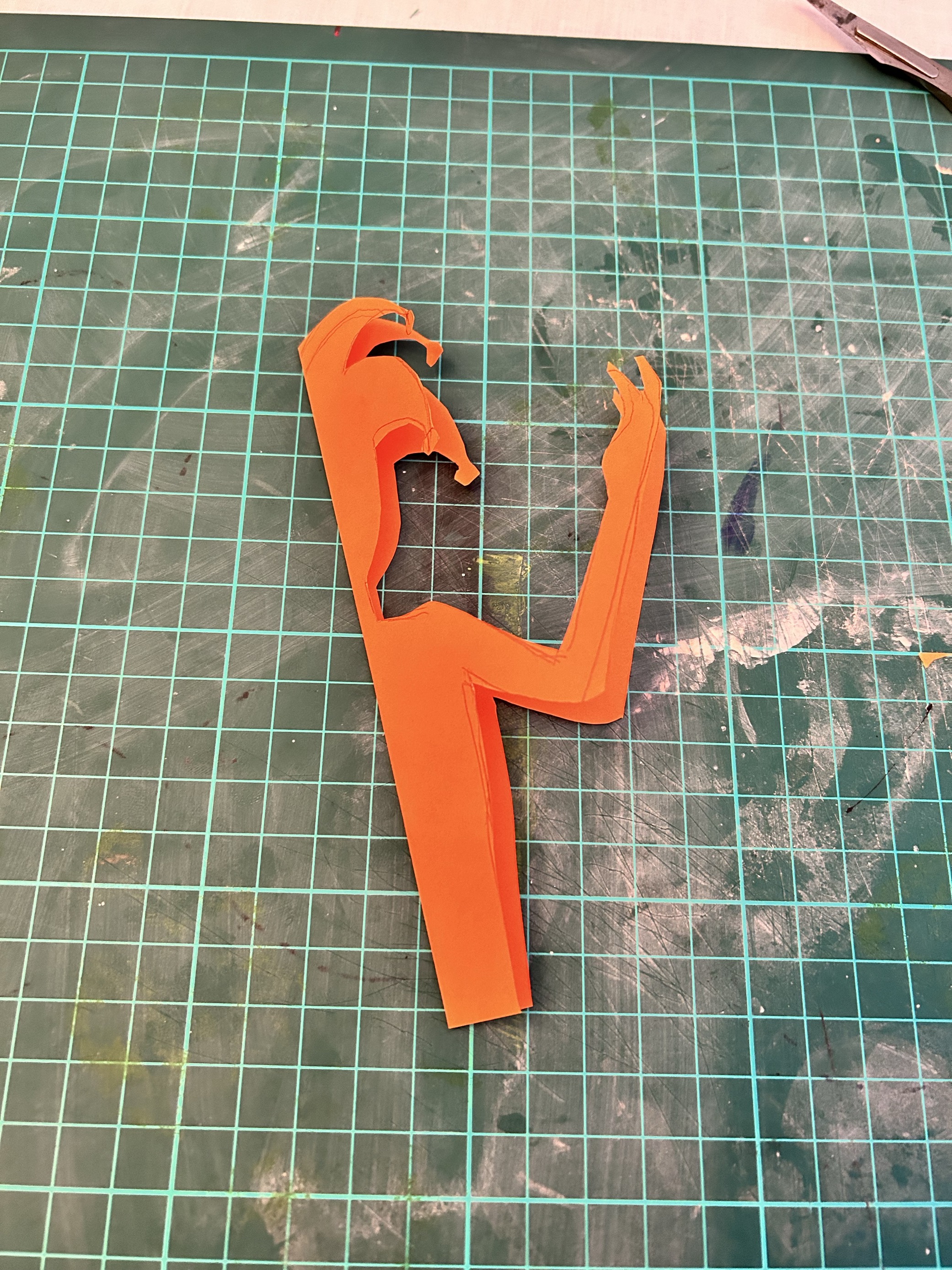
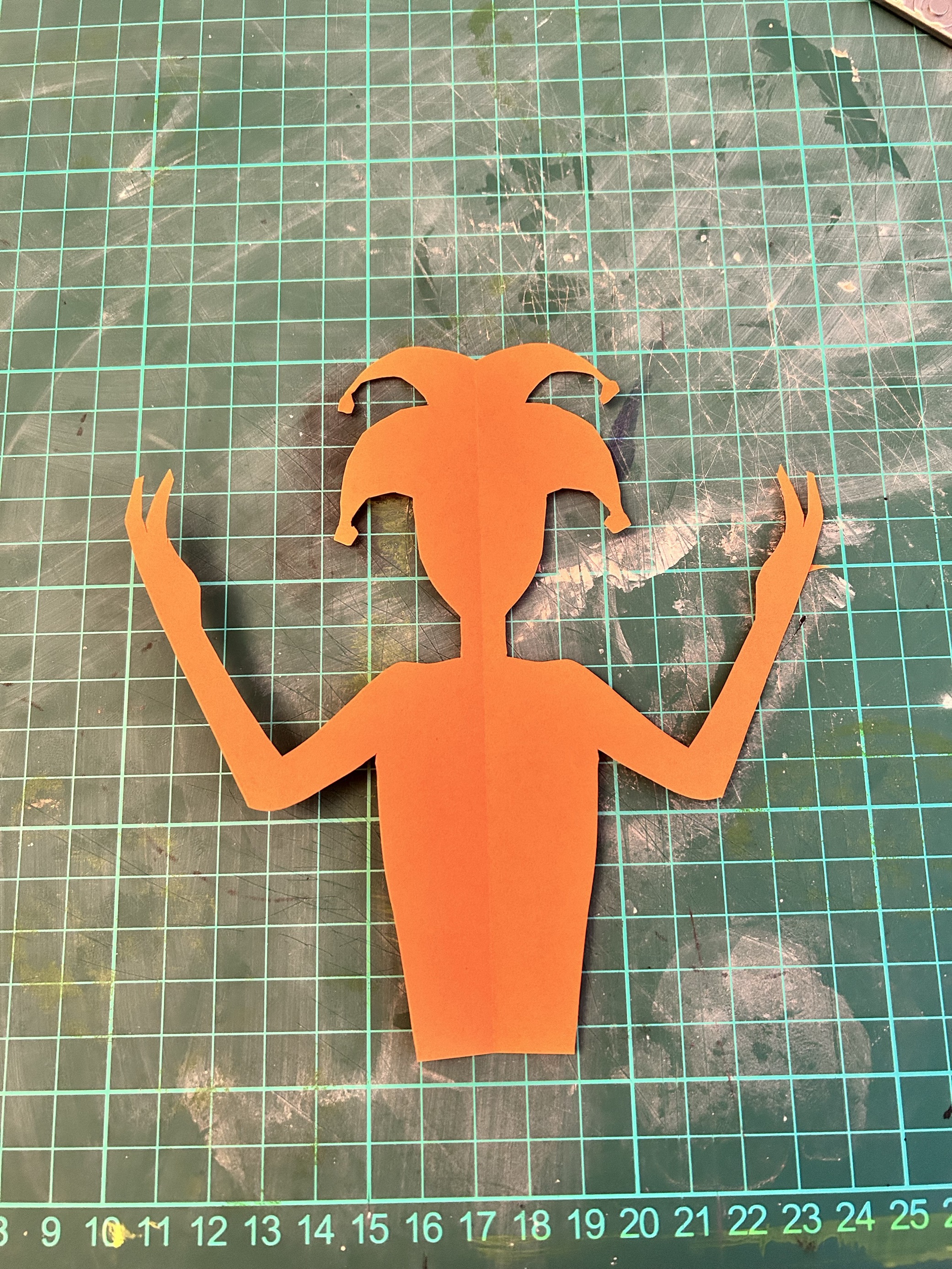
Jester:

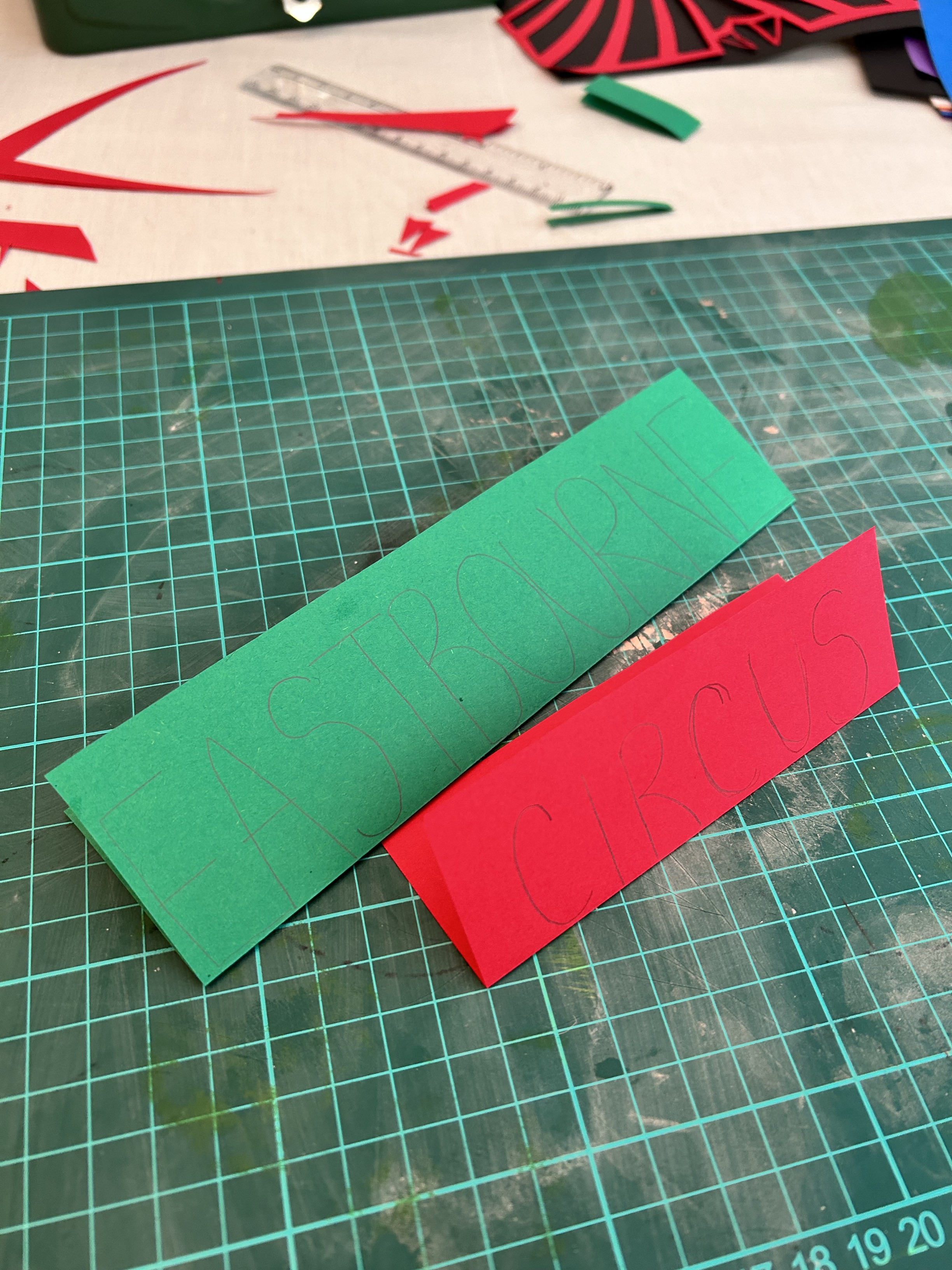
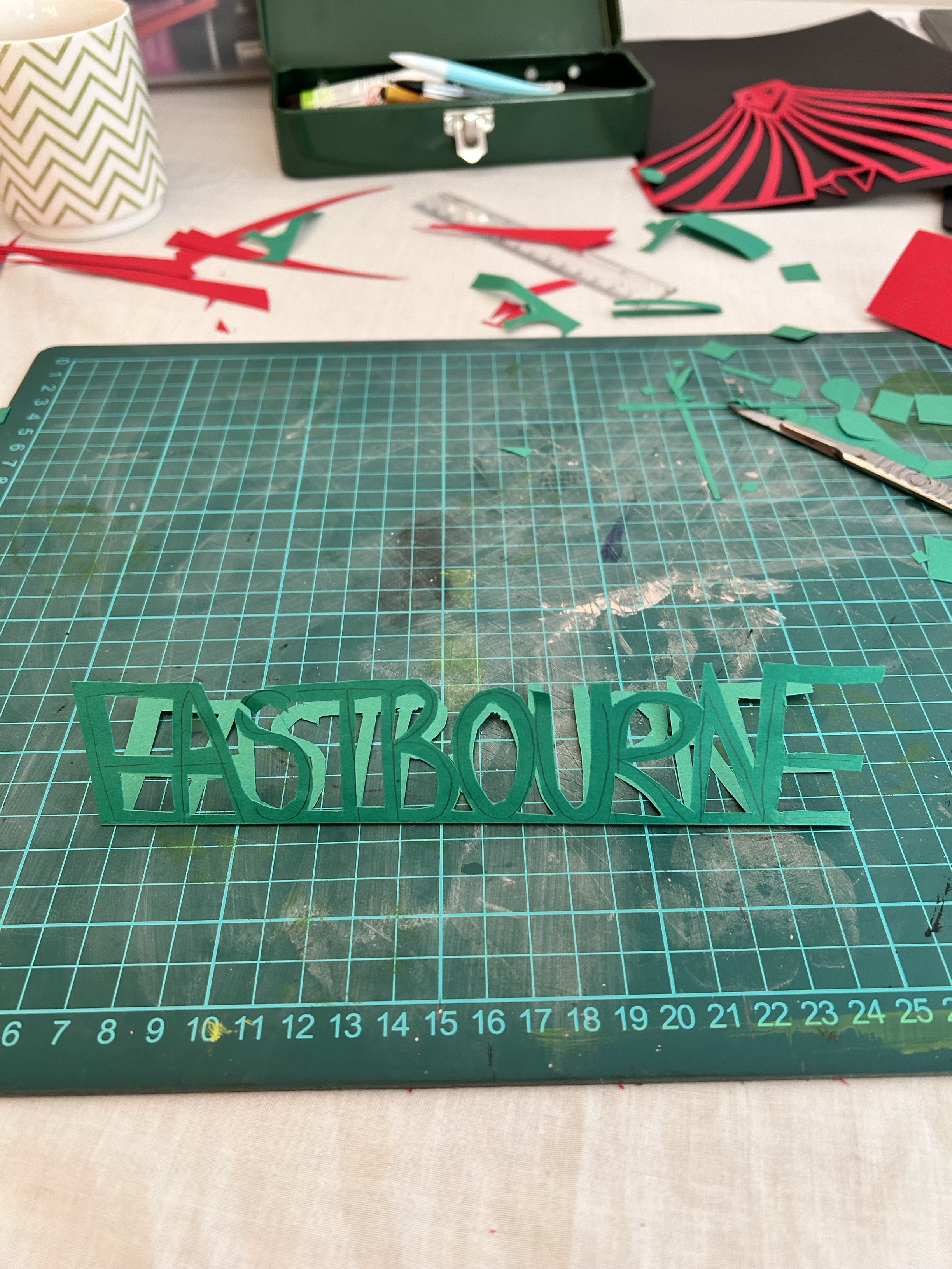
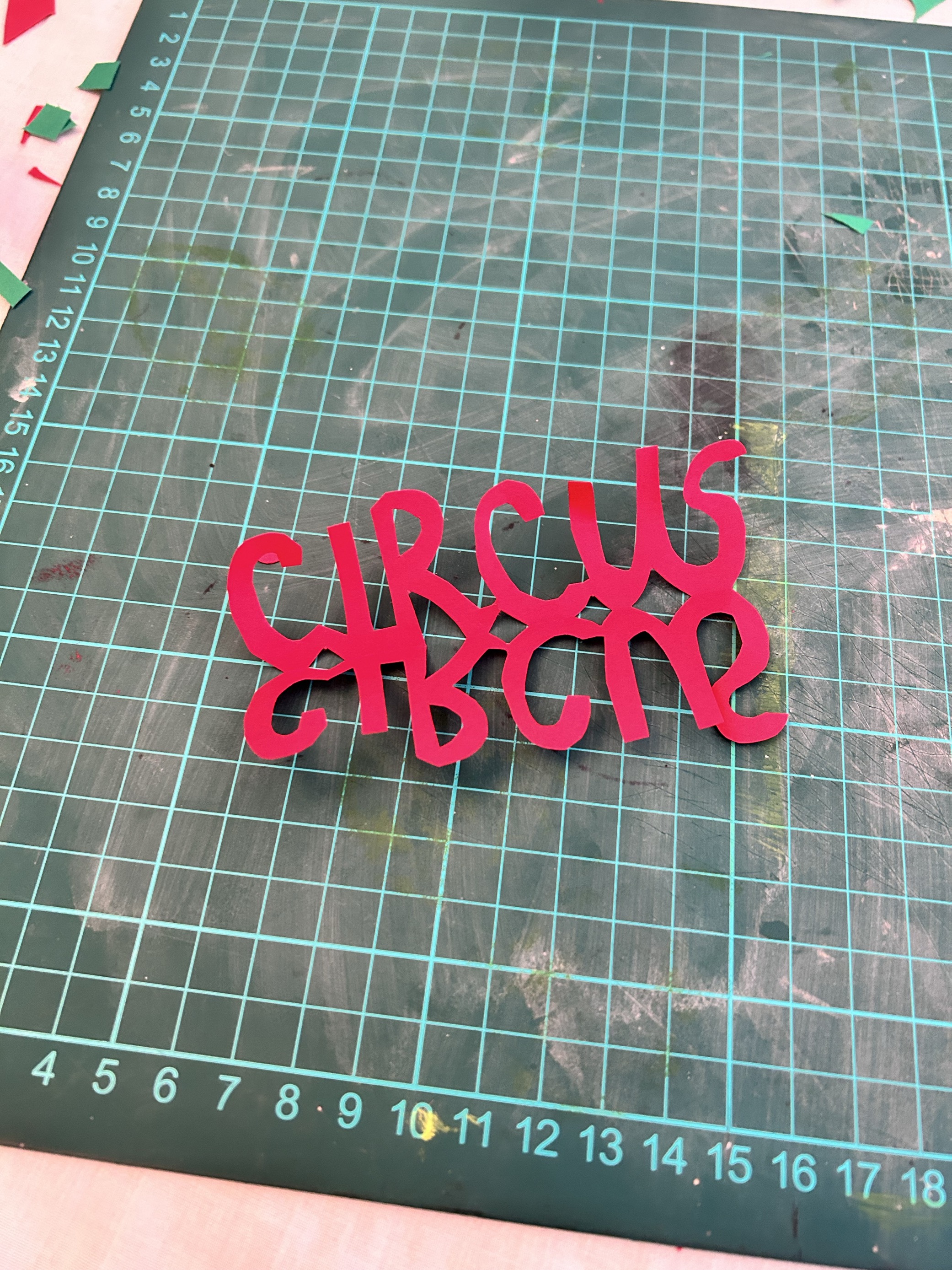
Text:
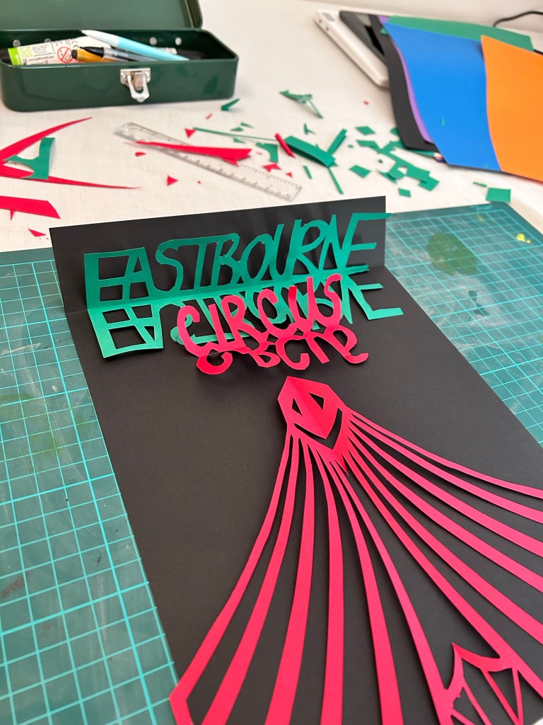
Circus Tent with background:
Text added to background:
Final Design:
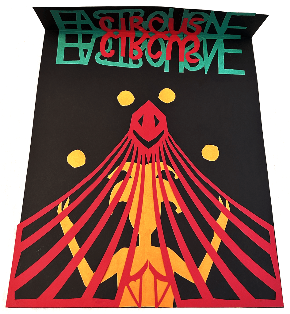
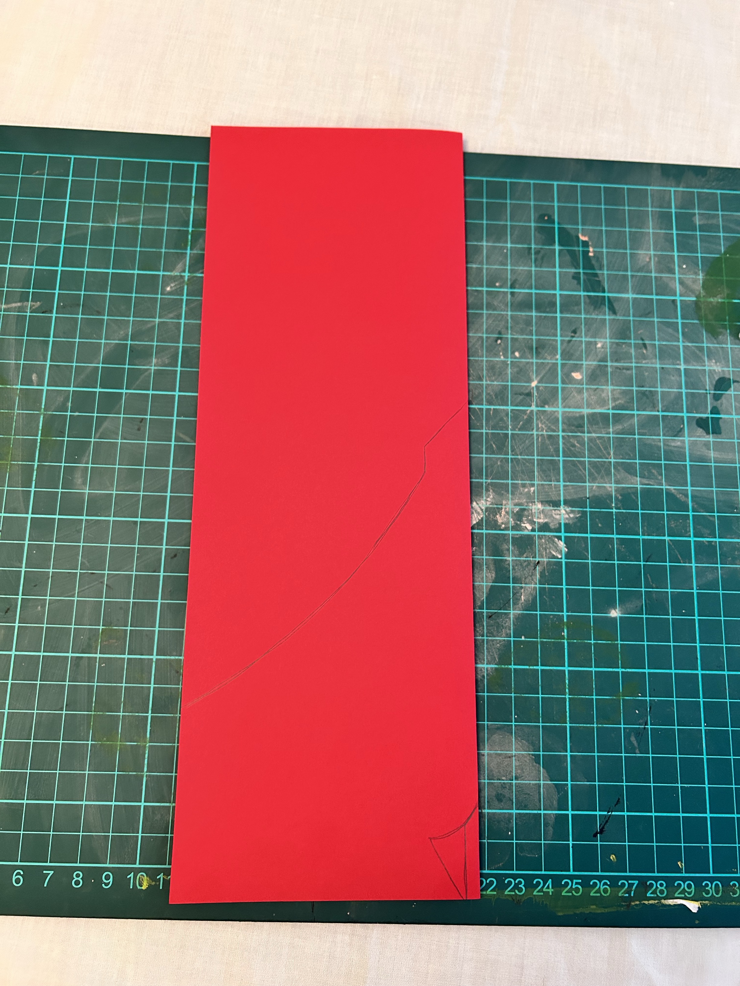
I used a scalpel for this exercise primarily but used scissors for some of the text as there were many curves. I think my final design stands out and would catch peoples eye. For the text/typography I wanted to focus on the ‘illusion’/mirrors part of a circus so for this I cut out the text with a mirrored version attached to it. I then overlapped the work circus on top of Eastbourne, this way the colours green and red would clash making it seem confusing and give a ‘dizzy’ 3D sort of effect. For the jester and the tent I folded my paper over so I cut out one side only and mirrored the design when I unfolded the paper. I showed the jester juggling some balls as well to really define what the image is trying to show. Looking back I suppose the tent could be mistaken for a jail cell with the jester behind? The only downside to this is that because of where I put the tent doors, it looks like the jester is wearing a bra!
Research Task 2:
For this research task I need to do some research into artists and illustrators who have used ceramics as a surface for their image-making.
Jacqueline Tapia

Jacqueline is a Chilean artist who molds her clay to show us an enlarged and fragile version of things that we would only see under the microscope. Even though science and ceramics might not share many qualities, both are combined in Jacqueline’s work.
Milo Hachim

Milo creates tiny ceramic pieces a lot of the time, she again is a Chilean artist. She works on a small scale, with bright colors and extravagant ideas, like this watch: it’s not functional but is the perfect fashion accessory. The character reminds me of Charlie Brown.
Camila Pino Gay

Camila stumbled upon the world of ceramics by pure chance. She is a painter by training, but she undoubtedly found her calling in clay. Each of the objects in the image above this paragraph is made of clay and perfectly mimics real items we use every day. Apart from the lined paper in the middle, the rest of the objects feels really real.
Exercise 2 – Contemporary ceramics:
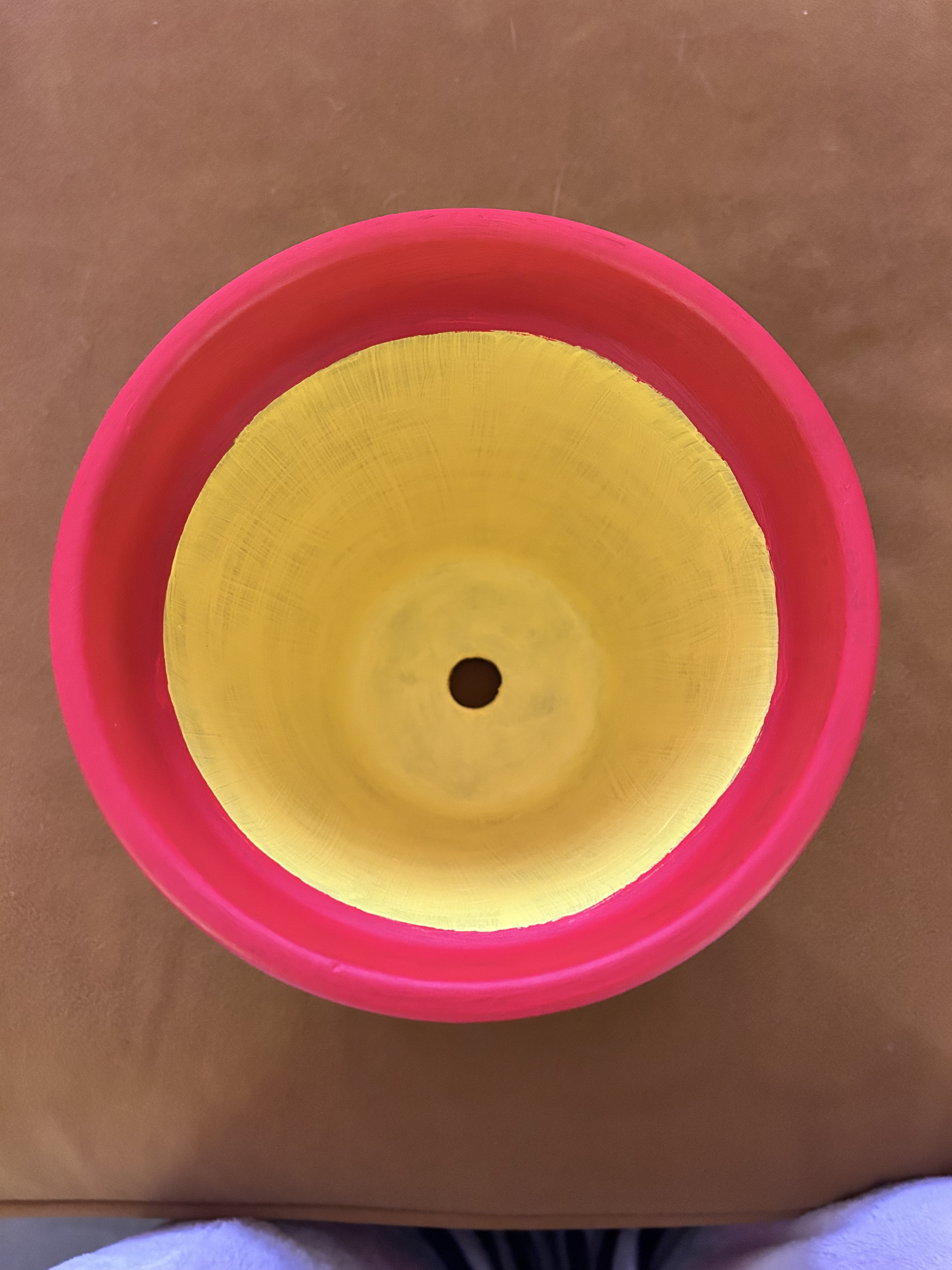
I’ve been asked to create a range of illustrations for contemporary ceramics that draws on the visual history and symbolism of pottery in some way. I can start with any historical period, draw on any tradition of image-making within ceramics, or perhaps make reference to the symbolism and visual storytelling of the blue and white Willow pattern, but I need to bring this up to date through my own illustrations. I will be creating work within the context of plates, cups, saucers, teapots and I will create a design using a terracotta pot.
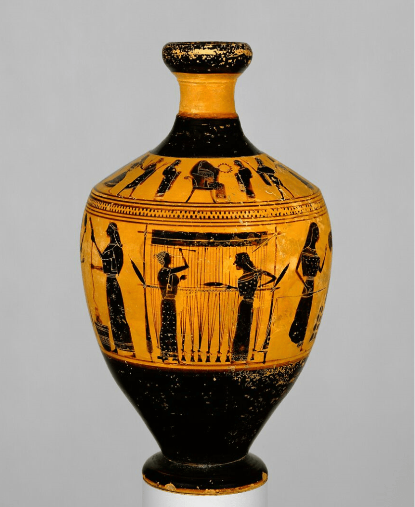
My historical period:
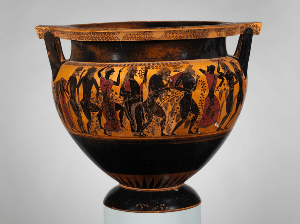
I decided to base my idea on Athenian Vase Painting: Black- and Red-Figure Techniques from between the beginning of the sixth and the end of the fourth century B.C (Greek and Roman).
my idea:
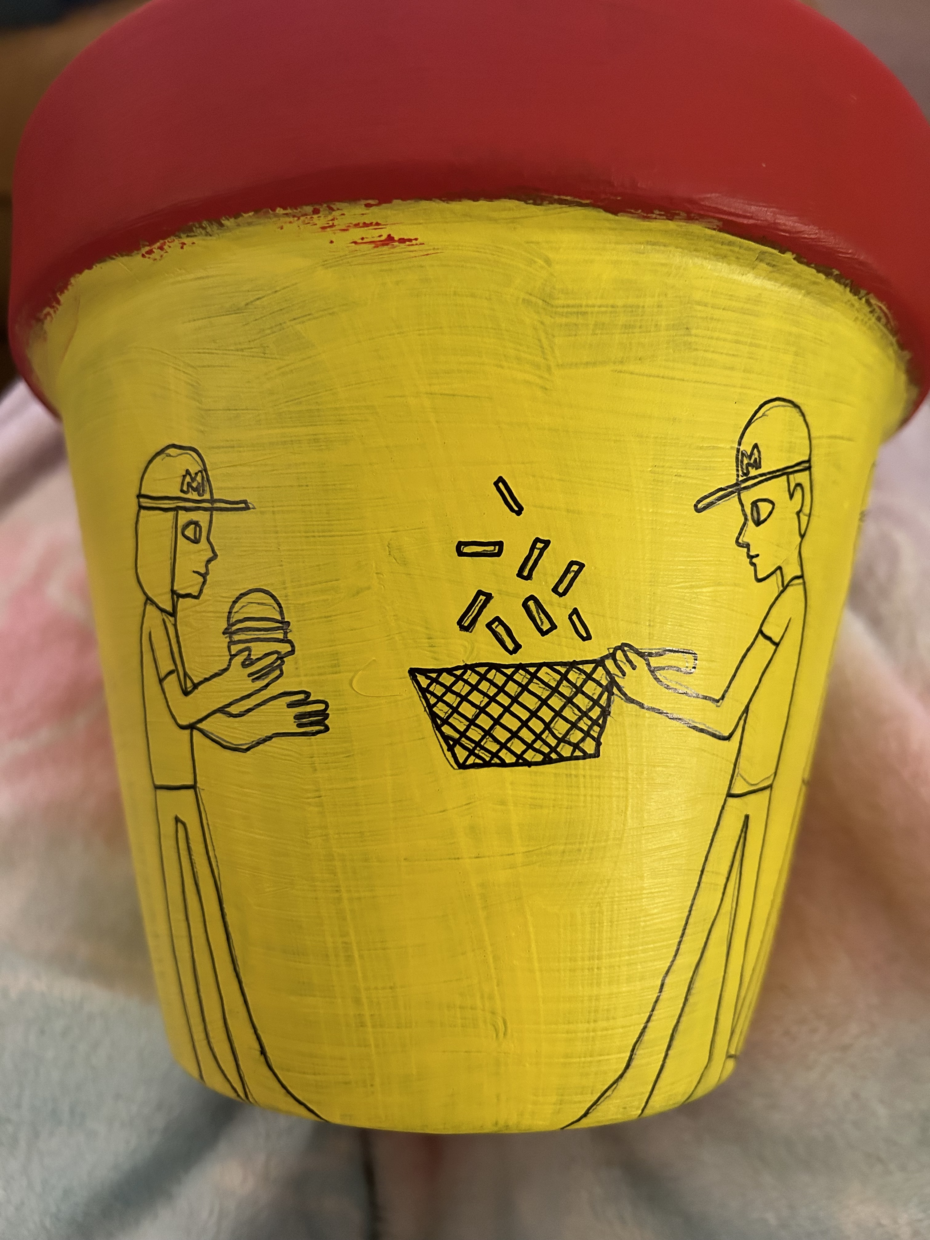
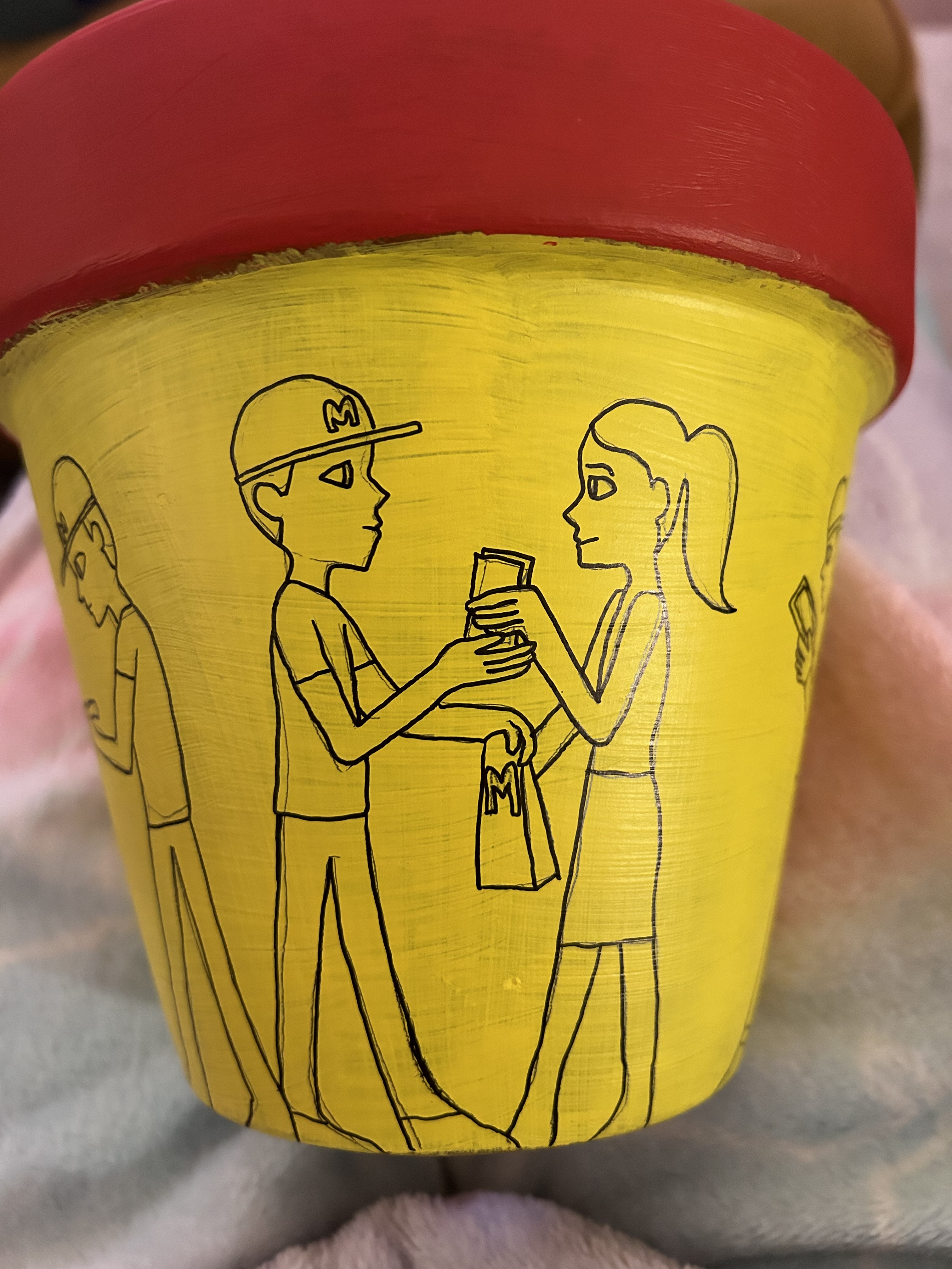
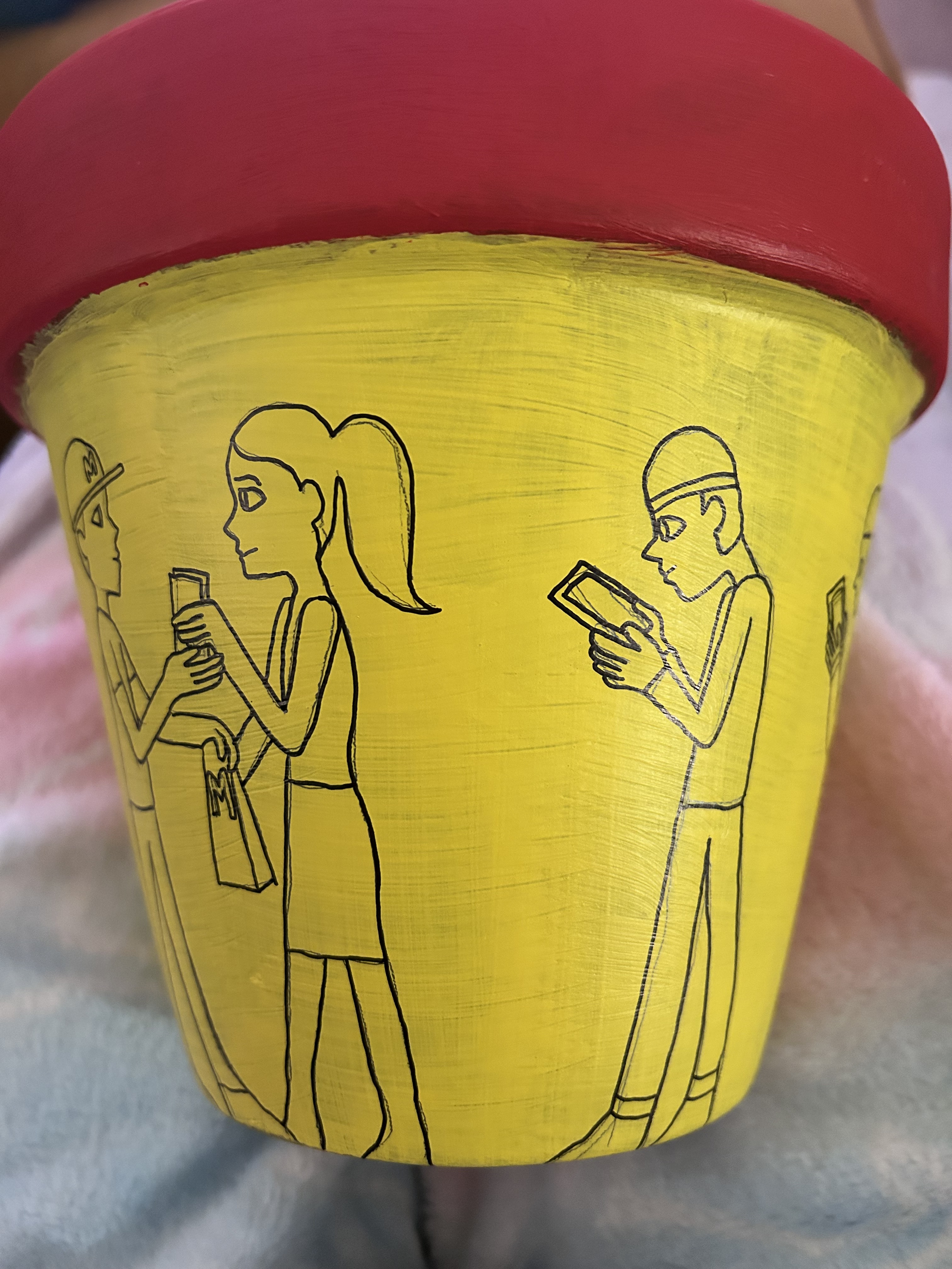
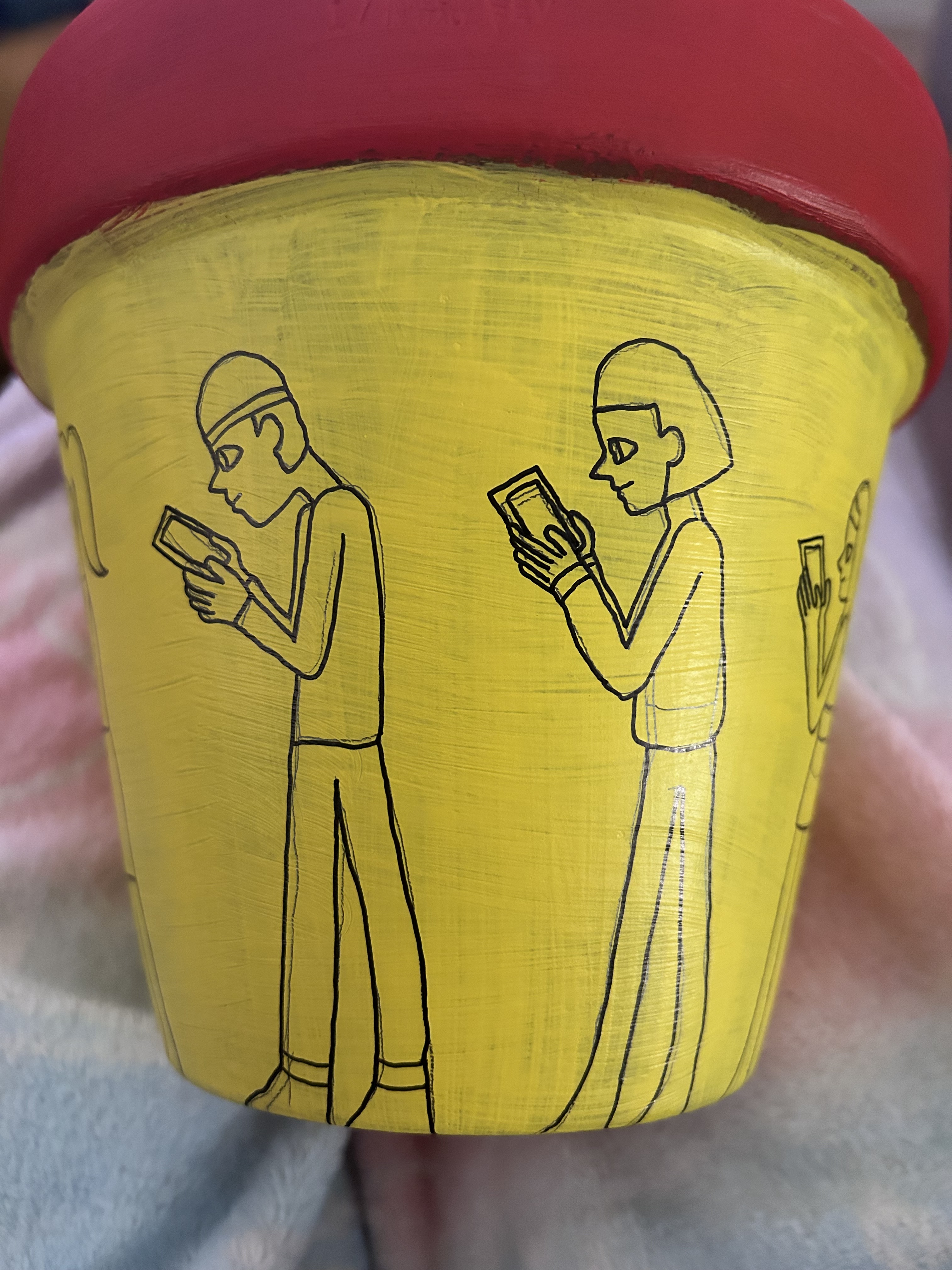
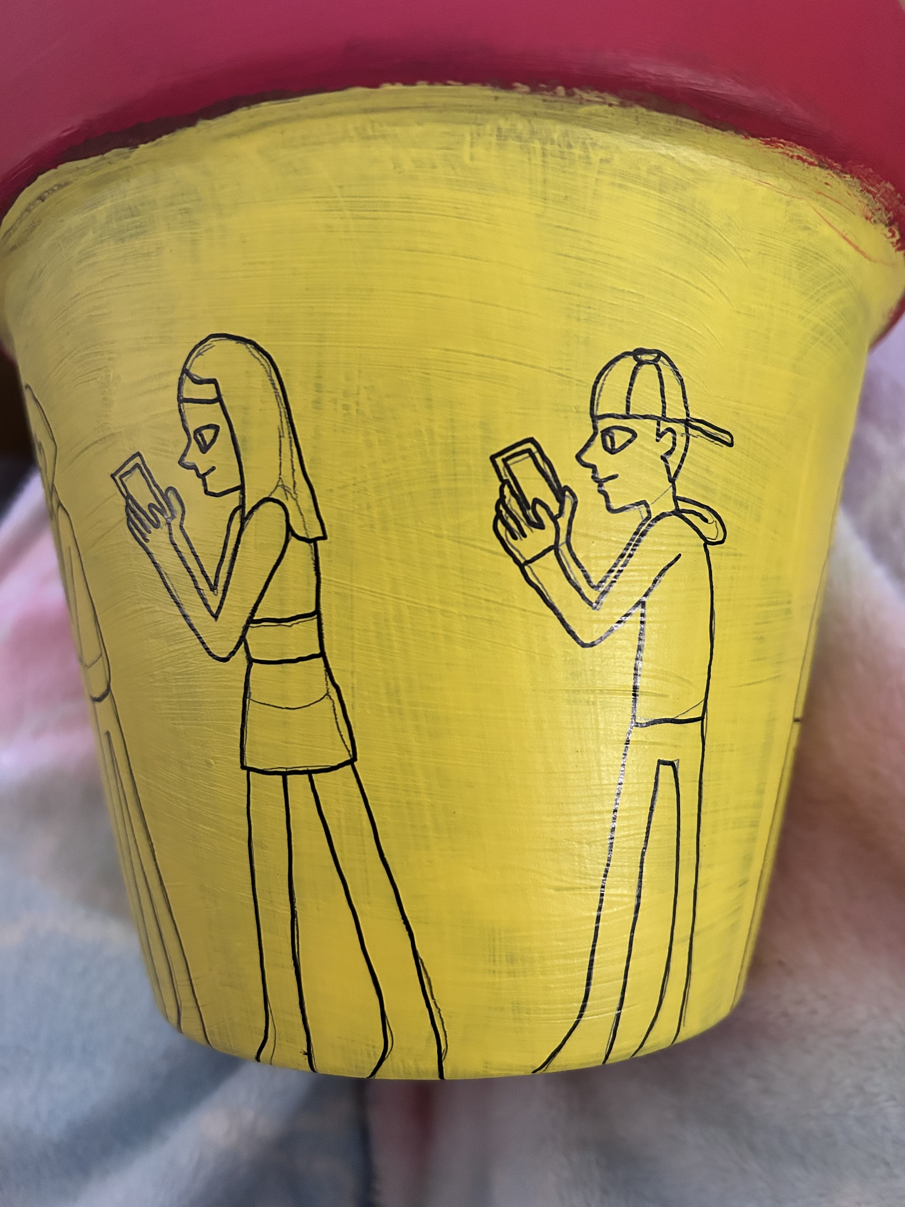
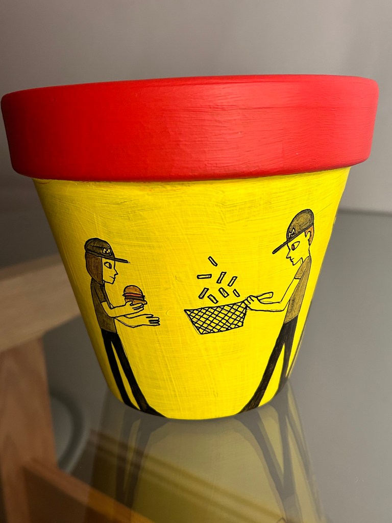
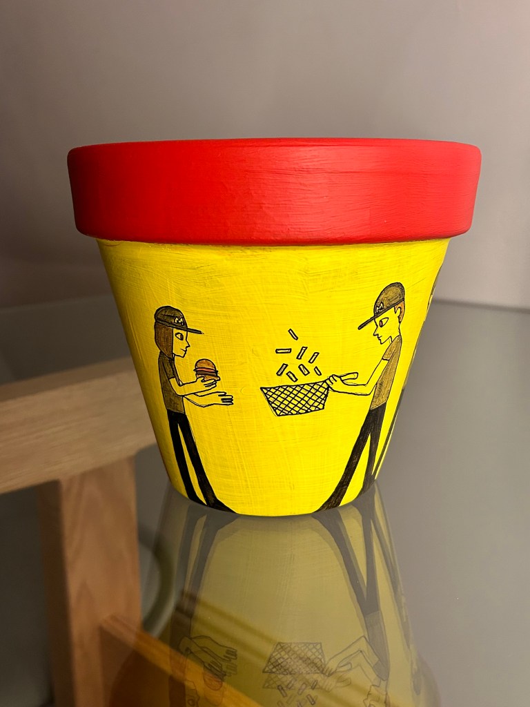
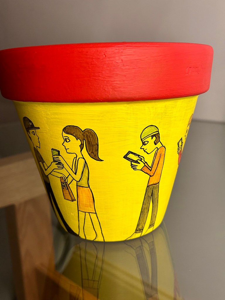
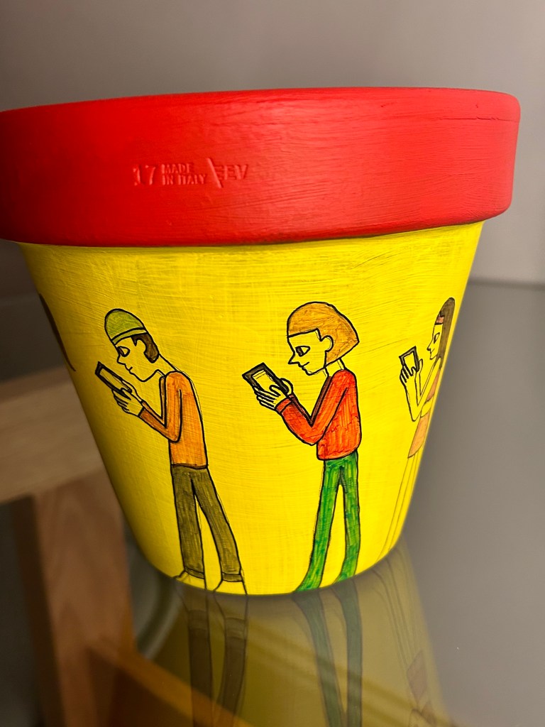
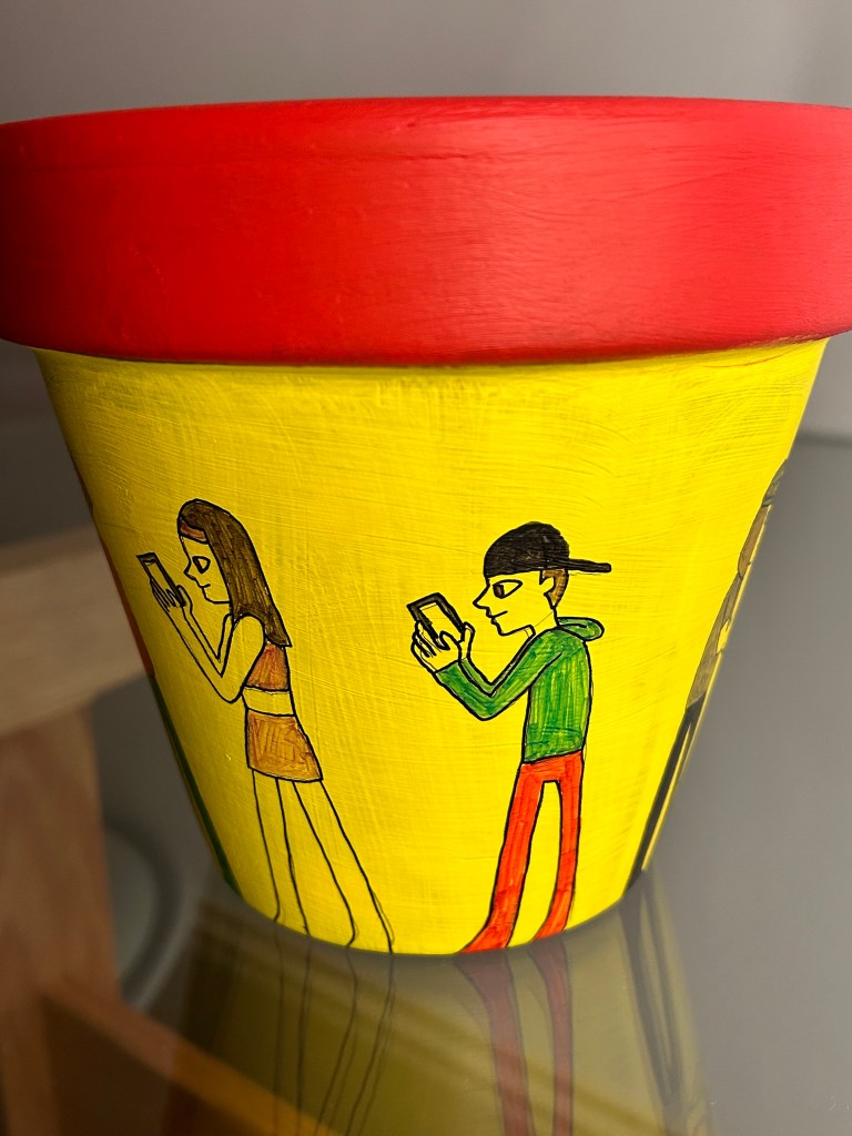
I’m going to bring the design up to date by incorporating a modern setting into it. I will show people in a queue at McDonalds. The people in the queue will all be on their phones which is the usual sight apart from the person at the front of the queue who is receiving her order. There will be a cashier, and two employees in the back making fries and burgers. I will make the terracotta design red and yellow to show the McDonald’s colours. I got this idea from the way the Greek show people in a line around the pot or bowl for instance in the image above. I thought that changing design to people in a queue for McDonald’s would modernise it.
Red and Yellow painted terracotta pot with pencil sketches of design:
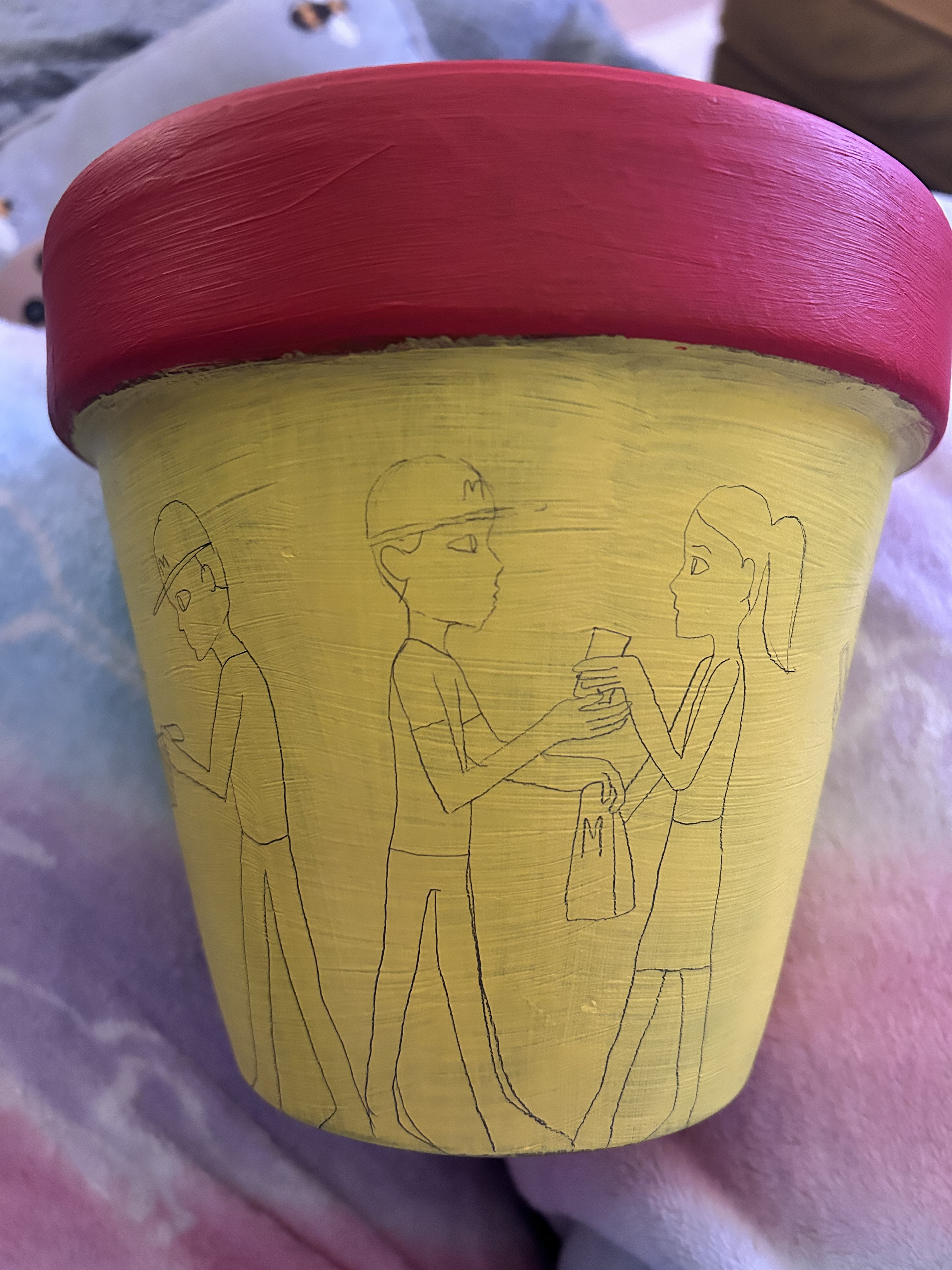
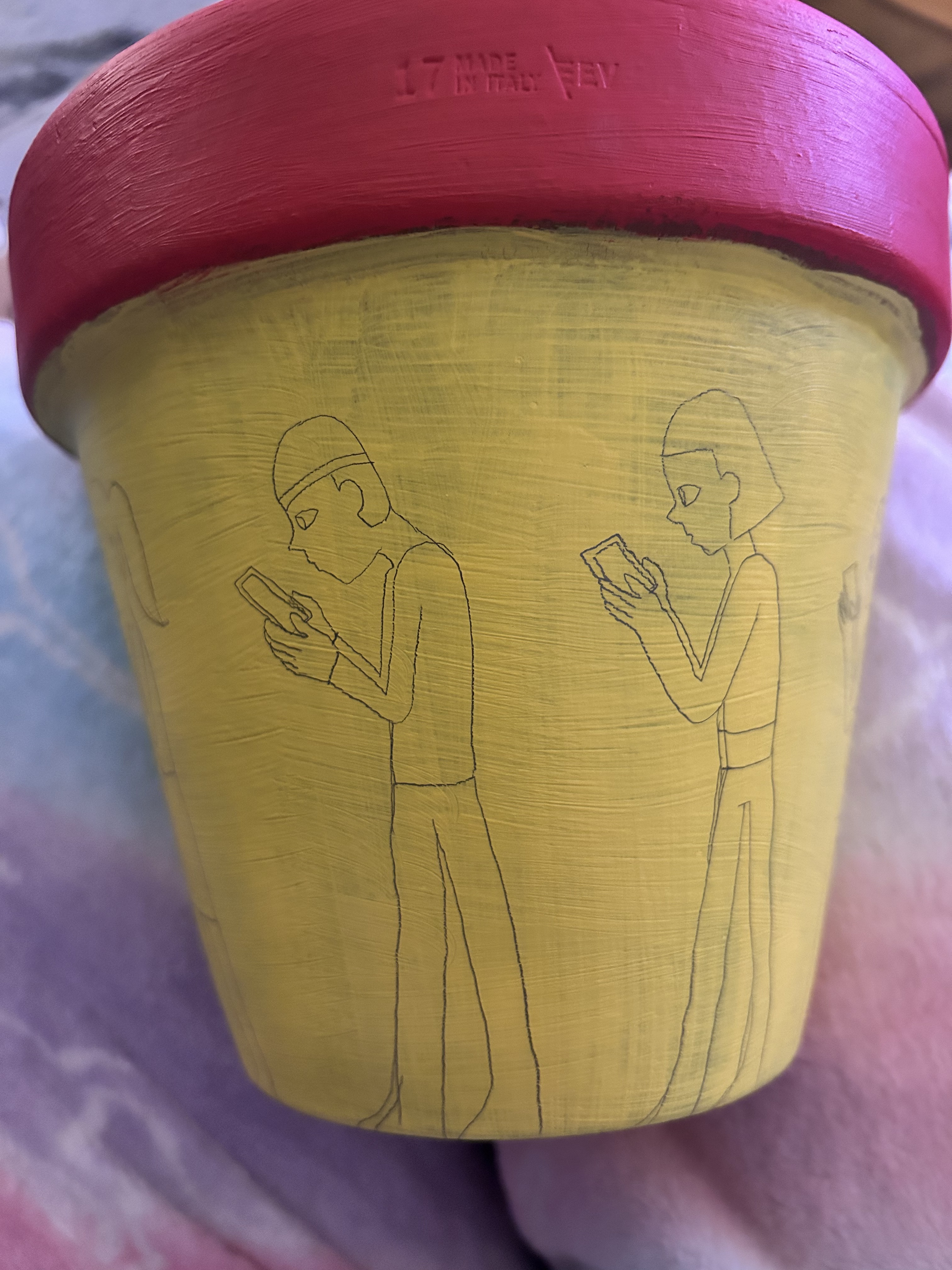
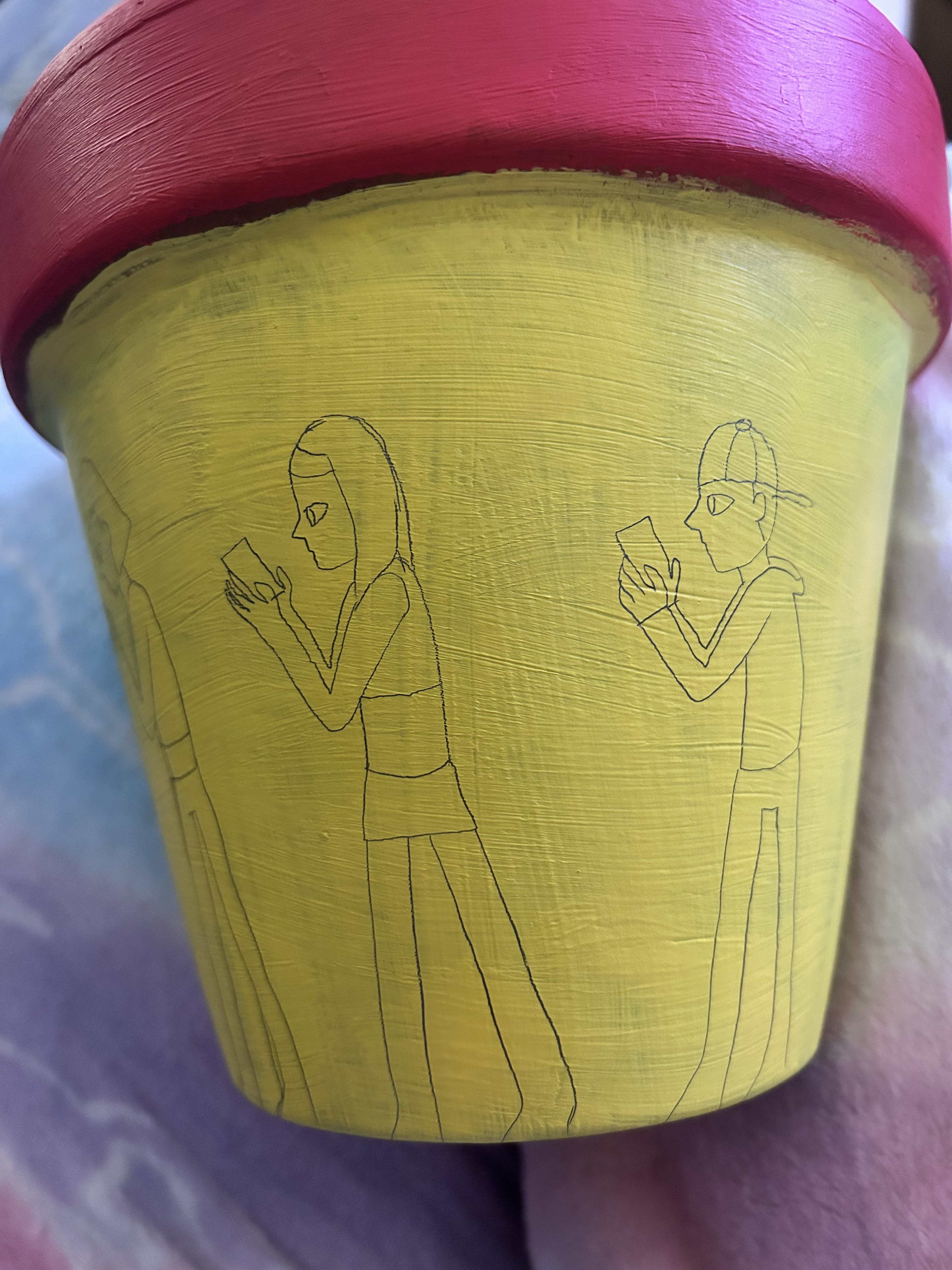
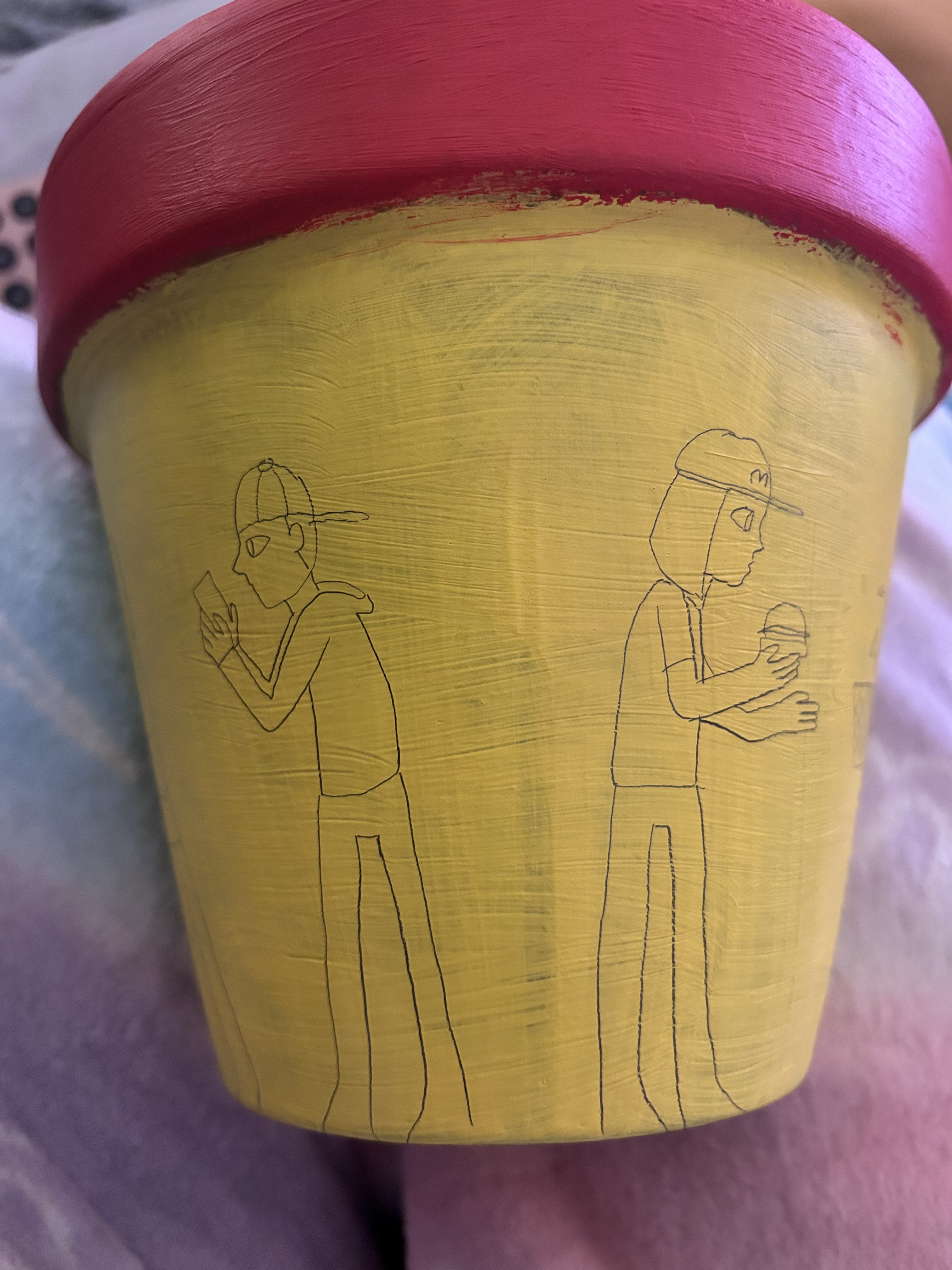
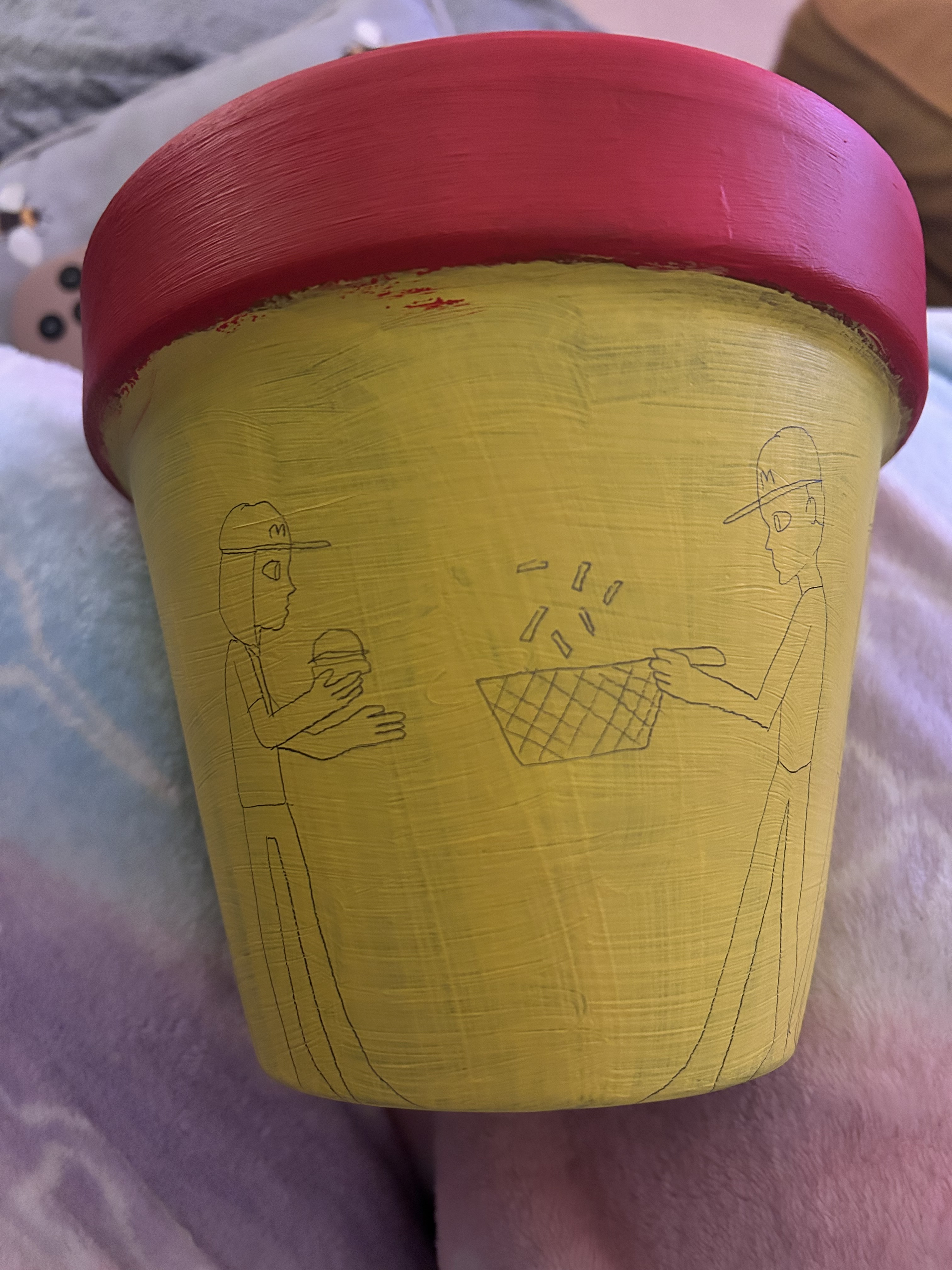
fineline pen work outlining design:
colour added to final design:
What did this opportunity offer me and how can I take what I’ve learned back into my paper-based work?
I didn’t enjoy this exercise, I think it was because I worked in 3D on an actual pot when I am not a 3D artist. As interesting as it was to create a 3D design I feel as though this opportunity has made me realise just how much I enjoy working digitally or at least in 2D traditionally paper-based. I still think my idea is good and interesting but maybe it would work better digitally as a mock-up rather than like this!
References:
Maude White – https://www.99inspiration.com/2015/07/amazing-detailed-paper-cut-art-by-maude-white/
Eiko Ojala – https://moomar.co.uk/amazing-paper-illustrations/
Maud Vantours – http://littlehelsinki.blogspot.com/2014/05/paper-art-by-maud-vantours.html?spref=pi
Jacqueline Tapia – https://www.instagram.com/jacceramiquita/
Milo Hachim – https://www.instagram.com/milohachim/
Camila Pino Gay – https://www.artsy.net/artist/camila-pino-gay
The MET Athenian Vase Painting – https://www.metmuseum.org/toah/hd/vase/hd_vase.htm
